Houzz Tour: An Artistic Blend in a Luxe Manhattan Loft
http://decor-ideas.org 01/18/2015 01:13 Decor Ideas
This story is kind of like The Brady Bunch, but instead of blending six kids in one household, this couple combined two awesome (and very individual) art collections when they moved in together. Mike and Carol Brady had Alice to offer wisdom and help establish an efficient household. This real-life couple (he’s in real estate; she’s a fashion designer) had interior designers Terrie Koles and Sarah Raymond to assist them in setting up their first home together.
Houzz at a Glance
Location: Manhattan’s Meatpacking District
Who lives here: A couple and a teenage daughter
Size: 4,000 square feet (371 square meters); 2 bedrooms, 4 bathrooms
The couple found their designers while searching for a home to share. While looking at properties on the market, they viewed a home designed by Terrie Koles. They passed on the property but contacted Koles. When they found the right place, they hired her, and she brought Raymond to the project.
This design begins and ends with the art. “It’s like a thread that’s woven throughout the house,” Koles says. Both owners had been collecting for years, and their art reflects their individual tastes. “Art is a lot like food; it’s all about taste — and taste is such a personal thing,” Koles says. “In this case the job was to honor their styles and make them work together. It couldn’t be a home just for him or just for her.”
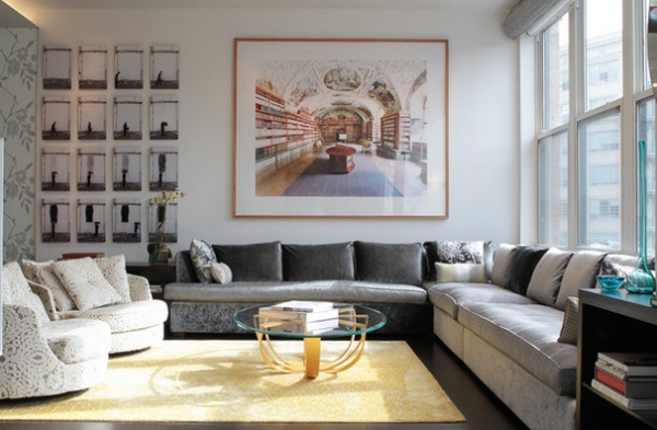
One of the main spaces in the two-story loft is a large combined living room, dining room and kitchen on the first floor. The space for the living room is so long, the designers created two seating areas. The first is centered around an incredible photograph by German artist Candida Hofer, pictured here above the sofa. The artist is known for capturing public spaces when they are empty — in this case, a library in Prague.
Coffee table: Nada Debs; rug: Jan Kath
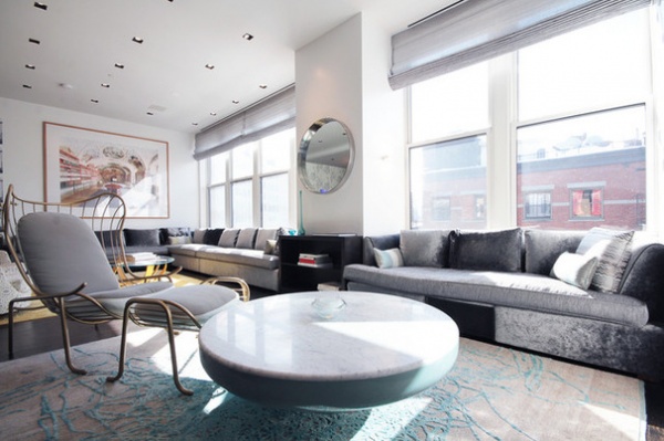
A longer view makes it clear that the two custom-designed sofas link the dual seating areas. The one in the rear is a long, L-shaped sectional with seats that measure a little more than 8 and 15 feet. The other sofa is 7 feet long and picks up where the larger piece leaves off, at a bumped-out wall.
The photograph makes it look as though the designers selected sofa cushions in subtly varying shades; in truth, it’s a trick of the light. The seat cushions are upholstered in a tweed-like material, while the base and back cushions are done in a velvet upholstery. The fabric’s nap and the ever-changing angle of the sun make them appear to change color throughout the day.
Koles calls the armchair in the second seating area a modern-day Barcalounger, because of its modern styling and extreme comfort. The chair is positioned at the ideal angle for watching television — after all, isn’t that what the celebrated recliner is for?
The coffee table appears to rise out of the waves woven into the carpet. “For me it’s all about texture,” Koles says. “And, just like many pieces of art, this loft has layers upon layers of texture.”
Arpa Chair and coffee table: Jaime Hayon; rug: Jan Kath
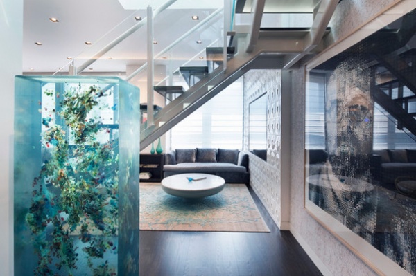
Unlike the Brady family, who didn’t have more children after combining forces, this couple has continued to add to their art collection after taking up residence together. There are his and her pieces — but the Dustin Yellin sculpture falls into the “ours” category. The massive sculpture is composed of images layered in sheets of glass. The placement was carefully chosen, as it would be hard to reposition the piece. “The piece must weigh 1,000 pounds,” Koles says. “It took seven men to move it.” A portrait by Chuck Close is on the wall nearby (right front).
The television treatment (right rear), is a minor work of art by the designers. They started with a television that appears to be a mirror when it’s off. Three-dimensional tile surrounds it. All that’s missing is Magritte-style script that reads, “Ce n’est pas un téléviseur” (“This is not a television”).
Television: Samsung
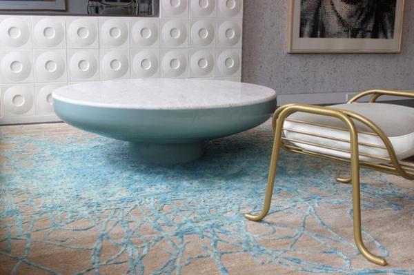
There is nothing surreal about the choice of circular patterns. “This is an industrial space. The circles soften it,” Koles says.
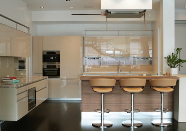
The kitchen is a quiet oasis in the art-filled space. The glass-front Italian cabinets are done in the fashion designer’s favorite nude color. “It’s a beautiful neutral color that is subtle and timeless,” Koles says.
Metal arms hold a retractable sheet of glass from the ceiling-mounted ventilation hood. It directs steam and smoke up toward the hood. “We chose it because we didn’t want to block the kitchen with a large ventilation hood,” Raymond says.
Kitchen system: Valcucine
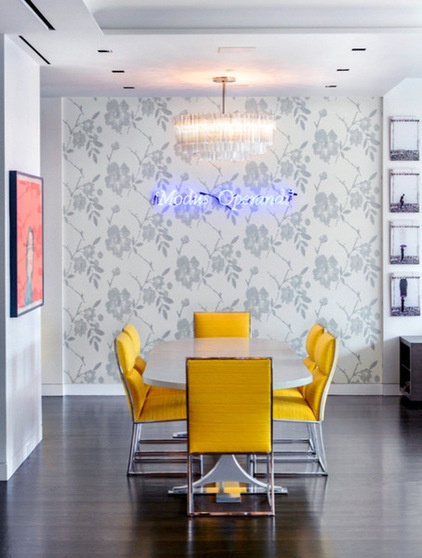
The dining room revolves around a piece of neon art by Joseph Kosuth that reads “Modis Operandi” in somewhat florid script. Those of you who studied Latin in school know this translates as “method of operation.”
Although it might go against conventional decorating wisdom, the elaborate wall covering behind the art highlights, rather than detracts, from it. “It’s a hard glass piece. The wallpaper and its pattern soften it,” Koles says. “The pattern is composed of small glass beads that reflect the neon and add another layer of texture.”
The chairs are vintage Knoll pieces covered in a sunny yellow fabric. “The woman loves yellow,” Raymond says. “She kept circling back to it, so we used it a lot in this home.”
Wallpaper: Donghia
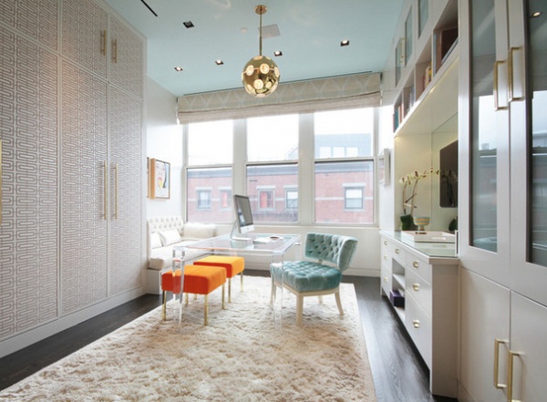
If you say “woman’s dream closet in New York City,” many people will think of the decadent clothes-and-shoes closet Big designed as a love note to Carrie Bradshaw in Sex and the City. This closet would surely give Carrie’s a run for the money — and it would certainly win, because it’s real.
“It’s basically a very large dressing room, and it serves as a dressing space, storage space and office space,” says Raymond. “It’s the kind of old-fashioned room many women dream of, but nowadays we don’t have them.”
Koles chose the vintage light fixtures, saying they remind her of some drop earrings her mother used to wear in the 1950s. A custom acrylic desk and plush chair make up the office area, and a banquette by the window is surely meant for daydreaming.
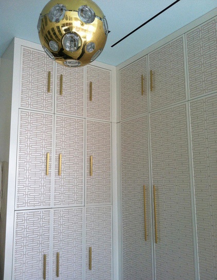
Beaded wallpaper covers the closet cabinets and doors, adding a decorative dimension to the storage space.
Wallpaper: Osborne & Little
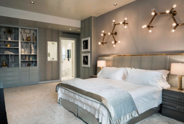
Whether you are visiting New York City or just watching a movie that’s set there, the sounds of the urban environment are almost impossible to escape (it seems as if directors always include a siren blaring in the background to set the urban tone). With its thick carpets, heavy curtains, upholstered walls and quiet palette, this bedroom is a restful escape from the sounds and visual stimulation of the big city. “The padding on the walls absorbs the noise,” Koles says. “It’s a place to go and rest and relax. Nothing is bright or glaring.”
The door opens to one of two bathrooms (one for him, one for her). The bath through this doorway is his, and the interior window to the left of the door was added so the real estate pro could see out the exterior window across the room while showering.
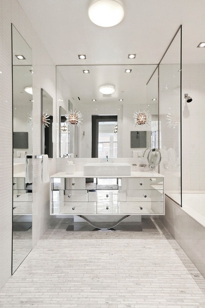
Her bathroom is done in a style that recalls old-fashioned Hollywood glamour, complete with a custom mirrored vanity and Sputnik-style sconces.
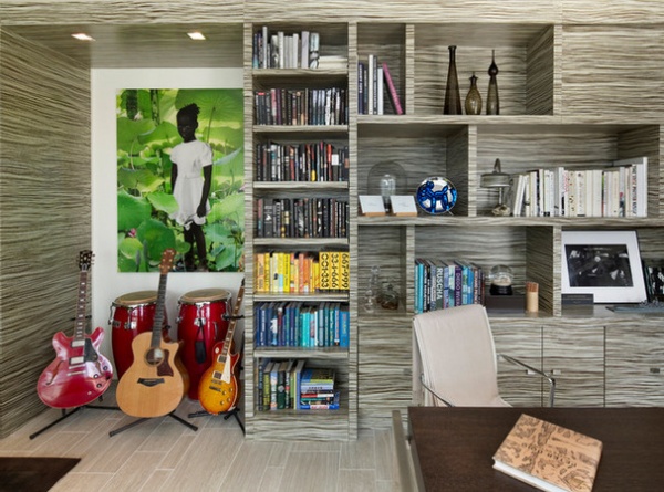
Up the metal and glass stairs, there’s another large, open space. The designers outfitted it as a library, an office and an undercover guest room.
Raymond describes the space as being “mostly for him,” a fact that is reinforced by the number of musical instruments under the leafy painting by Dutch artist Ruud van Empel. “He’s also an incredible musician,” Koles says.
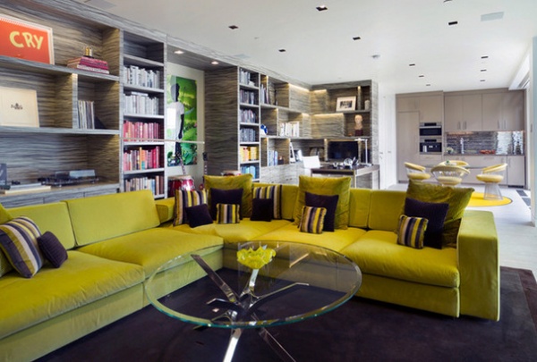
The chartreuse sofa (which opens to become a guest bed) and the strong horizontal pattern in the shelf veneer bring interest to what could have been a rather simple room. “It’s a big space that is just a big, horizontal box,” Raymond says. “The pattern in the veneer is quite busy, but it brings a lot of energy to the room.”
Sofa: Molteni
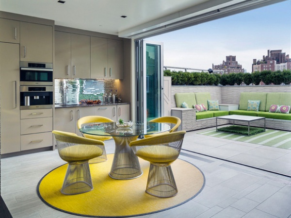
At one end of the long room, a small kitchen opens to a spacious (by New York standards) terrace. Koles says this makes the space a nice suite for guests, and it’s also nice to have a dining area near the grill on the terrace.
Raymond points to tile that runs inside and out. “We were trying to bring the indoors and the outdoors together,” she says.
Not only is the design a melding of art collections and indoors and out — it’s a successful combination of two personalities. “It was a project that united the lives of two people, aesthetically and personally,” Koles says. “We were able to honor them both by making everything work together.”
Browse more homes by style:
Small Homes | Colorful Homes | Eclectic Homes | Modern Homes | Contemporary Homes | Midcentury Homes | Ranch Homes | Traditional Homes | Barn Homes | Townhouses | Apartments | Lofts | Vacation Homes
Related Articles Recommended


