Kitchen of the Week: Renovation Honors New England Farmhouse’s History
http://decor-ideas.org 01/16/2015 23:13 Decor Ideas
“Clients who live in historic houses tend to be really intense and passionate. They love everything that’s wrong and right with their homes,” says designer Heather Alton. “Working with them is challenging but also a lot of fun.” These homeowners absolutely love their 19th-century farmhouse in Hudson, New Hampshire, and embraced most of its quirks. However, the kitchen, which had undergone an unfortunate 1970s renovation, was not functional at all. Here’s how Alton gave them all the modern amenities and the layout they wanted while maintaining the integrity of the historic home.
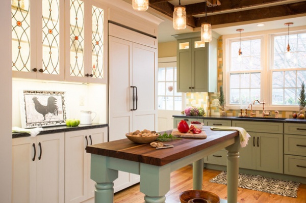
Kitchen at a Glance
Who lives here: A married couple; he’s an attorney, and she’s a teacher
Location: Hudson, New Hampshire
Size: 120 square feet (11 square meters)
One of the most important ways to keep a historic look is to camouflage the appliances. The tall white piece here is a refrigerator with panels that match the cabinetry. Joseph E. Godek of Chippaway Art Glass crafted custom cabinet doors made with stained leaded glass. The pattern is based on a historic one.
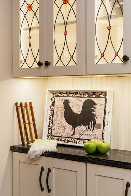
Lighting accentuates whatever the couple chooses to display on the countertop and in the glass-front cabinets.
“In a historic home, you have to be mindful when you acquire things,” says Alton, of New England Design Elements. “But it’s a great chance to display heirlooms, fun finds and nostalgic items.”
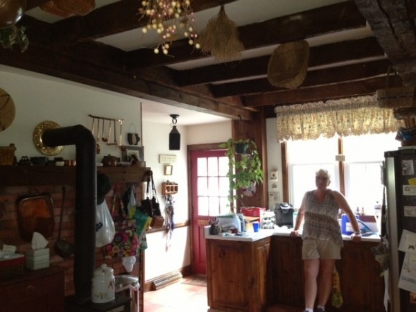
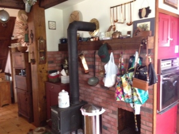
BEFORE (this photo and next): A few of the quirks the couple was happy to let go were a chimney that hogged a lot of space and the awkward placement of the range opposite the home’s entrance. Keys, mail, bags and coats were hung from the mantel, because their was no drop zone. To keep the new kitchen uncluttered, Alton added an entry drop zone where the range used to be.
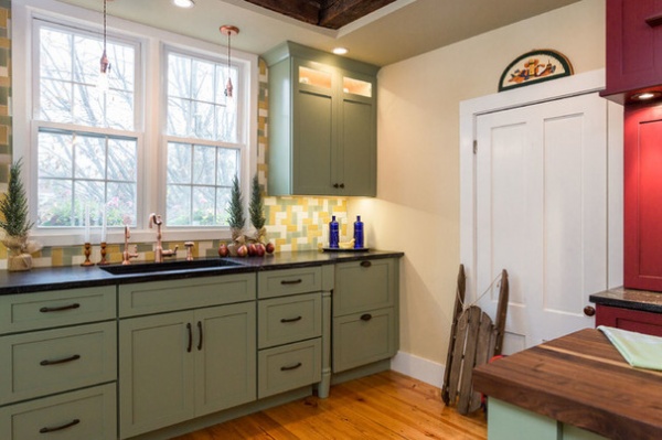
AFTER: Historically, farmhouses did not have matching cabinets throughout a kitchen; they had separate furniture pieces. Using different colors and hardware is a modern-day way to interpret the look.
Alton custom designed the cabinetry. The cabinets along the sink wall have a pleasing symmetry and are painted a custom pistachio green. The dishwasher is hidden by the two drawer fronts on the right; on the left end of this bank of cabinets, the hidden trash cabinet has the same drawer look. Table legs that match the legs on the island give the cabinets a furniture look that’s more in keeping with the home’s age.
All paint by Benjamin Moore: walls: Amulet; trim: Cappuccino Froth; ceiling: Plantation; soffit and wall with storage bench: Wicker Basket
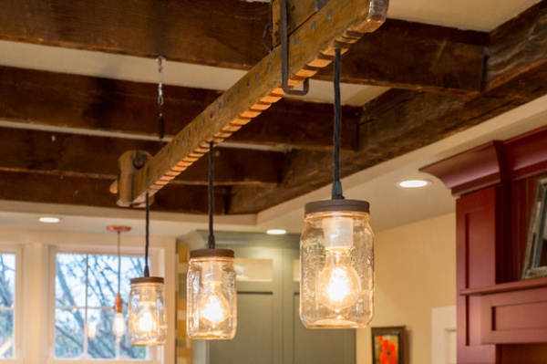
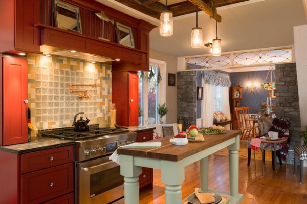
This piece over the island has special meaning to one of the homeowners. It was originally part of his great-grandfather’s workbench, and he wanted to use it in some way in the kitchen.
“He asked me if we could hang it on the wall, and I told him, ‘Oh, we can do better than that!’” Alton says. She designed a custom light fixture that incorporates the beam and three vintage mason jars.
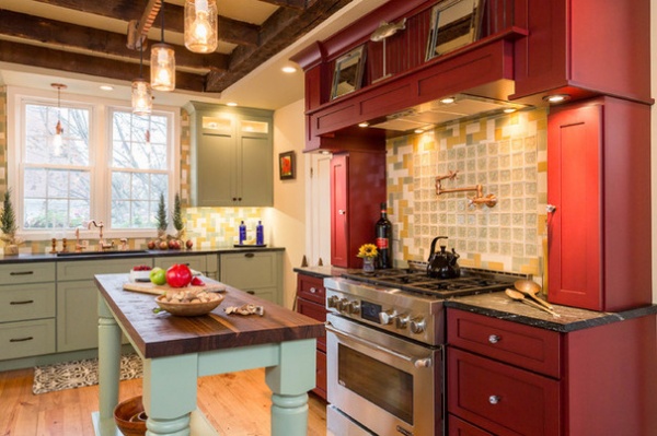
Because of quirky layouts in historic homes, Alton says it can be difficult to work in the kinds of work triangles and zones that can be carefully orchestrated in new homes. Here a small island that serves as a prepping drop zone was key to making the space functional. Its smaller size is in keeping with the farmhouse look. The top is walnut butcher block.
Without a lot of counter space adjacent to the range, the extra workspace was essential. The homeowners can unload items from the refrigerator onto the island that they’ll need while cooking, so that they’ll be within reach of the range. Food can also be chopped right on top of the butcher block.
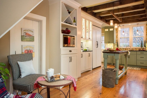
Another challenge presented by the quirkiness was a change in ceiling height from one end of the room to the other. Alton removed some bad faux beams that had been added during the 1970s renovation. Next she had to rearrange some of the original beams so they would make sense with the new layout. The original beams remain and are still structural, but are arranged in a way that makes more sense with the new layout. Soffits surrounding the beams provide space for the new recessed lights and contribute to a more cohesive ceiling composition.
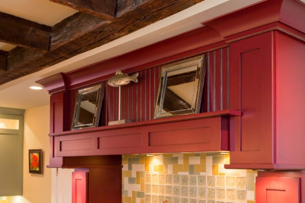
The mantel range surround, in deep barn red, delineates the range area. Tiles made of recycled crushed glass add some sparkle, as do the mirrors and silver fish atop the mantel. “Because of the low ceilings, we couldn’t work in an arch or other designs for the range mantel in here,” Alton says. The mirrors help bounce the light around and make things seem more open. The cabinets on either side of the range are for spices and other cooking essentials that would otherwise clutter up the adjacent counters.
Tile: Trikeenan Tileworks; range: Jenn-Air
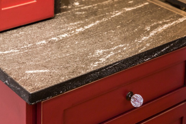
The Via Lactea leathered granite countertops also sparkle, as do the glass knobs on the range cabinetry. Using cabinetry with different paint colors and hardware maintained a bit of charming farmhouse kitchen hodgepodge style in a sophisticated way.
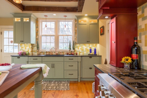
“My clients also wanted to incorporate copper accents,” Alton says. The pendant lights over the sink were fashioned from copper plumbing fixtures, the faucets are copper, and the hardware is a coppery bronze. The handcrafted tile is multicolored and in a herringbone pattern.
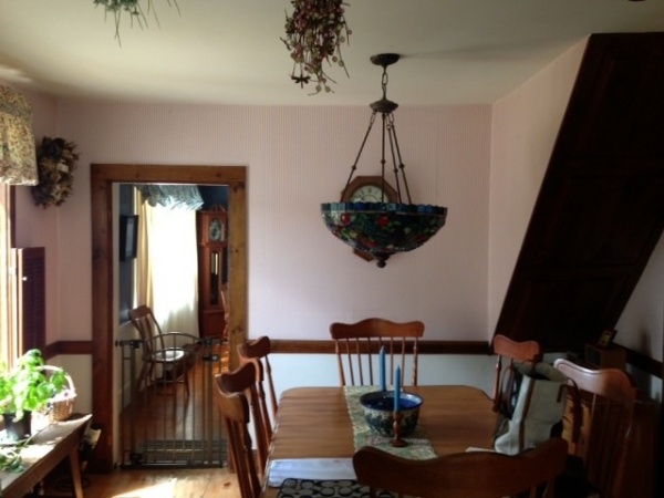
BEFORE: There was just a small opening between the dining room and the kitchen.
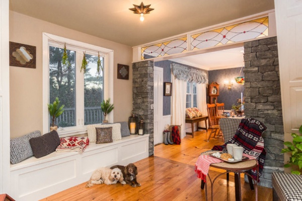
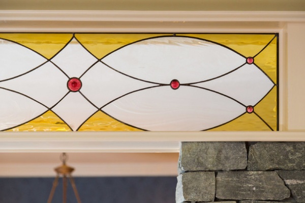
AFTER: Quibbles and Teddy hang out in a transitional area between the kitchen and the dining room that includes a long storage window seat. Now there is a wide opening connecting the two rooms, with stone columns of ashlar-cut stone marking the transition, along with a transom by Godek. The stone resembles the countertop stone, while the transom ties into the glass cabinet doors.
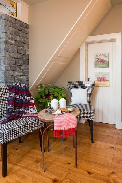
Alton created a little café area between the kitchen and the dining room, where the couple can enjoy a morning coffee or an afternoon tea. The door leads to a walk-in pantry.

Here’s a plan to help you see how everything fits together; some of the wide-angle photos make the cozy kitchen look much larger than it is.
Browse more Kitchens of the Week
Related Articles Recommended


