Room of the Day: Ocean Inspires a Light and Breezy Design
http://decor-ideas.org 01/15/2015 06:13 Decor Ideas
When interior designer Andrew Howard first stepped into this living room, its dark woodwork called to mind a mountain lodge. Nothing is wrong with that, but given that the home is in Florida and mere blocks from the beach, it seemed to be speaking the wrong language. Howard redid every surface to make the home feel like a local.
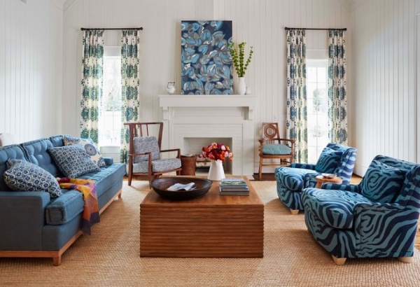
Room at a Glance
Who lives here: A couple and their 4 girls
Location: Ponte Vedra Beach, Florida
Size: 500 square feet (46 square meters)
Tip: To avoid the look of a matched bedroom set, slightly vary the wood finishes on the furniture.
The home’s new owners asked Howard, of Andrew Howard Interior Design, to make the inside reflect the beachy nature of the shingled home’s exterior.
To make the room fit the area, the designer started with the background. He removed the dark moldings and built-ins, leaving behind just one low cabinet (more on that in a moment). He then covered the walls with tongue-and-groove paneling. “You can’t tell it from the photos, but this room has a soaring ceiling,” says the designer. “I thought seeing 18-foot-high planes of drywall was not as interesting as the paneling.”
When you write about interior design, it’s fairly common to hear a designer say, “I started with the rug” or “I started with the sofa.” Howard took an unexpected route, saying: “I started with the curtains.” The designer says that the curtains are usually the largest vertical plane in a room and, to him, it makes sense to use them as a design starting point. “I think they make the biggest statement,” he says. “I treat them like art.” In this case the art is done in a large blue and white pattern, inspiring the rest of the colors in the room.
The coffee table is a custom piece, based on the memory of another ripple-sided table the designer spotted years ago. “I had two sides come all the way to the ground,” he says. “If you have a large coffee table, and all sides are open, you are looking at a cavernous dark spot in the room.”
Curtain fabric: Martyn Lawrence Bullard Design; painting: Stephen Floyd Design
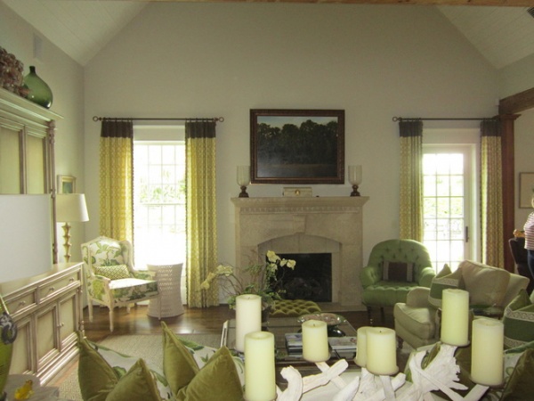
BEFORE: “The interior of the house was very traditional. It wasn’t the kind of thing you’d see at the beach,” he says.
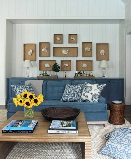
The niche behind the sofa previously had held a dark wood bar and shelves. The designer removed the shelves but left the lower bar cabinets, asking a decorative painter to cover them in washes of blue. The move transformed what he describes as a “beat-up” built-in into a bar with a rich patina.
With the shelves gone, Howard had an opportunity to make a statement with a large piece of art. He filled the space with pieces of cast coral framed by custom shadow boxes. “I had my carpenter make these, but basically it’s a box backed with burlap. It would be an easy look to replicate,” he says.
The custom sofa would be a much tougher DIY. The designer had it made in a large scale with French mattress detailing. “I wanted the family to be able to stretch out on it and feel like they were lying on a twin bed,” he says.
That brings up the larger decorating theme: casual comfort. “This is supposed to be a formal living room, but that’s not how we live down here,” Howard says. “I imagined the family piling in here, hanging out and getting comfortable.”
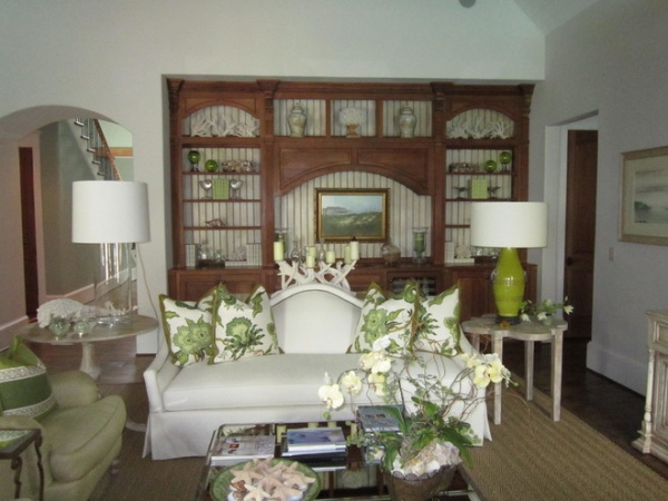
BEFORE: The original sofa sits in front of the niche with its dark wood bar and shelves.
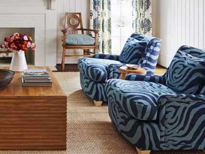
The armchairs are also deep and comfy. Howard says that if they had been done in a traditional fabric, they could have read as staid and uninteresting, but giving them a blue zebra-print fabric covering made them head turners. In the interest of varying the wood finishes (see the tip at the beginning of the story), he had the feet painted a cream color.
The wooden chairs on either side of the fireplace are also noteworthy. They don’t match, and their distinctive lines against the white wall give them a sculptural quality. But don’t think they’re all about looks; the designer says the wooden pieces are also comfy.
That goes right along with the designer’s easy-living mantra. “This really is a barefoot room,” he says. “I wanted it to be a space where you could kick your shoes off, put your feet on the coffee table and read a book.”
Chairs: Baker; chair upholstery: Zanzibar, Martyn Lawrence Bullard Design
Browse more Rooms of the Day
Related Articles Recommended


