Houzz Tour: Space-Saving Tricks Create a Versatile Home
The owners of this penthouse in east London wanted to reinvigorate their home. “They’d lived in the flat for 10 years and loved it, but it was time for a change,” says designer Gurjeet Hunjan. “They needed more storage and, as they do a lot of entertaining, they wanted a more adaptable space to accommodate visiting guests.”
The original property was built in the late 1990s, and the finishes were uninspiring. “We went back to the drawing board,” Hunjan says. “Clever spatial planning was the key to making the most of the limited space, while still injecting the owners’ personality into the decorating scheme.” To create a more versatile living area, Hunjan opened up a guest bedroom that previously backed onto the main living area, but she incorporated a floor-to-ceiling movable wall that allows the sociable couple to close off the space to create an extra room when necessary.
Houzz at a Glance
Who lives here: A professional couple
Location: Docklands, London
Decade built: Late 1990s
Year of renovation: 2014
Size: 2 bedrooms (one of which doubles as additional living space), 1 bathroom
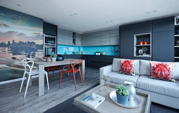
When it came to the decorating scheme, Hunjan, of Boscolo Interior Design, drew inspiration from the couple’s love of reading, as well as their favorite music festival, the Secret Garden Party. “They’re very cultured, but they also love festivals, so we tracked down an official photographer from the Secret Garden Party [Nick Caro] and based the scheme around one of his prints,” Hunjan says. “It’s a wonderful talking point for guests, and we used the colors to create the flat’s sophisticated, grown-up palette.”
“The owners regularly attend the festival, so this photograph is very personal to them,” says Hunjan. “We had it blown up and transformed into a mural, and we’ve introduced colors picked out from it elsewhere in the scheme to enhance the sense of flow.”
Print: Nick Caro Photography
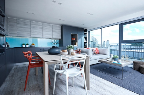
“Open-plan living space was important to the sociable couple,” Hunjan says. Zoned areas, such as the dining area and living room, help define the space without closing it off. “They also wanted a contemporary, timeless finish to the interior, which is why we introduced a few key designer pieces, such as the Philippe Starck dining chairs.”
Chairs: Kartell Masters by Philippe Starck, Heal’s
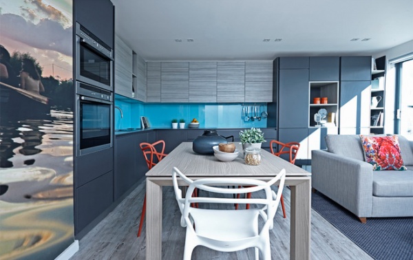
“We took care to seamlessly integrate the kitchen into the rest of the scheme so it doesn’t look too obviously like a kitchen,” Hunjan says. With this in mind, the designer chose a sleek finish with no handles for the cabinetry, while appliances, such as the washing machine and dishwasher, are discreetly hidden behind custom doors.
Innovative, space-saving touches were also introduced. “One of the drawers opens out to create a table, so there’s more worktop space when they need it, and one of the plinths transforms into a stepladder to reach the overhead storage,” says Hunjan.
The glossy turquoise glass on the backsplash is a practical and beautiful alternative to tiles. “It’s easy to wipe down and keep clean, but the light it reflects from the main window creates a lovely feature,” Hunjan says.
Kitchen: Schuller; washing machine: Gorenje; dishwasher: Miele
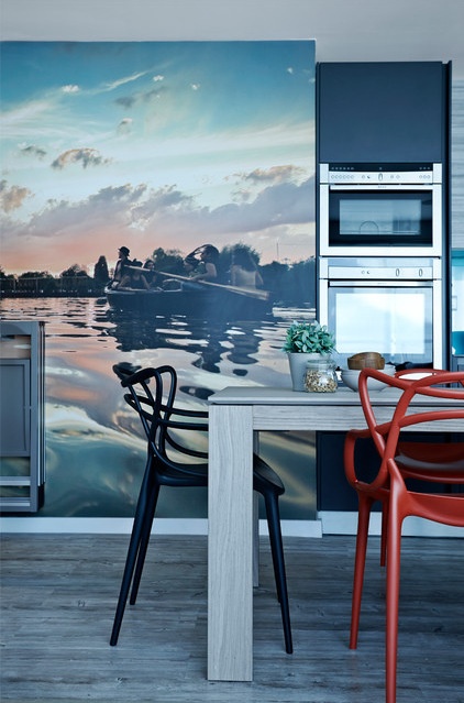
Hunjan worked with a clean, muted palette and a light floor to make the look bright and airy. “The clients wanted to use ethically sourced products wherever possible, so we went for a cork floor with a vinyl finish that’s both beautiful and environmentally friendly,” she says. “Cork has wonderful thermal properties, which helps conserve heat in the flat, so it’s incredibly efficient and cheaper than using concrete or timber.”
Flooring: The Cork Flooring Company; wall painted: White, Earthborn; dining table: Calligaris Omnia
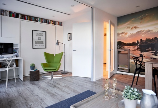
Off the open-plan living area is what was previously the couple’s guest bedroom. “We opened it up to create more space, but a partition door integrated into the door frame can be folded out to create an extra bedroom when they need it,” Hunjan says.
As the homeowners don’t watch TV every day, Hunjan incorporated another space-saving innovation in this part of the flat. “The slit in the ceiling conceals a huge projector screen they can pull down when they want to watch films,” she says.
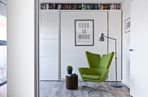
As this part of the flat is sometimes used as a guest bedroom, a pull-down bed has been incorporated into the cabinetry behind the green armchair.
“It’s a very clean, sleek space, but we’ve added interest with some iconic pieces of furniture. The books along the top of the cabinets also inject color into the scheme, plus the shelf provides essential storage for their burgeoning collection,” Hunjan says. “It’s a very versatile flat. Some of the cabinets in the kitchen are also used as concealed bookshelves to keep the scheme uncluttered.”
Wall bed: Clei
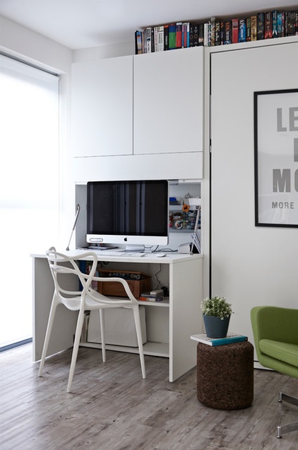
A compact workstation can also be stowed when guests arrive, creating even more space in the modestly sized flat. A cork stool, meanwhile, is a quirky feature that playfully references the cork flooring.
Stool: Moooi Cork by Jasper Morrison, Nest
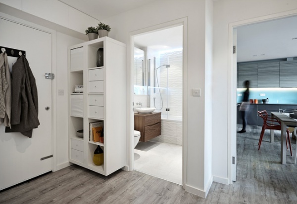
A neat but versatile unit in the hallway stores many miscellaneous items. “Before the renovation, the limited storage in the flat meant it was cluttered, with many of the couple’s possessions on show,” Hunjan says. “The key was to streamline the look while still maintaining its personality.”
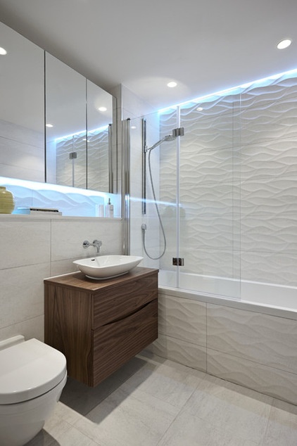
Laminate flooring was stripped out of the bathroom to make way for glossy tiles and integrated storage units. “We completely stripped it out and have kept the look simple, with lots of texture, to maximize the space here,” Hunjan says.
Wall tiles: Ona Natural, Porcelanosa; Glide II vanity and Anabel sink: Bauhaus
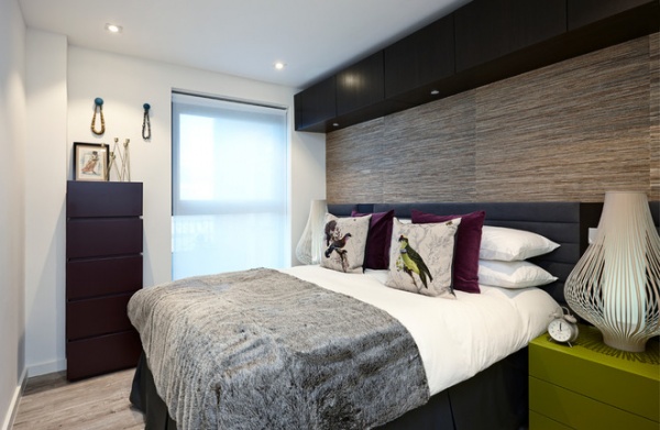
“Grass cloth wallpaper in the bedroom ties in nicely with the natural elements we’ve incorporated into the rest of the scheme, such as the cork flooring,” Hunjan says.
The custom bed and headboard were made by Boscolo Interiors, while glamorous touches were inspired by a visit to the Scarlet Hotel in Cornwall. “The owners loved the use of deep purples and greens when they visited this hotel, so we drew on this when designing the color scheme for their room,” says Hunjan.
Extra storage has been incorporated along the ceiling, with integrated spotlights for a dash of hotel chic.
Natural Oriental Wall Covering: K&K Designs
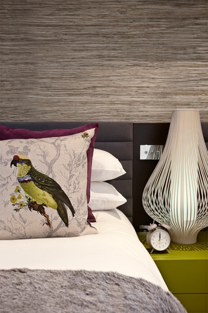
Rich textures and playful colors enhance the sense of luxury in the bedroom. “The grays link the color scheme to the rest of the flat, but we’ve added bolder hues to define this as a private, special space for the couple,” Hunjan says.
Lamp: Harmony Ribboned, John Lewis; bedside table: Abaco, Sangiacomo; Pisticule Cushions: Timorous Beasties
Browse more homes by style:
Small Homes | Colorful Homes | Eclectic Homes | Modern Homes | Contemporary Homes | Midcentury Homes | Ranch Homes | Traditional Homes | Barn Homes | Townhouses | Apartments | Lofts | Vacation Homes


