Room of the Day: A Painting Sets the Tone
http://decor-ideas.org 01/12/2015 22:13 Decor Ideas
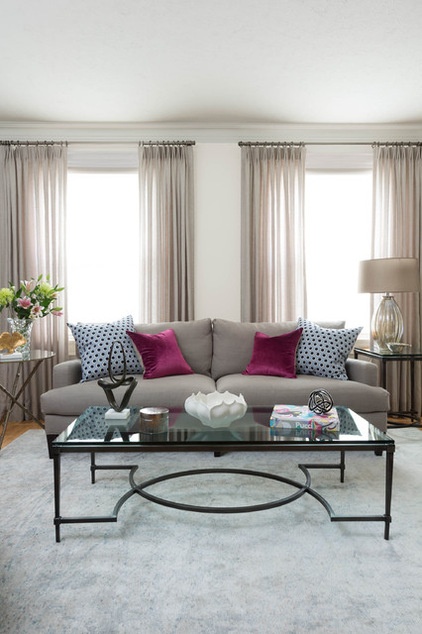
With their grown children out of the house, interior designer Enza Ricco’s clients were ready to update their home, beginning in the living room. “The space was kind of tired; they wanted an update that was refined yet still inviting,” she says. At the same time, it needed to flow with the rest of the home and provide them with comfortable spots for their downtime.
A painting given to the couple for their wedding many years earlier was central to the living room refresh. Inspired by the sandy taupe, blue, champagne and lavender tones in the work that her clients loved, Ricco pulled the room’s color palette from the piece.
Photos by Stephani Buchman Photography
Room at a Glance
What happens here: Reading, listening to music and entertaining
Location: Toronto
Size: 11 by 18 feet; 198 square feet (18 square meters)
Tip: Your favorite piece of art is probably showing you some of your favorite color combinations. Pull them out and you’ve got a color palette for a room that you’ll love.
“My clients wanted to go more contemporary, but the room needed to be in keeping with their home’s overall more transitional style,” says Ricco, of Fig Interiors. As for function, the empty nesters wanted comfortable spots where they could unwind — she wanted a special place for curling up with a book; he wanted one where he could relax with his music. And they both wanted a room that would be welcoming when they were entertaining, which they do often.
“I believe in keeping the investment pieces neutral and adding color, interest, texture and depth via the accessories,” Ricco says. “That way you can change them out as your tastes or even the seasons change with little investment.” The area rug was the first piece to add a large pattern; it has a subtle splatter-painted look.
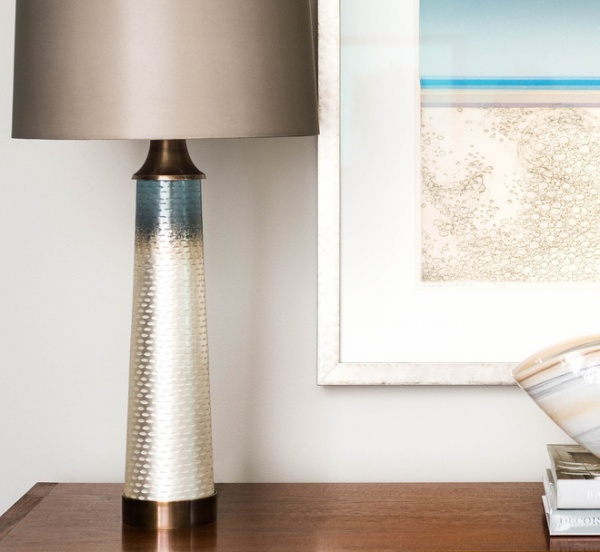
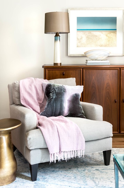
This is the painting that inspired the room’s color palette. The clients particularly love blues, grays and lavender, all seen in the painting. The champagne and sandy tones gave the designer a warm and welcoming base color.
Another inspiration piece was the large cabinet seen here, which Ricco repurposed from the dining room (it was the base of a hutch). “It’s a great place for lamps and can be set up as a bar when they are entertaining,” she says.
Matching lamps anchor each end of the cabinet top; they are an uncanny match to the painting. “When I found these, I knew they would be key pieces to the room. They are showstoppers,” Ricco says. The warm bronze on the base and hardware is part of a wide variety of mixed metals in the room, while the light base stands out against the dark cabinet. The etching even mimics the artwork. The cabinet, lamps and painting serve as the main focal point in the room.
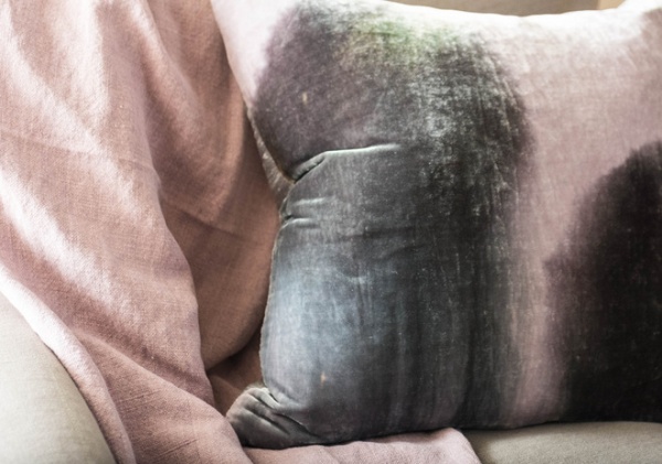
This corner is the wife’s special reading area. Just as the pearl washes into the blue on the lamp above, gray washes into plum and light lavender on the silk velvet throw pillow on her chair.
Wall paint: Revere Pewter, Benjamin Moore; lamps, mushroom table: Arteriors; chair: Lee Industries; rug: Elte
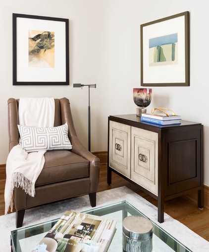
Over in the husband’s corner, a leather chair is adjacent to a new listening cabinet. It has enough room to store all of his electronic music devices and headphones. Ricco’s clients have told her that this is his new favorite spot after dinner; he sits here and enjoys his favorite music.
The listening cabinet’s front panels are a light wash in gray-brown tones that keep the room from being too weighed down by wood. The cabinet has a classic look with updated detailing; the double ring pulls bring in a few curves and another metal finish.
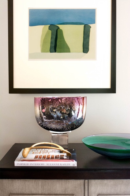
These paintings are two more of the couple’s favorite pieces. The designer had them reframed to give them a more contemporary look. “My clients love to travel the world and explore Toronto looking for artists to collect and follow,” the designer says.
Chair: Mitchell Gold + Bob Williams; lamp: Restoration Hardware; cabinet: Vanguard
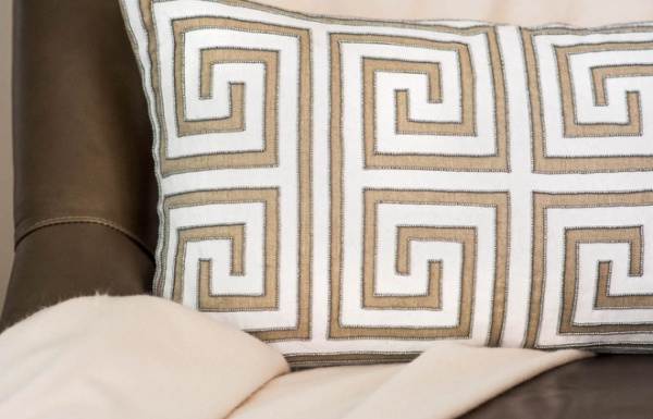
The Greek-key-patterned pillow above combines many of the elements used in the room. It’s a classic print that has a modern, graphic look. The pewter beading detail and champagne color bring in the gray-brown tones used throughout the room.
Ricco loves to shop her clients’ houses when redesigning a room. In addition to the hutch base, she borrowed the bowl from the dining room to add depth of color and energy to the room.
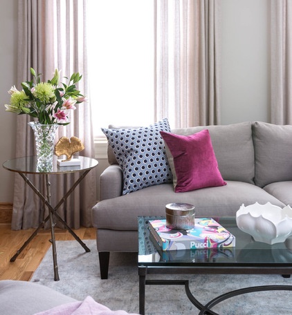
The homeowners love natural fabrics and organic shapes. The sofa and window treatments are made of soft linen, while the twig side table base and white bowls add organic shapes. While there are strong, straight lines throughout the space, Ricco threw in some curves to balance the contemporary with the classic. The coffee table, one of her first picks for the room, mixes straight lines with an oval.
She introduced bolder color via the throw pillows, in raspberry velvet and a navy and blue honeycomb pattern. “The honeycomb pattern is very fresh and brings in a more contemporary touch,” she says. Ricco brought in the crystal vase from another room.
Sofa: Lee Industries; throw pillows: via BooBoo & Lefty; coffee table, side tables: Elte; many small accessories: La Compania; drapes: Threadcount

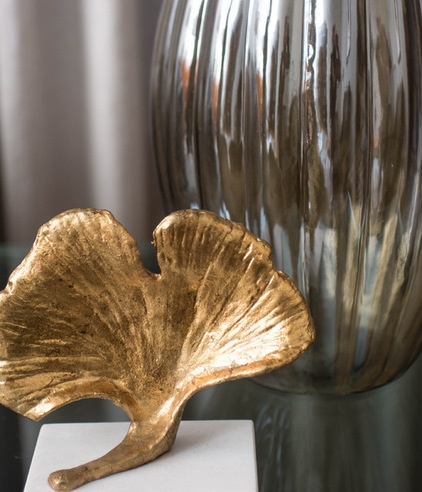
Accessories like a black knot and a Pucci book inject more color and youthful energy.
Throughout the room Ricco let the warmer metals — including champagne, brass, gold and warm pewter tones — dominate in honor of the painting. The mercury glass lamp seen here adds some silvery shine and doesn’t distract from the two lamps on the cabinet.
The living room refresh has set the tone for the rest of the home; Ricco completed a redo of the adjacent dining room at the same time, is currently installing the foyer-hallway and plans to get started on the great room and kitchen in the spring.
Lamp: Arteriors
Browse more Rooms of the Day
Related Articles Recommended


