Design Workshop: The Many Ways to Conceal a Garage
Cars are among the largest physical objects we own, which helps us rationalize the generous square footage we allocate to them on our property and in our homes. Because of their size, they’re not an easy aesthetic problem to solve. Architects and designers have always struggled with how best to orient the mass and large footprint of the garage. Detached, connected, trellised, to the side, to the rear, beneath — every possible location requires compromise.
The evolution of the residential garage mirrors its relative importance in our lives. Garages were once small, detached sheds positioned at the rear of our lots and meant to house carriages, but practical and convenience considerations have shifted them forward, closer to our homes and the street. One could argue that the garage has replaced the front porch: It’s become the new front door, the first thing that greets our guests upon arrival.
How do we balance the need for access and concealment of such large objects while maintaining an aesthetically pleasing public face? The following examples illustrate some clever solutions to concealing the garage in plain sight.
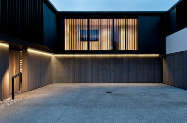
Beneath
This concept works well for urban lots or sloping sites where raising the living areas above the level of entry makes sense. However, raising the living levels means the garage doors will be even more prominent at the street level than they otherwise might be. In this project the designer tackled that problem by concealing them within a singular, unified wall surface of vertical cedar boards. Typically garage doors are recessed in the face of the garage wall, but here they’re set flush, which makes them barely visible when closed.
With the garage occupying the majority of the lower level, the main entry (with access to the upper living areas) needs to be clear. The architect has recessed it in the wall face here, breaking the wall surface and placing it in shadow. This subtle difference quite clearly says, “Enter here.”
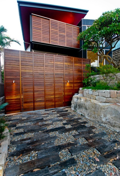
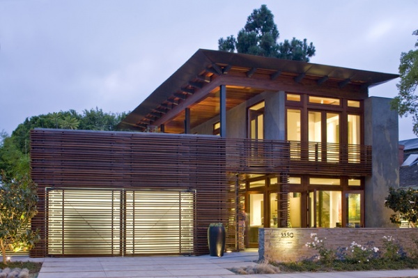
While the scale of this project is smaller, the concept is similar. Concealing the garage door within a larger design gesture — in this case a slatted wood motif — ties it to the materials used on the rest of the home.
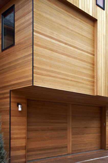
Cladding the doors with the siding material suggests that the opening is more like a wall than a door. The overhang above the garage here places it in shadow and further helps to diminish its presence.
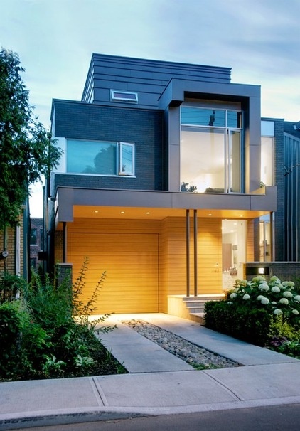
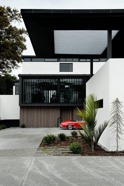
While this garage is clearly part of the entry composition of the house, it isn’t the dominant feature. The elements of the entry are scaled in a way that’s welcoming and comfortable to people rather than cars.
Even the driveway has been subdivided into two “sidewalks.” There’s a clear hierarchy here of what’s important. The thin reveal at the door edge is a reminder that there’s a garage right next to the front door, but the front door is appropriately more important.
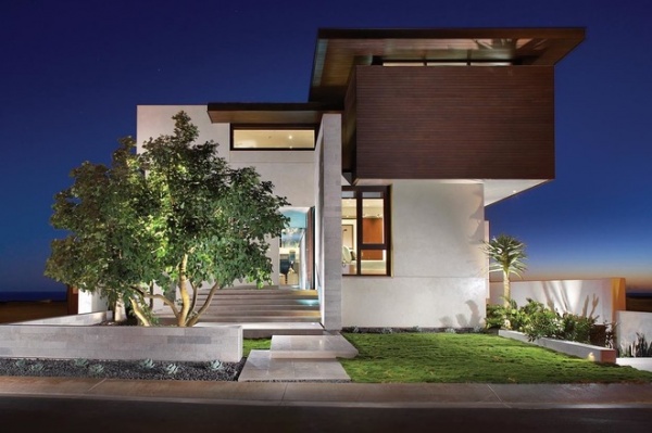
Beneath and Hidden
This garage is a clear representation of the priorities of the homeowners: Their cars are completely removed from the entry sequence. Believe it or not, there’s a four-car garage hidden here (on the right).
A garage designed to accommodate four cars has a large footprint by any measure. The architect here has used it as a foundation of sorts. Placed slightly below grade, it creates a broad plinth, or base, that the building organically grows out of.
The bays of the garage have also been turned 90 degrees to the street entry, further hiding them from view. Special care must be taken to account for turning radiuses and auto size before committing to this kind of arrangement.
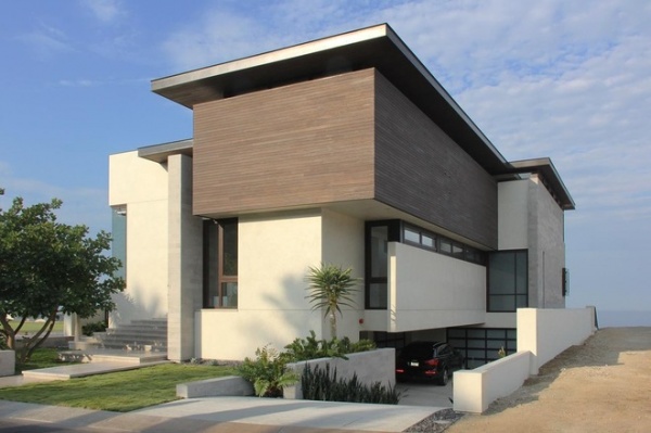
It’s an excellent example of a design that forces the car to defer to the architecture.
Side
The reason the attached garage is one of the most common today is that it is thoroughly convenient. There are two primary features that make this example work so well. The first is the siding material’s matching the adjacent walls — a theme that’s repeated throughout this ideabook.
The second is that the architects have minimized the mass of the garage by choosing a flat roof and using it as a gathering place — turning it into a rooftop deck. Note how your eye is naturally drawn toward the entry, located in the two-story volume, and its glazed facade. The combination of these two elements creates both convenience and clarity at the main entry.
![Modern Exterior by thirdstone inc. [^]](http://www.decor-ideas.org/upload/cases/2015-01-09/photos/middle/Design_W2538420150109031204612010125500.jpg)
Landscape features in this project along with a thoughtful design decision make this two-car garage all but disappear. The trees and low walls are positioned to guide visitors on foot to the front door, making the drive, on the left, feel secondary.
![Modern Floor Plan by thirdstone inc. [^]](http://www.decor-ideas.org/upload/cases/2015-01-09/photos/middle/Design_W2538420150109031204057036296800.jpg)
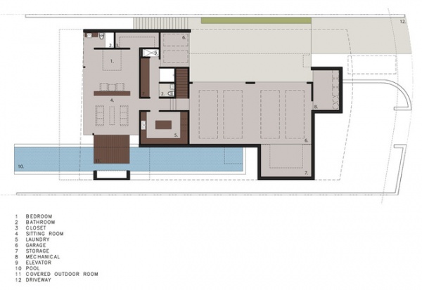
Looking at the floor plan (the street is to the left), we can see that the two-car garage occupies a longer sliver of space near the property line. Stacking cars works especially well if the lot has access from both sides and a drive-through approach like the one employed here. Without it you would need to plan for some added side clearance inside the garage to make backing up a little easier.
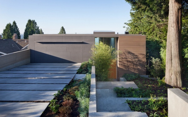
A thin plane of steel marks the entry to the garage on this steeply sloping site. Again, there’s a clear and intentional division of pedestrian and vehicular circulation in this project. The more open and meandering approach to the entry welcomes foot traffic, while the cars are kept completely separate. When closed, the doors become part of the solid wall volume rather than being a celebrated grouping of doors.
Rotated
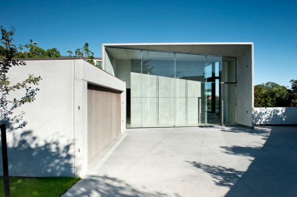
Turning the garage doors away from the street is an obvious way to minimize their presence at the main entrance. It does, however, increase the amount of driveway required, and that impact, with respect to the entry, should be considered.
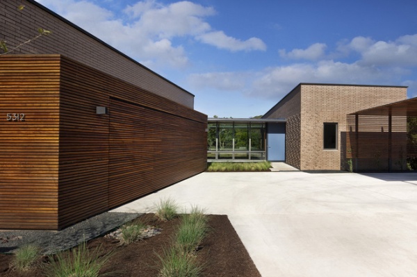
Adding siding to garage doors to achieve this flush look is a custom job but certainly is within the capabilities of any professional contractor you’d hire to complete the work. Rotating the garage at an oblique angle can make entering it from the street more convenient but backing out more difficult.
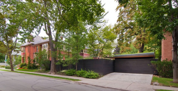
Concealed and Integrated
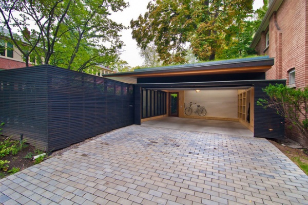
It’s hard to tell where the fence ends and the garage begins in this project. Larger design moves are the key to making this concept so successful. The fence is a wholly appropriate device for separating public and private areas. Matching the height of the fence with the required height of the garage seamlessly integrates the two elements.
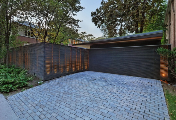
The fence wall transitions to become the large overhead door of the garage. Because the roof plane of the garage overlaps the private pool area (to the left), it creates an ambiguity as to where the garage ends and the pool begins.
Other Strategies
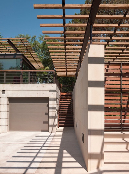
Overhead elements. There are other means of reducing the impact of the garage on the entry too. Overhead elements can draw attention and focus it elsewhere. Trellises are used to great effect here, suggesting the path to the stairs and entrance.
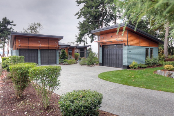
Separated. Recalling the classic carriage house model, the detached garage can be a good option to pursue if there’s room. Here there’s a distinct arrival zone beyond which the car is left behind.
There are two interesting concepts to consider here. One is a zoning concept that clearly divides cars and people. In the right climate (and without the need for a covered connection), this solution can offer a lot of diversity and in-between spaces on a property.
The other concept at work is one of scale. The guesthouse to the right borrows the scale of the garage-door opening. Embracing the large scale of openings rather than rejecting or concealing it is an option.
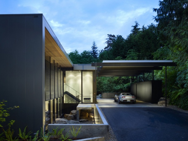
Carport. The garage was born out of a need to protect the open-topped early autos from the weather. But they’ve evolved into oversize storage closets and work areas rather than a place just to house our cars. If we can accommodate convenient storage elsewhere in our homes and return to the notion of simple protection for our cars, the carport is an attractive solution, especially from an architectural standpoint. It has a minimal visual impact while still offering convenient protection from the elements and a covered means to get inside. With a little forethought, it can also address some storage needs, as seen here.
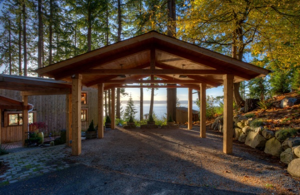
The carport is an extremely versatile element when it’s not housing cars. It can be a picnic shelter, a covered outdoor work area, a place to sit or a play area.
Each one of the projects illustrated here proves that our cars can continue to serve our needs without the need to abdicate our front porches.
More:
Key Measurements for the Perfect Garage
7-Day Plan: Get a Spotless, Beautifully Organized Garage


