Small-Space Ideas Unfold in Origami-Like Cube Loft
In 1984 architect Charles Moore — educator, author and one of the leading practitioners of postmodern design — joined the architecture department at the University of Texas at Austin. There he started a design practice with architect Arthur Andersson, and the business partners built a sprawling compound with two houses and two studios, where they worked and lived until Moore’s death in 1993.
After Moore died, a foundation was established to preserve the compound as well as its extensive collections and libraries. One of the compound’s structures, a 9- by 9-foot room, provided the Charles Moore Foundation with an opportunity. Andersson had built it as a painting studio when he lived on the compound. When the foundation took over the compound, visitors occasionally slept overnight there. Kevin Keim, the foundation’s founding director, wanted to make the room more comfortable for those visitors — to attract more people to the compound and to generate income for the foundation. Keim started to think about how the room could be transformed into an abode for architects, designers, artists, researchers and others during their visits to Austin.
He and recent architecture school graduate Adam Word Gates worked together to redesign the space. By the time the renovation wrapped up last year, Keim and Gates had transformed 130 square feet (including an adjacent bathroom) into 220 square feet of serene space. The remodeled studio — known as the Cube Loft — is packed with creative ideas for making the most of every inch in a small space.
To get more space, Keim first thought he would create a bumped-out bay extension. But the loft was built right up to the municipal setback, and the neighborhood would not modify the original boundaries. The cube couldn’t exceed the 9- by 9-foot footprint.
Keim decided that if they couldn’t push the space out, they would push it up, into an unfinished attic. He and Gates removed the 9-foot ceiling and opened the space up to the ridge beam in the attic, about 16 feet above the floor.
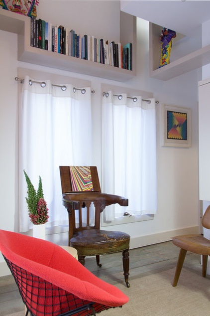
Downstairs a Bertoia Diamond chair, a Victorian reading chair and an Eames chair form a circle in the living area. The reading chair’s back swivels around to the front and creates a shelf that can hold a book.
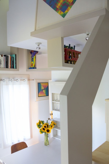
The fold-down Murphy table is from the original living area. When chairs are pushed back and the table is pulled down, glassware storage is revealed and visitors have a place to dine, work and gather.
Keim and Gates kept the design and material palettes simple. “Since we thought of this as a monastic cell, we wanted it very white inside to make the space feel bigger,” Keim says. The cabinets are birch plywood, and the desk and table were made from solid-core doors. The shelves and staircase are birch plywood. The bedroom floor is painted pine.
Budget drove the material palette, but so did Moore’s lesson that good design is not dependent on a budget-shattering palette of materials. “It’s really about the ideas,” Keim says.
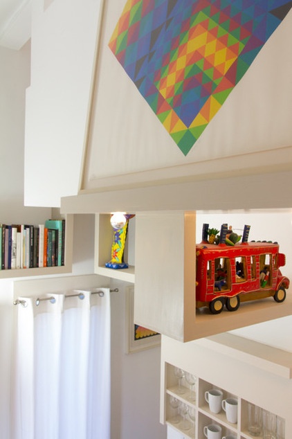
Most of the space has a clean, simple appearance, but Keim included colorful accessories to remind visitors of some of Moore’s bolder choices, particularly his vibrant and over-the-top main house on the property. Local collectors Margie Shackelford and her late husband, Alexander Caragonne, shared pieces from their extensive Mexican folk art collection with the foundation that are prominently displayed on shelves that wrap around the room. The pieces are contrasted by Keim’s equally colorful collection of geometric prints by Bauhaus designer Herbert Bayer. “We wanted just the right amount of color floating in this white container,” Keim says. The print shown here is called “Triangulation With Hidden Square.”
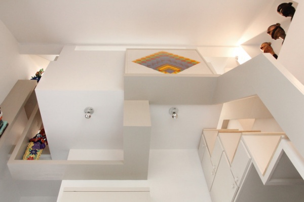
The new upstairs sleeping loft projects into the cube’s living area, as seen here from below. A built-in desk area sits to the left, and a built-in TV cabinet and staircase are to the right. A slim window above the bed overlooks the living area.
The desk area splits and forms two wood ribbons that wrap around the loft’s perimeter. “The ribbon is this pure thing that travels around the room,” Keim says. As it moves up and down, it creates ledges and shelves before reuniting on the cube’s other side as the staircase’s railings. “Like a Möbius strip,” says Keim.
The ribbon shelves needed to be structurally reinforced to handle all of these features while still appearing slim and elegant. The designers used standard 9-inch steel angled brackets, the kind normally used for wall shelves, but put them on their sides. One flat side is bolted to the wall’s studs and blocking, and the other flat side projects into a cavity within the shelves. The reinforced shelves now appear to lightly float down the walls and across the apartment.
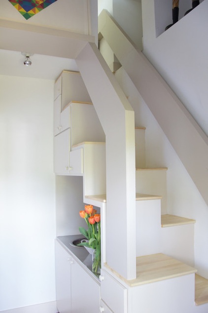
A ladder and a trapdoor had provided access to the attic before Keim and Gates added the loft, but they envisioned a more substantial transition between the two floors. They built a divided tread staircase to comfortably move people up and down in the cube. This type of space-saving staircase is also seen in Moore’s own residence on the compound, and even earlier in one of the groundbreaking condominium units he designed for Sea Ranch, on the Northern California coast, in the 1960s.
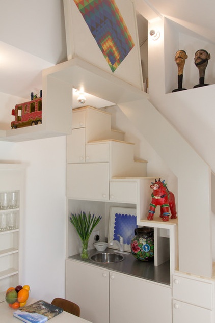
Keim and Gates turned the stair’s underside into a series of storage cabinets and expanded the kitchen amenities from the existing loft to include a freezer, microwave and sink.
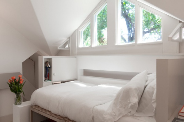
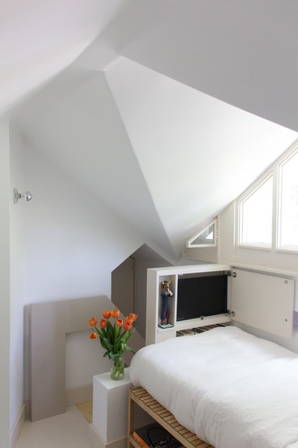
Without exceeding the height of the ridge beam, Keim and Gates built a cross gable that replicated one from the other side of the compound and added about 77 square feet of usable space. Keim made a new window wall by hand that extends the loft’s length; it overlooks the property and surrounding tree canopy. Tiny screened corner windows open up to bring in fresh air and the sounds of birds and squirrels, and close with magnetic clasps.
A built-in cupboard frames the foot of the bed and doubles as a staircase guardrail. A cabinet door conceals a small television, and a narrow shelf houses a ceramic devil figure, one of the many Mexican folk art pieces displayed in the loft. Behind the TV is the staircase that leads to the loft’s lower area.
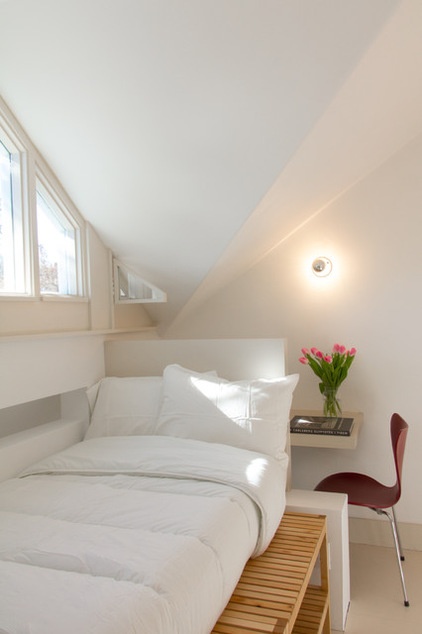
The bed runs the along the new gable and cantilevers out into the living space below. It’s shown here as a twin bed, but it can be expanded to create a double bed by pulling out the benches and changing the mattress. The bed’s headboard frames and supports a built-in desk that forms the railing for that loft’s corner and also braces the headboard.
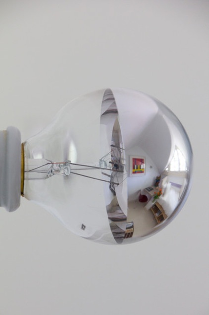
Simple Broadway-style lightbulbs are used throughout the cube; these were common features in Moore’s projects. They are affordable and attractive, and the painted metal tip refracts light to cast a soft glow.
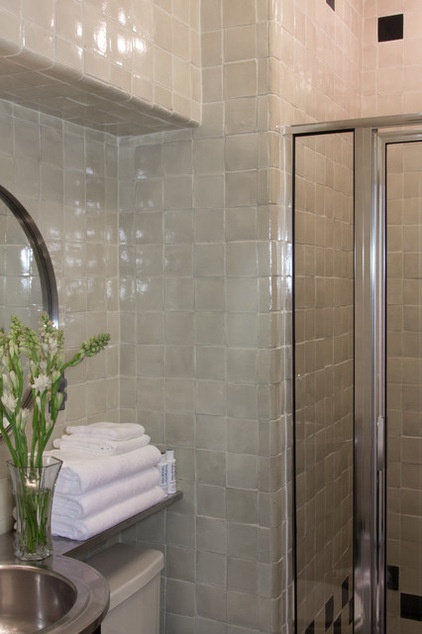
Keim and Gates didn’t touch the existing 49-square-foot tiled bathroom and shower, under the loft.
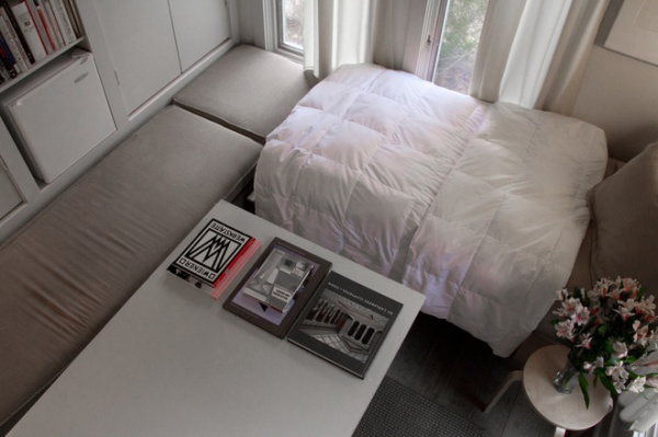
BEFORE: Eighty-one square feet isn’t a lot of space, but the existing cube didn’t utilize it as efficiently as it could have. A bed was pushed into a corner and surrounded by daybeds that were a little too wide for seats and too narrow to sleep on. A coffee table pushed up against the daybeds made it impossible to move around the room. A wall of built-in storage included space for one mini fridge.
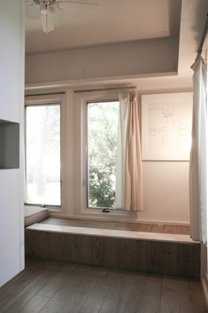
BEFORE: Arthur Andersson built this 9- by 9-foot studio adjacent to his residence at the compound. “It was basically a little painting studio and guest bathroom,” says Keim. It was in its original condition when the foundation was established in 1997.
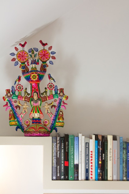
Visitors are invited to stay in the Cube Loft for a night, week or month. “It’s really meant to be of use to people,” says Keim, and though the foundation invites architects, designers, artists, curators and scholars to stay there, it is by no means exclusive to people in those fields. The room rate is $160 per night, with proceeds supporting the foundation.
Keim lives on another part of the property, but sometimes he tucks into the Cube Loft for a few hours if no one is staying there. “It’s just so quiet,” he says. “When I need to write, I’ll just take my laptop up there and zone out.”
Learn more about visiting the Charles Moore Foundation
More: 28 Great Homes Smaller Than 1,000 Square Feet


