Savvy Style and Easy Flow in a Contemporary Kitchen
When Paul Brivati was asked to design the kitchen for this London terraced house, he soon became involved in rethinking the entire ground floor. “There are four bedrooms upstairs, but downstairs was not that great,” he says. “It was cramped and didn’t flow well. We wanted to give the owners and their two children more of an open family home by extending out to create a kitchen and dining room that lead into the garden.”
Brivati cast his design eye over the garden and into the hallway too, where he and his team recommended moving a wall and installing sleek storage to help the entrance flow into the house. This attention to the overall space made the finished kitchen not simply a beautiful room sitting at the back of the house, but one that is fully integrated into a connected, flowing and family-friendly ground floor.
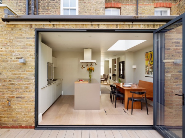
Kitchen at a Glance
Who lives here: A family of 4
Location: East Sheen, London
Size: About 18 by 11 feet (5½ by 3½ meters)
A contemporary addition at the back of the house is home to the kitchen. “It’s a small space but not tiny,” says Brivati, of Kitchen Architecture. “From the end of the island to the doors measures 1,100 millimeters. We could have made the island bigger and had less than a 900-millimeter gap between the two, but there was no need. The room is big enough for a really generous island, with ample floor space too.”
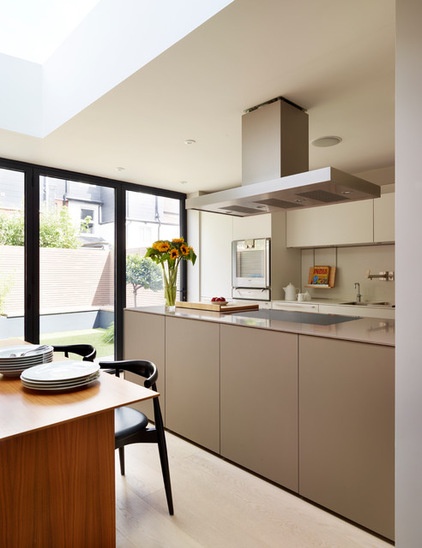
The kitchen has a softly Scandinavian feel. “We specified the whitewashed oak flooring and then fitted an island in a clay color and wall units in a pale, chalky shade,” Brivati says.
Island: Clay laminate; cabinets: Kaolin laminate (both, bulthaup b3 series, Kitchen Architecture); flooring: oak, AH Peck Flooring Contractors
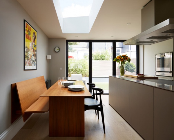
A walnut table and bench give the dining area a neat structure. “Using a bench allows you to push the table in closer to the wall, to create more flowing space,” Brivati says. “You can comfortably sit six people at the table and still walk past it.”
Table and bench: walnut, bulthaup, Kitchen Architecture; chairs: CH20 Elbow by Hans J. Wegner, via Aram
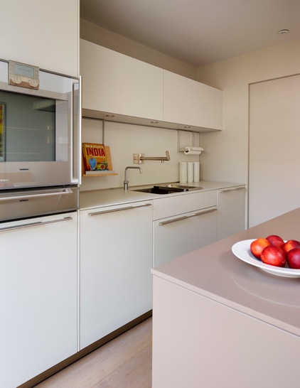
The ceiling height in the kitchen is 2,400 millimeters (almost 8 feet); Brivati designed the cupboards to extend to a height of only 2,180 millimeters (about 7 feet). “In a small room like this, if you plan right up to the ceiling, it brings the whole space in and makes it feel smaller,” he explains. “Leaving some wall visible above the units makes the room feel a little bit wider.”
Measurements to consider when planning your kitchen
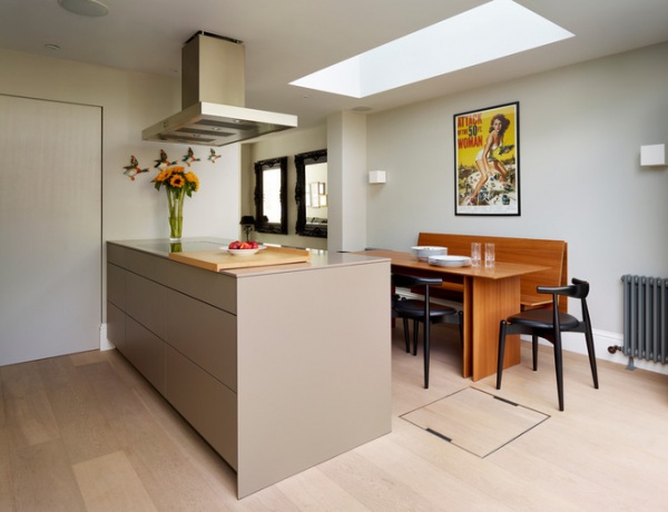
The side of the island that faces the oven contains drawers for pans, utensils and other kitchen implements. “It’s the working side of the kitchen and allows you to face the table while you cook, so it’s sociable,” Brivati says. “The island worktop is made from Silestone and is 10 millimeters thick. “The chopping board has a lip on it that’s also 10 millimeters thick,” he says. “You can push the board against the worktop and it fits snugly, so it’s easy to use, but you can also still open the drawers.”
Worktop: Unsui, Silestone; chopping board: bulthaup, Kitchen Architecture
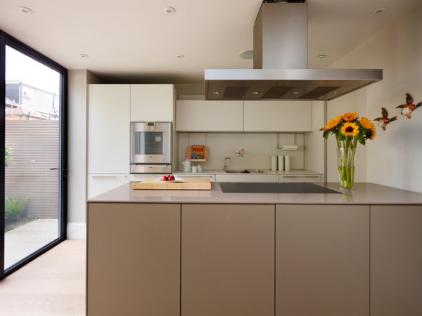
The island is the chief workspace in the kitchen, but it also provides lots of storage. On the dining side, sleek handleless cupboards hold glassware and china. Rather than a chunky gas range, a state-of-the-art induction cooktop has been fitted flush into the counter. “You can slide the chopping board over it and work there. It means the hob [cooktop] becomes part of one big workspace,” Brivati says.
Cooktop, oven: Gaggenau; extractor fan: bulthaup, Kitchen Architecture
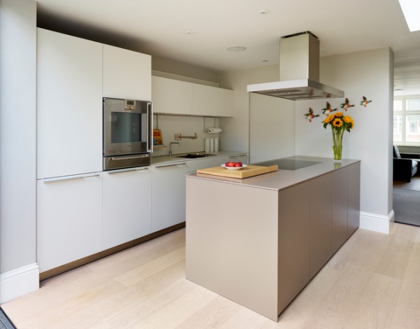
To keep the wall of units looking neat and unobtrusive, Brivati used the same chalky-toned laminate that the units are made of for the backsplash and countertop. A door between the island and units slides across to reveal a utility room, with washing machine, pantry storage and small appliances, including a kettle and toaster.
Sink fixtures: bulthaup, Kitchen Architecture
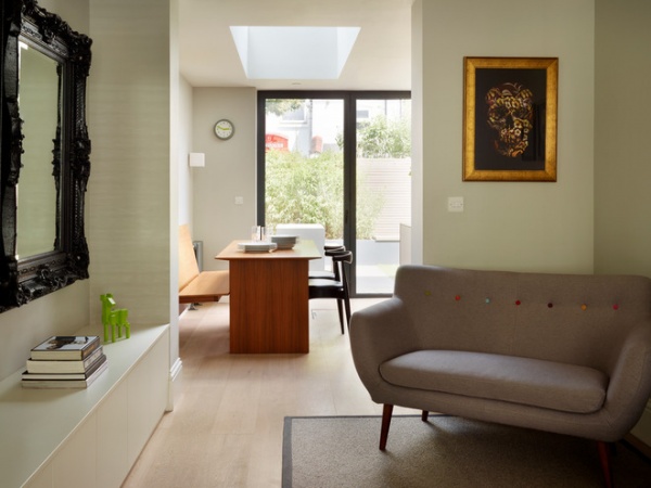
With the kitchen and dining space in the addition, the rest of the ground floor could be devoted to reception space. Wide openings ensure that this whole area flows and feels connected, and oak flooring throughout provides cohesion.
More:
Kitchen Workbook: 6 Elements of a Contemporary Kitchen
How to Design a Kitchen Island


