Houzz Tour: Urban Remodel Looks to Sweden for Bright Ideas
http://decor-ideas.org 01/07/2015 08:13 Decor Ideas
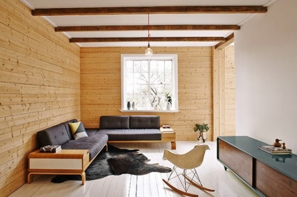
An industrial designer with years of experience in antique restoration and reproduction, Frag Woodall has a keen eye for aesthetic detail. So when he and wife Naomi bought a threadbare 1930s brick house three years ago, it wasn’t long before Woodall set about transforming it into a soothing, relaxed home reminiscent of a Swedish summer house that makes the most of the light and views over the leafy Centennial Park in Sydney, Australia.
Houzz at a Glance
Who lives here: Industrial designer Frag Woodall and his wife, Naomi
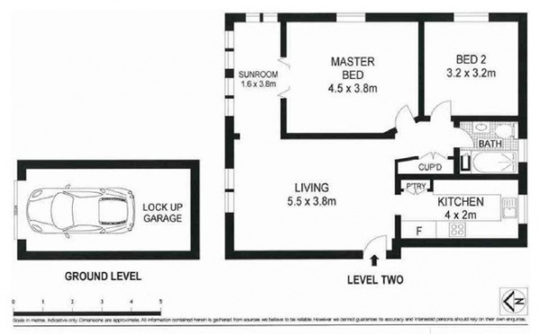
Size: 860 square feet (80 square meters); 2 bedrooms, 1 bathroom
Location: Kensington, Sydney, Australia
That’s interesting: Swedish stationery and giftware chain kikki.K used the apartment as the filming location for its latest TV ad. About 25 actors, directors, lighting and camera crew members crammed into the space for the two-day shoot. See the ad here.
Woodall’s first impressions of the 1930s brick apartment building he would come to call home were not overwhelmingly positive. “It’s somewhat unappealing from the outside and dark and cavernous walking up the stairs,” says Woodall, of Mr. Fräg. “It didn’t give much away on first appearance, that’s for sure.”
On opening the front door, however, he could immediately see the unrenovated apartment’s potential. One key feature stood out: the circular layout — no hallways or dead spaces. “No matter where you stand, you have an aspect to other rooms; you never feel as though you’re walking into a dead end or trapped,” Woodall says.
The apartment also overlooks Centennial Park and has plenty of natural light flooding in. “My intention was to buy what I couldn’t change — the light and the aspect,” he says.
Swedish summer houses are typically calm and relaxed, with plenty of natural light. A limited color and material palette helped Woodall create a similar look and feel here. Not chopping and changing colors and materials too much between rooms also means the apartment feels much bigger than its 860 square feet. “You’re not getting a new story every few steps,” Woodall says. “The furnishings are simple and pared back and not screaming for attention. That creates a calmness, and you’re letting the light do a lot of the work.”
Credenza: Mr. Fräg; rocking chair: Eames
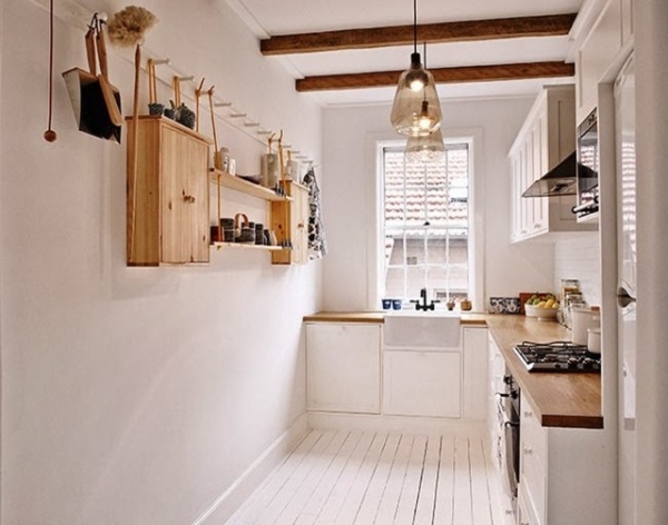
Woodall removed the apartment’s linoleum and carpets, and painted the floorboards underneath white. He also painted the walls and ceilings white, but added warmth with recycled tallowwood beams that had come off an old country bridge. The beams were oiled before installation. Woodall says he also wanted the beams to give a sense of rhythm and continuity to the home, while still allowing each space to have its own voice and distinctiveness.
“There is such a thing as a too-open plan. Everything gets lost, and you’re asking the furniture to hang everything together. Sometimes that’s a big ask,” he says. In the kitchen, big old slabs of French oak make up the countertops.
Lighting: Sokol
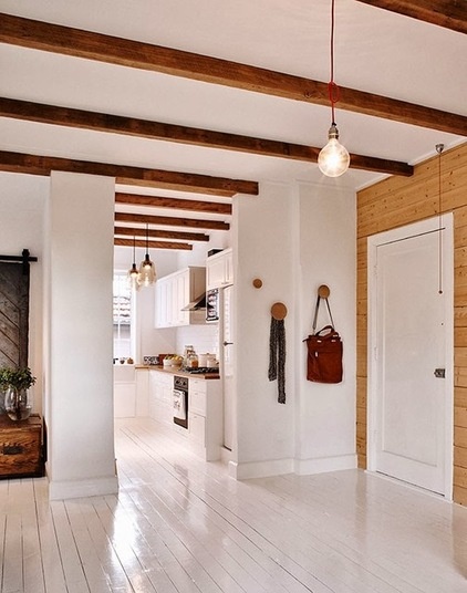
While the beams create a warm aesthetic, Woodall warmed the interiors further with Baltic pine paneling on the walls. “That warmth and texture coming in through those details meant I could go completely white on the walls and floor,” he says. “Otherwise it would look lost and empty and ungrounded, and it would lack a bit of soul.”
Although some people balk at painting floorboards white, Woodall says they look “just as gorgeous” three years on. “I used Berger paving paint — it’s absolutely bulletproof,” he says. “We have a no-shoe policy, so that helps, but we haven’t been precious with the floor by any stretch of the imagination. It’s tough as nails and holds its brightness.”
Coat hooks: The Dots, Muuto
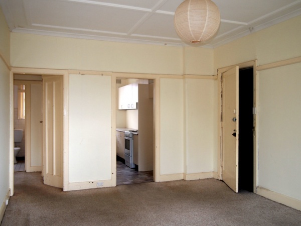
BEFORE: The apartment’s entryway before the renovation. What a difference!
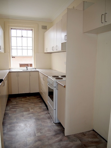
BEFORE: The ’80s-style apartment had been a “long, long-term rental,” Woodall says, before he and his wife moved in.
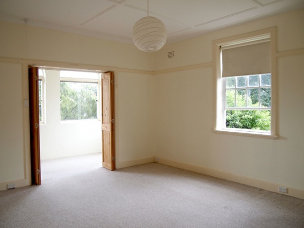
BEFORE: The main bedroom and sunroom were nothing to shout about before the renovation but had plenty of natural light and leafy views.
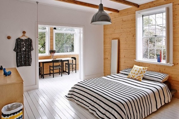
AFTER: The renovated main bedroom is fresh and inviting. Woodall opted for a true white paint with no tint on the walls, ceiling and floors. Although flat paint is usually used only on the ceiling, he also used it on the walls. (Matte paint is 3 percent gloss; flat paint contains no gloss at all and is not recommended for walls because it marks easily.)
Woodall loves the effect. “The walls look like they go off to infinity, because you’re not getting any reflection back. There’s a silky, silky softness to them,” he says.
And if the walls do get marked? “You just wipe off the marks or throw some more paint on. It’s so forgiving; it’s pretty carefree,” he says.
The industrial vintage pendant seen here came out of the original Sebel furniture factory when the company was still making toys.
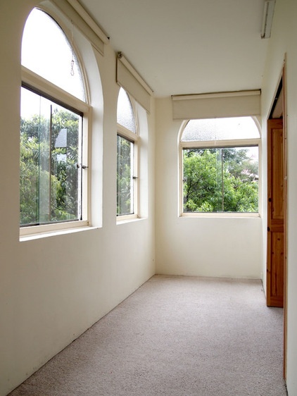
BEFORE: The carpeted sunroom reminded Woodall of a concrete box before its transformation.
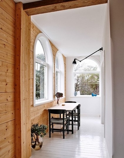
AFTER: The light and airy sunroom now serves as a dining area. Woodall designed and made the table to suit the narrow space.
The arched windows were there, but prior to the renovation had mottled glass up top that you couldn’t see through. And the windows couldn’t be opened. Woodall reglazed the windows and machined curved architraves around the windows and sills.
Postrenovation, he and Naomi love living here. “We just enjoy it so much. The space is beautiful,” Woodall says. “It looks so great when the sun is beaming in in the morning, but also looks incredible when it’s pouring down with rain outside and we light the candles. It can look wonderful and cozy but also fresh and bright.”
Woodall and Naomi have both spent time in Scandinavia and experienced the ability of Swedish summer houses to capture light in the summer and also make a very hygge atmosphere during the long winter.
“‘Hygge’ is a Danish word that has a number of meanings,” Woodall says. “It can mean ‘cozy,’ as in the warm glow of candlelight, and also spending time with friends and family. It is this atmosphere that we have wanted to capture with the Kensington renovation.”
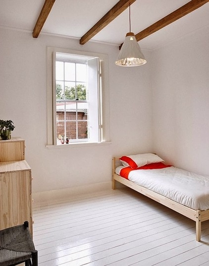
In the second bedroom, Parisian-style shutters that wouldn’t look out of place in a 19th-century manor add character. Woodall added edging detail with this in mind, putting to use the knowledge he gained during the years he spent restoring and reproducing antique furniture.
The pendant light also is a Mr. Fräg creation. Woodall painted an old light and made the timber fitting from which it hangs.
Bed: Tarva, Ikea
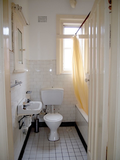
BEFORE: The bathroom was perhaps the least inviting room of the house before Woodall set to work on it.
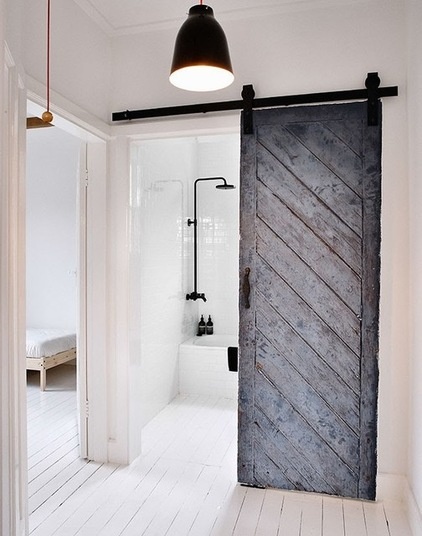
AFTER: An old barn door from the South of France is an unexpected focal point, its soft patina and character needing no enhancement. The handle is from Italy, and the hardware at the top is from the U.S.
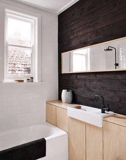
Although Woodall also used Baltic pine paneling in the bathroom, he dyed it black. He designed the vanity and used the same subway tiles as for the kitchen backsplash. There’s further harmony with the sink — it has a shape that’s similar to that of the Belfast sink in the kitchen.
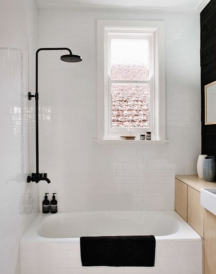
The bathroom hardware is black, but Woodall made some effort to end up with designs he liked.
“I couldn’t find really nice [hardware] that wasn’t screaming contemporary,” he says. He custom made the hardware and showerhead by stripping back chrome components, joining them together and powder coating them black.
Browse more homes by style:
Small Homes | Colorful Homes | Eclectic Homes | Modern Homes | Contemporary Homes | Midcentury Homes | Ranch Homes | Traditional Homes | Barn Homes | Townhouses | Apartments | Lofts | Vacation Homes
Related Articles Recommended


