Houzz Call: Show Us Your Best Kitchen Innovation
http://decor-ideas.org 01/06/2015 22:13 Decor Ideas
You could make a case for this statement: Where there is work to be done, there you will find innovation. Few (if any) other rooms work harder than the kitchen. We want to see your innovative solutions that have made kitchens better, smarter and more productive. Please upload your smart projects in the Comments below, and we will pick a few hardworking kitchens to profile in an in-depth way.
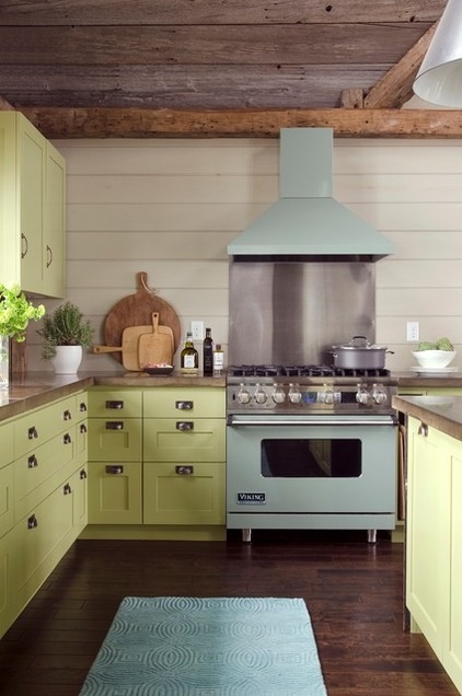
We are looking for kitchen perfection: A great material mix, genius ideas and a high-functioning layout. Some examples: Interior designer Kristina Crestin was asked to make a kitchen that would work whether two or 20 people were cooking. She answered the challenge by crafting a space that has separate zones that keep cooks (or would-be cooks) from colliding.
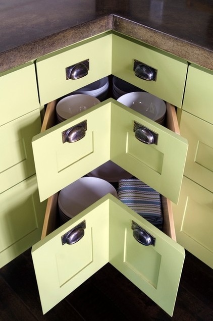
Dealing with kitchen corners is always a tricky business. Crestin solved the age-old problem with corner drawers made with angled fronts.
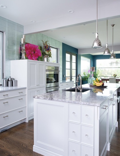
Those are the kinds of ideas we are seeking. Another example is found in this project by Kitchen Studio: Kansas City. The homeowners wanted a space that was composed of glamorous elements (mirrored tile and a demicabinet for art display) and outfitted with practical features.
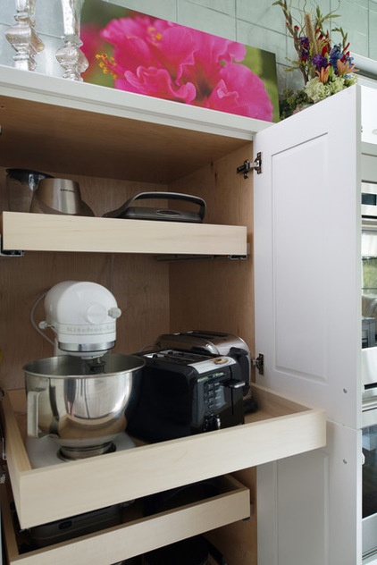
The demicabinet is used to display art and fresh flowers on top, but open the doors and you’ll find pullout shelves and electric outlets, so the homeowners can access their appliances without bending and lifting, and in some cases without having to take them out and set them on the counter.
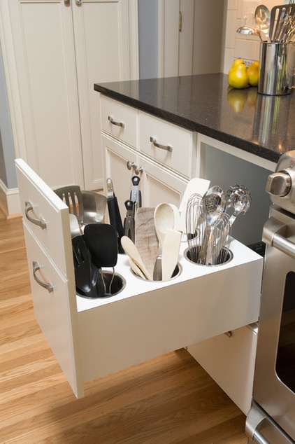
Who wouldn’t love to have implements stored in a pullout like this one, in a design by Kirstin Havnaer, Hearthstone Interior Design? They are stored upright (no rummaging) and within arm’s reach of the cooktop.
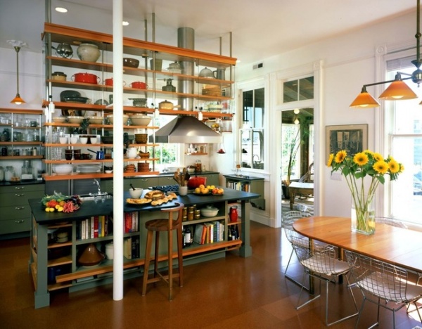
Design problems often lead to solutions that thrill both our style-seeking eyes and our sensible hearts. Check out the personal kitchen of architect Geoffrey Gainer of Actual-Size Architecture. Gainer wanted to make his modern kitchen work with his Victorian house. He did it by making a see-through “wall” of shelves that separates, yet marries, the modern and traditional spaces. He also created a storage powerhouse.
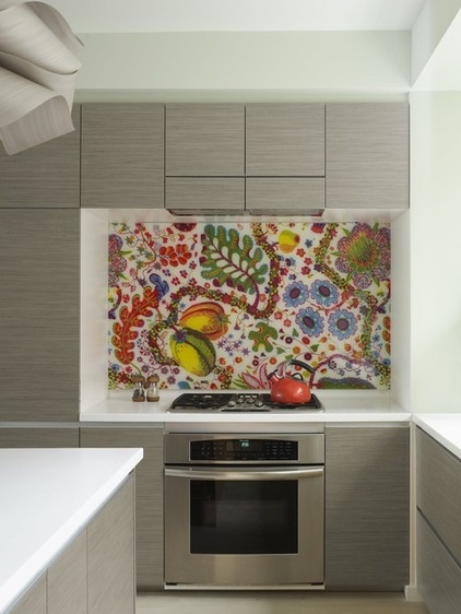
When a homeowner wanted a seamless backsplash that also had a bold pattern, Incorporated came up with the idea of covering fabric with glass.
Now it’s your turn. Upload those photos, floor plans and ideas below.
Related Articles Recommended


