Room of the Day: Grown-Up Style in a Family Dining Room
After living in their updated colonial home in Andover, Massachusetts, for a few months, Sean and Audrey Bergan were excited to make over the dining room. The busy couple, who share their home with their two children (daughter Sydney, age 13, and son Cooper, 11), had some key pieces but needed guidance on how to execute their vision.
They turned to designer Linda Holt to help them build on what they had. Together they developed a new color palette, added some key accessories and found a way to save one of the couple’s favorite pieces of furniture. “They really wanted the dining room to look grown-up, but they also wanted the kids to be able to use it,” says Holt. “This is a transitional, well-edited space. They don’t like a lot of clutter and wanted the space to feel fresh and airy.”
Photos by Linda Holt
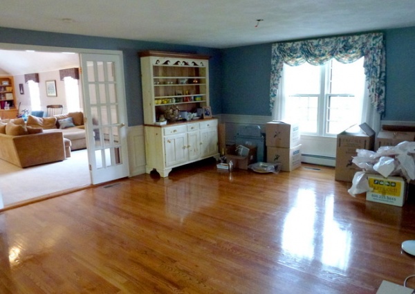
BEFORE: When the Bergans first moved into their home, it had lots of pink walls and floral accents. When they decided to change the color scheme, they chose what they thought was a gray paint color for the dining room walls. But after the paint went on the walls, they realized the color was bluer than they wanted. “The color made the space feel cold, and it didn’t express their personality at all,” says Holt, of Linda Holt Interiors.
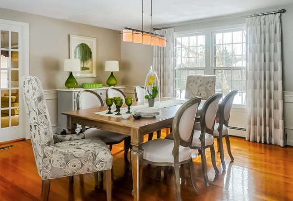
AFTER: The 22- by 15-square-foot dining room’s new cream and taupe color palette was inspired by the fabrics chosen for the dining room chairs. (Sean and Audrey found the chairs and table themselves.) Holt had the tall end chairs with maplewood legs covered in a treated easy-care taupe and cream indoor-outdoor fabric with white swirls. The shorter bleached solid oak dining chairs have a treated solid off-white fabric for contrast.
Taupe paint connects the walls to the fabrics, and the ceiling was kept white. Green accents add a dose of color and freshness, and tie the dining room to the adjacent family room with green floral window treatments.
The custom window treatments are made of a semisheer cream-colored fabric with a lining to protect furniture from the sun. The fabric’s taupey metallic dots create a subtle pattern. “The window treatments help warm the room,” says Holt. “They specifically didn’t want a rug in the dining room, so they needed something on the window that was warm and friendly.”
A long and lean modern-style chandelier above the dining table illuminates the space.
Avery Table: Ethan Allen; chairs: Arhaus; wall paint: Stone Hearth, Benjamin Moore; ceiling paint: existing white; chandelier: Hubbardton Forge; window treatment fabric: Kravet
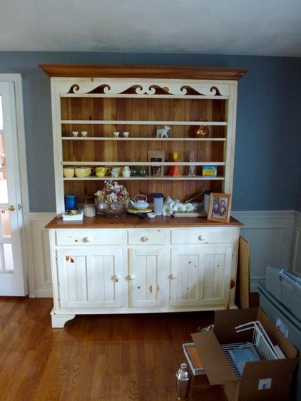
BEFORE: This traditional-style pine sideboard with a hutch was one of the first pieces of furniture the couple had purchased as newlyweds. It had sentimental value to them, and they wanted to work it into their dining room’s new design. The only problem was that the sideboard and hutch felt too country and didn’t fit with the more transitional style they wanted.
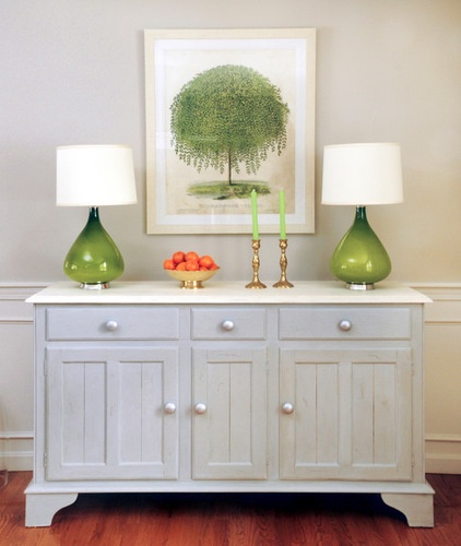
AFTER: Holt came up with a solution to transform the piece. After removing the top hutch, she had artist and decorative painter Susan Siefer use a custom blend of chalk paint from Annie Sloan Interiors (a combination of Paris Grey and Old White) to bring new life to the sideboard. For about $500 for labor and materials, Sean and Audrey were able to save the piece and have an attractive place for storing linens and special holiday plates and accessories. “We were so happy Linda gave us the idea to paint it,” says Audrey. “It really modernized it, and we love it. When people come over, they can’t believe it’s the same piece.”
A silver metallic paint gave the existing knobs sparkle. The countertop was painted with the Old White color for contrast.
Lamps: Jonathan Adler; botanical print: Circle Furniture
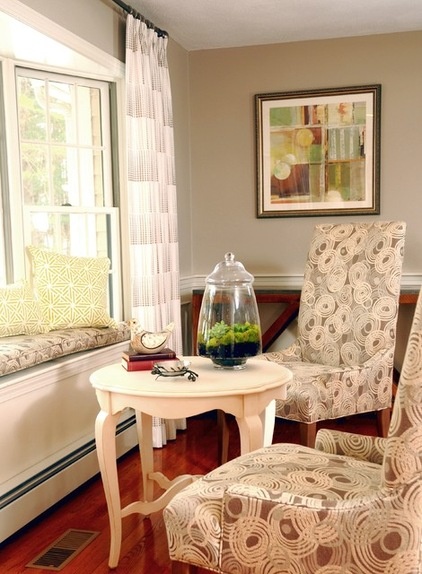
The room is now divided into two main zones: the eating zone with the dining table and chairs, and this conversation zone with a small table located by a window seat. The window seat’s cushion was covered with the same durable fabric used for the end chairs at the dining table. This sunny spot looks out into the home’s backyard.
“I always wanted a reading nook in our home,” says Audrey. “Before, the window seat had no cushion. Now it feels cozy and warm. The dining room for us is not necessarily every day, but more than just special occasions. It’s the space you use to walk through to the great room, but it’s also a family-time space, a place for us to come together and relax, or even read a good book.”
Table: birch wood, Ethan Allen; print: Art.com
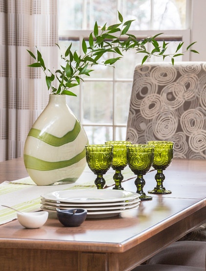
This dining room combines a number of high and low elements. While the custom window treatments were a splurge, the green and white striped vase is from HomeGoods and cost less then $50. Now Sean and Audrey have the beautiful, user-friendly space they wanted.
“We were able to create a soothing, functional and family-friendly dining room,” Holt says.
More:
Key Measurements for Planning the Perfect Dining Room
Single Design Moves That Make the Whole Dining Room


