A New Drop Zone Keeps the Clutter at Bay
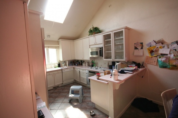
While touring a midcentury kitchen, we discovered that one of the biggest needs of the renovation was helping the homeowners keep the room decluttered. There was no place for the family to set things down as they entered their house from the garage. Mail, bags, phones, keys, coats and dog leashes all wound up on the countertop and the table.
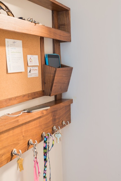
Carving a small mudroom area out of an existing laundry room was part of the overall renovation, and some built-ins were included for coats, hats and bags, as well as the small but hardworking custom piece seen below. Architect Stephen Reilly of SLR Architecture custom designed a wall-mounted drop zone with room for mail, keys, sunglasses, leashes, messages and a phone- and tablet-charging station. The fact that more than 1,000 Houzzers added a photo of the command center to their ideabooks right after the kitchen story ran let us know that you would like a closer look at this clever piece.

BEFORE: This counter and the kitchen table served as the drop zone. The new station is now on the wall beyond the right edge of this photo, in a vestibule between the kitchen and the door that leads to the garage.
“We needed an easy way to help the family stay organized as soon as they walked in the door,” Reilly says. “I thought if we made it part of the flow through the space, they would be more likely to use it.”
See the full kitchen renovation

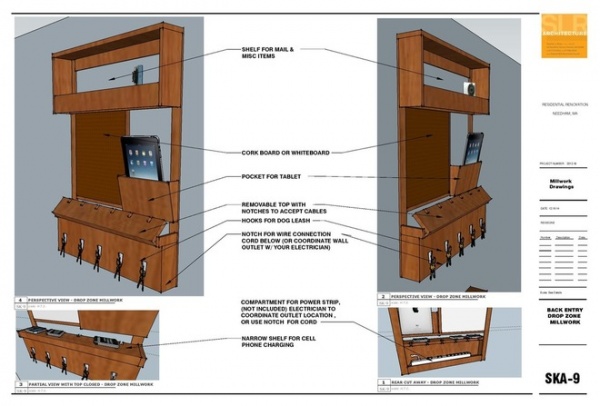
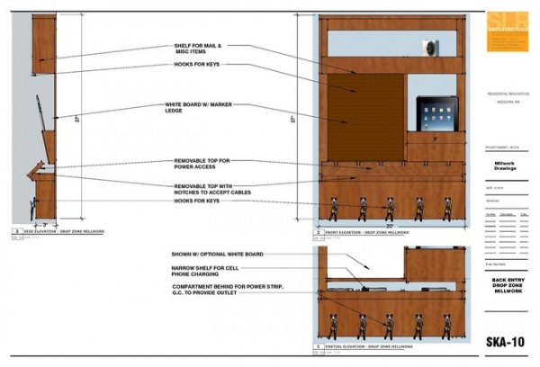
AFTER: From top to bottom, the small command station has a shelf for mail and sunglasses, a message center, a charging station for tablets and phones, and hooks for keys. The following drawings show how it all came together in detail.
The drop zone is also tied to the overall renovation in its material. The renovation included new walnut floors, and the piece is crafted from leftover flooring.

There are a few small differences between the drawings and the final product that the team made on the fly when assembling it. But the renderings serve as a great guide if you are thinking of doing something similar.
The proliferation of phones and tablets that need charging has become one of the biggest challenges to keeping countertops clear. The drop zone Reilly created has a removable, notched shelf for phones that allows the homeowners to tuck wires out of the way while their phones charge. There’s also a tablet-size pocket with cord access beneath it. The cords get plugged into a power strip that is hidden just beneath the phone shelf. The general contractor had a power outlet installed behind the command center to avoid an unsightly wire.

Along the bottom, hooks provide a spot for hanging keys and dog leashes. A bulletin board provides a prominent place to leave messages, pin invitations and business cards, and keep track of appointments. “The drop zone is right there when they walk in the door and inspires organization,” Reilly says. “It really helps them keep their new kitchen neat.”
Thanks to popular demand, Reilly and his carpenter have started making drop zones to order.
Take the full kitchen and family room tour


