From Awkward Corner to Multipurpose Lounge
http://decor-ideas.org 01/02/2015 04:14 Decor Ideas
“It was sitting on a stand in this empty corner like the elephant in the room,” interior designer Harmony Weihs says of a Seattle homeowner’s beautiful string bass. “I wanted to make this corner more useful for my clients and treat the bass like the piece of art it is.” Her clients, a music teacher and a Microsoft employee, had recently bought a house with a large great room. Now this is one busy multipurpose corner. It houses her books and bass and his extensive LP collection; provides a spot for enjoying a cup of coffee, some tunes and a book; and can transition into an intimate dining space for two.
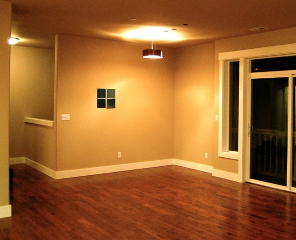
“The question in a big room like this is, how do you break up the space?” says Weihs, of Design Harmony. “Every area should have a purpose.” This corner was empty; even the large bass didn’t begin to fill it, and it just looked lost.
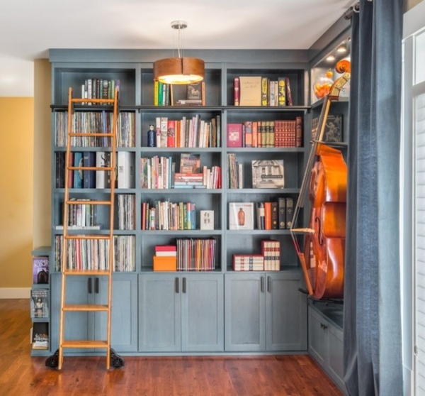
“After” photos by Holland Photography
AFTER: “Their collections are a huge part of who they are. They don’t watch much TV or throw dinner parties, so I designed the space around the way they like to live,” the designer says. One of the homeowners will never embrace reading on a Kindle, as she loves the feel of books in her hands. The other needed an easily accessible space in which to organize his records. Weihs designed the built-ins accordingly, creating a multifunctional zone. Floor-to-ceiling built-ins display the book collection.
Tip: “Anytime you have exposed storage, it can feel really busy; it’s a good idea to break it up by creating closed storage on about a third of it,” Weihs says.
She also recommends analyzing a collection before designing the shelving. These clients knew how they were going to use the shelves, so Weihs opted for fixed shelves over adjustable. “Adjustable is more versatile, but the holes make it less attractive,” she says. “If you know exactly what you want, fixed shelves have a cleaner look.”
In this case she added 1 inch to the standard bookshelf height and made them each 13 inches high. The depth of the bookshelves is 15 inches; on the bass wall, the shelves are 8 inches. Note the thickness of the shelves themselves, which is 1½ inches. This makes the collection easier on the eyes, accentuating the structure of the built-ins.
Rolling library ladder: Van Dyke’s Restorers
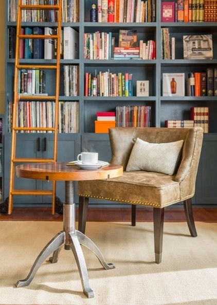
In addition to housing their collections, the homeowners also wanted to inhabit the space, using it primarily to sit and enjoy their books and music with a cup of coffee, and as a dining area on special occasions. They had a vision of a table that could transform from coffee table height and size to a dining table for two.
Working with their dream, Weihs collaborated with local furniture maker Gabe Strand of Strand Woodworks to create this amazing piece. The metal base twists up from about 18 inches high to 30 inches high, standard dining table height. Most of the time, it is set up like this.
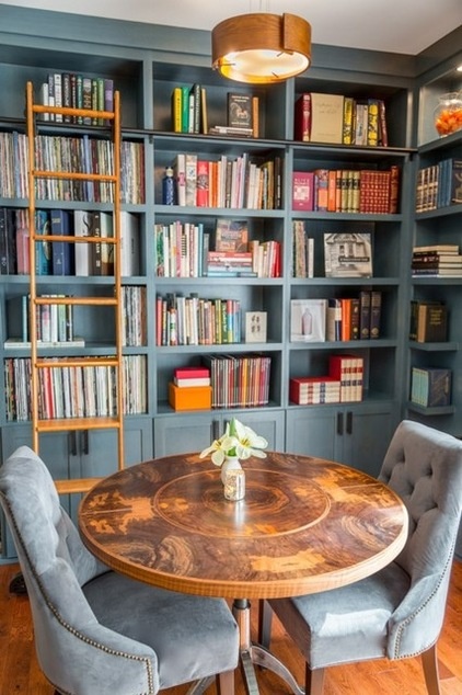
Because the owners eat mostly in the kitchen and don’t really host dinner parties, they don’t need a dining table very often. However, when they want to share a meal in their new cozy corner, they twist the table up to 30 inches high and add two C-shaped leaves that hook together around the table.
The striking wood wrapping the table is walnut brindle veneer. Strand book-matched the veneer to mirror the grain in a beautiful design on the tabletop. The homeowners already had the comfortable tufted dining chairs, which they can leave placed in the corner or move about the room.
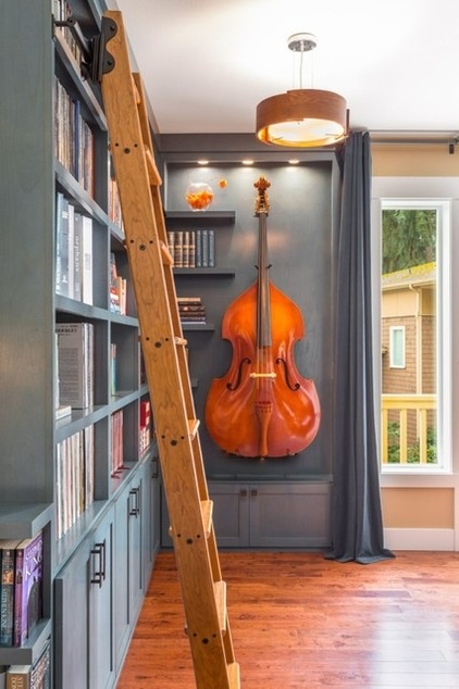
“I wanted to give the bass a special place and treat it like art,” Weihs says. She designed the built-ins on this wall to house it, with a few floating shelves balancing out the negative space. She also installed three 4-inch puck lights to accentuate its prominent placement.
Her clients brought the light fixture with them from their previous apartment and bought the velvet drapery panels at West Elm. Their color is a lucky exact match to the stain on the shelves.
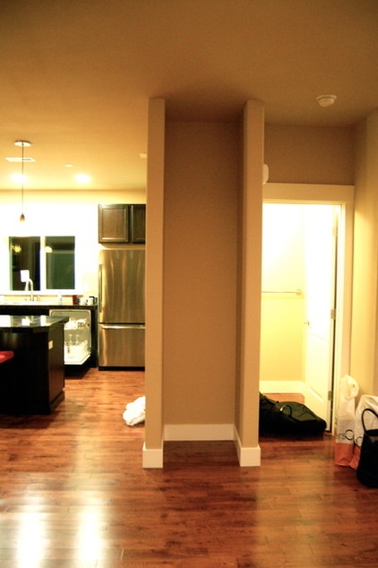
BEFORE: “A lot of these homes are built with these awkward niches, and people don’t know what to do with them,” Weihs says. This one is in between the kitchen and the hallway that leads into the great room.
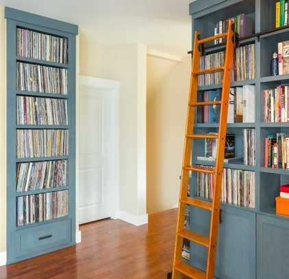
AFTER: In this case it was just the right size to create a built-in for the albums. Using the same shelving style, stain and oil-rubbed-bronze hardware connected it to the book and bass shelves across the hallway. “My clients wanted to be able to see the wood grain of the built-ins, so we had them stained instead of painting them,” she says.
“This project was about creating a zone with a purpose,” Weihs says. A corner that once sucked the energy out of the room is now hard at work, full of her clients’ favorite things.
More:
Get Ideas for a Cozy Library Space
What to Know About Adding a Library Ladder
Related Articles Recommended


