A Designer Edits — and Adds — for Dramatic Effect
“There is nothing simple about simplicity. … Simplicity is complexity,” writes interior designer Nancy Braithwaite in her new book, Simplicity. For Braithwaite design is all about the difficult task of skillful editing with a well-trained eye. She works with a range of styles and a wide variety of clients, and her philosophy guides her whether she is showcasing her collection of American antiques in her Atlanta farmhouse-style home or displaying a modern-day artisan’s work in her minimalist contemporary beach house. She has mixed artworks by Basquiat and Bleckner in a classic 1895 New York City townhome as deftly as she has layered rustic wicker and burlap in a mountain house in North Carolina.
I love that this gorgeous book kept surprising me. Right when I thought I had Braithwaite defined — say, as a disciplined “new traditionalist” who keeps to quiet tone-on-tone palettes or strong charcoal gray and cream contrasts — I’d turn the page and find a stunning art deco–inspired living room. I’d turn the page again and there would be a porch full of vintage rockers and wicker, or playful frog sculptures that seemed to hop up a minimalist bathroom’s wall.
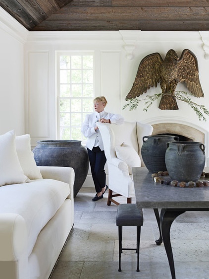
Photos by Simon Upton
“My intention is to let every one of a room’s components sing on its own — and also sing in harmony with every other facet of the given space, no matter how large or small.” — Nancy Braithwaite
Here the designer enjoys the view from her light-bathed Atlanta sunroom. At first glance you might notice the antique American eagle as the room’s diva, but then you’ll notice the other features — the strikingly large urns and table, the reclaimed-wood ceilings, the furniture’s metal legs. Humming in the background are crisply upholstered white pieces and white walls that allow for all of this contrast. As your eyes travel around, you’ll notice the smaller details, all of which pack a punch: for example, the dark, large upholstery nails that create a line along the bottom of the sofa.
Wall paint: Pearly Gates, Pratt & Lambert; sofa and chair upholstery: Great Plains, Holly Hunt Linen; urns: Balsamo Antiques; stools: Christian Liaigre; large table: custom, Nancy Braithwaite
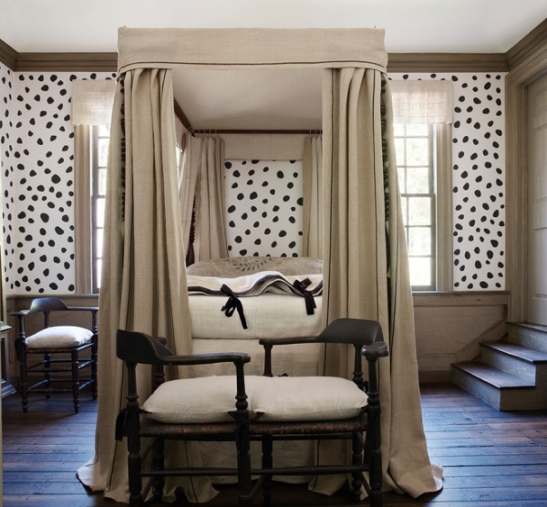
“It’s not easy to pare away at what is possible to reveal what is absolutely necessary.”
This bedroom in Braithwaite’s Atlanta home sports a striking custom paint job she developed with artisan Douglas Funkhouser. It’s based on an 18th-century pattern, an appropriate backdrop for her collection of American antiques. The color palette is limited to show off well-crafted pieces like the bench. The large pillow is covered in an antique grain sack. The bed hangings are attached with cotton twine — simplicity born of necessity.
Canopy linen: Ralph Lauren Home
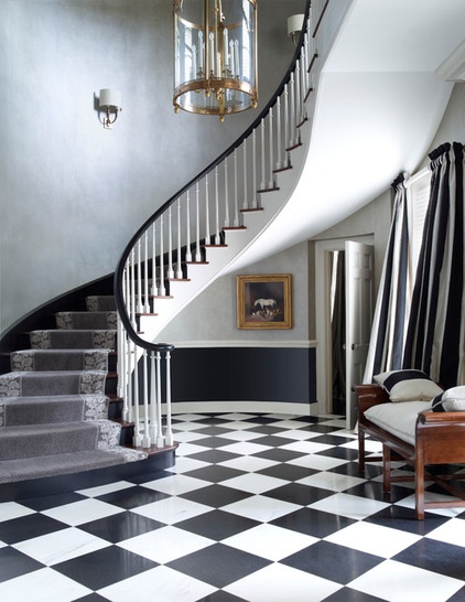
“To avoid visual noise, patterns need to be chosen carefully, mixed purposefully, and artfully applied.”
In this grand foyer, the elegantly curved staircase is a showstopper that needs a supporting cast. A dynamic charcoal and white checkerboard floor and striped drapes balance the strong curves of the wall and staircase. It’s a good example of how a pattern can provide what the designer refers to as “visual jazz.”
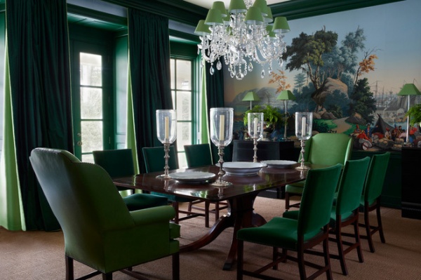
“Color should always be helpful, not hurtful.”
After seeing the previous rooms, it was a surprise to flip to this jewel-toned dining room. “In my view, one should always use color to support the design intent, whatever it may be,” Braithwaite writes. Here the intent was to complement the stunning antique Zubar wallpaper, keeping in mind that the room would most often be used after dark. Emerald chairs and window treatments accentuate the large-scale scene without overwhelming it. A crystal chandelier and glass hurricanes throw the light around in enticing ways.
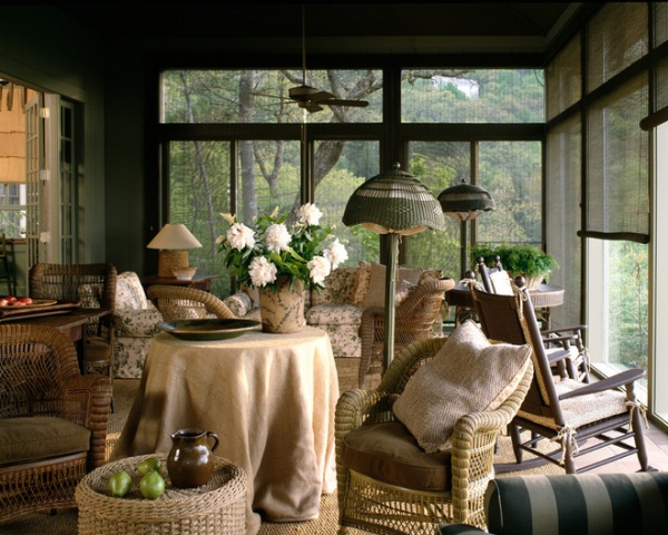
“I like texture and the extravagant use of many in one composition. … Texture must enhance and reinforce, not distract from, the form onto which it is placed.”
In this woodsy North Carolina mountain home’s screened-in porch, the designer didn’t hold back with a mix of wicker, sisal, bamboo and burlap. After seeing in previous pictures what a ruthless editorial eye Braithwaite has, I was surprised to come across so many things in one space — until I went back and reread what she had to say. Here there is lots of rustic yet comfortable seating for relaxed gathering, and because of her careful balance of textures, more is more.
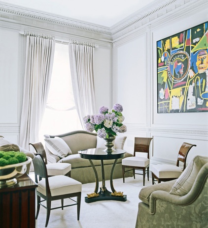
“When a grand house comes with a century or more of history and calls for a renovation, it is imperative to consider the original architecture.”
In this 1895 townhouse in New York City, Braithwaite stripped down the overly ornamental moldings added on in recent years to reveal the home’s graceful original moldings. She selected calm neutrals, classical furnishings and luxe textures. These elements work together to provide a serene backdrop that accentuates, rather than competes with, the homeowners’ dynamic contemporary art collection, including this piece by Basquiat.
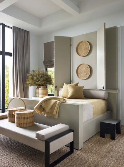
“This house is all about craft.”
In designing her family’s vacation home on Kiawah Island, South Carolina, Braithwaite worked closely with architect James Choate. Together they created a home that shows off not only its own contemporary craft, but also the work of modern-day artisans who carry on historic traditions. For example, pieces by master basket weaver Mary Jackson provide texture that connects to the marshes outside and the history of the region while providing contrast with the straight lines of the otherwise modern and minimalist interiors.
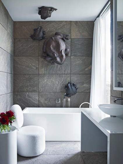
“I love the overscale — and the clarity that comes with it.”
In the bathroom of the same home, spectacular copper toads by Chinese American sculptor Robert Kuo perch on the walls and ceiling. The use of these pieces exemplifies many of the lessons taught in the book; Braithwaite practices what she preaches. There is sharp contrast in color and texture, from the rough cleft stone on the floor and walls to to the pristine white shine of the fixtures. The scale and patina of the toads are unexpected and purposeful.
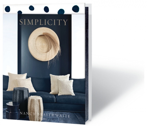
The book’s partial jacket is beautiful, but I recycled it about two seconds after I received the book. Underneath the jacket, the book’s cover has the same embossed dot pattern seen in the photo of her bedroom above. Before we even open her book, Braithwaite is giving us her first lesson in how paring down can reveal a beautiful simplicity.
Simplicity by Nancy Braithwaite (Rizzoli, $50)
More:
Simplicity vs. Simpleness in Architecture — and Why You Should Care
Book to Know: Design Advice in Greg Natale’s ‘The Tailored Interior’


