Houzz Tour: More Room to Relax in a Michigan Retreat
With four kids and a 70-pound dog, this Chicago family no longer fit in their vacation retreat located a few miles from the shores of Lake Michigan. All the kids had to sleep in one room, and the 13-year-old daughter had simply “had it” with sharing a bedroom with her younger brothers.
The homeowners wanted to turn the choppy interior into a comfortable, family-friendly space where each family member could have guests over and all could relax and feel comfortable. They tapped Space Architects + Planners to transform the house, and the firm began by completely gutting it, then adding more than 1,100 square feet by way of a handsome two-story addition that blends seamlessly with the charming original home. Next they created a 1,270-square-foot guesthouse. They added more than 2,300 square feet of new space in all. Now that’s a lot of elbow room.
Photos by Mike Schwartz
Houzz at a Glance
Who lives here: This is a retreat for a couple and their 4 children plus extended family and friends
Location: Three Oaks, Michigan
Size: Increased from 1,975 to 3,090 square feet (183 to 287 square meters); guesthouse is 1,270 square feet (118 square meters)
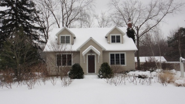
BEFORE: The original 1,975-square-foot house felt a little cramped when the whole family and guests were trying to cozy up inside.
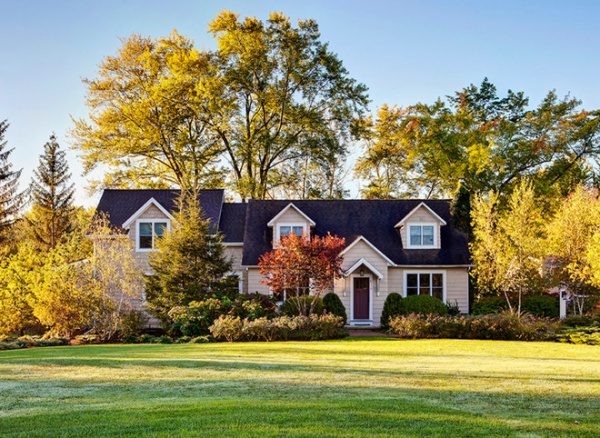
AFTER: Architect Jean Dufresne of Space Architects + Planners designed a 1,115-square-foot two-story addition, seen here, connected to the left of the original home. Meanwhile, the front facade underwent some changes to maintain a consistent plane.
A new roof and stained cedar shingles tie new and old together. “We wanted to make sure that it all felt seamless and integrated,” Dufresne says. “We wanted it to look like it was always there.”
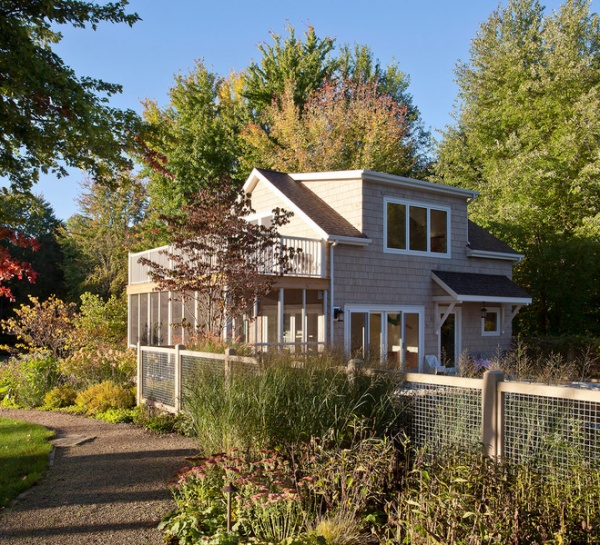
The same principle was applied to the new 1,270-square-foot guesthouse, shown here. “We didn’t want to build a giant object in the yard,” Dufresne says. “It all needed to fit in.” Serving primarily as an in-law retreat, the guesthouse accommodates two people in the bedroom and up to 10 on sofas and elsewhere.
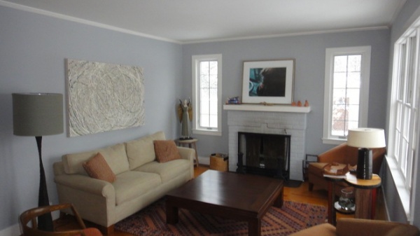
BEFORE: Although cute, the original home’s living room needed an update.
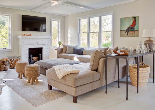
AFTER: The architects used decorative ceiling beams to add dimension and break up the expansive ceiling.
The project’s interior designer, Jennifer Miller of Los Angeles, says the house is situated on a sizable property, so there were no privacy concerns in the public living spaces. Unadorned windows invite natural light and views of the outdoors in.
The previously gray fireplace was painted white, as was the original flooring on the first floor. Miller says painting the wood floors white unified the existing mismatched wood with the new addition and highlights the family’s art collection.
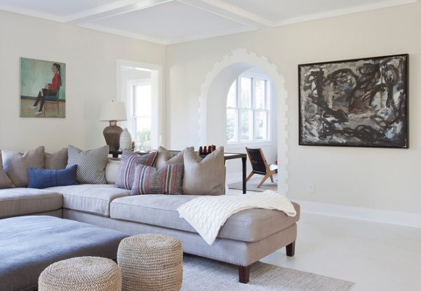
This wonderful rounded door between the living room and a small reading room was a detail saved from the original house. The homeowners found the various bottles that form the assemblage behind the sofa at a local shop.
Artist (painting on right): Harvey Ward
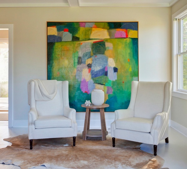
Here neutral wing chairs and a hide rug offset one of the many colorful paintings throughout the home.
Artist: Carolyn Cole
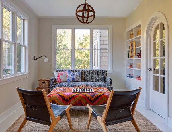
In the reading room, midcentury leather chairs meet a rowdy kilim-covered ottoman; there are equally fun prints on the sofa and splashy pillows.
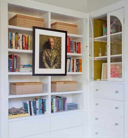
A photograph of John Malkovich adds a fun and quirky touch to the reading room.
Artist: Sandro
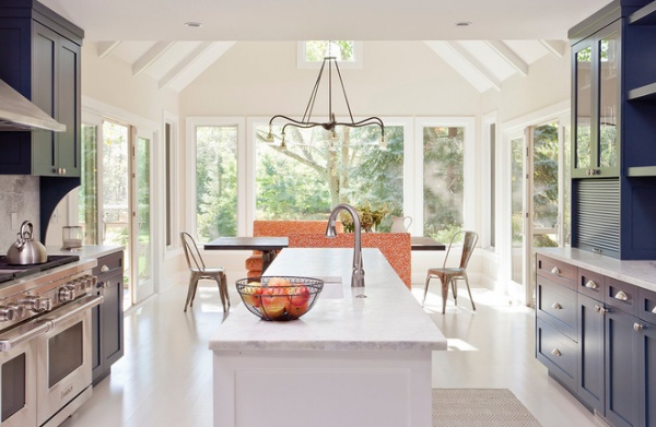
While the original kitchen was quite roomy, its L-shaped configuration created traffic problems. Without changing the square footage, the architects changed the configuration to that of a galley-style kitchen. Now the homeowners are able to seat 12 to 18 people, which they do a couple of times a week, including during a pizza party every Tuesday night in the summer for a group of kids who play tennis together.
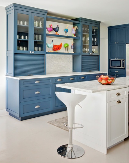
While colorful, the blue on the kitchen cabinets isn’t too vibrant, and carries a calming water reference throughout the center of the house. It also allows the chicken sculpture collection of one of the homeowners to pop.
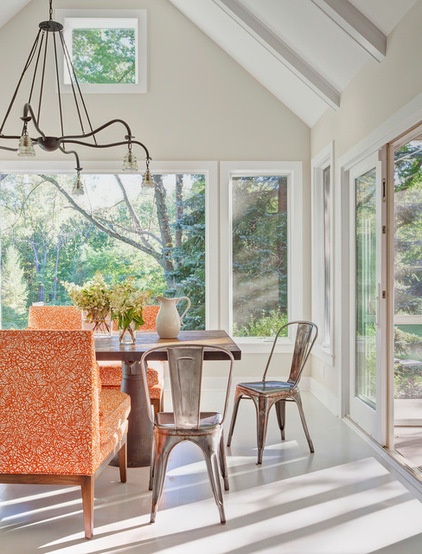
Light fills the dining area off the kitchen. The double-height roofline existed before the renovation, but Dufresne added two sets of sliding glass doors, one on each side, to access the two new screened-in porches. All of the windows were replaced in the room, and, as in the living room, new beams were added to the ceiling.
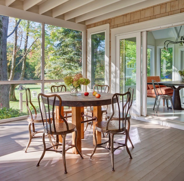
The homeowners refer to this as their “uberporch,” and at nearly 70 feet long, it is a favorite component of the project. The floor is made of painted cedar.
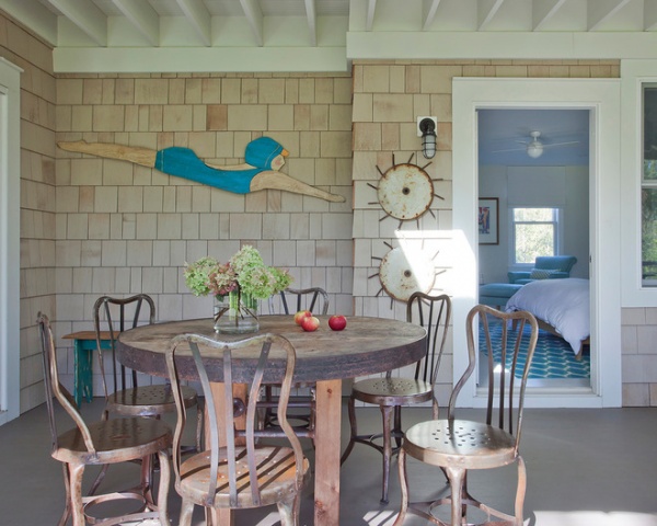
The porch, tucked between the dining area and the master bedroom, has an eclectic mix of artwork, farm tools and vintage chairs picked up at a Michigan garage sale.
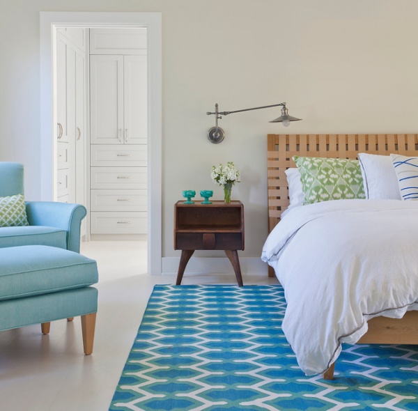
Crisp turquoise, white and green make for a fresh palette in the master bedroom.
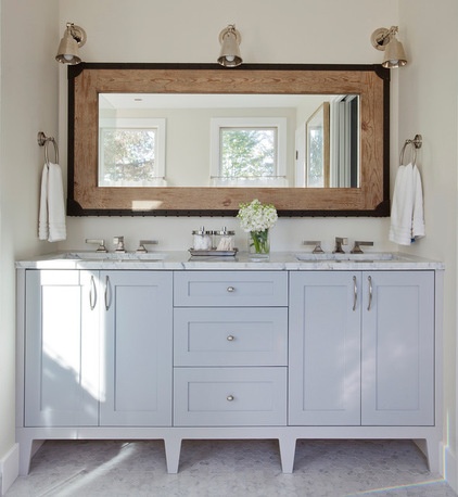
A cool light gray plays well with the Carrara marble countertop and floor in the master bathroom.
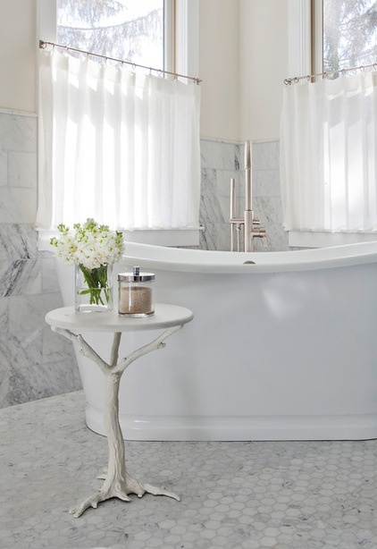
Miller found this tree branch table at a local shop. By painting it white and adding a round marble top, she turned it into a great tub-side table.
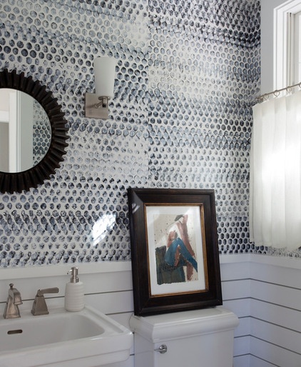
Wonderfully patterned and with an industrial edge, the powder room wallpaper was hand printed. (No, it’s not supposed to match at the seams.)
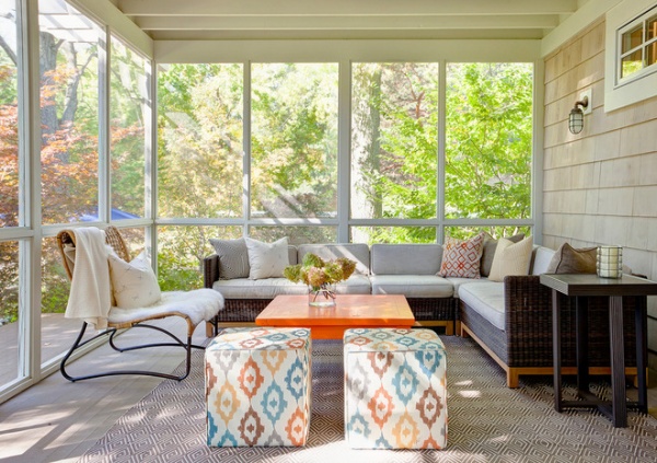
Right off the powder room is a second screened-in porch. Smaller than the porch on the other side of the house, this one takes on the function of an indoor-outdoor lounge.
As in many of the other spaces in the home, bursts of color nestle among neutrals. Here they’re seen in a flashy orange table and delightfully colorful ikat poufs.
Clean design that supports casual and easy living is the overall design approach for the house. The clients didn’t want anything in the house to be too precious and instead sought durability, so many of the fabrics used throughout the house are outdoor fabrics.
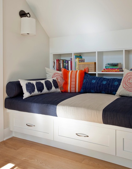
A handsome reading nook at the top of the stairs makes efficient use of what otherwise might be wasted square footage.
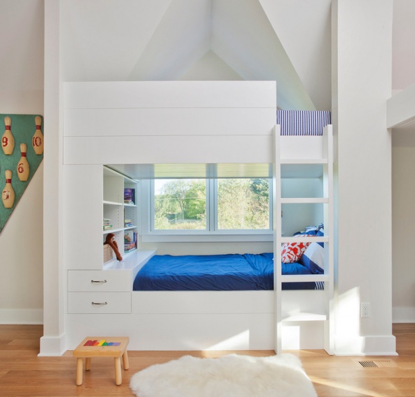
Second on the homeowners’ list of renovation favorites is the ability to sleep all the cousins. “Beds, beds everywhere!” one of the homeowners says.
In total the house can accommodate 18 people in beds and four to six more on couches. The boys’ bedroom, shown here, is located above the master suite and houses three sets of bunk beds.
Miller says she and one of the homeowners had fun together finding spots to place art pieces collected over the years. They concentrated on locations where they’d have the most impact. This bowling pin piece is a lucky strike.
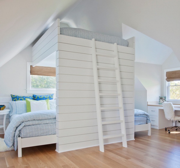
As good things come in threes, the girls’ room, situated above the living room, houses three beds.
Dufresne says the bunk beds for the kids are his favorite part of the project. “When they saw them completed —the smile on their faces, that was the best,” he says.
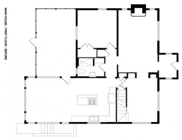
BEFORE: This is the first floor of the original home prior to the renovation. The kitchen, living room and reading room are the only spaces where the footprint was maintained. Even the staircase was removed and rebuilt.
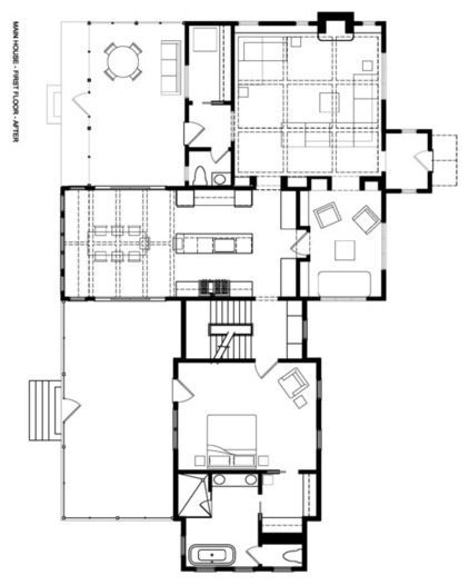
AFTER: Here’s the first floor upon completion of the renovation. The rebuilt staircase and master suite are located off the kitchen. Two front porches flank the kitchen-dining area.
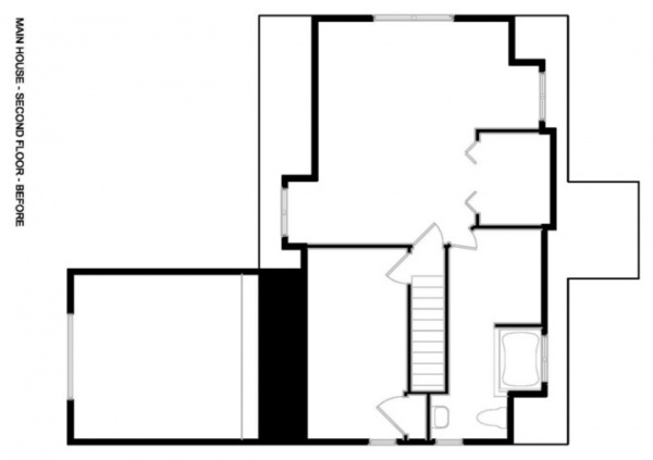
BEFORE: The second-floor configuration before the renovation. The entire second floor layout changed.
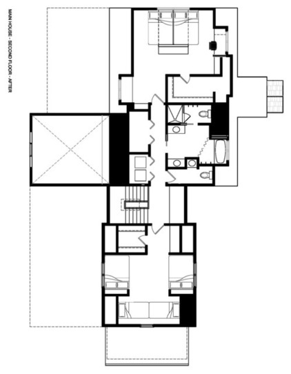
AFTER: The boys’ room is located above the master suite; the girls’ room is on the opposite side of the house, above the living room.
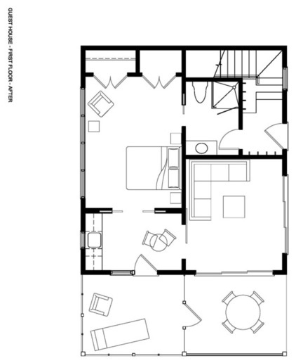
Here’s the first floor of the new guesthouse, a retreat for the in-laws.
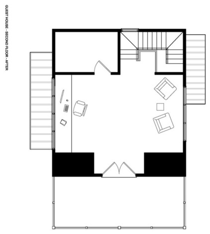
The second floor of the guesthouse has an office.
Architects: Space Architects + Planners
Interior design: Jennifer Miller Studio
Browse more homes by style: Small Homes | Colorful Homes | Eclectic Homes | Modern Homes | Contemporary Homes | Midcentury Homes | Ranch Homes | Traditional Homes | Barn Homes | Townhouses | Apartments | Lofts | Vacation Homes


