Houzz Tour: A Contemporary Addition Makes the Connections
http://decor-ideas.org 12/30/2014 22:13 Decor Ideas
Bill and Christine McCorkell purchased their Edwardian clapboard home in 2010 with the intention of renovating. They and their two kids needed more space, and they built an additional story to accommodate extra bedrooms and bathrooms. But they didn’t stop there. They remodeled rooms in the front of the house to make them more modern looking while maintaining period details such as high ceilings, ceiling roses and cornices. Farther into the home, the space shifts to a more contemporary style with polished concrete floors and honed block walls.
Houzz at a Glance
Who lives here: Bill and Christine McCorkell; their children, Harriet and Sam; George the rabbit; and Toby the lizard
Location: Balaclava, near Melbourne, Australia
Size: 1,722 square feet (160 square meters); 3 bedrooms, 2 bathrooms
The McCorkells, of ArchiBlox, wanted to create a home with personality — one that was beautiful, refined and playful at the same time. “We love the ease and beauty of the home, and especially the way it integrates the outside in,” Bill McCorkell says.
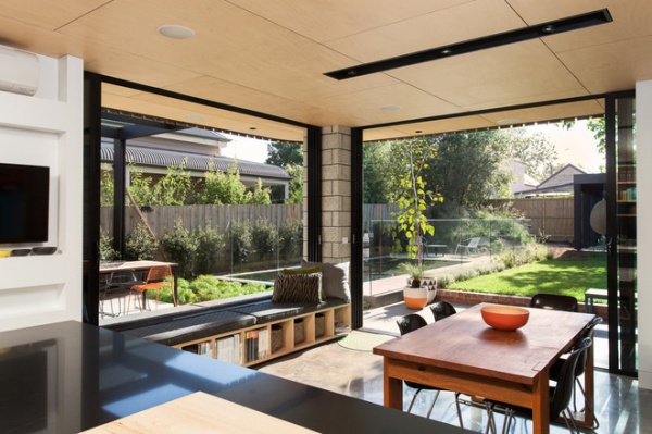
Indoor-outdoor living was achieved with a layout that captures every opportunity for external views, either out to the garden or over the adjoining properties’ roofs. Sliding windows open to the rear, letting in natural light, which bounces off and warms the polished concrete floor.
Daybeds transform the kitchen from a task-driven space to a multipurpose zone to unwind in. “With the morning sun on your back, it’s a pretty special place to read and have a cuppa,” Bill says.
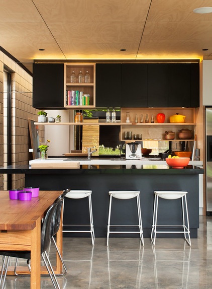
Bill and Christine designed many elements in the kitchen with recessed woodwork for items in constant use. The black Caesarstone island top, for example, has a recessed heavy-duty wood chopping board.
Stools: Last Minute, Hub Furniture
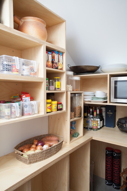
Tucked in a corner nook is a pantry that helps conceal everything else. Look up and you’ll notice a slant in the ceiling; the setup utilizes an awkward space under the stairs.
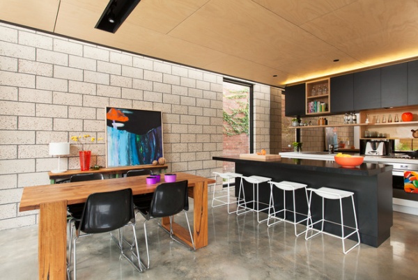
Polished concrete floors in the dining and kitchen area are set at the base of honed concrete block walls, reinforcing the inside-outside connection.
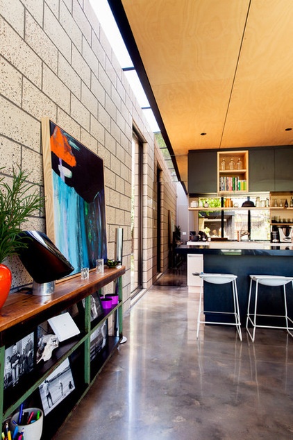
The block walls stretch past the ceiling level and into a void beyond a skylight that runs the length of the space. Natural light spills in, opening up and softening this side of the home.
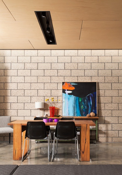
The contrasting ceiling is lined with staggered plywood panels; joints are emphasized with a black textile that is recessed between the panels.
A vibrant piece of art by Ali McNabney-Stevens complements the concrete and wood.
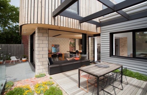
From the outside, notice the recessed black grout lines between the concrete blocks and between the timber panels on the upper level. This is a running theme throughout the house; it’s seen in the wet room as well, for example.
Every design element is consciously linked, in a layout that is free flowing and functional. As Bill says, “It incorporates order into what we all know as busy, crazy lives.”
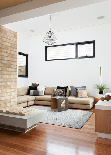
Despite the open-plan layout, zones create intimacy in all those big, open spaces. The kitchen, for example, opens to the dining area and a separate living area, so no one is ever disconnected, but everyone can still get away from it all. “We wanted to be able to retreat from the children, and vice versa, but keep that connection and family interaction,” says Bill.
Large windows open out to the barbecue area and provide a lovely leafy view from the couch. The children like to use the family room to watch TV or play their Wii games.
While the brickwork feature in this room creates interest, there are plans to turn it into a fireplace.
Cockatoo-print box: Bonnie and Neil; pendant light: Lineare A, About Space
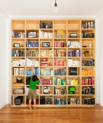
The family room makes a statement from afar with this custom-built ArchiBlox plywood bookshelf, which can be seen through the expansive windows as you approach the entrance of the house. “It makes a real feature and adds the finishing touch to our home,” says Bill.
The large shelving unit has room for family photos, knickknacks and books, which are arranged by color.
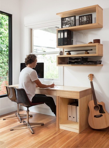
The study embraces multipurpose functionality: Bill and Christine use it mostly for work, to practice music and for meditation.
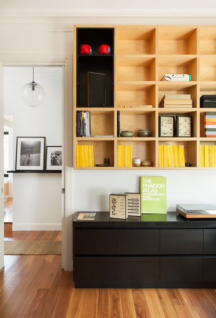
There is plenty of built-in woodwork in this room: plywood bookshelf, study desk, shelves and storage unit.
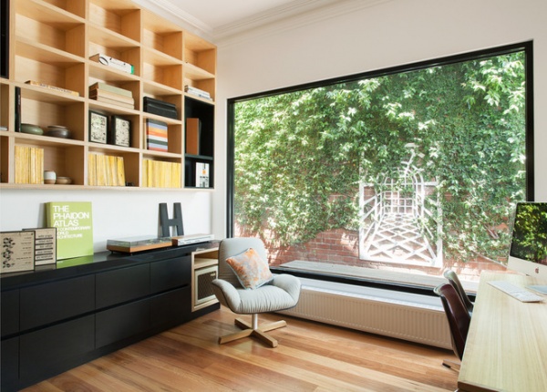
The window reveals a clever lattice feature on the wall outside that creates the illusion of a distant scene. It not only opens up the space but adds a tranquil quality to it.
The lattice wall feature was part of the original property and was discovered once the vines were cut back. “It’s one of the reasons we made such a big window: to be able to look at the lattice from inside the house,” says Bill.
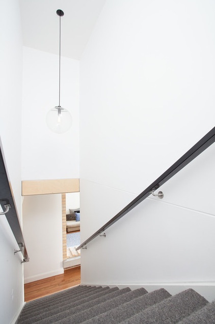
Just above the pantry and storage area, a staircase leads upstairs to a “learning corridor” that adjoins two bedrooms and a bathroom.
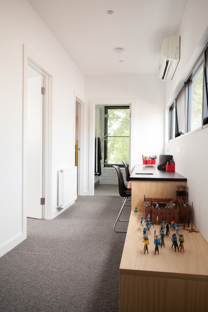
The learning corridor makes the most of what would usually be an empty area and is personalized with the kids’ toys. It also provides more space for the kids away from Mom and Dad, so they don’t always have to retreat to their bedrooms when seeking alone time.
“The flow and functionality provides an enhanced style of living with set designated areas. Kids’ zones, adult zones, family zones; there is a place for everything,” says Bill.
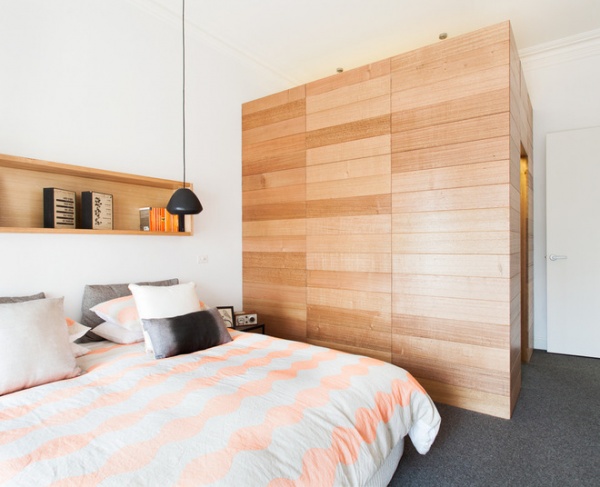
This box-like compartment in the main bedroom is a walk-in wardrobe; it’s a fun wood feature and flows through to a beautiful en suite. “It’s a great functional space that looks cool too,” says Bill. The box is made of Tasmanian oak.
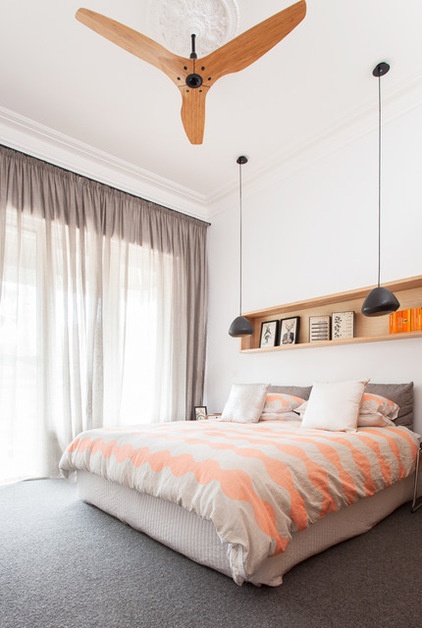
Quilt cover and pillowcases: Sandi, Country Road
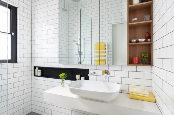
A wood shelf is strategically placed in the white-tiled bathroom, adding warmth and texture to the monochromatic color scheme.
Sink: Reece; tiles: National Tiles
Browse more homes by style:
Small Homes | Colorful Homes | Eclectic Homes | Modern Homes | Contemporary Homes | Midcentury Homes | Ranch Homes | Traditional Homes | Barn Homes | Townhouses | Apartments | Lofts | Vacation Homes
Related Articles Recommended


