Colors of the Year: Look Back and Ahead for New Color Inspiration
Sure, this time of year is all about joyful tidings and merrymaking, but if you are a color nerd like me, you also look forward to it for the various Color of the Year announcements by paint manufacturers and color management companies. I recently attended a handful of industry events put on by paint companies to present their Color of the Year selections for 2015. It was interesting to learn about the processes they use to select their colors.
Selecting and promoting a Color of the Year is certainly a marketing tool, but the process is taken very seriously, with many companies sending teams of color experts out into the field, near and far, to explore and document their environment. The teams then meet to discuss and present (and often argue!) about what they saw, what inspired them and what color trends they noticed. From all of this a color or colors are chosen.
We’ll take a look at last year’s picks first and then see what’s being forecast to be big in 2015.
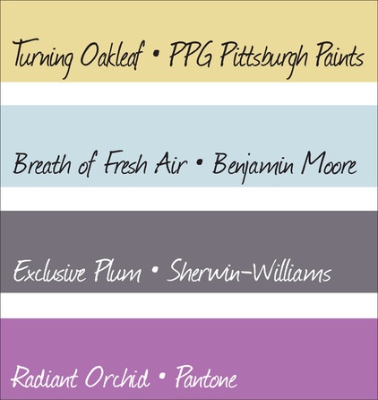
2014 Color of the Year Picks
With the exception of Pantone’s Radiant Orchid, the bulk of the Color of the Year selections for 2014 were fairly toned down and neutral. Most color forecasters felt that as we were slowly moving out of the recession, homeowners were feeling a bit tentative about color. They wanted to feel optimistic but weren’t quite there yet.
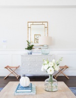
I think that of all of the picks, Turning Oakleaf and Breath of Fresh Air were the most successful. In my work as a color consultant, I found that many of my clients were open to similar soft shades of blue and yellow, especially when used as alternatives to the usual batch of neutrals: beige, gray and white.
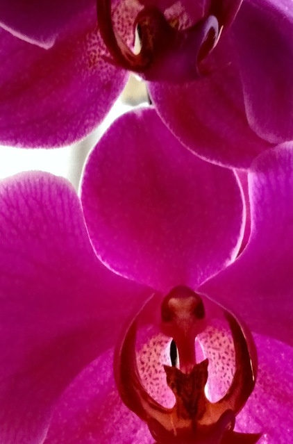
As mentioned in a previous ideabook, I did have one client opt for an accent wall in Exclusive Plum; no takers on Radiant Orchid or similar hues.
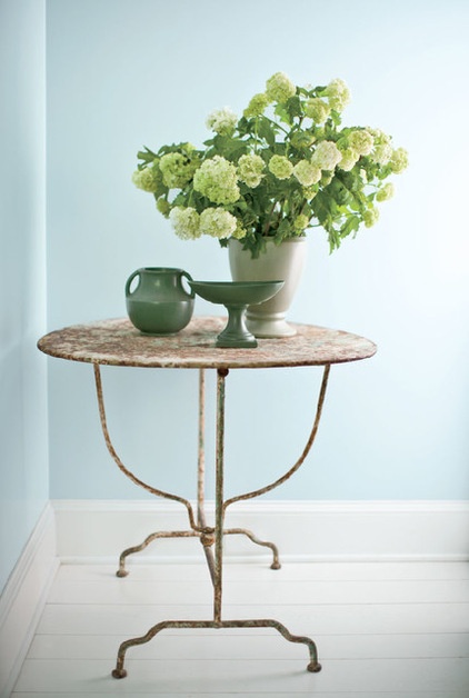
Benjamin Moore’s Breath of Fresh Air seemed to garner more favorable reviews. Houzz user nhorowi1 painted her bedroom with this color and says, “It gives the room a calming effect. It makes me feel like I’m in the Caribbean at the beach. I love it!”
Ae2ga says: “I love this color! Softer blues, yellows, greens with creams and whites make for a peaceful, calming space in ways that bolder colors do not. Embrace the softness!”
There were a few detractors, however. As efpico says, “I love blues and I love pastels, but dislike this color very much. It is way too babyish.”
See more on Breath of Fresh Air
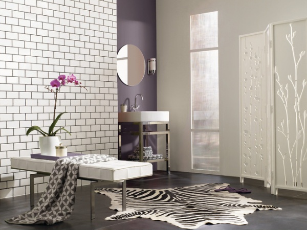
Sherwin-Williams’ selection, Exclusive Plum, was well received by Houzzers, collecting mostly favorable reviews. Ms. Fix-It Home Solutions gave it a thumbs-up, saying, “This is really, really pretty! Used judiciously, it could really set a soft and sultry mood. I like it!”
Firedog65 adds, “I used Exclusive Plum from Sherwin-Williams on one wall of our new master. Paired with gray on the other walls, a rich dark wood floor, white trim, a zebra chaise and white drapes on a whole wall of windows — I am in heaven!!! My husband was scared of the plum idea, but it has a masculine tone to it and he’s fine with it.”
See more on Exclusive Plum
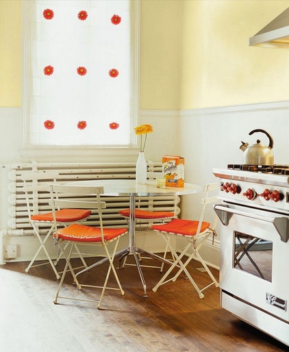
Turning Oakleaf from PPG Pittsburgh Paints also pleased most readers. Face39 says, “I’ve always gravitated to yellows like these for my home. Fresh, cheerful, lots of life.” Cricket07 says, “I want this color in every room!”
On the other hand, designwitch says, “As a professional paint contractor, I can tell you that the color I am asked to paint over more than any other is yellow.”
See more on Turning Oakleaf
2015 Color of the Year Picks
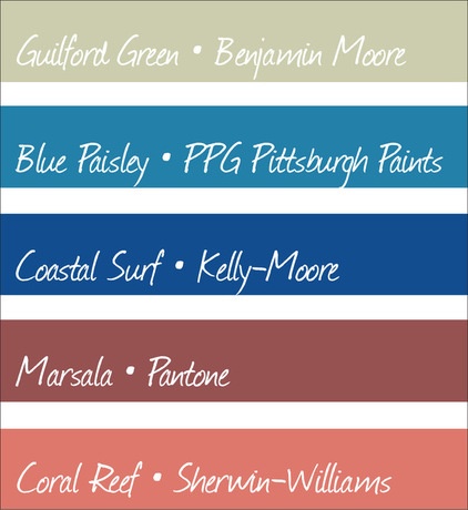
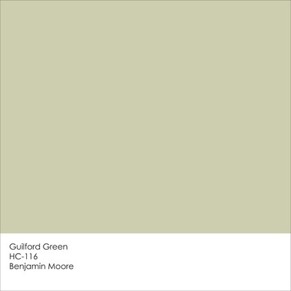
Similar to the 2014 selections, the Color of the Year picks for 2015 are a diverse bunch. There are two blues, both very saturated, and Pantone’s pick of Marsala is also on the deeper side. Coral Reef is probably the boldest of the group, and Benjamin Moore is keeping things soft and mellow with its selection of a wispy, neutral, yellowish green.
In general, though, the colors are lively and vibrant, perhaps indicating that a sense of optimism is finally in the air. Let’s take a closer look at each of these hues and how you could use them in your home.
Guilford Green
Benjamin Moore
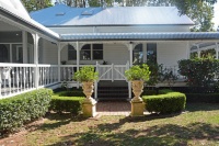
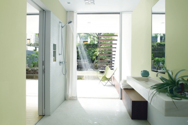
Guilford Green is a verdant neutral chosen to reflect fresh growth and emerging optimism for the new year. I shared this color with a few of my friends, and their comments were all over the place, from “I love it!” to, “Ick, reminds me of a hospital cafeteria.” One way to pull this color away from looking institutional is to pair it with cool, crisp white or use it as a backdrop to other more dramatic colors.
See more on Guilford Green
Coral Reef
Sherwin-Williams
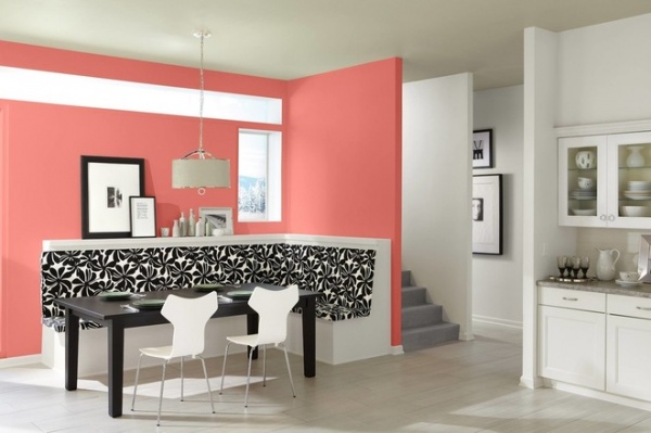
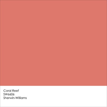
Sherwin-Williams’ 2015 Color of the Year, Coral Reef, couldn’t be more different than Guilford Green. Whereas Guilford Green is soft, soothing and neutral, Coral Reef is bold, bright and vivacious. They are, in fact, practically opposite each other on the color wheel. A blend of orange, red and pink, Coral Reef can be a tricky hue to pull off in the home, and in an informal poll I conducted on social media, it received mostly a thumbs-down, but I think it can have a place in the home if used judiciously.
See more on Coral Reef
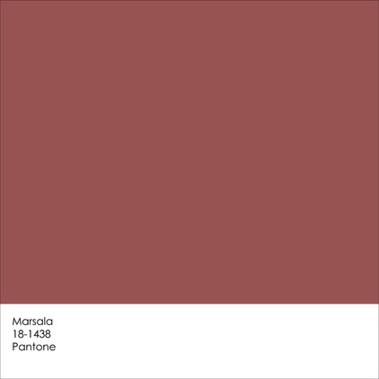
Marsala
Pantone
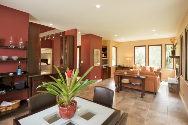
Pantone chooses colors that can have applications outside of home design use, and while I think this earthy rum-raisin hue could work well in the home, I think it needs to be partnered with colors that have a bit more life to keep the palette from feeling dull.
See more on Marsala
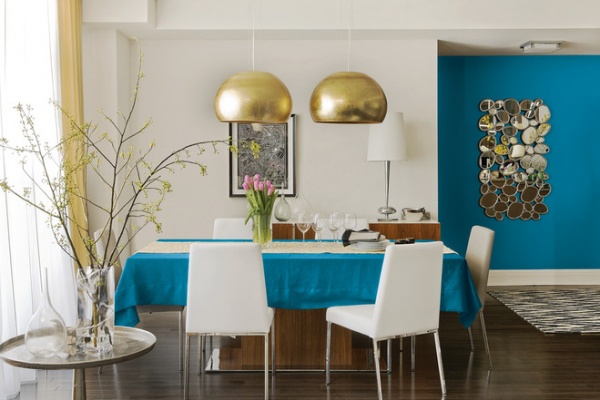
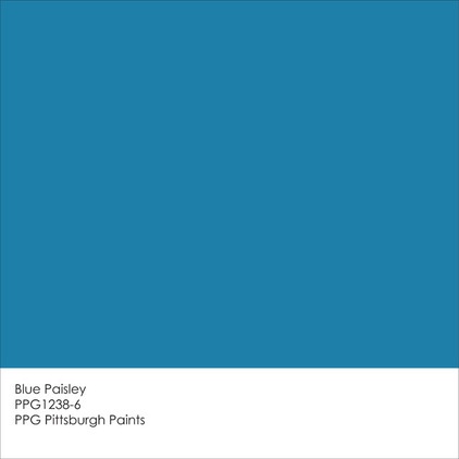
Blue Paisley
PPG Pittsburgh Paints
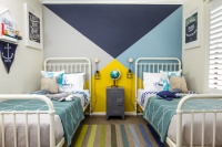
If your tastes run to the cooler end of the color spectrum, you might like PPG Pittsburgh Paints’ 2015 Color of the Year, Blue Paisley. This pretty, bold blue has a touch of green in it, and it therefore pairs well with greens. It also serves as a nice backdrop to gold- or bronze-toned accents.
See more on Blue Paisley
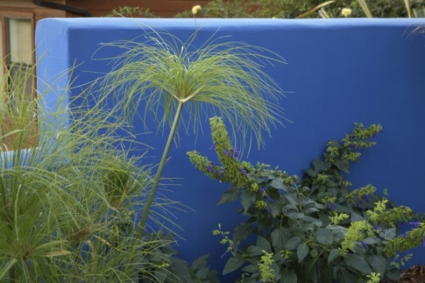
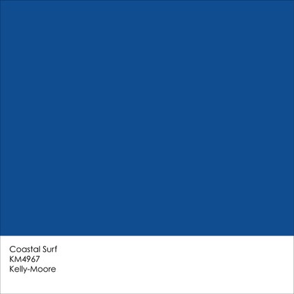
Coastal Surf
Kelly-Moore Paints
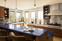
When I think of so-called “classic” blue, I tend to envision a certain shade of cobalt or indigo — a color similar to Coastal Surf, Kelly-Moore Paints’ selection for 2015’s Color of the Year. This is a deep blue that, like Coral Reef and Blue Paisley, tends to work best in small doses. But of course there are always ways to make a color like this work on a larger scale.
See more on Coastal Surf
Tell us: See anything you like? If not, what would your pick be for the 2015 Color of the Year?
More: See current and past Colors of the Year

