Kitchen of the Week: A Dark Kitchen Brightens Up
http://decor-ideas.org 12/26/2014 22:13 Decor Ideas
The last time this San Francisco kitchen was remodeled, the Summer of Love was in full swing. “The oak cabinets were very late 1960s and very dark,” says designer Lisa Nerland. She was hired to take its appearance back even further, to its Edwardian roots, while bringing its amenities into modern times.
Kitchen at a Glance
Location: Haight-Ashbury neighborhood of San Francisco
Size: About 144 square feet (13 square meters)
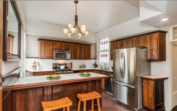
BEFORE: The homeowners felt surrounded by brown and decided it was time to update the dark stained cabinetry that had been there for more than four decades.
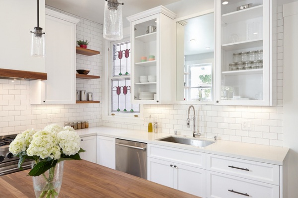
AFTER: In the new kitchen, the original stained glass window has been preserved, but the refrigerator has been moved from beside the sink to behind a new island, which replaced the peninsula to open up the space.
The clients requested a white kitchen but were concerned about the space feeling cold. “Adding in touches of walnut was really important,” says Nerland, principal of Nerland Building & Restoration. She used the wood for the island’s countertop, open shelves and trimwork around the cooktop ventilation hood.
Cabinet paint: Oxford White, Benjamin Moore; white countertop: PentalQuartz
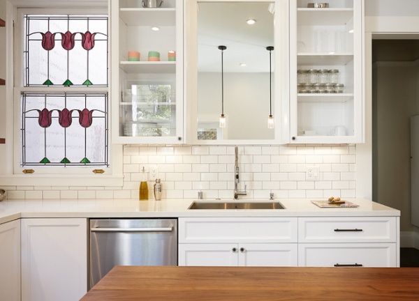
“We put a nice big mirror directly over the sink,” Nerland says. “It acts a bit like a window, brightening the space and making it feel more airy.”
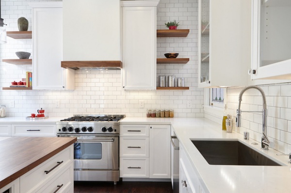
Nerland added some height to the cabinetry to gain more storage space, but she couldn’t take the cabinets all the way to the ceiling. “The thing about these old houses is that there isn’t a level line in them,” she says. “If we had taken the cabinets all the way up, it would have accentuated a slight slope in the ceiling.”
Instead she took the tile backsplash all the way to the top at the request of the homeowners; thanks to a skilled tile pro, the slope isn’t noticeable.
Extending the cabinets wall to wall wasn’t possible either, because of the windows on each side. Small open shelves make the most of the leftover space.
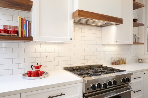
In addition to the walnut accents, gray grout on the backsplash helps add more warmth.
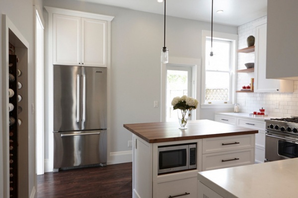
The new refrigerator was placed on the other side of the room from where the old one was, and was recessed into the wall for a sleeker appearance and to free up space.
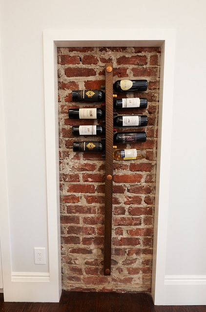
Almost every kitchen has a quirk. In this case the room contains a small brick wall — the remains of an old fireplace. Instead of covering it up, the designer made it work by slimming it down and surrounding it with trim, then the owners found a unique wine rack to fit the space. “It went from being a sore thumb to a design feature,” Nerland says. “I think it’s a grounding element in the room.”
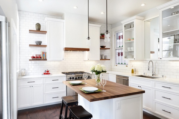
The new kitchen wouldn’t be called a period piece by any stretch of the imagination, but it’s more in keeping with the home’s original style. “It’s a clean, simple look that fits with the home’s exterior,” Nerland says.
See more Kitchens of the Week
Related Articles Recommended


