My Houzz: 1896 Victorian Home Gets a Contemporary Lift
“With two children and the two of us working from home, our house is always buzzing with energy,” says interior designer Kristen Peña. “People are coming and going, and we love that. We love nothing more than having a bunch of kids laughing and playing around us while we work or relax.“ That is why it was important for Kristen and her husband, Luis, a director, to find a home in which they could raise a family and carve out a studio space dedicated to their work. After waiting patiently for five years, they found their dream house in their dream city — a 118-year-old Victorian in San Francisco’s Noe Valley neighborhood.
The house needed a heavy renovation, including adding a new foundation and removing an inefficient sunroom that wrapped around the back of the house. Construction began in 2006, when Kristen was pregnant with the couple’s second child. The couple worked with CCS Architecture to convert the two-bedroom, one-bathroom, single-story residence — with the master bed and bath off the kitchen — into a three-level home with four bedrooms and four bathrooms. They kept the home’s original character but added modern elements.
Houzz at a Glance
Who lives here: Kristen and Luis Peña, daughters Sadie and Emmi, and cat Penny
Location: Noe Valley neighborhood of San Francisco
Size: 3,800 square feet (353 square meters); 4 bedrooms, 4 bathrooms
Year built: 1896
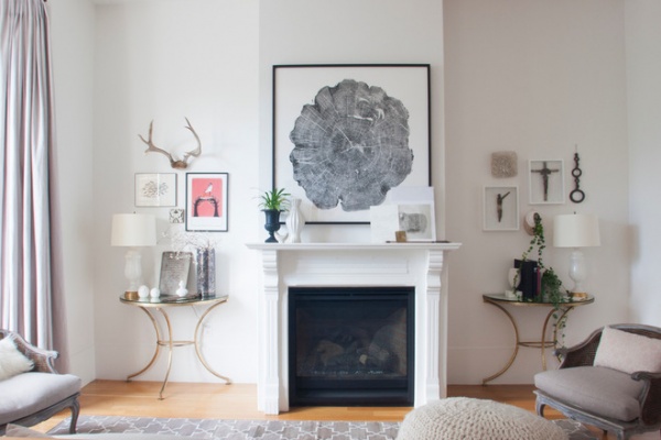
They also wanted to keep a clear distinction between their living space and their workspace, which they achieved by creating a separate entrance for their offices on the ground level. On the upper levels, they focused on warming up their living spaces with art and vintage furnishings collected from their trips abroad, as they did in the living room shown here.
“My mother is a lovely homemaker. I know I got my sense of balance and visual strengths from her,” says Kristen, of K Interiors. “I think my mind was blown when I started traveling the world in college, and still to this day my interior style is very much influenced by my travels.”

Throughout the home, Kristen displays small vignettes featuring pieces the family has collected during travels abroad.
Decorating their home was Kristen’s first formal foray into interior design, which she now does professionally. She had been running her own clothing company but found she loved working with the architects on the design of the home as well as finding materials and products. The home she and Luis created reflects her design approach.
“In design I aim to create very open, contemporary, light-filled spaces,” she says. “I then soften the lines with layers of textures, treasures and art to create a cozy, warm, inviting space — a home!”
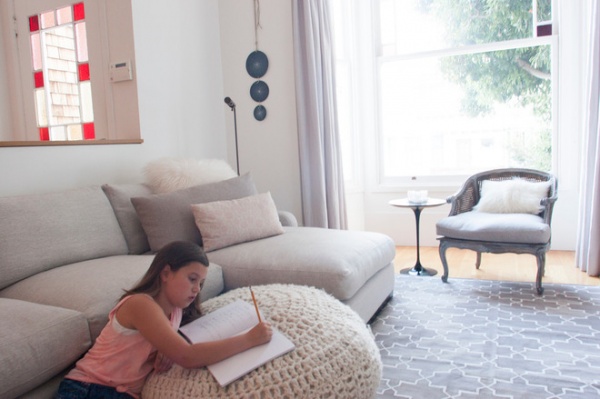
The front room is filled with light throughout most of the day, thanks to its large windows, making it an ideal spot for older daughter Sadie to work on homework in. The furnishings are a perfect example of Kristen’s design sense. She says, “I love to find vintage pieces and often rework them.” The armchair is vintage with new cushions made with fabric from Mark Alexander, while the rug is from Madeline Weinrib.
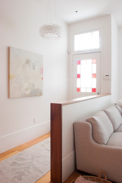
The stained glass window in the front door, which is original to the house, allows even more light into the space.
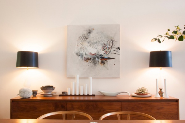
A piece by artist Reed Danziger hangs on the dining room wall. “I love all of our art,” Kristen says. “We try to buy a new piece each year as a gift to one another.”
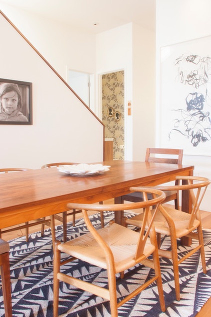
When not directing, Luis makes custom furniture, such as this dining table. Kristen found the vintage wishbone chairs at a flea market.
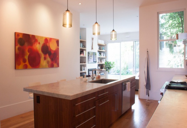
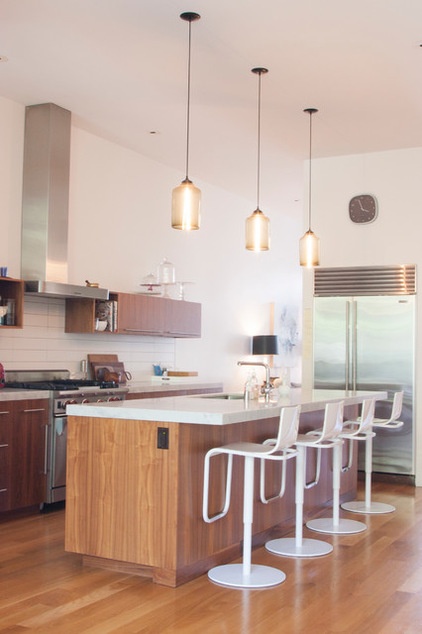
An art piece by Kathryn St. Clair hangs in the updated kitchen. The lights over the island are from Niche.
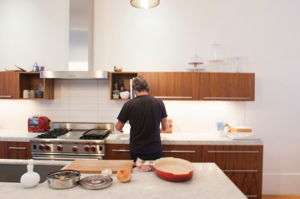
Luis takes on cooking duties for the evening in the open galley kitchen.
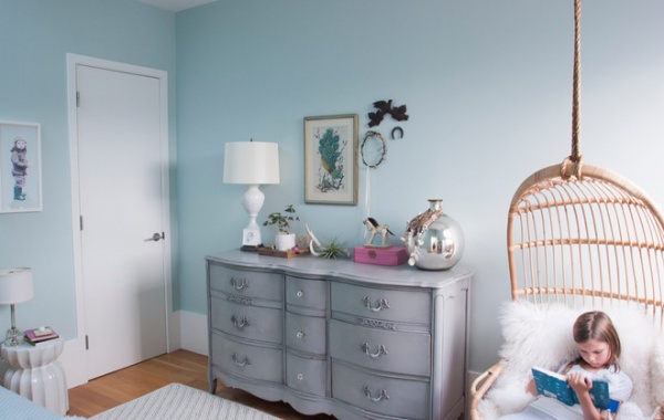
Emmi, the couple’s younger daughter, spends time in her room reading in comfort in her hanging rattan chair from Serena & Lily.
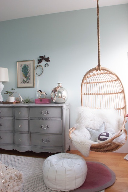
“I try to let my kids collaborate on their spaces,” Kristen says. “My 8-year-old was looking through one of my design books for ideas. She decided she wanted a Moroccan wedding blanket for her bed covering. She found a beautiful vintage one on our trip there this summer. I’m thankful for her great taste!”
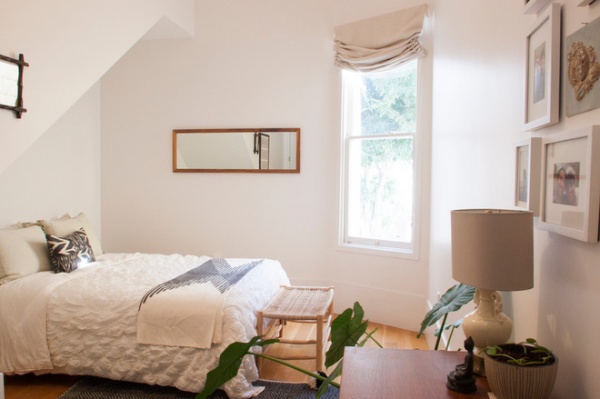
White walls and simple furnishings make the guest bedroom an inviting space.
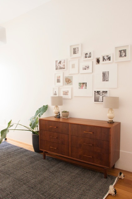
Along with other travel finds, the Peñas also make it a point to search for amazing rugs at flea markets.

Most of the home is painted in soft pastels, but the guest bathroom stands out with its fun floral wallpaper.
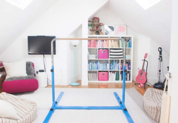
The house needed a new foundation and was taken down to the studs. Only the facade, which is on the historic register, remained untouched. The team excavated the basement for the first level and converted the attic, seen here, for the third story. The architects followed the lines of the original building, which resulted in 15-foot ceilings and plenty of room for skylights, as seen here in the kids’ playroom.
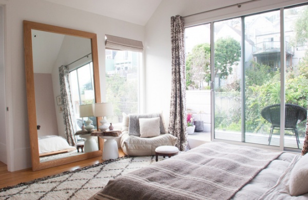
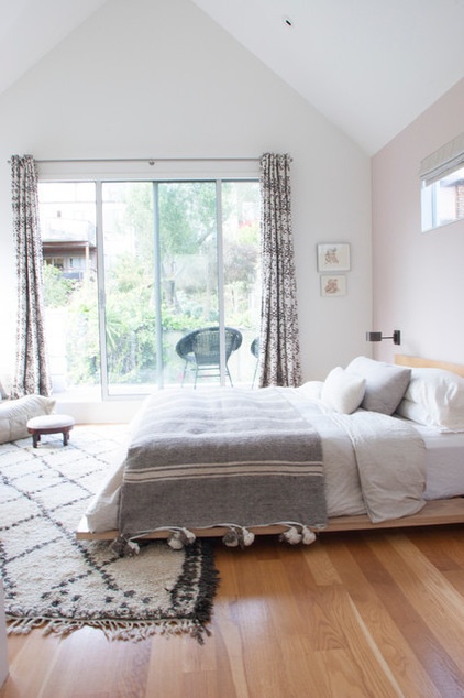
Kristen’s favorite place in the house is a corner of the couple’s bedroom, with a Togo chair by Ligne Roset, which sits on a vintage Moroccan rug. She says, “It’s so sunny and warm there with a view of Sutro Tower and the fog rolling in.”
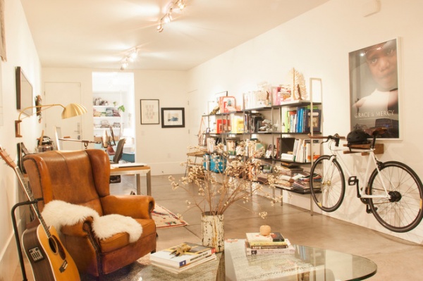
Kristen’s latest find, a vintage Ralph Lauren leather chair, anchors the couple’s his-and-her studio-workspace.
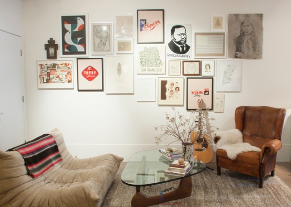
Togo chairs can be found throughout all floors of the home, tying the living spaces and workspaces together. Here one sits alongside an Isamu Noguchi coffee table in the studio.
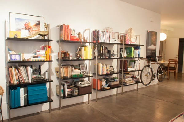
“We work from home, so it was important to make our office level feel very different from the rest of our house,” Kristen says. “We wanted clear distinction between the two.”
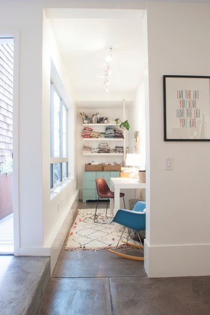
Kristen often works out of the design nook, especially when she has clients in.
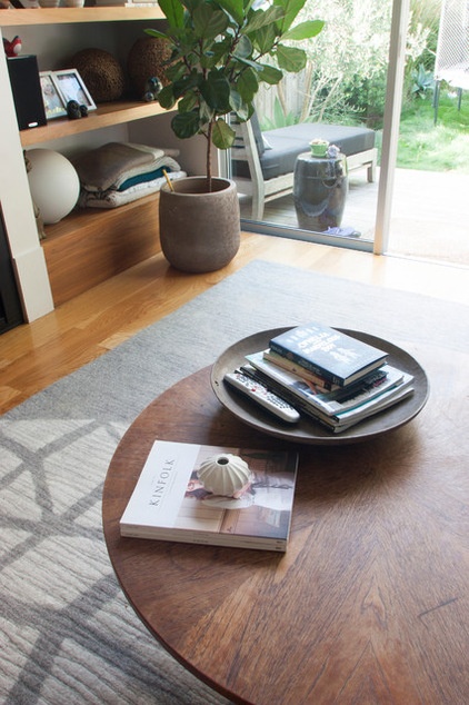
“I believe on splurging on pieces that are standouts — art, curtains, lighting, rugs and some furniture pieces. But I am much more reasonable on other pieces,” Kristen says. “That is why I like vintage; you can get special pieces for less.”
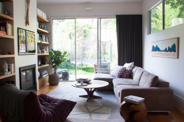
The family room opens up to the patio, with floor-to-ceiling glass sliding doors that take advantage of available daylight.
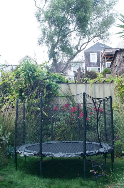
The compact backyard has just enough space for a trampoline for the girls.
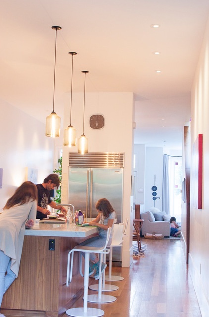
As the family gathers before having dinner, light streams in from both ends of the home.
See more photos of this house
My Houzz is a series in which we visit and photograph creative, personality-filled homes and the people who inhabit them. Share your home with us and see more projects.
Browse more homes by style:
Small Homes | Colorful Homes | Eclectic Homes | Modern Homes | Contemporary Homes | Midcentury Homes | Ranch Homes | Traditional Homes | Barn Homes | Townhouses | Apartments | Lofts | Vacation Homes


