Better Circulation for a Family Kitchen and Bathroom
At first Sara and Gibbs Rounsavall figured they would make over their 1980s plastic-laminate-filled kitchen with just new cabinets and appliances. But once they met with architect Emily Fisher and heard her ideas on flipping the layout to create smarter, better circulation, they decided it was worth the additional cost. “It was a brilliant idea that we had not considered,” Sara says. “It would definitely increase the overall cost of the project, so we delayed it almost a year, saved and made it happen.”
Then, when they asked that a small adjacent bathroom accommodate a washer, dryer and shower, Fisher used creative thinking to squeeze everything in, installing a 32-inch prefabricated shower and stacked 24-inch washer and dryer units. “Thinking of something in a totally different way is the kind of thing an architect can bring to a project,” Fisher says.
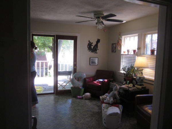
BEFORE: The family rarely used a sitting area connected to the kitchen, because there was already a den right off the kitchen. And because this end of the space opened to the dining room (where this photo was taken from) Fisher decided to flip the arrangement and put the work triangle here.
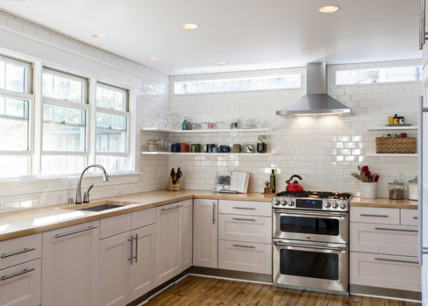
AFTER: Fisher and her team at Rock Paper Hammer collaborated with T.M. Faversham of Deep Creek Builders on the project, and converted the French doors into three windows over the newly placed sink. To keep some of the southern light that came from the previous windows on the end wall, they created narrow windows near the ceiling above the floating shelves, an idea Sara got from Houzz.
The new arrangement also freed up the opposite side; now it’s more of a circulation route that connects the kitchen to the newly remodeled bathroom, a den and a new doorway that leads to the backyard.
Fisher struggled with where to fit in a second oven, which generally comes stacked in a tower with a primary oven. But then she found the GE Cafe model, which takes up the space of just a single oven. “It’s a great solution that I’ve used since,” she says.
Cabinets, butcher block countertops: Ikea
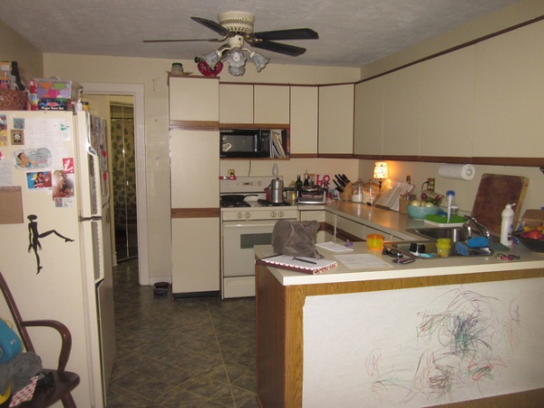
BEFORE: Plastic laminate cabinets and linoleum floors left over from the 1980s previously defined the kitchen. “It was a relic left over from whatever was done 30 years ago,” Fisher says.
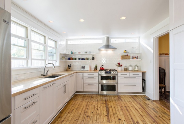
AFTER: Ripping up the flooring, the team discovered a subfloor with lots of character that they decided to put a clear coat on and keep. The couple was “excited about the cost savings of not having to add in new flooring too,” Fisher says.
A 24-inch-deep refrigerator to the left sits flush with the countertops.
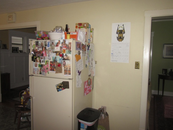
BEFORE: The previous refrigerator floated between the openings to the dining room on the left and the den on the right.
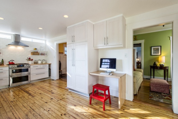
AFTER: A large pantry replaced the refrigerator, and Fisher designed a small desk from the leftover countertops for a computer and message station.
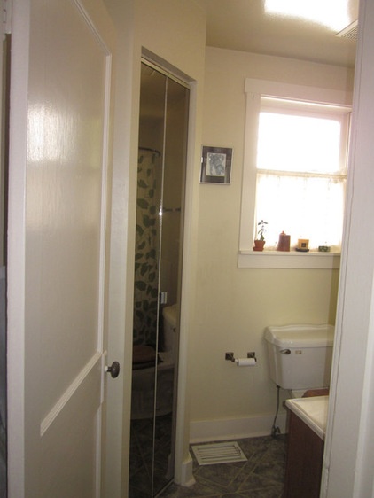
BEFORE: In the bathroom just off the kitchen, the sink and toilet were previously right across from each other, which meant you would bump your knees on the vanity if you sat down on the toilet. There was also a weird mirrored bifold door at a 45-degree angle that concealed a broom closet.
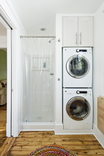
AFTER: Fisher completely redesigned the space. Since they were gutting the rooms, moving the plumbing around wasn’t a problem. To keep the two windows, Fisher put the tall, vertical pieces — the shower and stacked appliances — on the short interior wall, replacing the broom closet. Then she moved the doorway over a few feet and even had to get crafty with the structure too. Inside the wall behind the shower and appliances, she turned the studs sideways to create a flat-frame construction to fit everything in. There were “some gymnastics that had to happen,” she says.
A fold-up table from Ikea attached to the wall on the right creates a folding station when needed.
Washer, dryer: GE; shower: Sterling
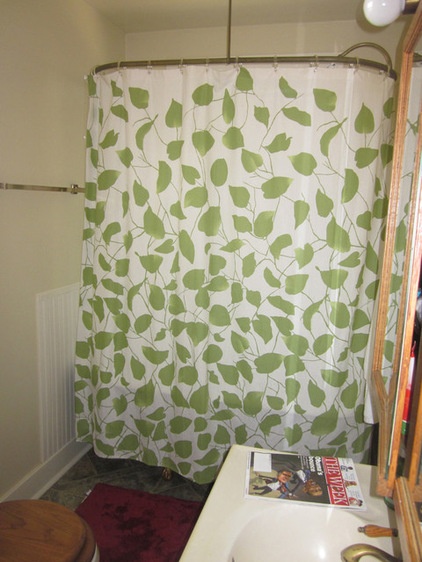
BEFORE: A pedestal tub sat at the far wall in front of a window, blocking all the natural light from it.
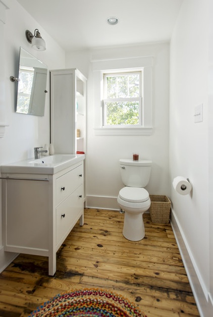
AFTER: Fisher wanted to put the vanity and sink in a place that had enough wall space for a mirror, so that determined that the toilet would go where the tub once was.
Vanity, mirror, sink, cabinet: Ikea
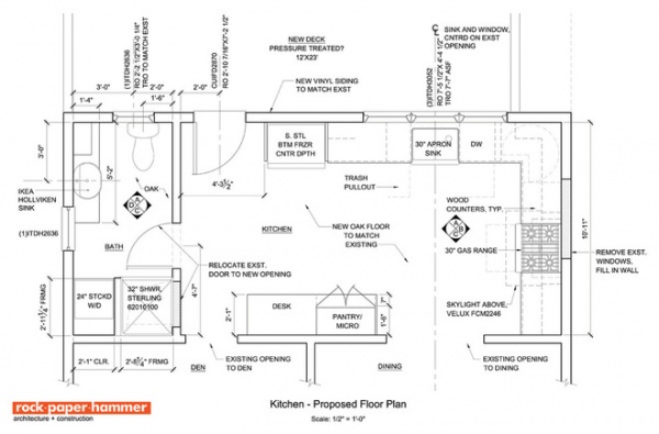
The floor plan shows the new kitchen’s workflow on the right and the better circulation path between the bathroom on the left, the den opening and the new door to the backyard. “Had we not hired a professional architect, yes, we would have had a new kitchen,” Sara says, “but not at all the daily satisfaction.”
Fisher says the cost of this project came out to $50,000 to $60,000 for the kitchen and bathroom projects combined. That figure includes:
Demolition of existing structureRough framing for new walls, doors and windows in the kitchen and bath Relocation of plumbing and electrical for new layoutSpray-foam insulation for walls and ceilingIkea cabinets and countertopsAppliancesPlumbing fixturesLighting layout and recessed fixturesGlass exterior French doorWindowsFull-height tile backsplashCarpentry for floating shelves etc.
More: The Most Popular Kitchen Storage Ideas of 2014


