Kitchen of the Week: A Small Galley With Maximum Style and Efficiency
http://decor-ideas.org 12/19/2014 22:13 Decor Ideas
When architect Stephanie Horowitz and her husband, Alex, moved into a new condo in Boston, they were expecting their first child. They wanted to make some changes in a hurry to ensure that the home was healthy and functional for their growing family. They used VOC-free paints and floor finishes throughout and did a gut renovation of the galley kitchen. Used to a tight urban kitchen, the couple had clear ideas for how to make the small space practical and efficient for the way they live. Aesthetically, they wanted it to be pleasing to view from the adjoining living space. A large peninsula creates a smooth transition between the rooms.
Photos by Eric Roth Photography
Kitchen at a Glance
Who lives here: A young family of 3
Location: Boston
Size: 10 feet by 10 feet; 100 square feet (9 square meters)
Architect: Stephanie Horowitz
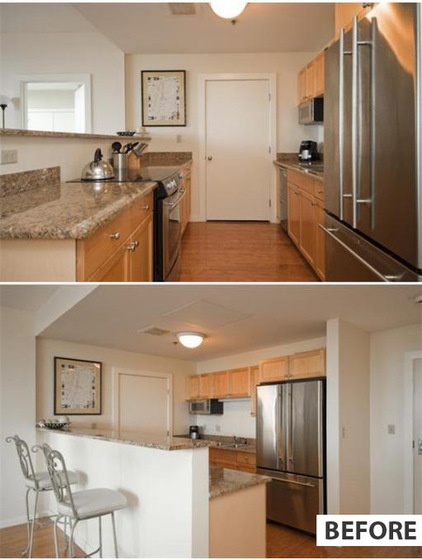
BEFORE: An awkward half wall with a counter too small to be practical for dining and a big door to a laundry room–pantry at the end of the galley were clunking up the flow.
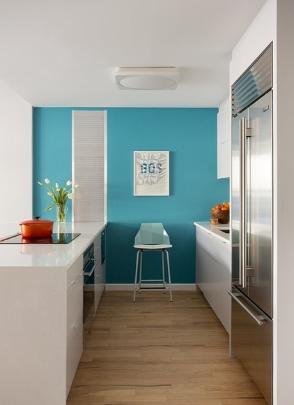
AFTER: One of the first things they did in the kitchen was to relocate the door that led to the laundry room–pantry area. “Having a large door in the kitchen disrupted the flow and access,” says Horowitz, of ZeroEnergy Design. “Plus, laundry and food storage are a bad mix, as a laundry room is often a humid space.” The laundry room is now accessible via the newly renovated master bathroom.
Now, more efficient cabinetry — including deeper cabinets, upper cabinets that extend to the ceiling (Horowitz estimates they doubled the upper-cabinet storage space with this one simple move) and a new appliance garage — provide plenty of space for storing all of their food, china, glassware, small appliances, cookware and cookbooks.
Note that the appliances are flush with the cabinets. It’s an important subtle detail that makes everything pleasingly streamlined.
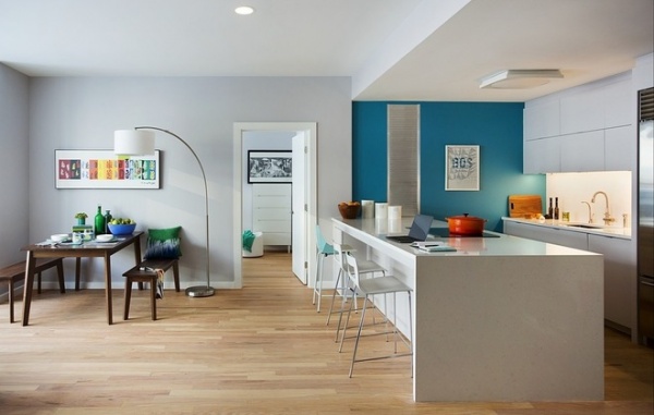
In addition to making the kitchen efficient and functional, they also wanted visual continuity between it and the open dining-living space. Integrating it into the larger open space meant paying meticulous attention to creating clean lines, cabinetry and a backsplash that fade into the background, with no eyesores.
Horowitz replaced the half wall with a hardworking wide peninsula. The peninsula’s waterfall counter defines the kitchen space while creating an easy continuous look between the kitchen and living area. A pop of bright blue on one wall delineates the kitchen in a playful way.
The far side of the peninsula has enough room for stools for this family of three, and incorporates a liquor cabinet to the left side, complete with room for glassware. The wide peninsula is also a great work surface. “That laptop sitting there is not staged for photography; I often work here at night,” Horowitz says. “The setup works very well for us — one of us can be cooking while the other one is eating or tending to our son.”
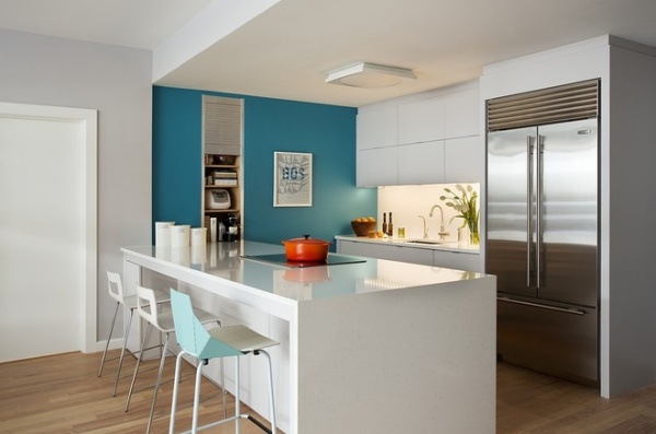
As an architect, Horowitz was not afraid to use her own home as a design laboratory. “Using the same material on the countertop and backsplash [Organic White Caesarstone] was something we had not tried before,” she says. “It creates one continuous surface that’s easy to clean and simple.” She tucked a plug mold for the electrical outlets underneath the upper cabinets rather than interrupting the backsplash. Undercabinet LEDs add functional lighting and ambience.
Because she knew her “clients” so well, she was able to accommodate their lifestyle down to the smallest details. For example, she and her husband use the blender on a daily basis for pureeing food for their son and making juices and smoothies; in their former apartment the upper cabinets hung too low to accommodate it. She set the upper cabinets high enough to accommodate the blender underneath, so that they can leave it out but somewhat tucked away.
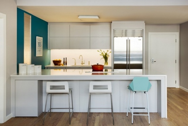
They wanted the kitchen to be something they enjoyed viewing from their dining and living spaces. Painting the cabinets the same color as the walls ties it into the greater space visually, as do the white backsplash and countertops. Not wanting a vent hood to clutter up the view, she opted for a pop-up downdraft vent instead, which hides beneath the counter’s surface when not in use.
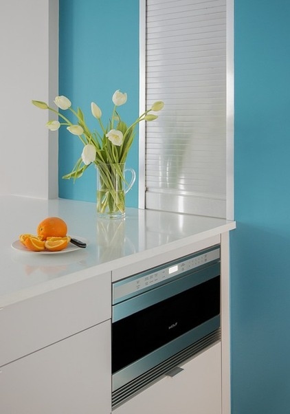
Another potential eyesore was the microwave, which the family doesn’t use very often. Horowitz tucked in a microwave drawer to keep it hidden. Above it is a deep appliance garage.
Sometimes in an open plan like this, it’s hard to know where the paint should change colors. Here an existing jut-out provided the perfect stopping point for the blue accent wall.
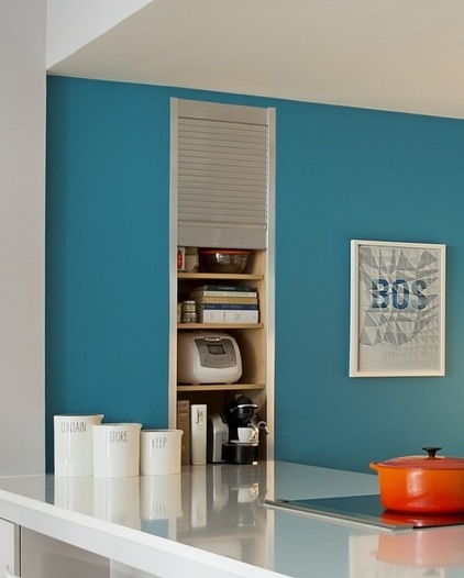
The appliance garage stores a rice cooker, an espresso maker, cookbooks and other small appliances. This keeps the countertops uncluttered and maintains the neat look from the living room.
A month after they moved into their redesigned space, the couple welcomed their son to the family. “We see ourselves living here for a long time; it was worth the investment to make it healthy, make it our own and make it right,” Horowitz says.
See more Kitchens of the Week
Related Articles Recommended


