Houzz Tour: Much to Like About This Traditional Beauty
Interior designer Jules Duffy had a running start when it came to decorating this northern New Jersey home. “This is such a beautiful home,” she says. “The proportions of the rooms are absolutely perfect.” Not only that, but the previous owners had recently finished an extensive renovation that was so good, she didn’t need to change a piece of molding, a cabinet or even any of the wallpaper they had chosen.
When it came to understanding her clients’ lifestyle, Duffy also had a big head start, having already decorated their previous primary residence as well as their beach home. Because they were leaving both behind with their move to this residence, she had an extensive mix of familiar inventory to pull from. She cataloged every piece to figure out which ones they could repurpose here and see which new pieces they would need. The result is a beautiful and comfortable home that’s new to them yet comfortingly familiar.
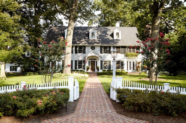
Photos by Laura Moss
Houzz at a Glance
Who lives here: A married couple and their 2 teenagers
Location: Northern New Jersey
Size: 6 bedrooms, 4½ bathrooms
The home has beautiful colonial revival architecture. “The former homeowner had impeccable taste,” Duffy says. “There wasn’t one wallpaper we got rid of.” While they kept the wallpapers, she created custom glazed, textured walls in some of the rooms. The key was to give a lot of the existing pieces a makeover to fit in here, and accentuate them with new pieces to round out the design.
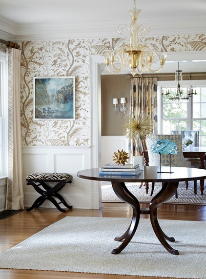
The birds on the wallpaper here have very tiny splashes of blue, which Duffy picked up on with the artwork. This is a preview — touches of blue in different shades create cohesiveness through the house. The sculpture is sludge glass from the Ball Glass Company. A local metal artist created the stand for it.
Duffy repurposed the drapes that were left behind in the dining room in here. The table was handmade by Glendale Architectural Wood Products, a woodworking shop in New York. A handblown Murano glass chandelier and a dash of zebra introduce visitors to the new homeowners’ style as soon as they walk in the door.
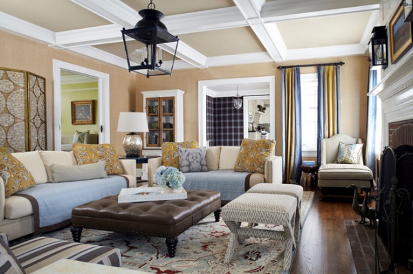
The main goal in the family room was to keep it light and add lots of comfortable seating. One of the homeowners fell in love with the embroidered fabric seen on the large throw pillows when Duffy presented it to her, and it wound up inspiring the color scheme for the entire room. Duffy custom designed almost all of the upholstered pieces.
Tip: Change up your sofas with blankets. The linen blankets across the sofas keep them from getting soiled and add a comfortable equestrian-style-inspired touch. The spring and summer side of the blankets is light blue, while the other side is a darker gray-blue. This allows the homeowners to darken the color scheme a smidge in fall and winter.
The new lantern’s large scale makes a big impact and lends a casual feel, as do the new sconces over the mantel and the large leather ottoman. The shell-encrusted table lamp adds some sparkle. The rug was a hand-me-down from one of the homeowner’s sisters. “I loved that the colors in the rug complemented the room without matching everything,” Duffy says.
Lanterns, sconces: Vaughn; screen: Oly; ottoman: Jules Duffy Designs
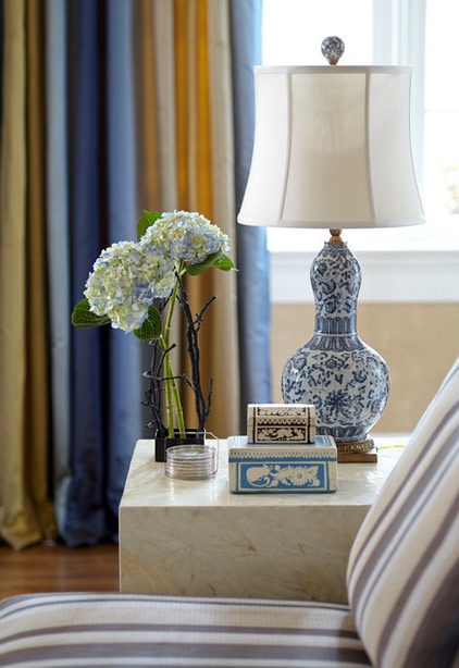
Just out of frame on the left side of the previous photo are two slipper chairs with a console table and a TV behind them; this is one of the slipper chairs. Touches of blue are seen in key accessories like the lamp and the handmade paper box.
Cube table, slipper chairs, lamp: via Jules Duffy Designs
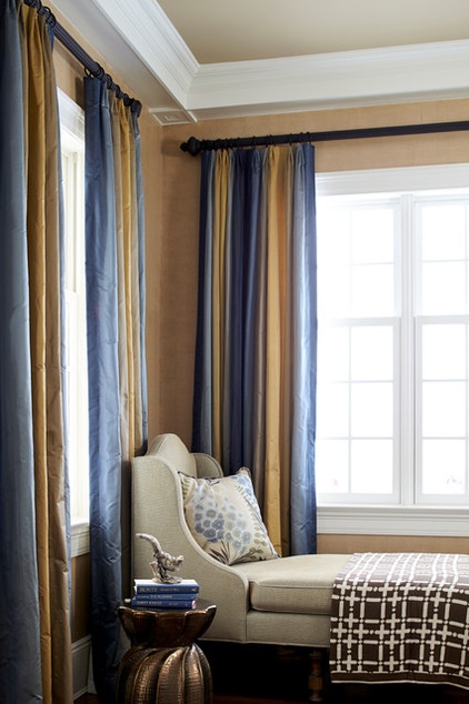
The window treatments are ombré, in shades of gold and blue. The chaise provides a comfortable spot in the corner for reading or looking out at the beautiful backyard. A bronze porcelain stool serves as a side table and adds more shine to the room.
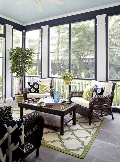
Through some French doors off the family room is a screened-in porch with a slate floor. “Out here we really wanted to accentuate the columns,” Duffy says. She painted the walls navy blue and the columns white to make them pop. New ivory upholstery on the couple’s existing rattan furniture and the colorful new outdoor pillows and rug add pops of more navy and bright green.
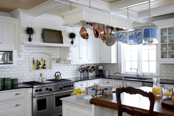
The kitchen was already dreamy, with its walnut-topped island, black granite counters and beautiful cabinetry. Duffy just added a few key details to tie in the homeowners’ beloved transferware collection from the beach house. In this shot we see the new valance and light fixtures with silk shantung shades.
One element the designer can’t take credit for but loves is the way the island drops down 6 inches to baking level. The marble-topped area is perfect for rolling out dough and making cookies.
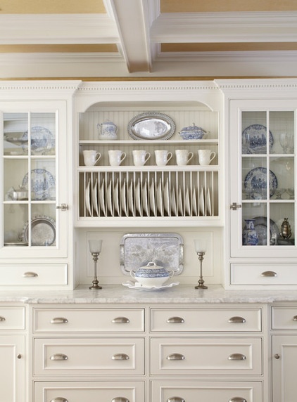
The existing glass-front cabinets gave Duffy a great opportunity to show off the transferware collection.
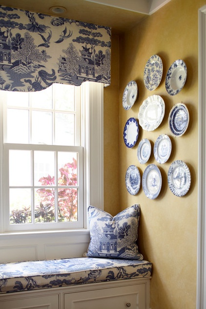
She hung another portion of the collection on the wall. “They don’t have to be the same pattern or shapes,” she says. “I just lay them all out on the floor and play with the arrangement before I install it.” A new window seat cushion, pillow and valance complement the collection.
DIY: The Secret to Hanging a Plate Collection
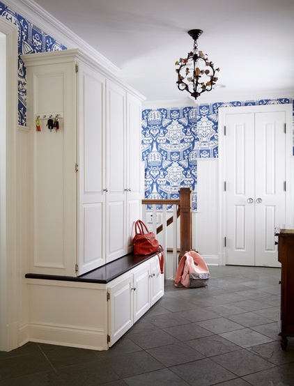
This is the back entry; the built-ins and wallpaper were existing.
Tip: Consider concealed storage in a mudroom or entry area. “It’s really nice to have closed storage in this type of room,” Duffy says. “All of the organization is hidden, and it looks much cleaner.” The one touch she did bring in was a beautiful light fixture from the beach house. It is wrought iron with hand-painted porcelain flowers.
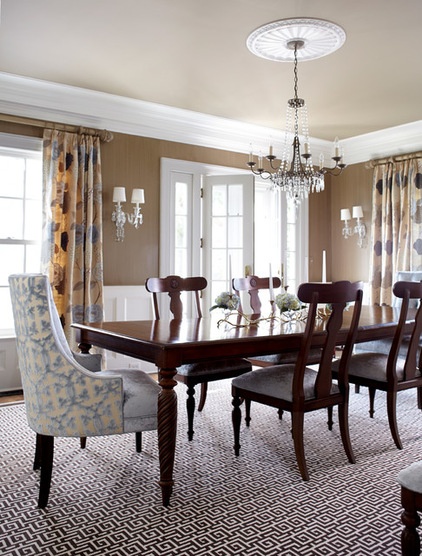
In the dining room, she and the clients were happy to use the former owner’s chocolate and ivory Greek key rug. Her clients brought over the chandelier, dining room table and side chairs from their former home, while Duffy added new drapes, sconces and host and hostess chairs to the mix. She also had the walls painted in another special textured glaze.
The hand-embroidered drapes are silk and velvet and add softness, as do the velvet end chairs. They are cut velvet on the back and textured velvet on the inside.
Fabric: Scalamandré (outside chair backs); Osbourne and Little (inside and seats)
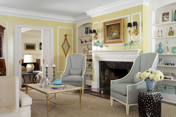
The living room has another custom wall treatment, this time in textured, glazed chartreuse. Duffy added aqua accents in the accessories to complement the wall color.
Two large chairs upholstered in a blue woven fabric are a modern take on the wingback. “I love these chairs, because they are a clever take on a classical design and high backs are so architectural,” she says. “The curved tops also complement the curves on the top of the built-ins.”
The coffee table has a shell marquetry top and very delicate legs and stretchers. The antiqued bronze candlesticks add a darker patina. Also adding some dark contrast is a side table made of resin embedded with mother-of-pearl dots that sparkle. The mirror and the secretary desk came from her clients’ former home.
Side table: Twilight, Oly
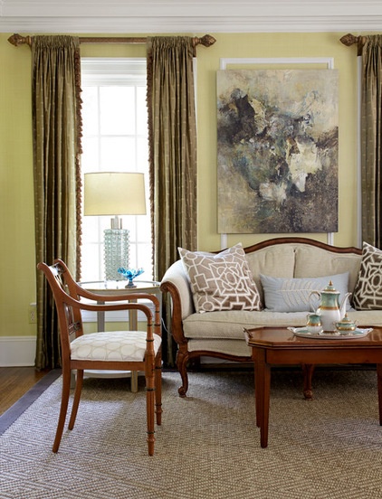
More of their existing pieces are seen here on the other side of the room — the sofa, chairs and coffee table. Duffy gave them a facelift with new fabric.
“I wanted to incorporate really modern art with traditional furniture,” the designer says. “I also love the way it doesn’t fit within the moldings — it’s important to break a few rules.”
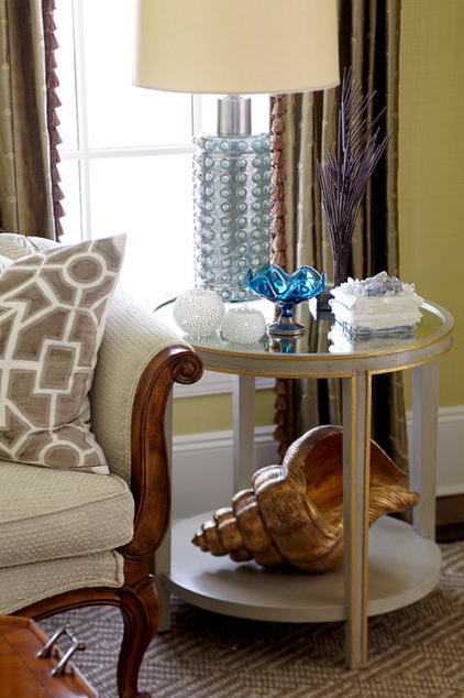
She mixed in a new pair of mirror-topped end tables and handblown glass lamps. The tables have a chalk finish. The mix of accessories includes an antique blue glass compote, crystal boxes and a giant shell that adds some heft and shimmer.
The window treatments were already here and worked well. “There’s no reason to add to the budget when something like this is working,” Duffy says.
End tables, shell: Oly
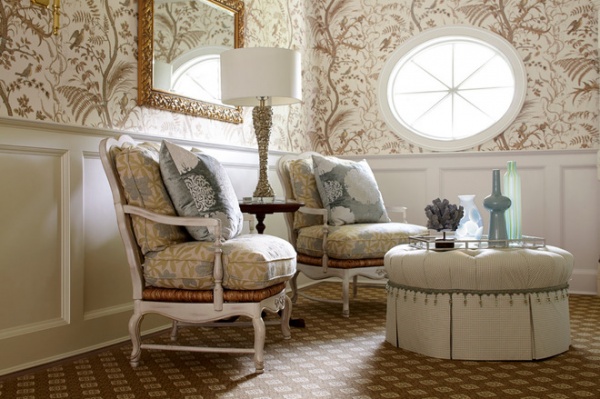
In the upstairs hallway, Duffy created a sitting area from furniture repurposed from the beach house, freshened up with big new pillows. The curvaceous pieces complement the architecture of the oculus. The mirror came from the couple’s primary residence.
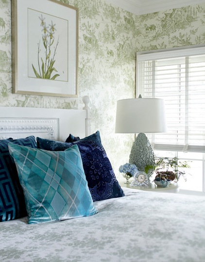
The soft green toile wallpaper in the bedroom worked perfectly with this duvet cover from the beach house. “I added the deep cobalts and aquas to balance out all that soft green,” the designer says.
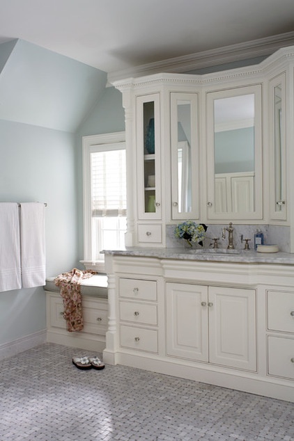
The master bedroom wasn’t really touched during these renovations, but it’s worth showing it for the way the cabinet doors emulate a bay. “The angled cabinets are softer than typical cabinets,” Duffy describes. And because all three cabinet doors are mirrored, one can open them partway to check out the back of a hairdo.
Browse more homes by style:
Small Homes | Colorful Homes | Eclectic Homes | Modern Homes | Contemporary Homes | Midcentury Homes | Ranch Homes | Traditional Homes | Barn Homes | Townhouses | Apartments | Lofts | Vacation Homes


