A ‘Brady Bunch’ Kitchen Overhaul for Less Than $25,000
Kate and Patrick McComb once called it the Brady Bunch house. That’s because when they first moved into their Connecticut home, the place seemed stuck in a time capsule buried in the 1960s, when the house was built. Dated wallpaper adorned every wall; carpet and linoleum prevailed underfoot; and avocado-colored appliances and orangey cabinetry in the kitchen set up the color theme for the rest of the house.
Recently the couple got started on updates, first tackling the kitchen. To keep costs down, and because they didn’t need to move any plumbing, they went through their local Home Depot for the whole project, picking out their own cabinets and appliances and working with the company’s in-house designers to semicustomize. They added glass fronts to some cabinets and pullout spice racks to others, and even worked in a double oven — this time in stainless steel.
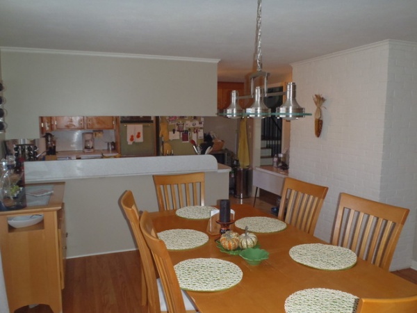
BEFORE: In the view from the dining area, it was difficult to tell there was a kitchen back there, due to full upper cabinets over a peninsula range with a raised divider.
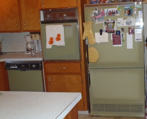
BEFORE: Meanwhile, the avocado-green appliances and orange cabinets were left over from a bygone era.
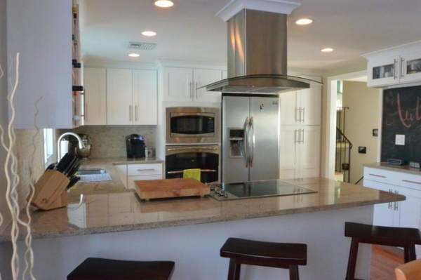
AFTER: To begin planning, Kate created a Houzz ideabook with photos of kitchens that she liked and used that to guide her decisions. The McCombs then gutted the entire kitchen, updating the electrical and insulation and adding all-new appliances and cabinetry.
They kept pretty much the same layout, feeling that it was already functional enough, with a good work triangle. They removed all the upper cabinets over the peninsula and got rid of the raised ledge. They kept the range where it was, because the range hood vents directly out through the roof and they didn’t want to lose that open ventilation. “Plus, it’s like you’re on a cooking show,” Kate says, adding that they were also able to create seating on the opposite side where she and Patrick eat most of their meals together.
To make up for lost storage, they added a pantry to the right of the fridge, where nothing was before.
For appliances they got everything new, saving money by snatching up discounted floor models when possible.
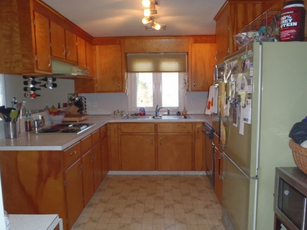
BEFORE: The awkward location of the dishwasher — seen here to the right of the sink — meant that the door opened toward the legs of whoever was doing dishes.
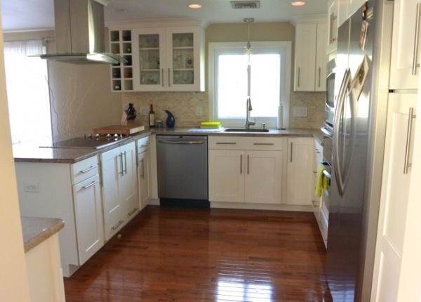
AFTER: They located the new dishwasher in a better position, to the left of the sink, and replaced the linoleum floors with hardwood. They chose white cabinets to make the most of the small amount of light coming through the one window, and then semicustomized them to include glass fronts and a wine rack. The countertops are granite.
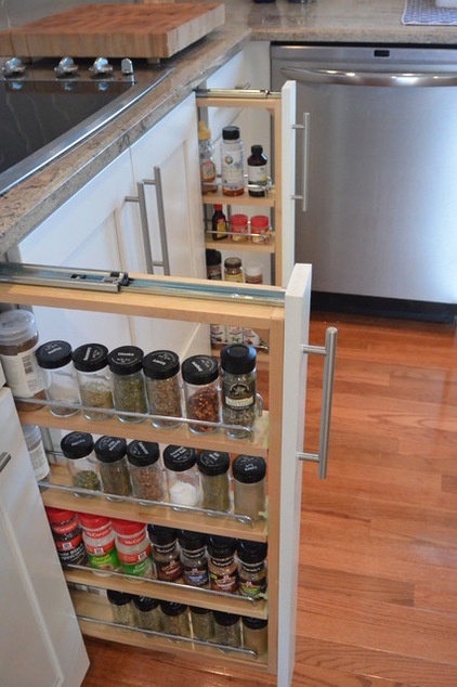
They were also able to customize pullout spice racks flanking the cooking range.
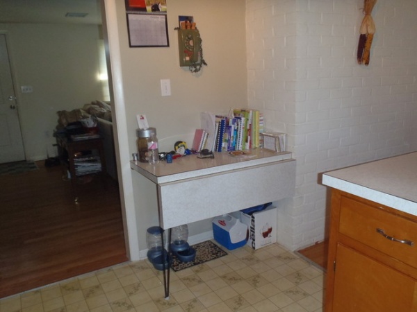
BEFORE: The old phone on the wall gives a clue to the time period the house was stuck in. The McCombs weren’t exactly sure what to do with the built-in mail table that had a pop-out top. “You couldn’t sit there,” Kate says. “Or you wouldn’t want to anyway. It didn’t make sense. But we did like the idea of a cabinet there.”
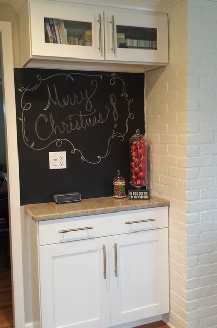
AFTER: So they turned the corner into usable space that was less invasive, storing cookbooks and including a message center there. Kate painted the back wall in chalkboard paint.
The McCombs went into the project looking to spend around $20,000 and ended up spending about $24,000.
Here’s the breakdown:
Labor: $10,000. The McCombs had to spend a bit more in this category than they expected to update all the outdated electrical systems.
Appliances and countertops: About $5,000. They saved in this category by purchasing floor models so that they could splurge on better cabinets.
Cabinets: Around $9,000
General contractor: MLC Associates
Browse more ideabooks about kitchen design


