Kitchen of the Week: New Function, Flow — and Love — in Milwaukee
Katy Nast and son Andrew didn’t like being in their kitchen. The closed-off room cut them off from guests in the dining room, and Katy felt distanced from her son when he was doing his homework in another room. Plus, the kitchen’s mustard-yellow countertops and worn-out cabinets lacked appeal. “It just wasn’t functional, and I love to cook,” Katy says.
To create a better connection between their kitchen and the rest of their two-story 1929 bungalow home in Milwaukee, they tapped designer and cabinet dealer Gwen Adair for help. Adair updated the layout with a new opening to the adjacent dining room and a back hall landing area that acts as a buffer between the kitchen and the outdoors. New gray cabinetry, light gray walls, a white subway tile backsplash, updated appliances and an attractive farmhouse sink also turned the kitchen into a room worth spending time in.
And that wasn’t the only positive outcome. Katy met carpenter Bob Picciolo during the remodel, and they’ve since married and are expecting a child.
Kitchen at a Glance
Location: Whitefish Bay neighborhood of Milwaukee
Who lives here: Katy and Bob Picciolo and son Andrew
Size: About 200 square feet (19 square meters)
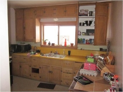
BEFORE: The enclosed kitchen, its color and material schemes, and the lack of a dishwasher frustrated Katy. “It was time to upgrade,” she says.
“After” photos by Erol Reyal
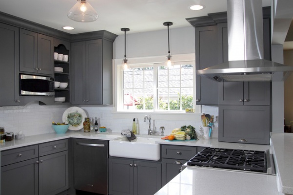
AFTER: In the new layout, Adair moved the range, previously located to the left of the sink, to the other side of the kitchen, where she created the new opening to the dining room. That way whoever is cooking can still see and interact with guests.
Antique pewter knobs and pulls add an elegant touch to the kitchen’s new gray painted maple cabinets. “I’m glad [Katy] was bold enough to choose such a deeper tone of gray, because it’s such a statement,” says Adair. The white subway tile backsplash with a textured finish contrasts the gray cabinets.
Katy found a number of the products used for this renovation herself, including the retro-style pendants that hang over the sink.
Maple cabinetry: Homestead Panel in Storm Gray, Dura Supreme; cabinetry hardware: Berenson; pendant lights: BBC Lighting; subway tiles: The Tile Shop
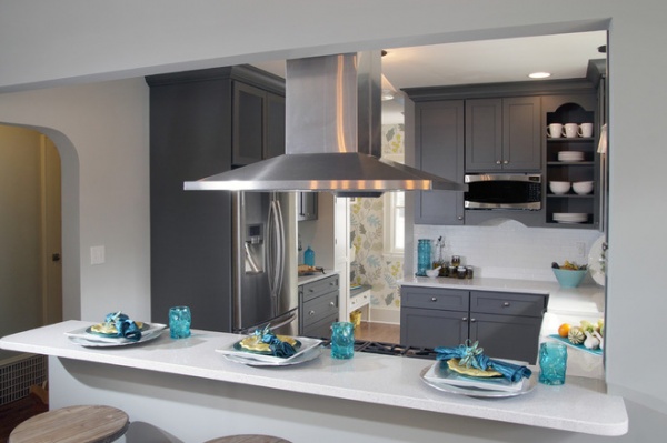
The new opening also allowed room for a bar with stools. “My son uses it every day to eat his breakfast and do his homework at night,” says Katy. “It’s also where everybody sits when they come over.”
Adair says the counter was raised to provide protection when the range is being used. The bar features the same white flecked quartz counters seen elsewhere in the kitchen.
Vent hood: peninsula style, Zephyr; perimeter counters: Caesarstone; refrigerator: Samsung; wall paint: Light French Gray; ceiling and trim paint: Antique White, both by Sherwin-Williams
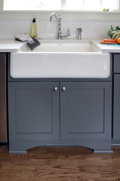
The new apron sink and furniture-style cabinet create a prominent focal point, while the new oak floor with a medium brown stain helps the kitchen blend in with the rest of the home.
Sink: Kohler
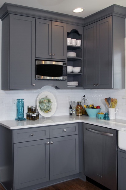
The open cabinet keeps plates, bowls and cups within easy reach and allows the surrounding cabinets to be uniform in size.
Dishwasher: KitchenAid; microwave: Profile series, GE
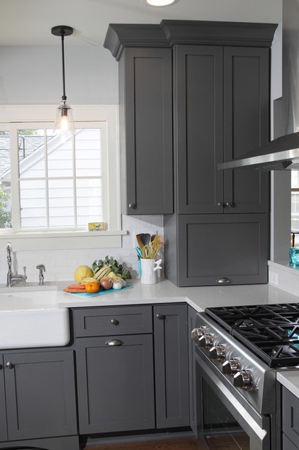
Smart storage solutions help the family stay organized. For example, a 24-inch-wide appliance garage with a lift-up door on the counter to the right stores a coffeemaker and toaster. A bottom-corner lazy Susan for dry and canned goods is just below, and a long pullout spice rack sits to the left of the range.
Range: Dacor
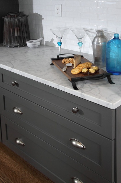
A buffet counter sits at a lower height (33 inches) than the rest of the counters and has a marble top that gives it an offset look. “I love to bake, and use that marble counter to roll out bread doughs,” says Katy.
Long and wide drawers below provide storage for casserole and baking dishes.
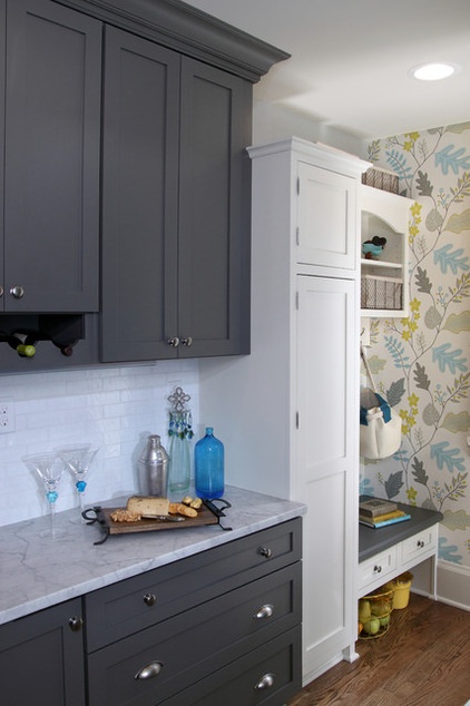
An open shelf with wine bottle slots hangs above the buffet. The closed cabinet just to the right contains a message center with cubbies and an outlet for charging phones.
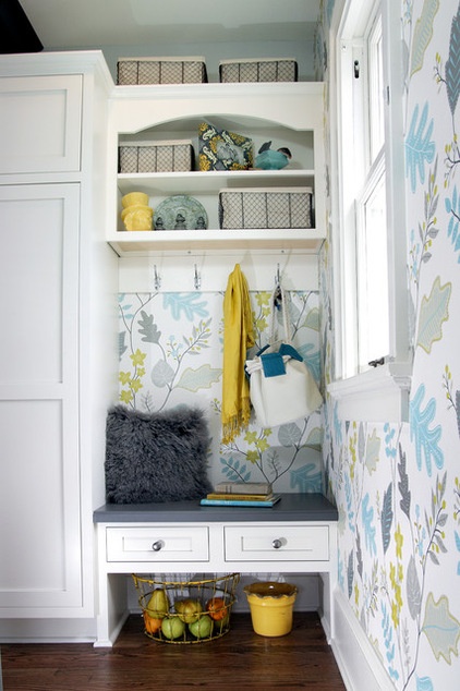
Removing a wall that separated the kitchen from a back hall staircase improved traffic flow and allowed space for a landing area. “It almost felt like a different house,” says Katy. “In many of these bungalows, they were converted into duplexes, and now that back area feels part of the kitchen.”
The white cabinets have inset doors and polished chrome decorative exposed pin hinges that nod to the classic style of the home’s original kitchen. The wall covering picks up the new kitchen’s gray tones but also includes teal blue and yellow that add punches of color to the space.
A painted gray maple bench gives the family a place for changing shoes. Hooks for coats, open shelves with baskets for seasonal items like sunglasses, and drawers below for gloves and keys help control clutter.
Wall covering: Wallpaper Wallpaper
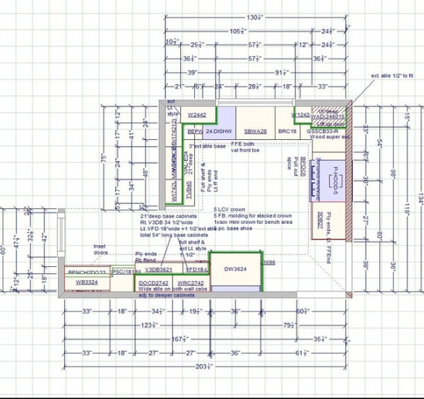
As this floor plan shows, the updated kitchen has a layout that works for preparing daily meals and entertaining. “For everyday living it’s great to have everyone connected,” Katy says. “And since I love to cook, this gives me the dream kitchen I wanted.”
See more Kitchens of the Week
Designer: Gwen Adair, Cabinet Supreme by Adair
Builder: Advantage Carpentry & Remodeling


