Houzz Tour: A Vintage Home Wrapped Up in a Box
http://decor-ideas.org 12/12/2014 07:13 Decor Ideas
Chris Maher and Charlotte Kennedy run their architecture and interior design practice, Studio 53, from home and, with three children all heading into their teens, decided to extend and renovate their newly purchased but run-down worker’s cottage in a suburb of Perth, Australia, before they moved in. “The house had been untouched for 90 years and was in desperate need of TLC,” Kennedy says.
The Arts and Crafts home sits on a relatively small lot — 5,242 square feet (487 square meters) — so the options for adding more space were limited. Kennedy says she and her husband also wanted to respect and enhance the existing craftsmanship. The answer? A big yellow box.
Houzz at a Glance
Who lives here: Designers Chris Maher and Charlotte Kennedy with their children, Ruby (age 14), Rafferty (12) and Tess (9)
Location: Subiaco, Perth, Western Australia
Size: 4 bedrooms, 2 bathrooms, 2 powder rooms
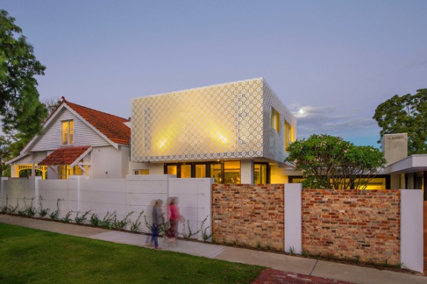
What used to be a traditional, fairly unremarkable home as seen from the street is now an eye-catching wonder that draws attention from passersby.
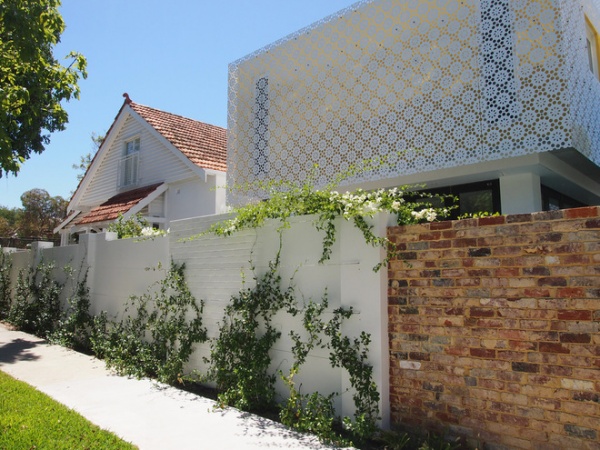
The upper-level addition stands out from the existing house by taking the form of a pure yellow box, placed on top of the ground floor behind the gable form of the existing home. The box is wrapped in a perforated screen to shade and protect it from the sun.
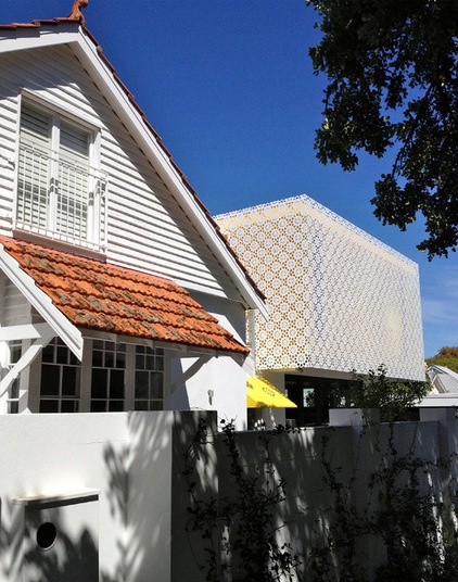
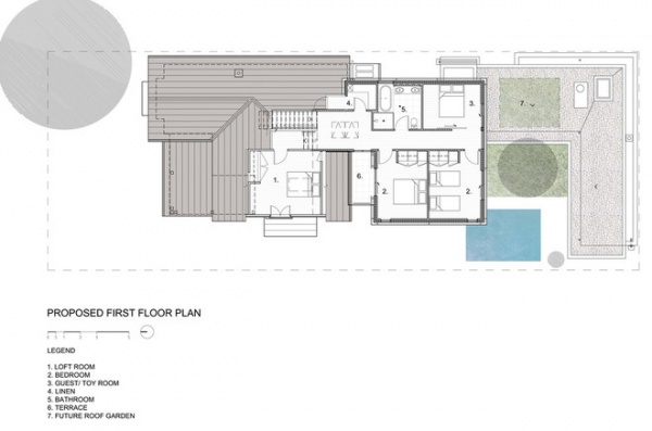
Internally, the box is its own zone, housing the children’s bedrooms, a guest room and a bathroom. Externally, the box defines the character of the addition, highlighting the change from existing house to contemporary home in a sympathetic but contrasting manner. Kennedy says the biggest challenge of the project was working creatively within the strict policies of the local council.
The original tin awning on the front of the existing house was resurrected with a coat of yellow paint to match the box.
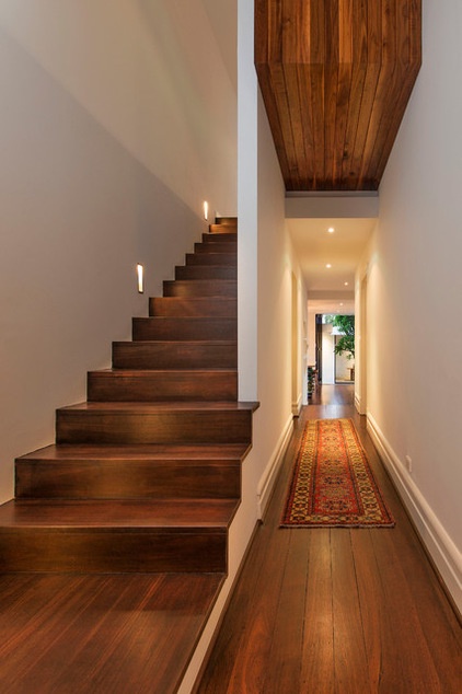
In response to the original home’s humble Arts and Crafts heritage, Kennedy and Maher chose materials for their honesty and integrity.
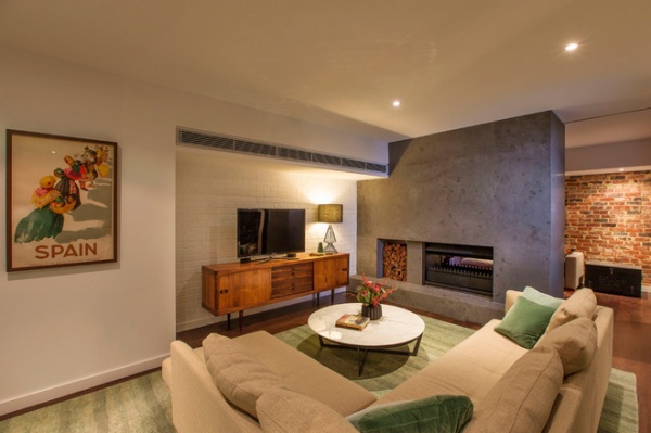
Painted white brick walls, concrete, wood floors, gray terrazzo and recycled brick all contribute texture and warmth to the interiors.
Couch: Walter Knoll modular, Living Edge; sideboard: Klein
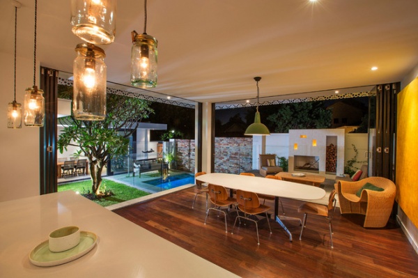
The furniture is a mixture of original midcentury pieces and other pieces and artworks collected on travels, including an Eames dining table and walnut chairs.
Bifold doors open up the kitchen and dining area to the outdoors, dramatically increasing the sense of space. An outdoor fireplace cozies up the space, and a covered dining area by the pool can be used as a garage when needed.
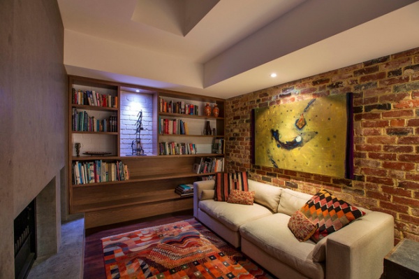
The library is tucked away in the extension, which wraps around the courtyard and pool. While the rest of the house is designed for gathering with family and friends, this room is a sanctuary for time-outs.
“Throughout the design process, we reused and recycled elements of the existing home to create a story of restoration,” Kennedy says. This included recycling bricks, light fittings and even the old laundry trough, which is now a thriving herb garden.
Shelving: Agnes in walnut, SCP
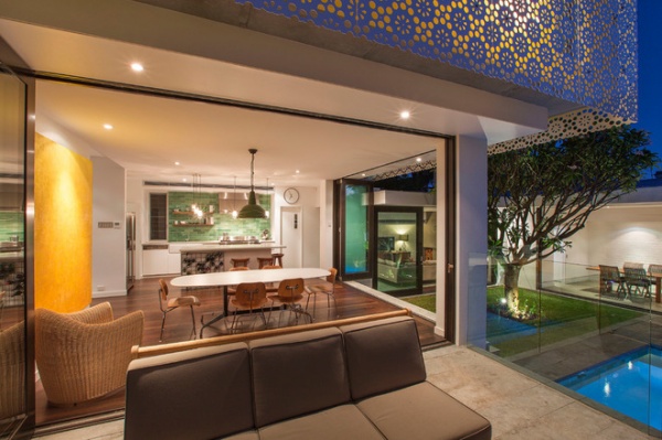
“We are really enjoying our new home; it gives us all separate spaces and also provides us with zones to come together and be a family,” Kennedy says. “It gives us great joy every day.”
The Wolf oven and range hood make a strong impact in an otherwise understated kitchen.
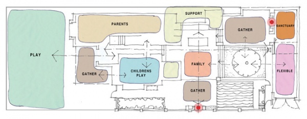
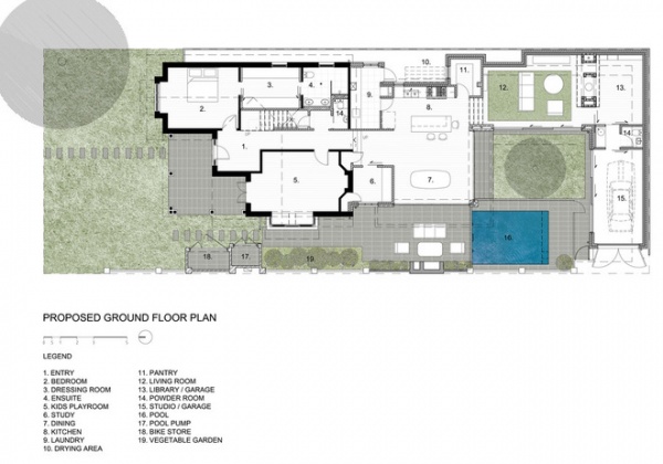
This plan shows the thought that went into creating a variety of areas for togetherness and personal space.
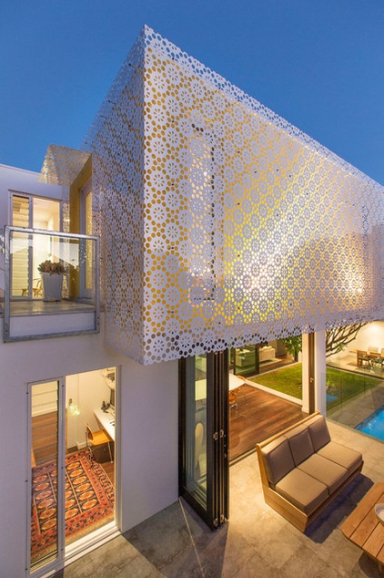
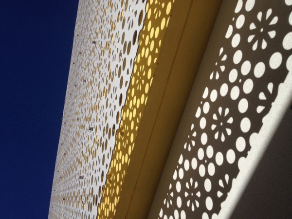
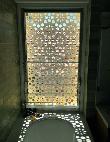
The screen envelops the box on all sides. Inspiration for the pattern came from the floral motif of the original carpet and fireplace tiles. “The screen provides visual richness, shade and protection to openings while offering opportunities for passive surveillance of the street,” Kennedy says.
At night interior lighting illuminates the screen, its glow providing moments of joy for the neighborhood.
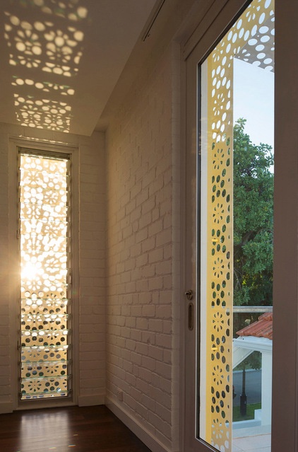
Strategically placed louvered windows catch breezes and provide cross ventilation. The home also incorporates double-glazed skylights in the upper and lower roofs that can be programmed to open and close at different times of the day, allowing the house to breathe naturally.
Double glazing, a light palette and significant cavity and ceiling insulation ensure that the home is cool in summer and warm in winter. The home also conserves energy because it’s separated into living zones rather than having open-plan expanses.
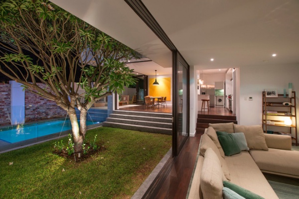
To the rear of the existing home, Kennedy and Maher constructed a ground-floor extension near a landscaped courtyard.
Building to two boundaries and focusing the new ground-floor rooms toward the courtyard helped create and blur the boundaries between indoors and outdoors. “The intent was to provide multiple spaces of differing character to be used at different times of the year — some inside, some outside,” Kennedy says.
The lower-level flat roof overhangs the courtyard windows, protecting them from the summer sun. The flat roofs of the addition also are excellent platforms for gas-boosted solar hot-water systems, photovoltaic cells and a future roof garden.
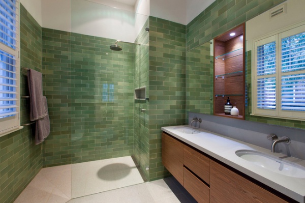
The green tiles used in the kitchen make another appearance in the upstairs bathroom and are in keeping with the midcentury feel of the home.
Sink fixtures: Vola; tiles: Heath Ceramics; sinks: Roger Foster for Duravit, Sea of White
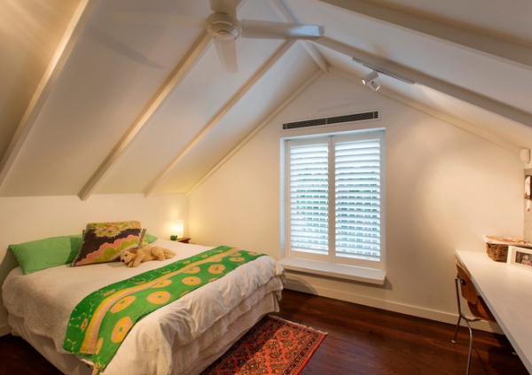
Wood warms up an otherwise neutral palette in the upstairs bedrooms. Each child was allowed to paint each bedroom door in a favorite color.
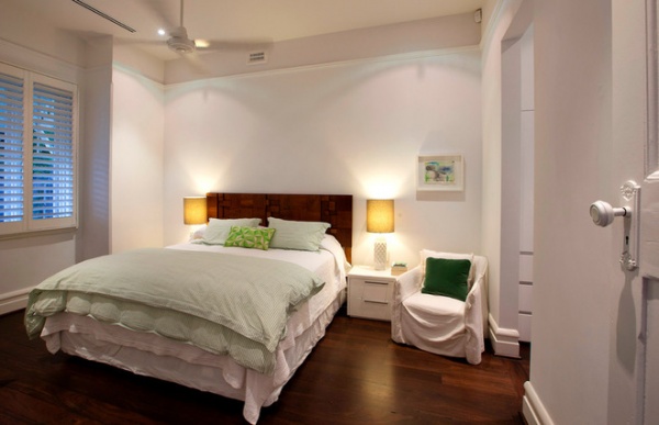
The main bedroom is in the original part of the house and includes an en suite and a dressing room.
Browse more homes by style:
Small Homes | Colorful Homes | Eclectic Homes | Modern Homes | Contemporary Homes | Midcentury Homes | Ranch Homes | Traditional Homes | Barn Homes | Townhouses | Apartments | Lofts | Vacation Homes
Related Articles Recommended


