Best Uses for the Boho Blue Color of 2015
I was meeting with a client the other day for an interior paint color consultation, and at one point we found ourselves sitting on the stairs just outside of her powder room trying to figure out the exact shade of blue she wanted for an accent wall in the room. We couldn’t find the color in the paint fan deck I had with me, but then she suddenly pointed to my ponytail elastic and said, “That’s the blue I want!”
I’d describe it as a bold electric blue that has the teensiest touch of green in it. That very afternoon I saw the announcement of Blue Paisley as PPG Pittsburgh Paints’ Color of the Year for 2015 and realized it was the exact hue my client wanted for her powder room wall. And now I am suddenly seeing this color popping up everywhere, from accent walls to winter clothing to decorative accessories.
One in a series: Keep an eye out for more coverage of companies’ featured colors for 2015.
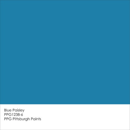
Blue Paisley was chosen for the 2015 Color of the Year by PPG Pittsburgh Paints because of its vibrance and global, bohemian vibe. It’s meant to invoke positivity and possibility — things we tend to crave during chaotic and uncertain times.
Now this is no neutral wisp of a color. It’s an intense blue that is best used in small doses, to call attention to certain interesting areas or features of your home.
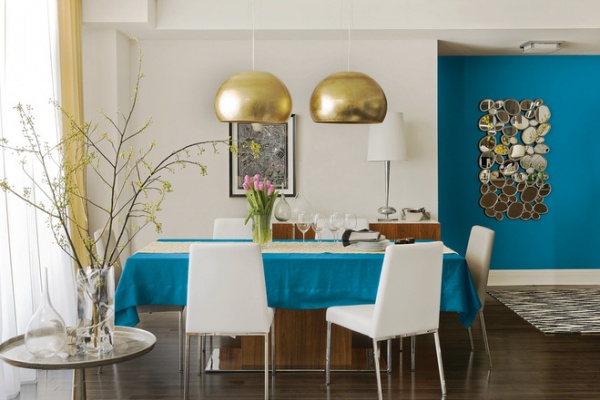
Here’s a great example of how to use the attention-getting hue. The partial accent wall really draws the eye into this dining space. The bright blue also acts as a nice eye-catching background for the shimmering wall art.
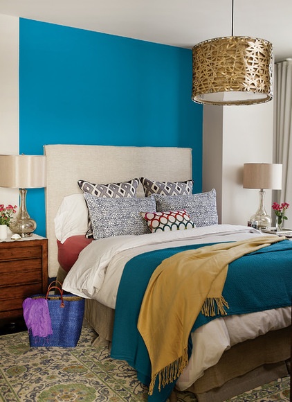
If you love colorful interiors but are nervous about taking the leap in your own home, try limiting the bold color to just one wall. In a bedroom I like making the headboard wall the accent wall. It anchors the bed in the room, and the bed and headboard (and any artwork hanging over the headboard) help break up the block of color a bit, lessening the intensity.
If your bedroom has a low ceiling and doesn’t get much natural light, keep the ceiling and remaining walls light and fairly neutral. This will prevent the color from feeling too heavy and the decor overdone.
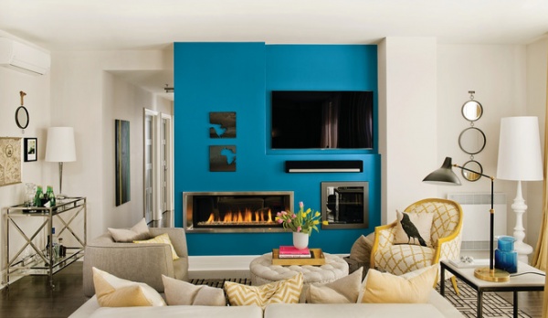
You’ve heard it a hundred times before, but it bears repeating once more: Create a focal point in your living room and then design and decorate around it, in support of it. If you have too many focal points in a space, then they all compete with one another, nothing stands out, and the room can all too easily devolve into a cluttered mess.
An attractive fireplace always makes a great feature in a room, and you can really focus attention on it by painting the surrounding wall in a notice-me color. Blue is a good choice here because blue and orange (the colors of firelight) are complementary colors, meaning opposite each other on the color wheel. When used together they offer maximum contrast: Blues look more intensely blue, and oranges look more orange. A bold blue such as this one will really make your orange-toned wood floors or other wood-clad features stand out and be noticed.
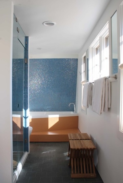
Really love this shade of blue and feel ready to make a commitment? Select a bold blue tile for the backsplash or shower or tub surround in your bathroom. Blues are a good choice in a bathroom because they evoke the sea and the sky and therefore create a calm, relaxed feeling. Of course, this particular blue is a bit more high energy than a sky blue, but it still has a clean and refreshing vibe that’s perfect for the bath.
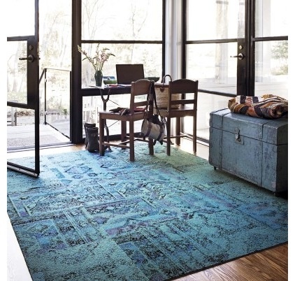
Remembrance Teal Carpet Tiles by FlorA quick and easy way to add fun color to a room is with an area rug. I like using carpet tiles, because you can configure them however you like, creating the exact-size rug you need in whatever color and pattern you desire. And if a spot gets dirty or damaged, it’s easy to pull the tile out and deep clean or replace it. The tiles shown here have a touch of our featured blue color in them and also capture the hip, bohemian look that is so popular right now.
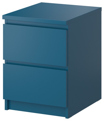
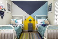
Ikea Malm Chest With 2 Drawers - $49.99This bedside chest in a color similar to Blue Paisley would look great in a kid’s or teen’s room. You could pair it with orange hues for a high-energy, dynamic and youthful look. Or make it more mature and at home in a master bedroom with a toned-down palette of other blues — such as navy or a soft gray-blue — as well as a selection of handsome neutrals.
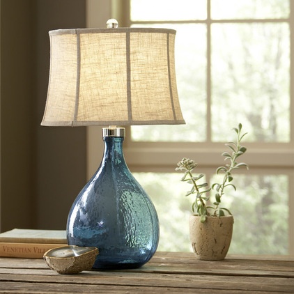
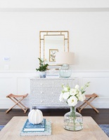
If you find yourself drawn mostly to neutral interiors, well, first of all, congratulations on making it so far into this story! But also consider adding a small bit of color via glass accessories. It’s a much softer way to inject color into a room. This beautiful glass table lamp is reminiscent of sea glass and would work well with any style of decor. Just adjust the lampshade you pair it with to get a traditional, transitional or even contemporary look.
Tell us: Do you think Blue Paisley will be a cool color trend for 2015?

