Houzz Tour: Parisian Flat’s Redo Revolves Around a Terrace View
http://decor-ideas.org 12/08/2014 08:13 Decor Ideas
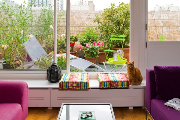
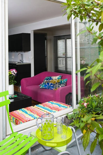
“It was the terrace that made the owner of this apartment fall head over heels for it,” says architect Manuel Sequeira. He was in charge of the radical overhaul of this 753-square-foot flat in the 20th arrondissement (district) of Paris. “It was her number-one criteria before purchase,” he says. But the client, a manager in the information technology sector, couldn’t fully see the potential of the dark and partitioned apartment at first. It was only after talking with Sequeira, who proposed a modular and open space, with plenty of light, that she was able to picture herself there.
Houzz at a Glance
Who lives here: An IT manager
Location: 20th arrondissement of Paris
Size: 753 square feet (70 square meters)
Sequeira and his client decided to redesign the apartment to enable the light from the terrace to reach every corner. This was when the idea of a modular loft with large windows became obvious.
The apartment was built in the ’70s, and the blueprints reflect the era. Numerous walls, all connected by a long corridor, resulted in dark rooms and less living space.
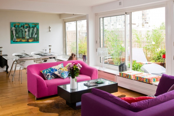
“The layout of the apartment was poor,” says the architect, who took down the inside walls and created a large living-dining room and a spacious bedroom. “The separation between the living room and the terrace then disappeared.”
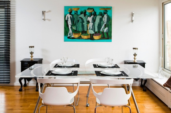
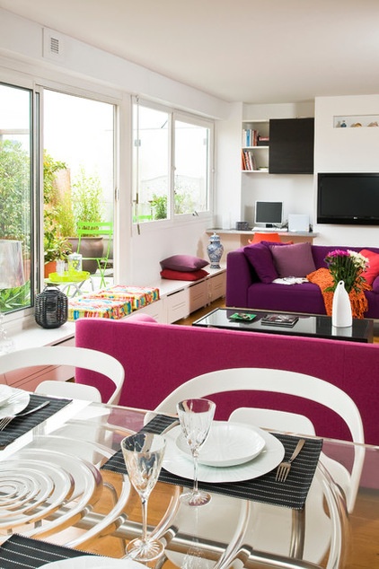
“The owner has a property in Avignon [in southeastern France] and has strong feelings for the region,” Sequeira says. Drawing on this, he knew that bold colors from the Provence region would be key to the project.
They decided to run with the idea of white walls and integrated black furniture. “This sobriety allows the presence of color without overburdening the space,” he says. It also enabled the homeowner to buy this purple sofa, which she had been dreaming of for a while.
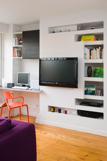
An office corner was created in the former kitchen, and is right next to the terrace. On the wall around the television are multiple little alcoves. “The old technical columns of the former kitchen were restrictive, because we couldn’t alter them,” says the architect, explaining the reason for the alcoves’ presence. “We turned the constraint around and filled the existing gaps with shelves.” A black cupboard was added to echo the kitchen cabinets.
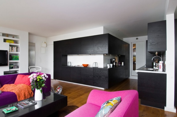
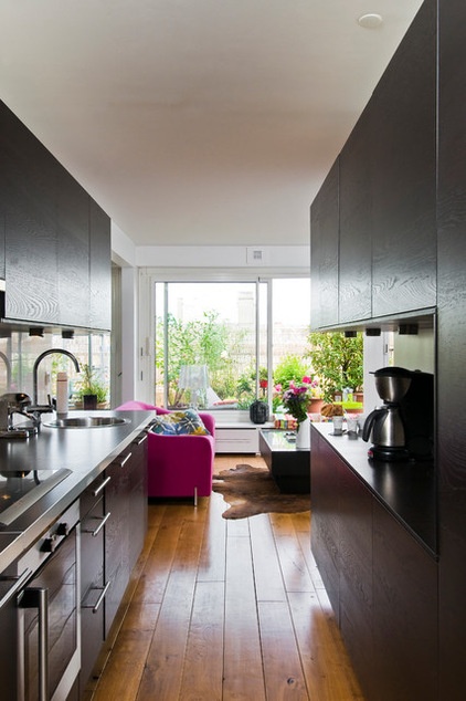
The kitchen is where the dressing room previously was. It has a direct view of the terrace, as every room of the apartment does; this is one of the apartment’s greatest assets. The kitchen is put together with elements from major retailers, showing the architect’s ingenuity.
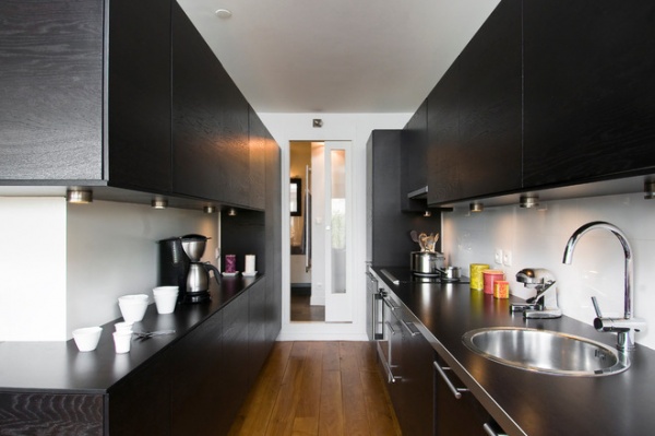
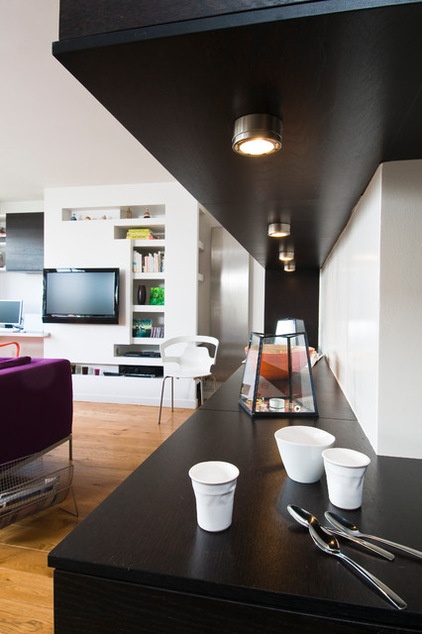
The countertop extends around the wall and can be used as a worktop, buffet or sideboard. It is an essential element of the apartment.
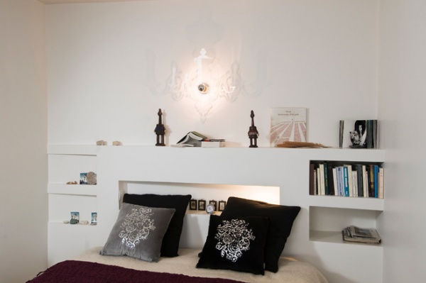
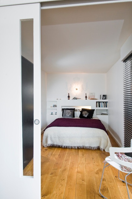
A sliding door separates the bedroom from the rest of the apartment when the owner hosts friends or family, but when alone she loves to have views of the terrace. The same wood was used for the bedroom floor as for everywhere in the apartment: clear solid oak. “An untreated matte varnish preserves the original aspect of the wood,” the architect says.
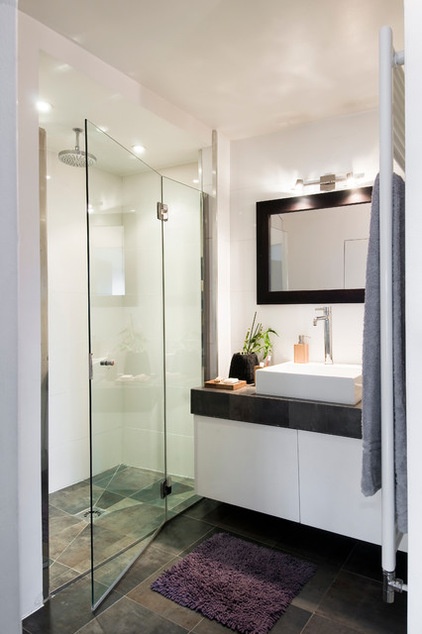
The bathroom was expanded and raised to separate it from the rest of the apartment, and to allow water to drain easily. The monochromatic color scheme respects the sobriety of the rest of the apartment. The gray slate of the floor echoes that of the sink unit. “We decided to oppose the dark-toned horizontals and white-toned verticals,” Sequeira says.
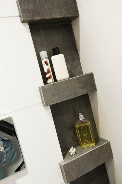
The architect’s advice is to “turn constraints to your advantage.” Built-in pipes here were used to create alcoves for storing bathroom products.
Tell us: Have you turned constraints to your advantage in your home? Share your experiences in the Comments section.
Browse more homes by style:
Small Homes | Colorful Homes | Eclectic Homes | Modern Homes | Contemporary Homes | Midcentury Homes | Ranch Homes | Traditional Homes | Barn Homes | Townhouses | Apartments | Lofts | Vacation Homes
Related Articles Recommended


