Best Uses for the Saturated Blue Color of 2015
http://decor-ideas.org 12/07/2014 00:13 Decor Ideas
Manufacturer Kelly-Moore Paints surveyed a large group of interior designers to select its Color of the Year for 2015, and the winner was Coastal Surf, a vibrant true blue.
One in a series: Keep an eye out for more coverage of companies’ featured colors for 2015.
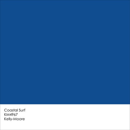
This is no soft and wispy shade of blue. Coastal Surf is deep and dramatic and works well with a variety of design styles.
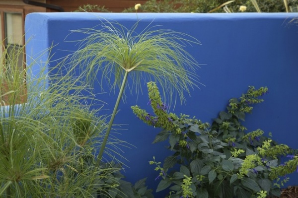
Vibrant blues such as Coastal Surf make terrific background colors. They immediately draw the eye in, and whatever is set in front of them really stands out. Greens and blues tend to come together well, forming a soothing palette. This is because they are both cool colors and are adjacent to each other on the color wheel. You can use more intense shades of each color and still get a calming vibe. Just be sure to use them in smaller chunks to keep them from taking over the space.
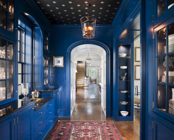
If you do opt to go big with this deep blue hue, try limiting it to rooms that are used only in passing or for small amounts of time, such as a butler’s pantry or a powder room. Floor-to-ceiling intense color can be tough to pull off in a living room or kitchen, where we spend many of our waking hours, but in a space you don’t spend much time in, it’s a fun, unusual and very dramatic choice.
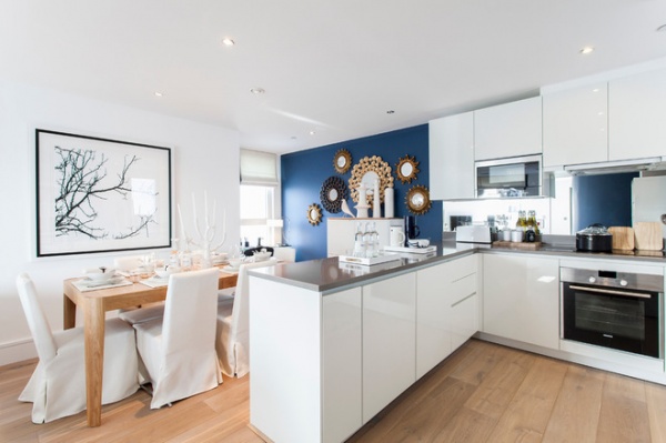
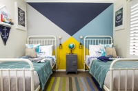
There used to be a rule against using blue in dining rooms and kitchens, because it was thought to be an appetite-suppressing color, but I say if you love blue, go for it. This small accent wall adds a nice dash of color in an otherwise light, white space. It’s another example of how this shade of blue works well as a backdrop for artwork and furnishings.
When to Use Blue in the Kitchen
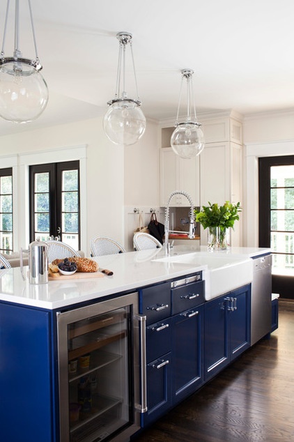
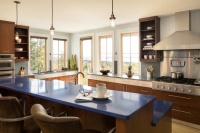
Here’s another mostly white kitchen that gets a refreshing kick of color via the blue cabinets. It’s a great place for a nice little dash of blue.
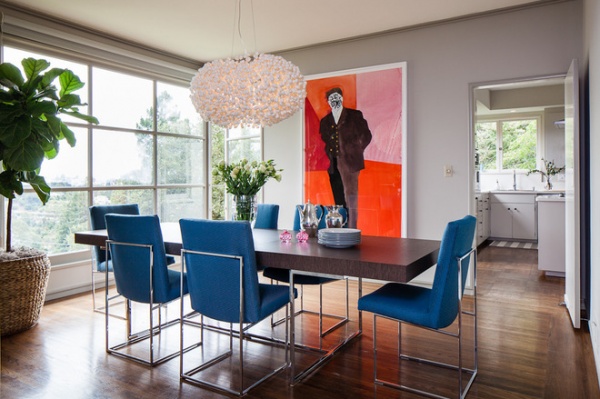
Don’t want to commit to colorful cabinetry or other built-in items? Go for bold blue furniture instead. Chairs are a breeze to change out later if you fall in love with another hue.
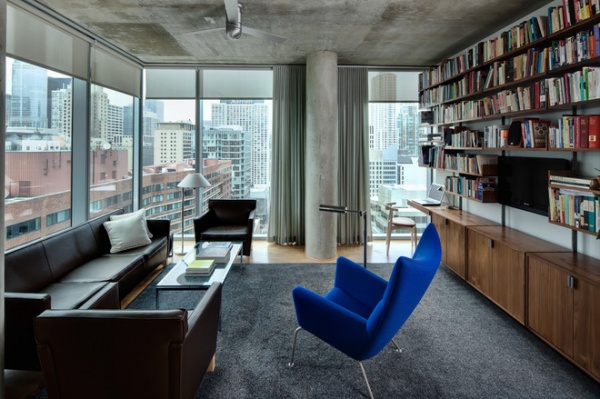
Make a statement with one colorful piece of furniture in an otherwise neutral space. Just make sure it’s something worth calling attention to, such as a cool modern chair.
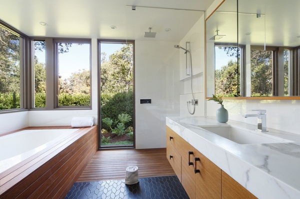
I love the use of blue tile here — just a hint as someone heads into the shower.
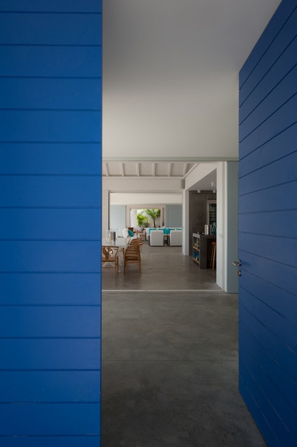
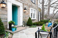
The front door is a terrific place for a dose of fun color. It’s not a huge amount of color, and the door is fairly easy to repaint later on if you tire of it.
When to Paint Your Door Blue
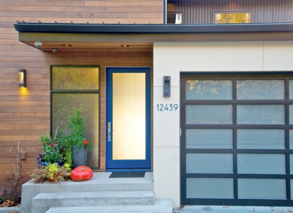
If you have a fully glazed front door, you simply must take the opportunity to go with a bold color for the door frame. It’s such a small amount of color that you can get away with a supersaturated blue or any other vibrant hue you love.
More: How to Use Marsala, Pantone’s 2015 Color of the Year
Tell us: Did the interior designers get it right? Is this the color for 2015?
Related Articles Recommended

