Living Area Is Lightened Up and Ready for Anything
http://decor-ideas.org 12/06/2014 04:03 Decor Ideas
Water, sand, kids and dogs are a recipe for a messy home. That’s the dilemma these homeowners on the shores of Gun Lake in Michigan were facing. Looking for interiors that were a bit more durable, they asked interior designer Jennifer Butler to help with a remodel that brought in tougher fabrics and a brighter vibe. “They wanted it to feel like a lakefront property without feeling like a cottage,” Butler says.
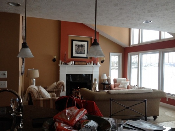
BEFORE: The homeowners never liked the paint colors in their living room. They wanted the view of the lake to be reflected in the colors of the house. “They kept using the word ‘watery,’” Butler says.
Plus, the fireplace wall had an inset with drywall that broke up the room in a weird way and took away from the raised ceiling. “It didn’t feel unified,” she says.
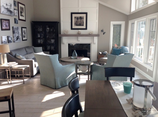
AFTER: Gray tones took the space in a more contemporary direction, while porcelain tile with a wood-grain look replaced the golden-colored traditional square tiles for a more durable update. “It gave the home a more updated look without having to have real wood floors that would be hard to maintain with the sand and dogs,” she says.
White paneling on the fireplace wall created an impressive tower effect and brightened the room. “Even though the light coming in isn’t any different, it truly feels like it is,” the designer says.
Butler considered a sectional, but from a traffic-flow perspective, it wouldn’t have worked. Instead, two swivel chairs allow for conversation in the living room and dining room without blocking anyone’s view of the lake. “We wanted that room to feel updated and very sophisticated, yet not terribly formal,” she says.
All the upholstery fabrics are outdoor ones. “They’re very practical,” she says. “Kids, dogs and wet bathing suits won’t mess them up.”
Wall paint: Amazing Gray, Sherwin-Williams
12 Hot Ideas for Fireplace Facing
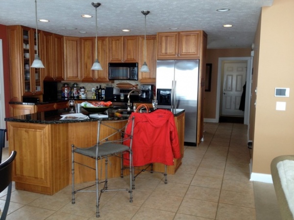
BEFORE: The homeowners thought the cherry cabinets in the kitchen were nice and beautiful, but they were ready for something new. Their first thought was to paint the cabinets, but the raised door panels felt more formal than they wanted. Also, because of the funky angle of the island, the homeowners were able to fit only two chairs there.
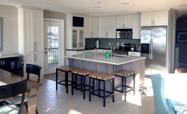
AFTER: New cabinets lightened things up and aligned the space with the contemporary feel of the updated living room. The new island has space to seat all four family members.
To keep costs down, the homeowners kept the black granite on the back counters but used white quartz for the island. All the plumbing stayed in the same location, so that helped keep costs down too.
Stools: Horchow
Your Guide to Choosing Kitchen Cabinets
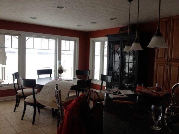
BEFORE: The hutch made things dark and crowded in the dining area, while the round table wasn’t enough seating whenever the family had guests over.
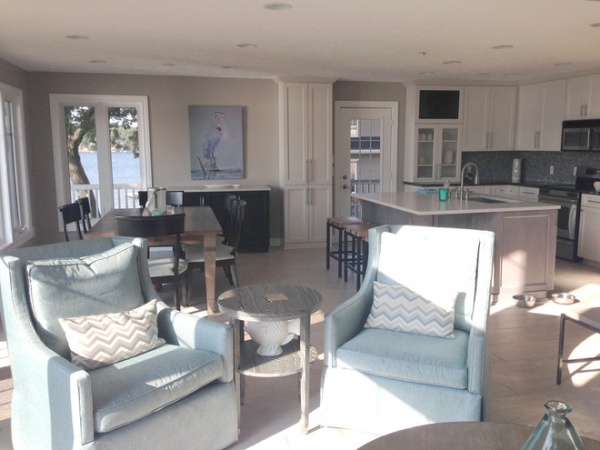
AFTER: Butler moved the hutch to the left of the fireplace and added a buffet-style table to give the space some breathing room. A rectangular farm-style table fits more seats.
Got a project you’re proud of? Upload your photos to our Before & After section. Your project could end up in a featured ideabook on Houzz!
Table: Ethan Allen
Related Articles Recommended


