Kitchen of the Week: Curves in Unexpected Places
http://decor-ideas.org 12/05/2014 21:13 Decor Ideas
When the owners of this Richmond, England, house were writing a wish list for their family kitchen, they said they wanted it to have a contemporary design, to use every bit of space and to have an inclusive feel so the chef wouldn’t be left out of the fun. They run their own business from home and are enthusiastic cooks who use their kitchen a lot.
Enter kitchen designer Johnny Grey, known for his unique vision and creative designs. Grey, a cult figure in the industry, was described by The New York Times as “one of the world’s most influential kitchen designers.” Imagination was certainly not lacking in Grey’s vision for this kitchen. The design is innovative, well thought out and functional.
Kitchen at a Glance
Who lives here: A large family with grown-up children
Location: Richmond, a suburb of London
Designer: Johnny Grey, Johnny Grey Studios
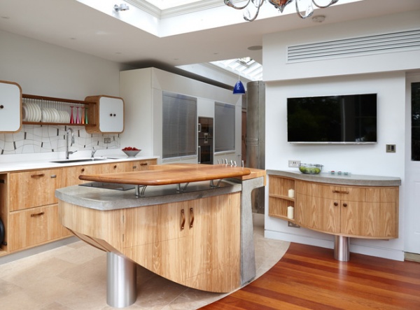
“The space is actually very awkward,” Grey says. “You can’t fit a standard kitchen in it, and the owners wanted to avoid a galley layout.” Previously, the room had been a conservatory–office area that was slightly smaller. It was rebuilt and enlarged to make room for the kitchen, and the skylights were added to bring in light.
The kitchen is an L-shaped space. “There are three distinct areas to it,” Grey says, “the conservatory area, a connecting corridor and, at the far end, a small study area. It meant there were three distinct activities to design for.”
He resolved this by using the three spaces for different functions — a culinary and dining area, a storage and appliance zone, and a home office.
The cabinet units in the culinary zone are made predominantly from wood and cast concrete. The curves eliminate the obstacles of corners. “The key thing about soft geometry is that it’s based on how the eye works,” Grey says. “When the eye detects sharp corners, it sends off a threat alert. Without corners you can expand the amount of work surface, because the body needs less room to maneuver around obstacles.”
Custom tiles: Alex Zdankowicz
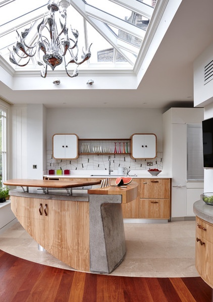
“When we start planning a space, we establish the command position of the room, and everything is derived from that point,” Grey says. “I have quite an extended design philosophy, and my first instinct is always to work out the driving position of the room.” It’s all about eye contact and sociability, something Grey calls instinct-based design — design tailored to meet instinctive needs.
In this kitchen the command position is behind the island, as the person standing there can see both “legs” of the L-shaped space. This command position determined where the different areas would be. The kitchen area is in the center to ensure that the cook is fully involved, the home office is at the end of the corridor, and the conservatory–dining area is in front of the island.
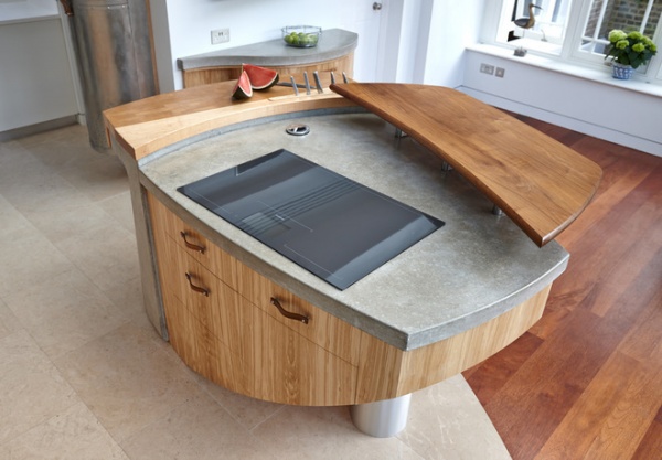
The shape of the central island is unusual, almost rhombus-like. “We worked out the minimum space needed to walk around the sink cabinet and the perimeter, sketched it out onto paper, and the negative space in the middle became the template for the island,” Grey says.
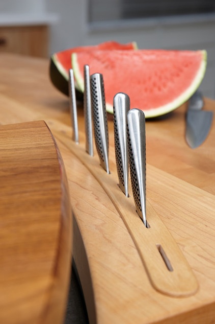
The island contains a built-in knife block and end-grain chopping board, a testament to Grey’s belief in functionality. “Some people are worried about using end-grain block, but there’s no other material that’s as good to prepare food on,” he says. “It’s hard wearing, cleans easily, and there’s a natural oil in the wood that destroys bacteria.”
The solid English ash raised server bar doubles as a place where people can perch to chat with the chef. “All these minor things make the emotional meaning of the kitchen that much nicer,” Grey says.
The concrete, incredibly heavy, was made by artisans in molds brought down from the Midlands.
How to Design a Kitchen Island
The initial phases of his projects are all about the planning, layout, shape and function of the room, Grey says. “Then a visual architect comes in and we brainstorm colors, surfaces, textures … and in a miraculous way, you end up with a design on your hands.”
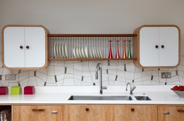
The backsplash tiles with platinum glazed inserts form a flowing pattern on the wall. “We commissioned the tiles from artisan tile maker Alex Zdankowicz, whom we try to include in every project,” Grey says. “He sits down and brainstorms with the client and then makes and installs every single tile himself.” The distinctive plate rack is made from walnut.
Countertop: Corian
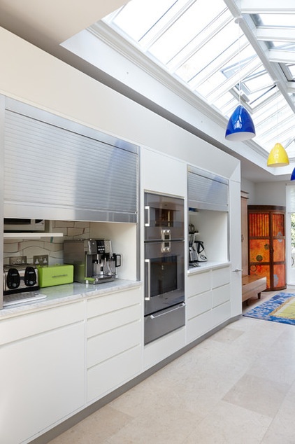
The clients chose the pendant lights; lighting consultant Light IQ designed the rest of the lighting. A border around the white Corian cabinet unit is lined with lights that glow at night. “We used a lot of indirect lighting — a mixture of halogens and LEDs –—to emphasize the lines of the different features and make it relaxing,” Grey says.
The appliance garage is highly functional, with marble countertops and aluminum doors that can be pulled down when the area isn’t in use.
Cabinet unit: Corian
The Best Places to Stash Small Kitchen Appliances
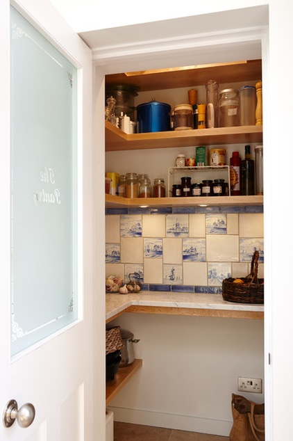
A spacious pantry sits opposite the appliance garage. Grey is a firm believer in pantries. “If you’re on a budget and you have the room for a walk-in pantry, it takes the pressure off the amount of cabinetry you need, which is more expensive,” he says. “More than this, it relieves the room of having too much furniture, which can dominate.”
The client had some historic Dutch tiles from the 19th century, and these were integrated with custom white tiles made by Zdankowicz to create a backsplash with character.
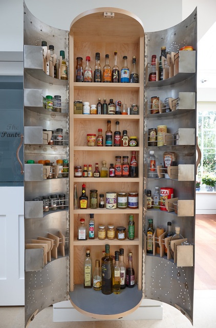
The spice rack, which is just to the right of the pantry, was inspired by the tradition of Indian tinware. “We wanted something with a very relaxed, beaten-up look next to the clean white Corian,” Grey says. Aside from aesthetics, the spice rack is highly functional, holding dozens of bottles, jars and packets.
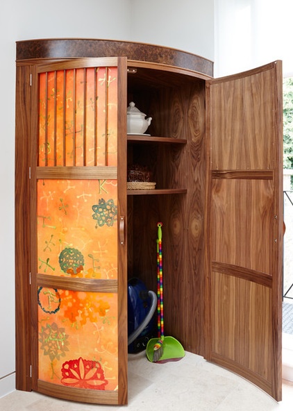
Grey created a broom cupboard at the far end of the kitchen, opposite the study area. It sits directly on the floor, without a base, to enable easy access to the vacuum cleaner and brushes.
Artist Felicitas Aga was commissioned to paint Indian-inspired designs for the doors, to warm up this side of the room. Canvas was stretched onto the English walnut panels to create the colorful feature.
“Why should kitchens all have to look so seamless — why must everything be in rows and behind cupboard doors?” Grey asks, calling the effect “death by boring cupboard.”
Door artwork: Felicitas Aga
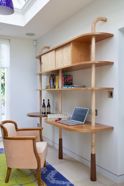
The home office area is at the end of the corridor, next to glass doors and beneath the end of the run of skylights, so it’s lovely and light. Grey designed the desk, which is made of maple with walnut legs. Aga designed the rug, which was made by Veedon Fleece in a factory in Nepal.
“We wanted to keep this area fairly low key, because we already have a lot going on,” Grey says, “but it’s still very friendly to use.”
Tell us: What do you think of this kitchen? What ideas would you incorporate into your own space?
See more Kitchens of the Week
Related Articles Recommended


