Houzz Tour: Toronto Loft Gets an Industrial Style Overhaul
http://decor-ideas.org 12/05/2014 06:13 Decor Ideas
Looking for a simple, clean and modern makeover for their orangey, oak-filled loft, this Toronto couple found their way to Rad Design. Founder and principal Golbou Rad and her team demolished the space down to the concrete slab and helped the pair — both city planners, one of whom is a passionate photographer — bring a sleek and industrial vibe to the narrow loft.
She added custom shelves made from pipework, replaced the oak floors with laminate made to look like reclaimed barn wood and swapped out the orange-tinted kitchen cabinets for crisp white ones. “It’s a style that you see in a lot of restaurants and bars, but not in too many homes,” Rad says. “But they both love that style, and I was really open to it.”
Houzz at a Glance
Location: Toronto
Who lives here: A couple, both city planners
Size: About 1,500 square feet (139 square meters); 1 bedroom, 1 bathroom
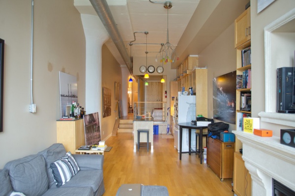
BEFORE: The loft is inside a converted warehouse that used to serve a big department store. The units ended up oddly long, narrow and multileveled. The beige walls and orange-hued wood didn’t work for the homeowners, who wanted something more modern and clean looking. “They needed to organize their house better,” Rad says.
“After” photos by Donna Griffith
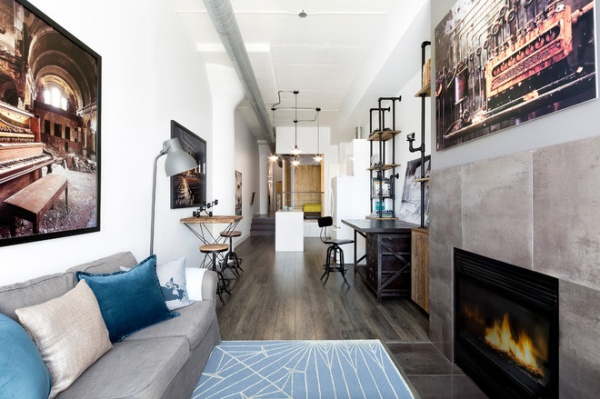
AFTER: The team ripped out everything in the unit and started fresh, first with all-white walls intended to let the photography — shot by one of the homeowners — command attention. “If you start with an all-white space, it doesn’t look cluttered, and in such a long and narrow space, white makes it look bigger,” Rad says.
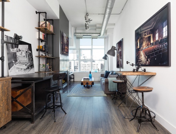
New gray-toned laminate floors resemble reclaimed wood. Rad chose a wide plank for a more modern look and because the planks more closely resemble barn boards.
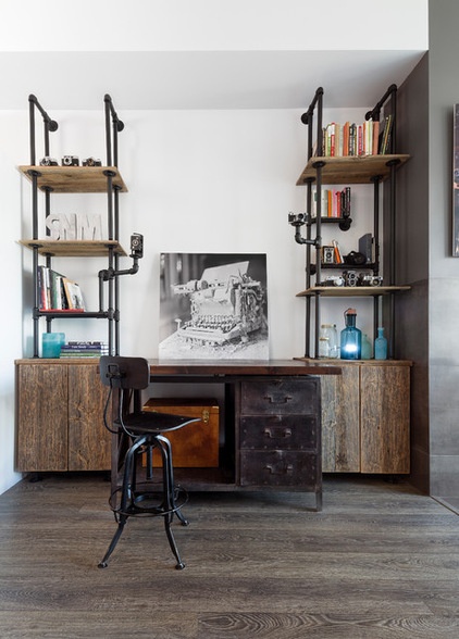
Rad custom designed the industrial reclaimed-wood and steel pipe shelves to perfectly fit this wall space. Pipe arms extend to display a few cameras from the collection of one of the homeowners.
Stool: Restoration Hardware
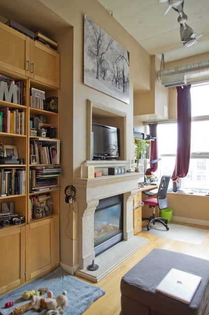
BEFORE: A traditional, ornate mantel and TV niche above it also didn’t make the cut.
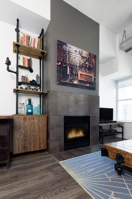
AFTER: The homeowners originally wanted metal cladding surrounding the fireplace, but concerns over the material’s getting too hot forced them to reconsider. Instead Rad found porcelain tiles in a raw metal finish. She stopped the material to leave room for the homeowners to hang a piece of art and then matched the color of the tile in a paint that she took to the ceiling.
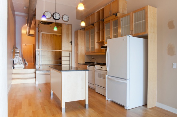
BEFORE: The homeowners didn’t like how the kitchen cabinets had see-through doors that showed off the cluttered shelving.
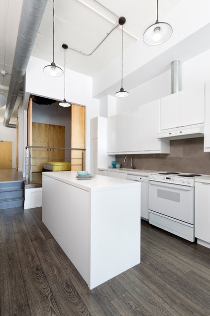
AFTER: Rad enclosed the kitchen storage in all-white cabinets that were much less distracting. The backsplash is natural stone with a raw finish texture.
Countertops: Ceasarstone; lights: custom
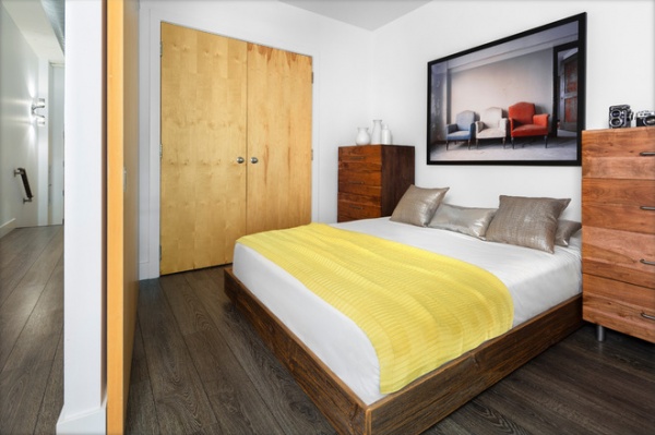
Rad custom designed this reclaimed-wood bed to be extra low, so the homeowners’ aging pug could easily jump onto it.
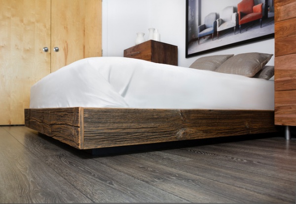
She designed a recessed base and painted it black to make the bed look like it’s floating.
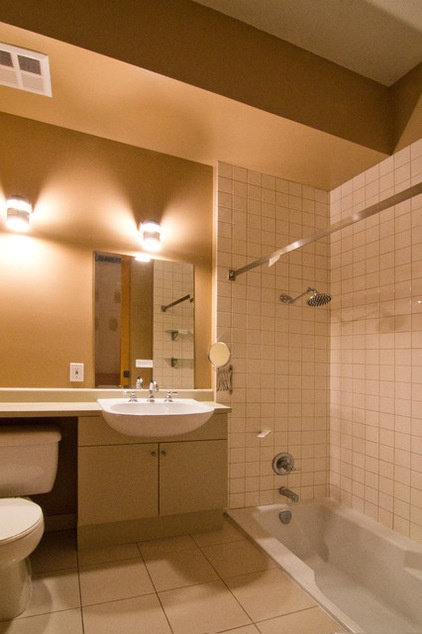
BEFORE: The bathroom had those beige tones the homeowners wanted to get away from.
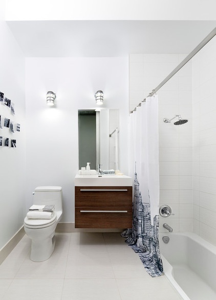
AFTER: White walls brightened things up. The bathtub is sunken, due to level changes in the layout of the loft that were made during the building’s conversion. A wall-hung vanity with drawers makes better use of space. “You can see what’s in back, as opposed to doors,” Rad says.
Browse more homes by style:
Small Homes | Colorful Homes | Eclectic Homes | Modern Homes | Contemporary Homes | Midcentury Homes | Ranch Homes | Traditional Homes | Barn Homes | Townhouses | Apartments | Lofts | Vacation Homes
Related Articles Recommended


