How to Give Neutral Paint Colors a Subtle Jolt
http://decor-ideas.org 12/03/2014 21:13 Decor Ideas
I have to admit: As much as I love big, bold color, I like it best when it is used with restraint — and used strategically. After all, a little bold color goes a long way, and it’s all too easy to go from “wow!” to “ouch.” For the color-shy out there who are looking to spice up their neutral interiors but want to steer clear of anything too intense, here’s how to add small to moderate splashes of vivacious hues to a mostly neutral interior palette.
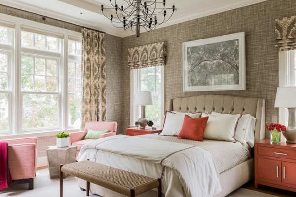
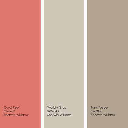
This sophisticated bedroom gets a nice punch of color via furniture and decorative accessories in happy shades of coral. Because the coral elements are spread throughout the room, it doesn’t feel overly colorful, and your eye is able to move about the space, taking it all in. Additionally, the white elements in the room keep the taupey-tan hues from looking too muddy.
For a similar palette: Use Coral Reef with easygoing neutrals Worldly Gray and Tony Taupe, all from Sherwin-Williams.
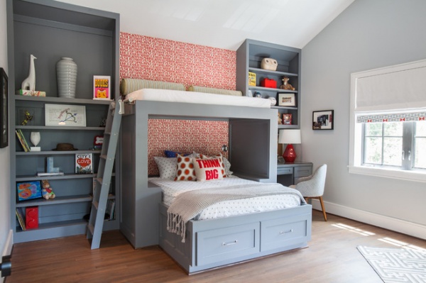
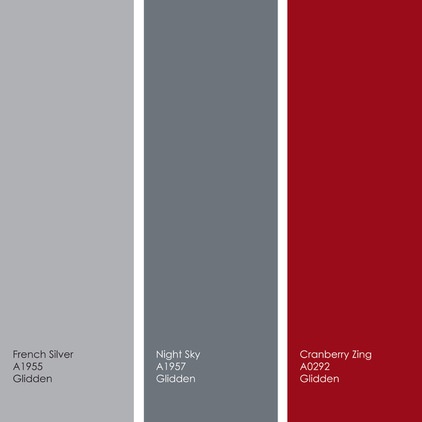
If you favor cooler hues, try a palette of blue-grays, then spice it up with hints of hot red. This is a terrific palette for an office or a kid’s or teen’s bedroom. The grays have a soothing vibe, but the heart-racing red injects some energy into the space.
For a similar palette: Try French Silver and Night Sky with a bit of Cranberry Zing, all from Glidden.
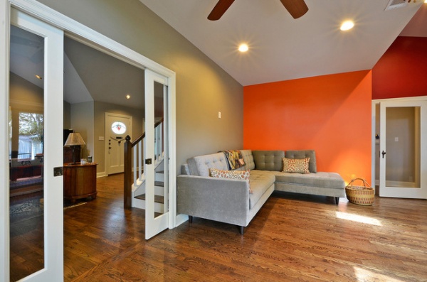
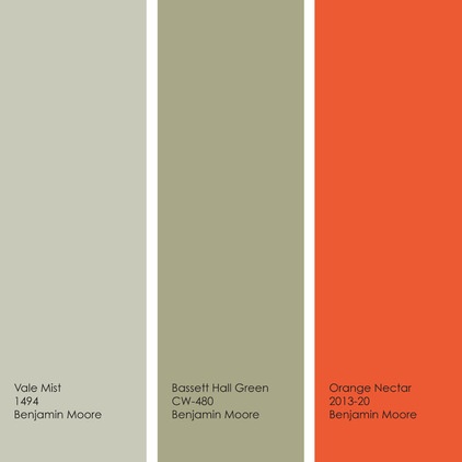
Not a fan of large displays of tchotchkes and objets d’art? You can go a bit wilder with color, because you won’t have visual clutter competing with a bold wall. But bright orange is a tough color to pull off, even in a minimalist space. Take a tip from this room and limit the color to one or two smaller walls, and pair it with shades of a neutral — such as sage green.
For a similar palette: Use good doses of Vale Mist and Bassett Hall Green with a dash of vibrant Orange Nectar, all from Benjamin Moore.
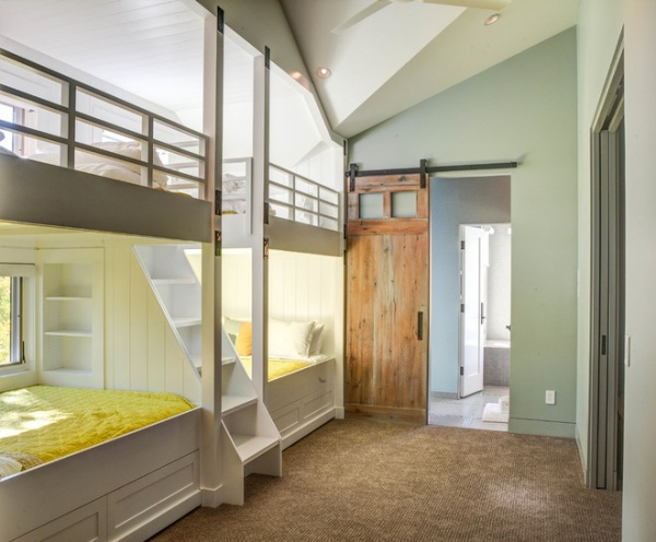
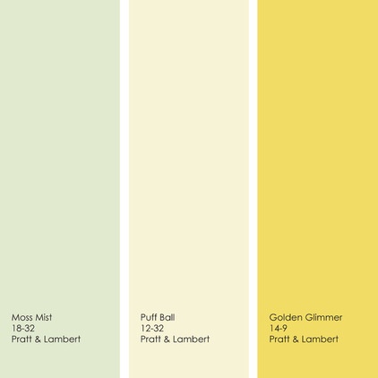
For those who prefer light neutral walls but are on the hunt for an alternative to white, beige or gray, think about going with a pale green or soft yellow as your main neutral. If the hue has a bit of gray or brown, it will work as a neutral. Then add a small hit of bold yellow to really spice up the space.
For a similar palette: Try a mix of Moss Mist and Puff Ball with Golden Glimmer, all from Pratt & Lambert.
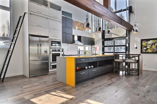
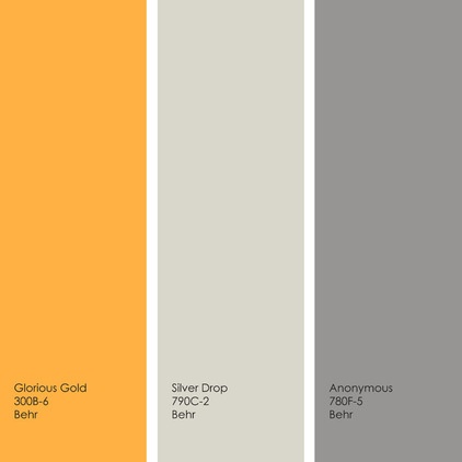
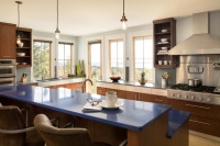
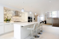
This fantastic open kitchen has several shades of warm and cool neutrals with just a small strip of gold. When you use just a tiny amount of a bold color in an otherwise neutral space, be sure to put the color on something that you want to draw the eye to, such as the quartz countertop here.
For a similar palette: Use some Glorious Gold with a neutral background of Silver Drop and Anonymous, all from Behr.
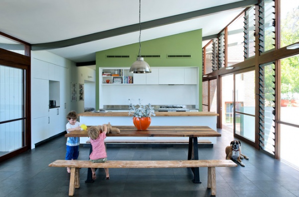
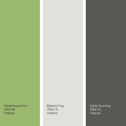
Kick up the drama in a mostly white kitchen by adding small bits of a warm, dark gray. Use the gray to highlight interesting architectural elements. Then make the look fun and fresh with an accent color in a leafy shade of green.
For a similar palette: Pair a gray-tinted white, like Blizzard Fog, with small chunks of Fiddlehead Fern and Sable Evening, all from Valspar.
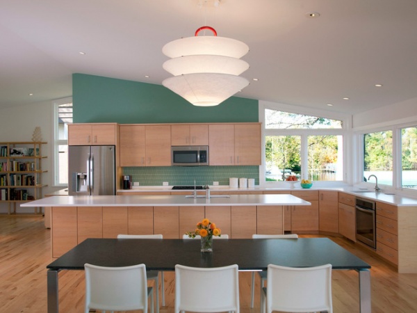
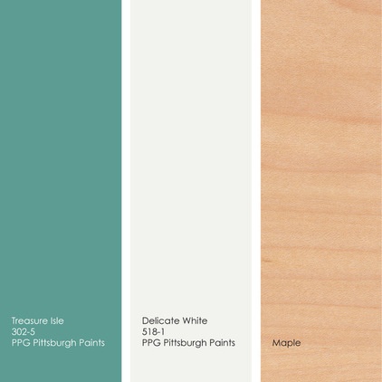
Here’s another green-accented kitchen, but this hue has more blue in it and creates a nice midcentury modern vibe. You can’t go wrong pairing this pretty hue with white and light-toned woods.
For a similar palette: Add a splash of Treasure Isle to a backdrop of Delicate White, both from PPG Pittsburgh Paints. Warm it all up with plenty of maple or a similarly toned wood.
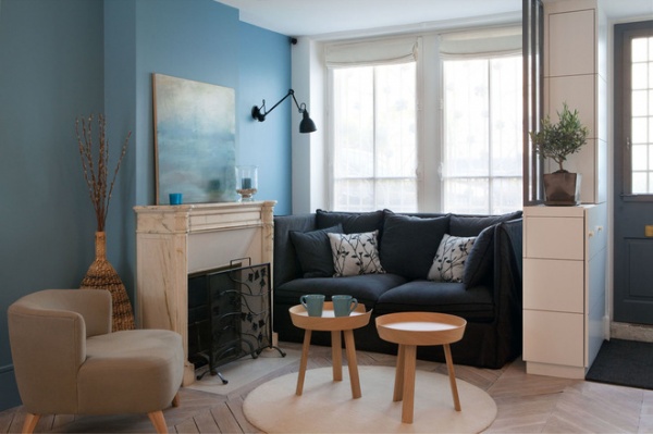
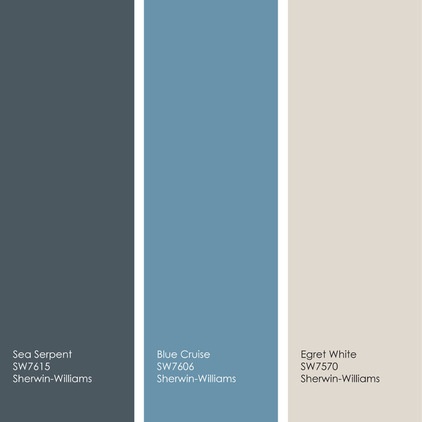
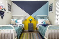
A medium watery blue accent wall looks fantastic when grounded with a deep navy. Add warmth to the palette with light, warm whites.
For a similar palette: Try a warm white, such as Egret White, and add splashes of blue hues, like Sea Serpent and Blue Cruise, all from Sherwin-Williams.
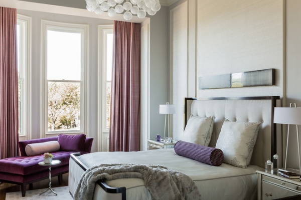
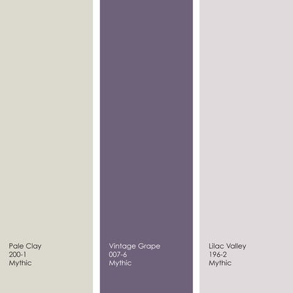
Shades of purple are thought to have a calming effect, so they are a smart choice for a bedroom. Mix small hits of pinks and purples with larger swaths of warm whites for a pretty, soft and soothing sleeping space.
For a similar palette: Try mixing various shades of pink and purple, such as Vintage Grape and Lilac Valley, with a light, warm white, such as Pale Clay, all from Mythic.
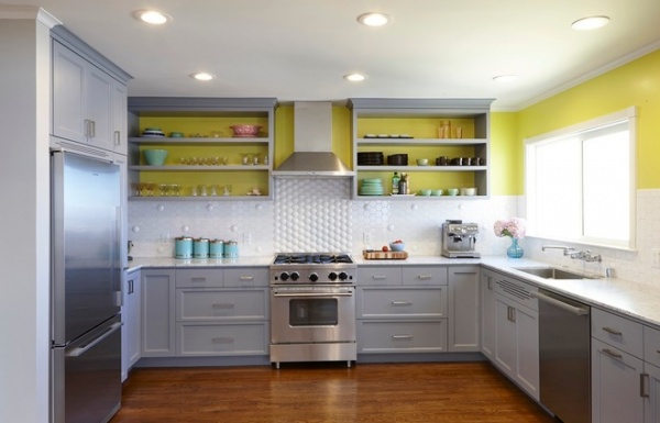
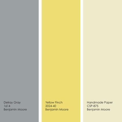
I cannot get enough of this fun and fantastic green-tinged yellow — I’ve used similar shades of it in small doses all over my new house. It looks supermodern set against shades of gray and pure white. Keep in mind that if you use a vibrant hue in the back of a shelf or niche, you’ll want to keep any items stored there neat and tidy, as everyone’s eye will be immediately drawn to that area. Also, when you have a lot of cool gray in a space, think about including some warm elements, such as a wood floor or wood furniture, to help it feel warm and inviting.
Get this look with Delray Gray and Yellow Finch. You could also throw in a yellow “neutral,” such as Handmade Paper, all from Benjamin Moore.
Tell us: What’s your go-to neutral? And what bold colors do you like to pair with it?
More: 9 Daring Colors for Your Front Door
Related Articles Recommended

