Houzz Tour: Couple Pares Down and Pumps Up the Style
With their daughter off to college, this couple was ready for a complete lifestyle change, and moved from their suburban home in Andover, Massachusetts, to a two-bedroom condominium in Boston. In doing so they reclaimed about 10 hours a week of time together (the length of the commute to Andover). And the beautiful waterfront, historic Bunker Hill and Italian yumminess of the North End are just a quick hop from their new address.
Their new urban surroundings were just a part of their dramatic life change. Ready to start fresh with the major downsize, the couple pared down their belongings and enlisted the help of the designers at Lee Kimball to help them create efficient storage; fully renovate the kitchen, bathrooms, bedrooms and closets; and create harmony between some of the traditional design details and their more contemporary tastes. The result is fine urban living that has made the transition a joyful and exciting one.
“After” photos by Mary Prince
Houzz at a Glance
Who lives here: 2 empty nesters whose daughter is in college
Location: Charlestown neighborhood of Boston
Designer: Lee Kimball
Size: 1,200 square feet (111½ square meters); 2 bedrooms, 2½ bathrooms
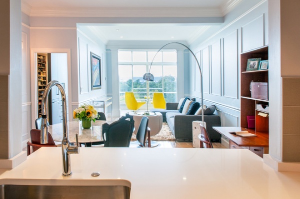
In the main living area, the kitchen has a large pass-through that opens the view to the dining area, living area and sunporch. The doorway to the left leads to the master bedroom.
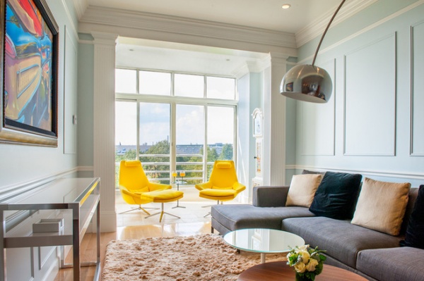
Streamlined furniture and the home’s traditional millwork mix in harmony. Beyond the living room on the sunporch, two sunny yellow modern Metropolitan chairs can be swiveled to be part of the conversation area during gatherings, or swiveled 180 degrees to take in the views. The vistas also balance old and new — historic Boston Harbor and a supermodern, more recent landmark, the Zakim bridge.
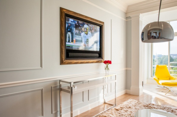
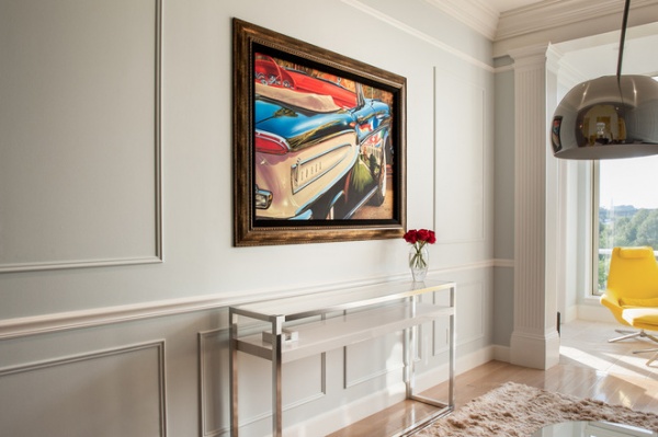
When it came to placing a TV in the living room, the female half of the couple didn’t want one, and the male half thought it was a must. They found a compromise with this solution. When the TV is off, a piece of art slides over the screen to camouflage it. “They jokingly refer to this as a marriage saver,” says Bruce Johnson, principal at Lee Kimball.
Most of the millwork was existing, except for some clever reconfiguring that frames the TV. Many of the wall moldings are painted the same color as the walls to help those traditional elements blend into the more contemporary space. The designers used many of the same colors consistently throughout the space but used different finishes, including flat, eggshell and semigloss.
All paint by Benjamin Moore: Constellation AF-540 in eggshell finish (walls); Chantilly Lace OC-65 in flat finish (ceiling); Chantilly Lace OC-65 in semigloss finish (trim and millwork); TV/art screen: Vutec
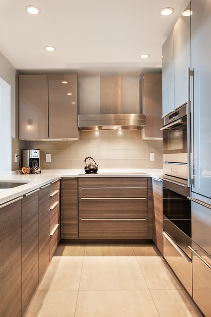
The U-shaped kitchen is by Poggenpohl and includes an induction cooktop. The bottom cabinets are covered in a laminate called Teak Quartz, and the top cabinets have a high-gloss lacquered finish. “We crammed a lot of great storage into the kitchen,” Johnson says. This includes drawers under the cooktop and efficient corner cabinet storage. Lighting includes square LEDs that are flush with the bottom of the cabinets.
Wall paint: Constellation AF 540 in flat finish, Benjamin Moore; floor tile: Porcelanosa; oven: Wolf; refrigerator: Sub-Zero
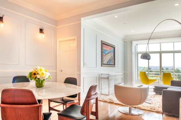
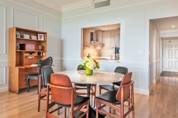
The large pass-through keeps the kitchen from feeling claustrophobic. A secretary desk the homeowners brought with them from their suburban home serves as a discreet workstation and provides more storage in the main living space.
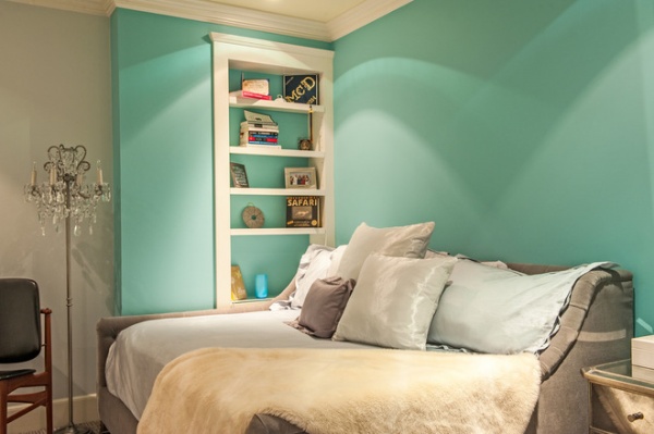
To make the downsizing work, creating multipurpose spaces was a must. The second bedroom is one of the first things you see upon entering, and the Tiffany blue walls make a big visual impact. The room doubles as a den for the couple, who love to cozy up and read or watch TV here. When their daughter is home or they have a houseguest, it serves as a bedroom. The sofa bed is custom.
All paint by Benjamin Moore: Constellation AF-540 (main); Clearlake 738 (accent wall), Ginseng Root 386 (trim)
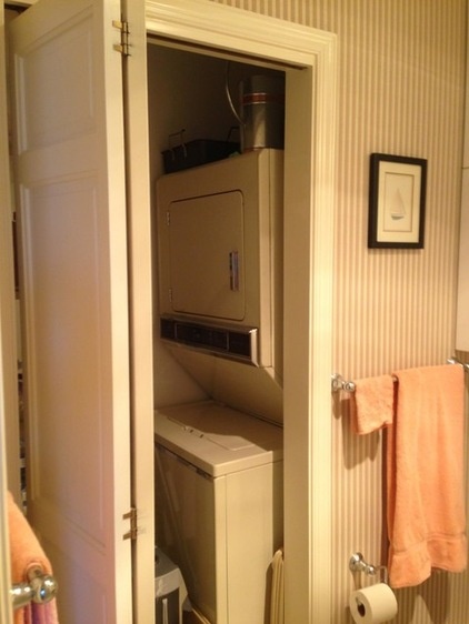
BEFORE: The guest bathroom doubles as the powder room. Before, the bifold closet door and layout made doing laundry awkward.
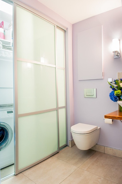
AFTER: The bathrooms are the sleekest and most contemporary spaces in the house. New metal-framed shoji-style doors with translucent glass not only give straightforward access to the laundry, but also let the light through with a pleasing glow. Behind the door adjacent to the toilet are shelves and cabinets for storing linens and other bathroom supplies. A recessed cabinet replaced a clunky wall-mounted one; it extends back 15 inches.
Wall paint: Angel’s Wings 1423, Benjamin Moore; vessel sink, toilet: Toto; tile: Porcelanosa; sink shelf: bamboo in Durata satin finish, Grothouse Lumber; mirror: Roburn
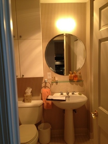
BEFORE: Clunky cabinets and fixtures placed close together once gave the bathroom a cramped feeling.
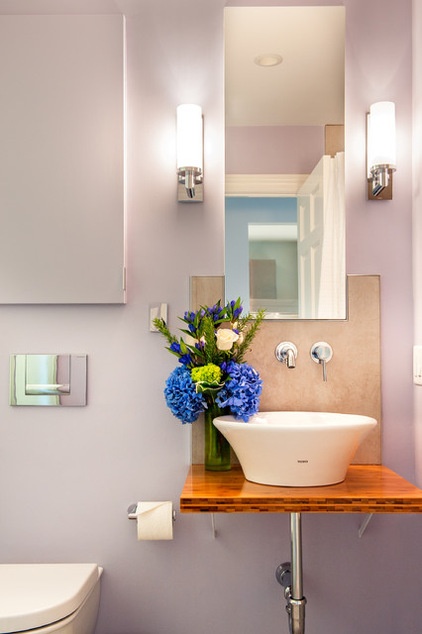
AFTER: Just out of view to the right here is a soaking tub (see the plans below). The recessed cabinet, clean lines and vessel sink create a streamlined, open look. The bamboo shelf adds a warm organic element to the contemporary room.
Tip: A wall-mounted toilet is a space saver, as the tank is behind the wall. Removing the flush panel provides access to the plumbing.
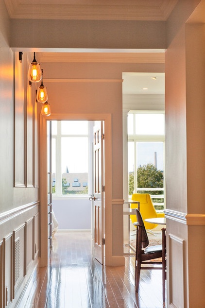
This is the view from the front entrance into the condo. WIth the master bedroom door open, it provides a clear view through. Three new sconces balance historic and more contemporary style and illuminate the formerly dark passageway.
Wall paint: Constellation AF-540 in eggshell finish, Benjamin Moore; wall sconces: Chelsea, Sonneman
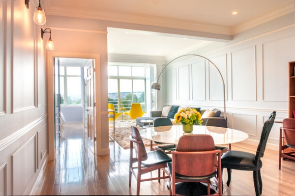
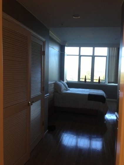
BEFORE: The master bedroom had a lot of wasted space and a badly configured closet.
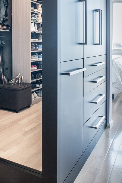
AFTER: Now smart cabinetry in a black finish includes a hamper, shelving and drawers for clothing. You can catch a glimpse into the newly reconfigured walk-in closet in the full-length mirror.
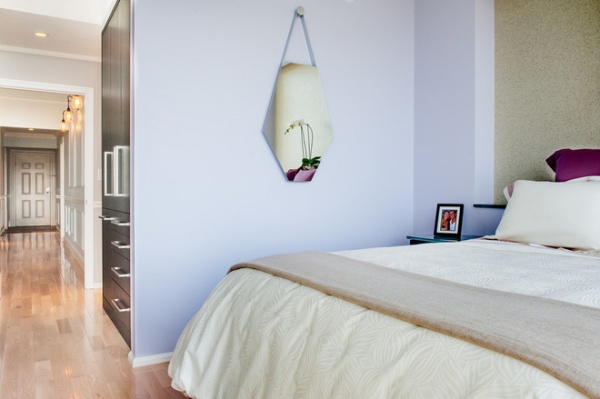
The couple goes to bed each night and wakes up each morning to spectacular views of the harbor and the city. They gave up about half the square footage in the master bedroom to incorporate the new, efficient storage.
The custom nightstands are also space savers and add to the ambience. They have silver-backed glass tops, are backlit at night and are finished in the same black as the bedroom cabinetry. Also adding to the ambience is the wall covering in the niche behind the bed. “It has glass in it, and it sparkles at night,” Johnson says.
Paint by Benjamin Moore: Spring Iris 1402 (walls); Chantilly Lace OC-65 in flat finish (ceiling)
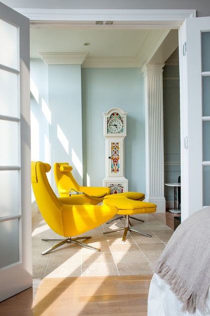
The sunporch, at the end of the living room, also connects to the master bedroom. The French doors have translucent glass and are often open when the couple is home alone but can be closed for privacy. The antique clock is one of the homeowners’ favorite pieces brought with them from their former home.
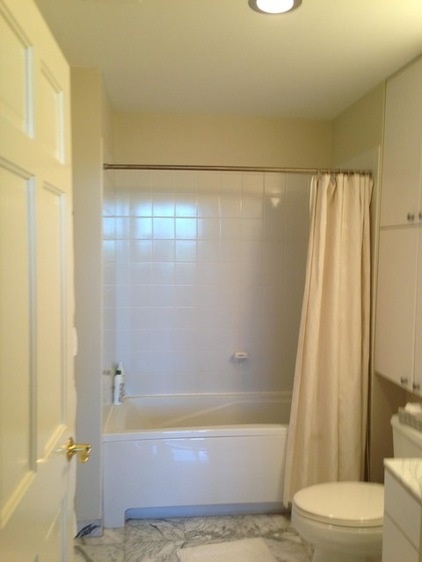
BEFORE: The master bath was uninspiring.
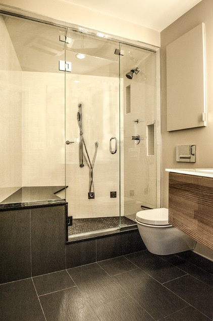
AFTER: In the new configuration, the designers angled the steam shower stall’s glass wall to make room for a large bench. This provides enough room for stretching out and relaxing during a steam. (See the plans below to get a better feel for the layout.)
“There is a grass-cloth-like texture to the floor tiles,” Johnson says. Combined with the warm wood on the vanity, the tiles keep the room from looking too stark and slick. Using large-format tiles and extending them up the shower stall divider made the room feel larger; a small-scale tile would have felt too busy.
Wall paint: Wish AF-680, Benjamin Moore; tile: Porcelanosa; mirror: Roburn
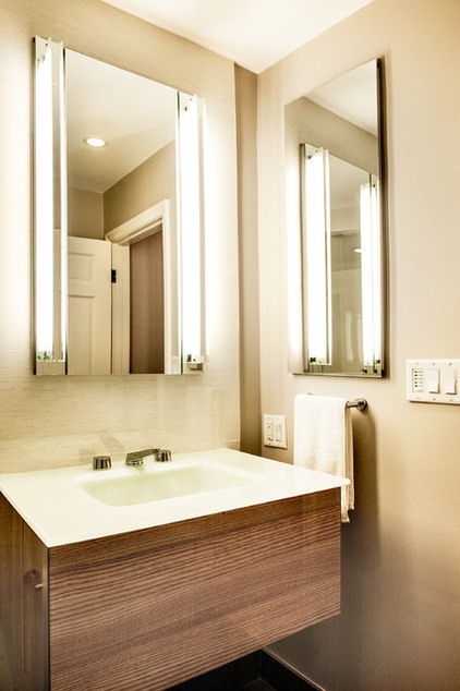
The clear glass, wall-mounted vanity and toilet, and recessed wall cabinet save space and give the room a more open feeling.
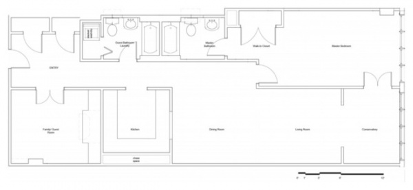
BEFORE
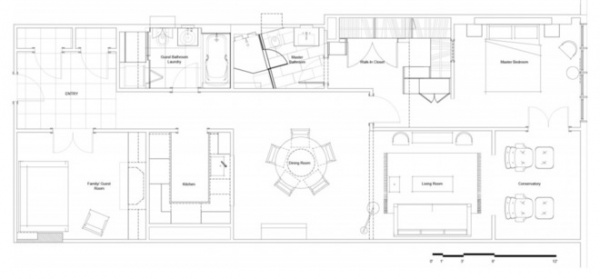
AFTER: Here you can see the details like the angle in the steam shower, the new laundry room configuration and the reconfigured master bedroom with its new storage.
Browse more homes by style:
Small Homes | Colorful Homes | Eclectic Homes | Modern Homes | Contemporary Homes | Midcentury Homes | Ranch Homes | Traditional Homes | Barn Homes | Townhouses | Apartments | Lofts | Vacation Homes


