Houzz Tour: Stylish Farmhouse Addition Keeps a Low Profile
Like many of the homes built in this area in the late 1960s, this Mornington Peninsula, Australia, farmhouse was a simple, single-story brick veneer bungalow that was ordinary in every way. Far from taking in the glorious valley views, the low-set L-shaped home hunkered close to the ground and was designed in such a way that the living areas were cold and the vistas blocked off. The owners, a retired couple, wanted to enjoy their glorious location with new living areas that were more in touch with the surroundings. They called on architect Justin Noxon of Noxon Giffen to design an addition that wasn’t showy but would allow them to live a quiet life in complete comfort, and would accommodate their large extended family members when they visited.
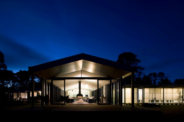
Houzz at a Glance
Who lives here: A retired couple with visiting extended family
Location: Mornington Peninsula, about 1½ hours from Melbourne
Architect: Justin Noxon, Noxon Giffen
Project: A single-story 3,870-square-foot (360-square-meter) addition to an original 1960s brick-veneer bungalow
Although the result is striking, architect Justin Noxon approached this project with the idea that the proposed extension shouldn’t diminish the rather ordinary original house, but rather build upon and enhance it. The home is comfortable, stylish and serene, but not flashy, just as the owners wanted it.
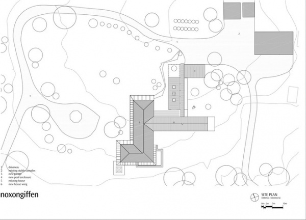
The existing home had a north-south orientation, but its living areas faced south— a chilly proposition in this part of Australia during winter. Three bedrooms, a study, a main bathroom and a laundry were accessed via a long hallway, and a studio, cabana and guest room had been hastily added to the east — a move that screened the valley from view. The home also had a deck, lap pool and double carport.
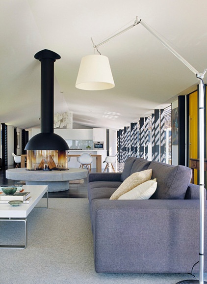
Noxon’s assignment was to design an addition that would house a new living, dining and kitchen area, as well as a separate pool and garage facilities.
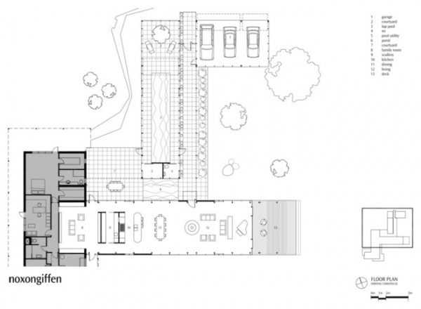
The bedrooms and support spaces are in the original dwelling, while the living spaces are in the addition. Cathedral ceilings and an open-plan design give the extension a light, open feel – quite a difference from the original home’s low-set ceilings and closed-off rooms.
Noxon says he’s proud to have “enriched the owners’ lifestyles in a low-key manner and exceeded their expectations.”
Sofa: Colombus, King Furniture; lamp: Tolomeo by Artemide, Lighting55; fireplace: Mezzofocus
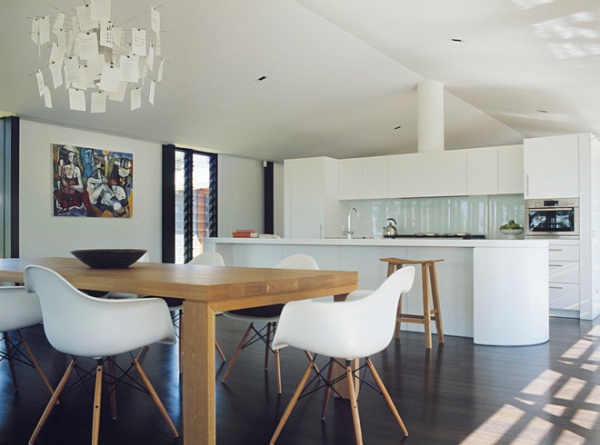
The stained Victorian ash floorboards continue from the original home into the extension to tie the old and the new together.
Light: Zettel’z 5 by Ingo Maurer, Space Furniture; wall paint: Natural White, Dulux
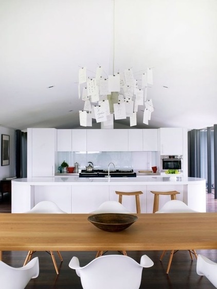
Range: Aga; integrated refrigerator: Liebherr; countertop: Corian
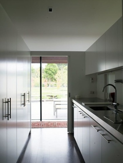
A butler’s pantry behind the main kitchen provides plenty of storage and counter space for food preparation.
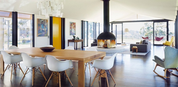
Noxon designed the addition to connect with the outdoors. The detailing and materials are deliberately restrained to ensure that the colors and textures of the ever-changing landscape dominate the interiors.
“A single floating fireplace element provides focus to the living spaces while the kitchen-pantry pods add further spatial definition,” he says.
The Mezzofocus fireplace has been given pride of place on a custom-built concrete base.
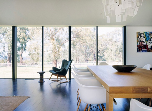
“The owners love how the extension connects them to the landscape and all the different aspects of their site via intimate domestic courtyards and ponds to long-distant vistas over paddocks and farmland,” Noxon says.
Dining table: April, Zuster Furniture; dining charis: Eames, Living Edge; armchair: Featherston
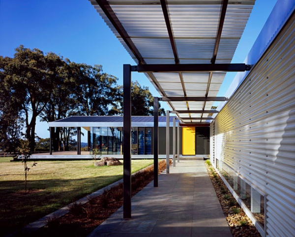
A covered walkway runs alongside the pool house, which is set perpendicular to the new extension.
The extension replaces a previous attempt at extending the house — an addition that included a studio, guest bedroom and pool. The new extension is a long, singular living space that stretches into the landscape. A pool house replaces the old pool and carport.
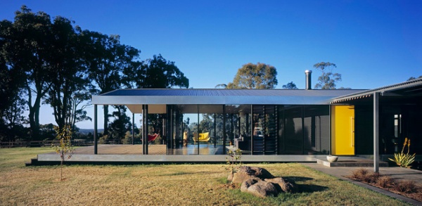
The biggest challenge of the project for Noxon was figuring out how to make the best of the landscape and environmental aspects while also protecting the home from ever-present winds and weather.
“And also tying the new work into the original house in a subtle and low-key manner to produce a cohesive and integrated whole,” Noxon says.
Roofing: Woodland Grey, Colorbond
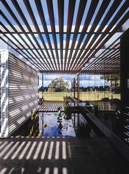
The water feature is quiet and calm, much like the rest of the house and surrounding countryside.
Bronze sculpture: Douglas Stephen
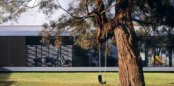
Sustainable design initiatives were part of the assignment. Climate control was achieved through high-performance double glazing and heavy ceiling, roof and floor insulation. The narrow single-volume floor plate provides excellent cross ventilation, and rainwater is collected onsite via two 50,000-liter underground water tanks. All waste is treated onsite. The lighting is low-energy compact fluorescent and LED.
All the new spaces take advantage of warm winter sun streaming in through north-facing windows, and receive an abundance of controlled natural light when desired via automated window shades.
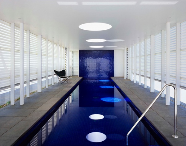
The new pool and garage pavilions stretch out over the site and are interconnected via courtyards and pergolas, offering protection from the elements and revealing new vistas beyond.
“The new works are a collection of long and low buildings in the tradition of expansive single-level rural buildings,” says Noxon.
For both the pool and garage buildings, basic construction methods of economical steel portal frames with fiberglass sheet siding were used — an abstract reference to the adjacent existing farm shed construction.
“The buildings are filled with natural daylight, transforming into glowing garden lanterns at night,” Noxon says. Yet the fiberglass siding ensures no one can see in from the outside.
The homeowners are low key — they didn’t want a pool that looked like it belonged in a resort. But both husband and wife swim daily, so the pool gets plenty of use. The corrugated fiberglass siding provides shelter from the wind and allows in plenty of natural light.
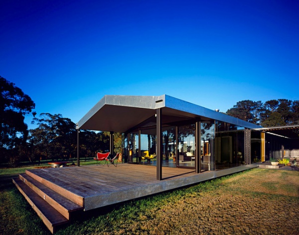
There is a variety of outdoor seating areas for the couple and their guests. The weather can change quickly here, so it helps to have options. Noxon describes the views from the house as being like “moving wallpaper.” Now that the home is slightly elevated and the living areas face the valley, the outlook has been transformed. The owners describe the home’s new relationship with the landscape as a “total, delightful surprise.”
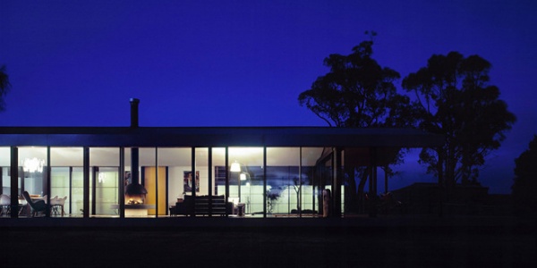
A simple internal steel portal frame structure is wrapped in floor-to-ceiling smooth and seamless butt-jointed double glazing, so the pavilion appears to hovers delicately over the site.
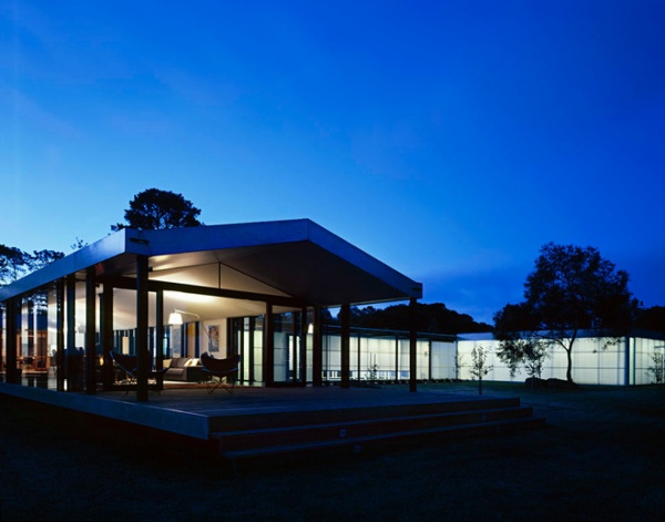
“The new house wing adopts a similar pitched-roof cross section to the original for continuity and cohesion,” Noxon says. “However, unlike the original solid brick walls, the new walls are light and open, thus offering strong visual connection with the site.”
The low, flat ceilings of the original dwelling become open cathedral ceilings in an elemental and simple expression of shelter here, he says.
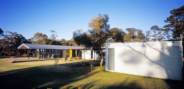
“The new works eschew an architecture of dominance and excess,” Noxon says. “Rather, the project offers a subtle and delicate engagement with the natural elements through spatial transitions and a dynamic play of light and reflections, which capture the many and varied moods of the site.”
Browse more homes by style:
Small Homes | Colorful Homes | Eclectic Homes | Modern Homes | Contemporary Homes | Midcentury Homes | Ranch Homes | Traditional Homes | Barn Homes | Townhouses | Apartments | Lofts | Vacation Homes


