Room of the Day: Geometry Rules in a Modern Master Bathroom
Architect Holly Hulburd has been helping this family renovate their home, in San Francisco’s Pacific Heights neighborhood, since 2000, and it seems they saved the best for last. The parents of three first focused on their shared family spaces, including the kitchen, family room, dining room and living room, then renovated bedrooms and bathrooms for their children during another design phase, then finally requested a project just for themselves. After living with a yucky master bathroom for 14 years, they were ready for something really special. They wanted his-and-her vanities; she wanted a soaking tub; and he wanted her to have a place where she could sit and relax while getting ready. Hulburd carefully considered every color, finish and subtle detail, such as where grout lines met windows and backsplashes met mirrored medicine cabinets. A lot of complicated work went into making everything look so pleasingly simple.
“After” photos: César Rubio
Room at a Glance
What happens here: Long soaks, beautifying, showering with a view
Location: Pacific Heights neighborhood of San Francisco
Architect: Holly Hulburd, Hulburd Design
Size: Before: 95 square feet (9 square meters); after: 160 square feet (15 square meters)
What to look for: This room is a lesson in how lining things up can make a look visually pleasing.
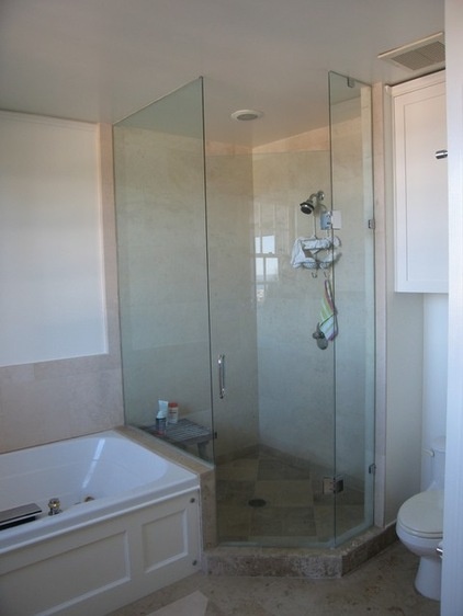
BEFORE: The corner shower’s relationship to the bathtub was not at all artful. By extending the room to take over an unused terrace, the family gained about 65 square feet. This left enough space in which to build a separate room for the toilet, a roomy shower, his-and-her vanities and a stunning custom Corian bathtub.
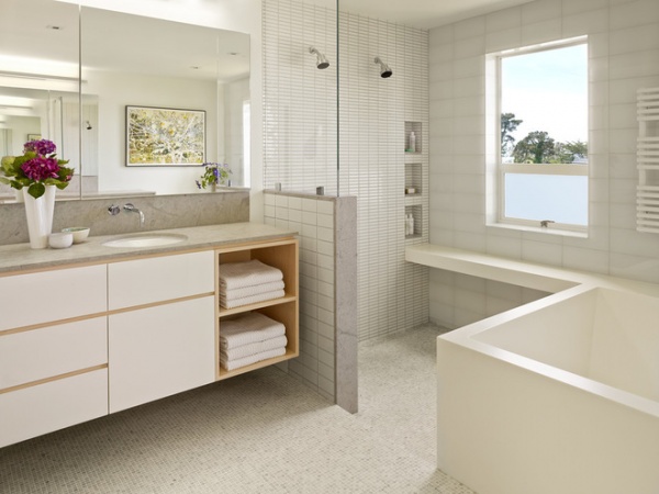
AFTER: A semiopen shower stall with dual showerheads has a much more open feeling. The floor slants ever so slightly toward a wall for drainage. Because no obvious drain was required, this left the floor tile clean looking and uninterrupted. One of the first ideas Hulburd had for the room was extending the bathtub surround to create a shower bench. It gives the room a wonderful sense of continuity and interesting modern lines.
Two of the subtle design details that took a lot of time and thought were the shape and color of the tiles. The floor is grounded in a ½-inch square tumbled white Carrara marble mosaic. Hulburd looked far and wide for one that wasn’t too gray — she finally found this tile in France. The rest of the tiles are longer rectangles in varying sizes. “We changed the size of the rectangles so that it would not look too busy,” she describes.
Other details worth noting are the way the shower niches relate to the scale of the tiles, and the way she used the same marble on the countertops, backsplashes and pony wall wrap.
Shower wall tile: 1- by 4-inch Savoy Mosaic in Rice Paper, Ann Sacks; pony wall tile: 3- by 6-inch Savoy Mosaic in Rice Paper, Ann Sacks; floor tile: ½-inch square mosaic in tumbled white Carrara
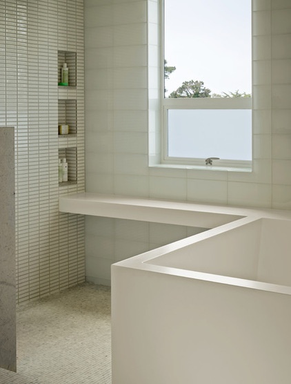
The window wall tile is glass and has an ethereal glow. “It has a very Japanese look,” the designer says. She meticulously planned the tile placement and window surrounds so they line up with the grout lines in a pleasing way. The tile also meets the main part of the floor and the ceiling perfectly. In other words, no cuts were made around the bottom or top of the tile wall’s composition. The designer did not happen upon a tile size that fit the room height perfectly — she floated the ceiling a little to make it meet the top of the top row of tiles.
Designing the custom Corian tub required a lot of math and several mock-ups. The homeowners would visit Hulburd’s office to take a mock soak in the mock-up, and then the architect would tweak the cant of the back and the size of the deck’s edges. The tub not only had to please the homeowners with its comfort, but it also had to fit up the stairs. An intrepid craftsperson made the one-of-a-kind piece.
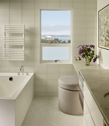
Hulburd didn’t want to block the spectacular views or natural light (you can spy Bernard Maybeck’s Palace of Fine Arts in this photo), but wanted to create a sense of privacy and ventilation, so she created operable lower window portions with frosted glass and upper portions of clear glass.
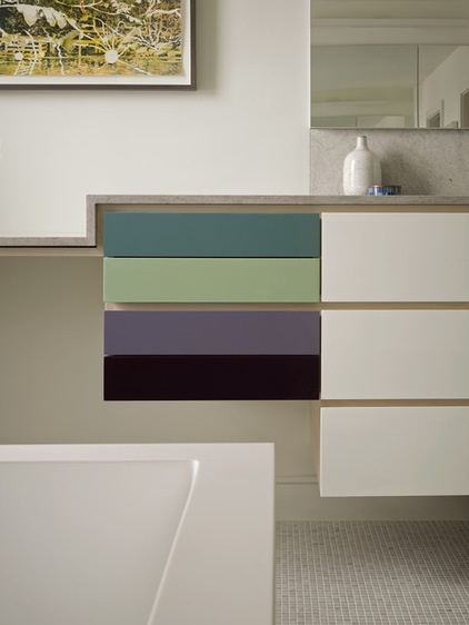
One of the homeowners is Scandinavian, and the couple loves a clean, simple Scandinavian aesthetic. Hulburd used plays on geometry and bands throughout the home (see them in the kitchen design), seen here via the detailing on the cabinetry. The reveals in the vanity are one of the thoughtful subtle details. “Usually the reveals would be veneer, but we used solid ash; you can really tell the difference,” she says.
This photo also illustrates the exacting precision employed for every little detail. Note the way the ¾-inch reveal under the ¾-inch counter on the left lines up perfectly with the top drawer. Another detail that’s hard to see is how the backsplash relates to the mirrors. Because the mirrors needed to protrude ⅞ inch off the wall due to the medicine cabinet doors, she recessed the backsplashes to be flush with the drywall.
Mirrors: Roburn
Design Basics to Help You Think Through a New Master Bath
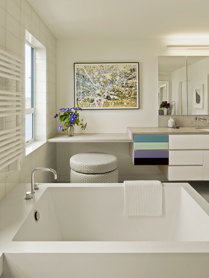
Hulburd also repeated a step-down theme, seen here where the vanity counter steps down to meet the bottom of the window line. One steps down into the shower stall as well.
One unique surprise is the burst of color on the vanity’s drawers. “I design very graphically,” the designer says. She and the lady of the house sat with a fan deck to determine the colors they loved, then pulled them in big sizes to play with which ones worked best together. Both homeowners have a great eye for art, and this colorful piece is a perfect fit for the very neutral room.
Artwork: via Hosfelt Gallery
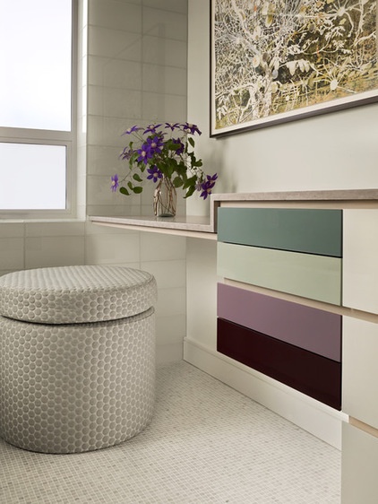
One of the most fun pieces in the room provides a break from the bands, grids and other straight lines. It is a round custom pouf designed by Hulburd and covered in a circular patterned fabric. Appropriately, the fabric is called Bubbly, and it can stand up to moisture. Isn’t it sweet that a spot for his wife to perch on a pouf was a husband’s number-one request in their shared bathroom?
Countertop: ¾-inch Beau Perle marble; wall paint: custom, Benjamin Moore; pouf fabric: Bubbly in Ecume, Luna Textiles
More: See phase 1 and phase 2 of this project


