Houzz Tour: Historic Home Connects With Its Past
It’s hard to believe it now, but the owners of this home purchased an old, run-down house with a bad ’70s addition and one bathroom. There was method to the madness, however, as the home had stunning historic details and finishes and was located on an attractive street. With a view to turning the home into something functional, attractive and perfect for entertaining guests, the owners called on the expertise of designer Brett Mickan.
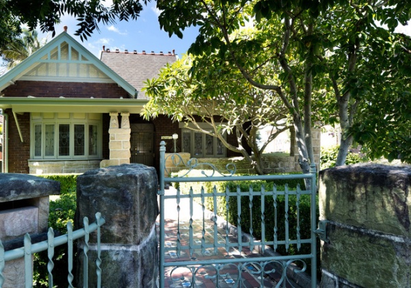
The property had survived multiple renovations influenced by the trends of the day. It was originally built during the Arts and Crafts movement (1880 to 1910), got an addition during the days of art deco (1920s to 1930s) and then got a final addition in the 1970s. The last renovation wasn’t sympathetic to the architecture of the home; the owners had filled the house with faux-Victorian fixtures that worked against the simplicity of the Arts and Crafts style and made the interiors feel dark and claustrophobic.
Houzz at a Glance
Who lives here: A young couple and their 4 kids, all younger than 7
Location: Haberfield, a suburb in Sydney
Designer: Brett Mickan, Brett Mickan Interior Design
Size: 5 bedrooms, 4 bathrooms plus a cabana
Appearances can be deceiving. Planning regulations of Haberfield say an extension cannot be visible on the street facade of the home. Now, when guests arrive at the front doorstep of this cute little circa-1900 home, they are guided through a generous hallway that opens up to large entertaining areas and a beautiful garden beyond.
When embarking on the project, one of Mickan’s design challenges was to make the new plan flow seamlessly with the addition, while retaining the simple lines and grand scale of the elegant period features. To do this he had to pare back to create a gallery-like display of the home’s architectural details, which would then allow for the addition of contemporary fixtures and furnishings. Mickan also collaborated with Colin Filmer of Filmer Architects to realize the vision for the house.
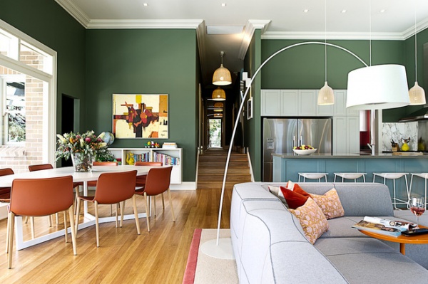
Although the owners weren’t sure about such a bold color choice for the walls at first, they are now absolutely delighted with the result and are happy that the home has a visual connection from the living areas to the front of the home.
“They love that the spaces feel generous without feeling austere, and that the whole family has room to get together or to be separate from one another — and that they don’t have to share a bathroom,” says Mickan.
When undertaking a design project, Mickan tries to guide his clients through the sometimes tricky process of what to invest in and where to save. “In the family room, they splurged on the Patricia Urquiola Bend-Sofa and B&B Italia Seven table; however, the floor rug is actually an edged piece of wall-to-wall carpet,” he says.
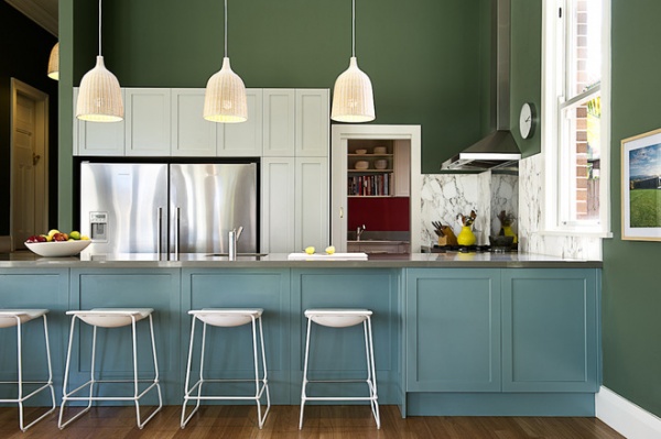
Color is a defining feature of the home, with strong hues displayed throughout. The deep green tone that flows into the large kitchen and living area allows what could have been a cavernous room to feel cozy and directs attention to the yard outside. “It also allows the large kitchen to sit quietly within the shared space,” Mickan says. “By continuing the wooden floorboards throughout, we have created a flow to the new floor plan.”
The large family kitchen is the hub of the home. “It works just as well for two people as it does for 50,” Mickan says. “The high ceilings and ability to open up to the garden make it a place hard to leave.”
Pendant lamps: Leran, Ikea; stool: Last Minute, Hub
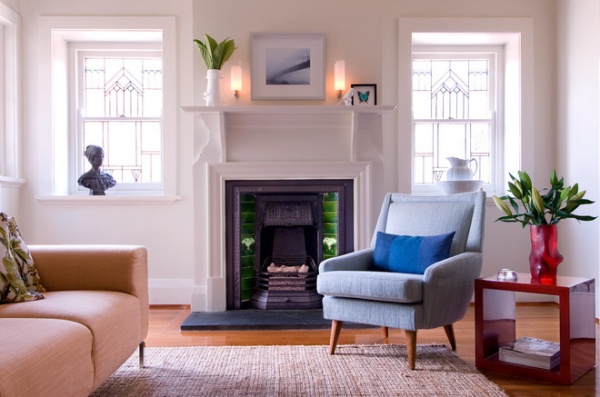
Mickan loved that the home had an eclectic mix of styles, and rather than try to hide the juxtapositions, he sought to make them features and blend the molding details and finishes.
“The objective was to respect the existing architecture when modernizing and adding the extension. This was achieved through a combination of the use of materials, scale and color. Period elements were simplified with off-white, and the extension was painted in a deep green reminiscent of the era. The style of the home is definitely contemporary, while also being Arts and Craft,” Mickan says.
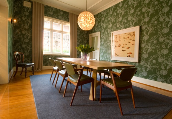
A formal dining room is often removed or not built into modern homes, but the one here is one of the designer’s favorite rooms. “It has a great visual and functional connection to the rest of the home, making it constantly used for guests, while also providing a little seclusion from frantic family life,” he says.
The furnishings and features in the home reference a variety of periods to create a curated feel. Handmade and natural materials have been used to emulate the Arts and Crafts era in which the home was originally built. “An example of this is the Jardan oak table and Kai Kristiansen teak with leather upholstered dining chairs,” Mickan says.
Chairs: vintage Kai Kristiansen, Vampt Vintage Design
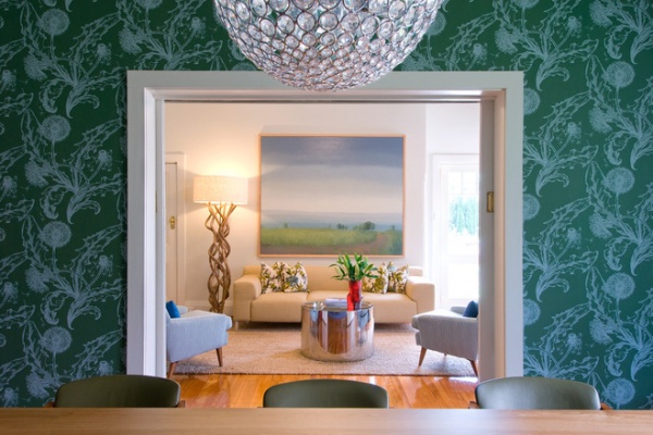
The dining space is enveloped by rich, green-toned Dandelion wallpaper from Porter’s Paints. “It is the perfect backdrop for intimate dining in this large space,” Mickan says. The Genie chandelier from Mondo Luce adds a contemporary touch. A doorway to the living area reveals an oil painting of Australia’s Southern Highlands, west of Sydney.
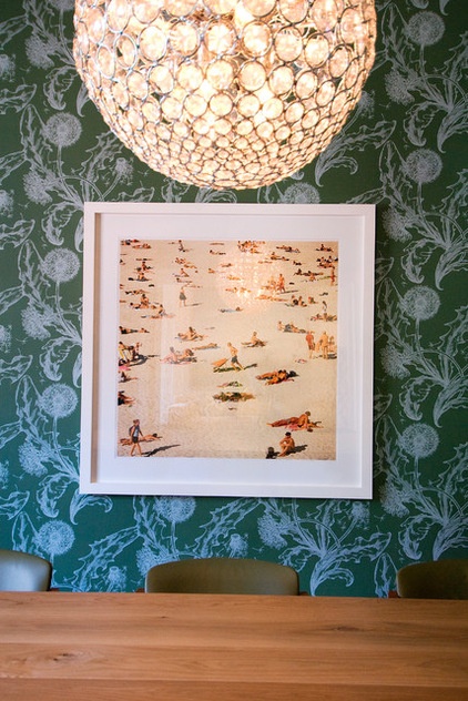
The home features artworks depicting vistas of Bondi, Australia, and the Southern Highlands, both places where the owners have previously lived.
Photograph: Rex Dupain
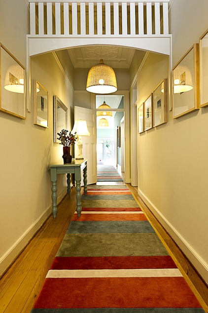
On the hallway floor are modern striped five-color runners.
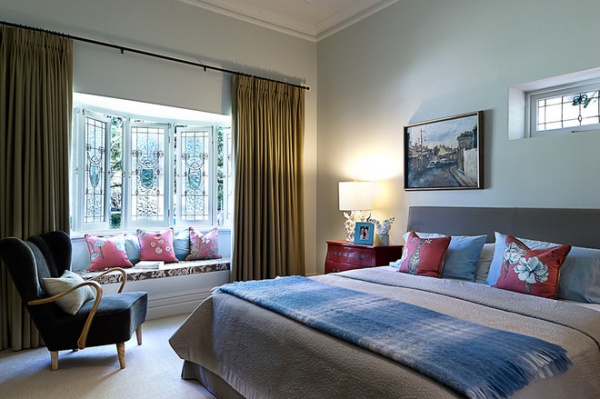
The spacious master bedroom is another one of Mickan’s favorite rooms in the house. The bay window is the perfect place for curling up with a book or daydreaming while gazing outside.
Coral lamp: Anthropologie
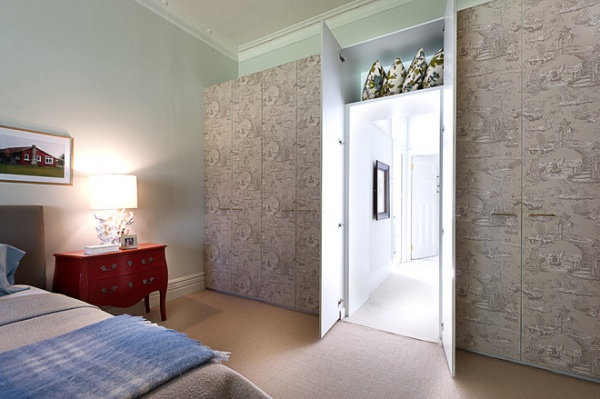
The master bedroom features closets that have been wallpapered in a beautiful toile paper. “The big surprise is one of the wardrobe doors conceals an entrance that opens onto a beautiful dressing room and master bath,” Mickan says.
Wallpaper: Oriental Toile, Sheila Coombes
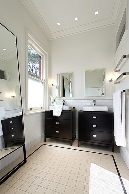
An elegant full-length mirror, neutral tiles and wall paint, and window open up the master suite dressing room–bathroom to create the illusion that it is bigger than it really is.
Vanity cabinets: custom, Intercraft Furniture
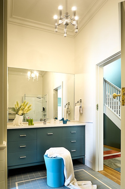
Bold colors are also evident in the custom-made vanity cabinets in the family bathroom. Decorative touches such as the vase, toothbrush holder and blue ceramic origami crane, from Bed Bath N’ Table, add personality to this bathroom.
Sink fixtures, blue stool: Reece
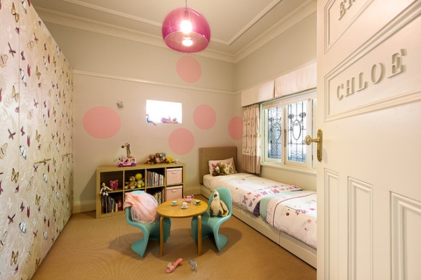
The whimsical girl’s bedroom features Nina Campbell’s Farfalla wallpaper, pink pendant lighting and custom-made banquet beds and headboards.
FL/Y Suspension Lamp in Transparent Cardinal Red: Space Furniture
Browse more homes by style:Small Homes | Colorful Homes | Eclectic Homes | Modern Homes | Contemporary Homes | Midcentury Homes | Ranch Homes | Traditional Homes | Barn Homes | Townhouses | Apartments | Lofts | Vacation Homes


