Kitchen of the Week: A Hardworking Island in a Timeless Space
The kitchen in this 1940s Ottawa cottage was big enough for only one person to use and not suitable for the family now living there. “Before, this kitchen was about the size of a bathroom and was lackluster,” says interior designer Nathan Kyle of Astro Design Centre. Kyle began the design process by learning how the family likes to function in the kitchen when working together, then set up the layout accordingly. He took down a wall and incorporated into the kitchen a side entry hallway that had been a waste of space. He also added luxe elements that suit the family’s love of eclectic and contemporary style. Rich wood finishes and a lively backsplash provide a beautiful backdrop for a display of intricate pieces they brought to Canada from Iran and create a timeless look.
Photos by Doublespace Photography
Kitchen at a Glance
Who lives here: A family with one child in college and another in high school. At the time of the remodel, they had recently relocated to Canada from Iran.
Location: Ottawa, Canada
Designer: Nathan Kyle, Astro Design Centre
Size: About 160 square feet (15 square meters)
Tip: If you can’t find a tile pattern you like, you can have one custom designed.
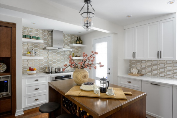
The beam that runs across the kitchen in front of the range and side entry door in this photo marks the place where a wall used to separate the kitchen and a side hallway. The house is a 1940s cottage, and the side hallway and entrance had been added by a previous owner.
The kitchen island seen here is a big part of the room’s new design. “A lot of people today don’t want a work triangle,” Kyle says. “When two people are working in the kitchen at the same time, they will get in each other’s way in the triangle.” Instead, he designed workstations with the large island (60 by 42 inches) as the hub. There are separate areas for unloading groceries, prepping food and loading dishes into the dishwasher near the sink.
The island countertop is a beautiful walnut butcher block with a chevron pattern instead of the typical slat lines or square blocks. The walnut was roasted to remove the moisture and then oiled. The couple can chop directly on this surface. “You can keep it pristine, but I feel scratches and stains are made with love,” Kyle says.
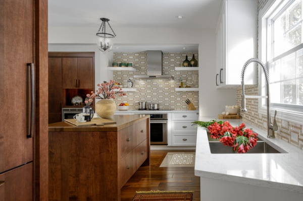
The cabinetry on the left conceals a panel-front refrigerator and a pantry. The homeowners enter the kitchen here with their groceries. Kyle designed this part of the layout so they could walk in, set their groceries on the counter on the right, across from the refrigerator and pantry, and put the food away.
Overhead an etched glass light’s X pattern throws beautiful shadows onto the ceiling at night, a nod to Middle Eastern style. Four-inch pot lights illuminate the rest of the room and have a more updated look than typical 6-inch pots.
Light fixture: Hudson Valley; faucet: Axor, Hansgrohe (note: The sprayer on the newer version is slightly different, a straight tube)
Learn more about setting up kitchen work zones
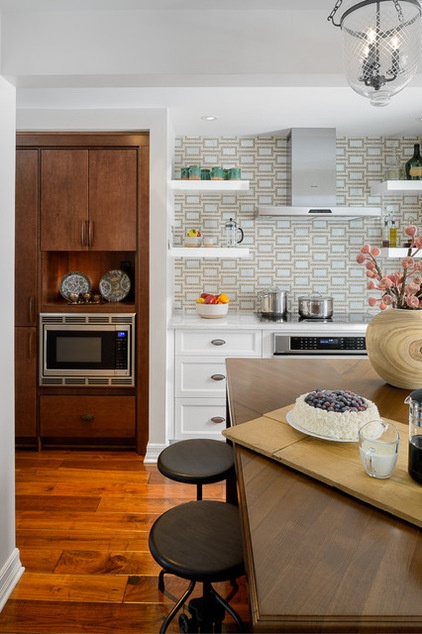
Kyle custom designed the dazzling backsplash using a bright white marble tile and ⅝-inch golden sandy-brown squares in a dynamic graphic pattern. “The clients have eclectic taste, and we really needed something to liven things up in here,” he says. The pattern is a reminder of home and creates a stunning backdrop for them to display favorite glassware and china pieces. They have intricate pieces from Iran to display: colorful fine china with beautiful patterns and metallic glints. Kyle added the floating shelves on the range feature wall to accommodate those things.
“During Iranian New Year, they bring out their finest china, candlesticks, incense and other items as part of the celebration,” he says. The niche above the speed oven and the open shelves provide display space. The niche has a power outlet and can also serve as a spot for a cookbook stand. The designer also kept future use in mind by sizing the niche to fit a luxury espresso station, which was beyond the budget at the time but can be added later. To the left of the speed oven is more pantry storage space.
The countertops are Torquay quartz by Cambria. “They have veining in grays and caramels that mimic natural stone,” Kyle says. They also pick up on the tones in the backsplash tile.
Backsplash: custom by Nathan Kyle, Astro Design Centre; appliances, vent hood: Dacor
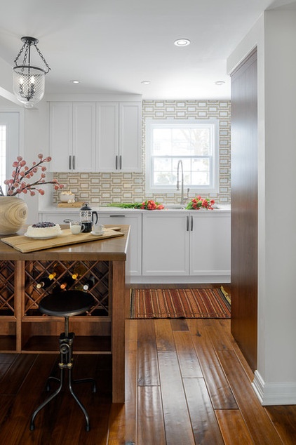
The front of the kitchen island has deep drawers for storage, and the back side has open shelving and wine racks. The overhang on the wine side accommodates counter stools. The island’s legs give it the look of furniture, as do the drawers on the front and the applied molding on the legs.
The cabinet finish is a custom stained birch veneer. The floors are prefinished sculpted cherry engineered hardwood. Although this product is more expensive than hardwood floors, the cost is made up in lower maintenance. They are durable enough to handle the high traffic through the kitchen and will never need to be refinished. Kyle chose 5-inch planks for a timeless look that worked with the architecture of the house.
“We didn’t want the kitchen to have the distinct look of any one style or era,” Kyle says. Instead, he melded the family’s love of contemporary and eclectic style with the more traditional architecture of the home.
Learn when to use engineered wood floors
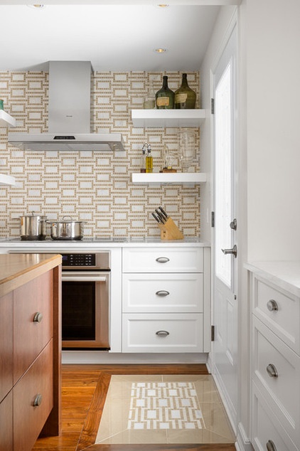
“The house is architecturally traditional, but the homeowners have a lot of contemporary furniture,” Kyle says. The goal was to give the room a timeless look, not one of any particular era. The eclectic mix continues in subtle ways. There’s a mix of Shaker and flat-front cabinets in white and rich wood finishes. Each cabinet finish has its own corresponding hardware — the wood drawers have a rusted iron-forged hardware, while the white cabinets have antiqued pewter. “We wanted to minimize the amount of stainless steel on the appliances, so we used panel fronts on the refrigerator and dishwasher,” Kyle says.
Another unique touch is the tile area rug, which matches the backsplash tile. While the engineered hardwood floors can stand up to snowy boots during a Canadian winter, the little rug is a good place to step onto and shake them off first.
Backsplash: custom via Astro Design Centre
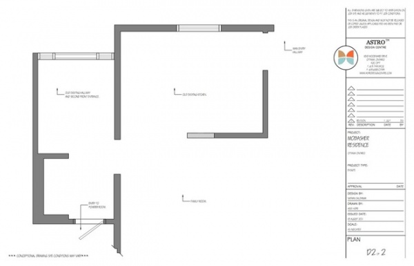
BEFORE: Here is the plan from before the remodel. The original wall between the hallway and the kitchen was where the beam seen in previous photos is now.
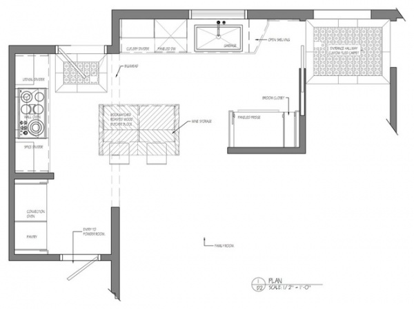
AFTER: By removing the wall, Kyle gained much-needed space from the hallway as well as natural light from the side door. Another part of the project was adding a new powder room (bottom left).
See more Kitchens of the Week


