See the Clever Tricks That Opened Up This Master Bathroom
This was a classic case of the shoemaker’s kids going barefoot. Robin Amorello spent eight years designing other people’s master bathrooms, while the one she shares with her husband, Joseph, went untouched. An angled ceiling meant the large one-piece bathtub-shower combination had to be installed in an awkward spot that crowded the toilet. That created a barely functional alcove that prevented the addition of a second sink. “It was badly designed from day one,” she says.
But about a year ago Amorello finally found time to be her own client. She gutted the 75-square-foot bathroom and swapped the shower-tub combo for a shower, which freed up space for an additional sink. She wall-mounted the toilet and faucets for a roomier feel and to make cleaning easier. She also raised the vanity and recessed the medicine cabinets and even the toilet paper holder. “In the end it was about carving out inches here and there,” she says.
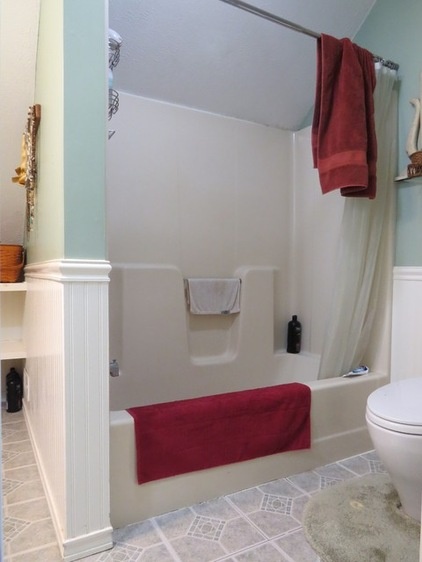
BEFORE: The previous one-piece shower-tub combo ended at the sloped ceiling, resulting in the cramped arrangement. “There was just empty, unused space wasted behind it,” Amorello says. “In fact, I think squirrels were living back there.”
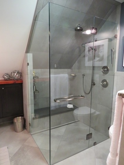
AFTER: Removing the 5-foot shower-tub combo and its wall and installing a 4-foot shower allowed Amorello to push the space farther back under the eave. That made the toilet area less crowded and allowed for a shower bench. An HVAC duct runs underneath the bench, warming it whenever the heat is turned on.
Frameless glass creates the appearance of more room. The glass is higher than 80 inches, so the air in the shower doesn’t get as cold as it would if the glass were the standard 72 inches.
Meanwhile, installing a trench drain in the shower meant Amorello didn’t need a threshold. This allowed her to run the large-format tiles seamlessly. “It tricks your eye into feeling like the space is bigger,” she says. Plus, the 2-foot by 2-foot porcelain tiles meant fewer grout lines for a less busy look, and the diagonal pattern gives a visual impression that the space is stretching out.
Tips for replacing a tub with a shower
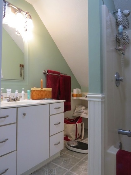
BEFORE: Beadboard wainscoting, cultured marble, Formica and linoleum tiles on the floor weren’t materials that made Amorello happy. “Everything was plastic on plastic on plastic,” she says.
And the crowded layout made a second sink impractical and created a narrow corner for storage. “You had to suck it in to grab a towel off the shelf,” she says.
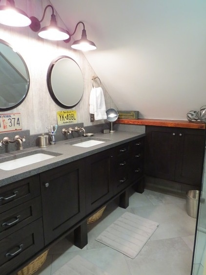
AFTER: With the wall now gone, and a foot of space gained, Amorello was able to add a second sink and an extended custom vanity with better navigation into the corner.
She designed raised espresso-stained oak cabinets that allow for storage underneath and give the appearance of more space. “You can see all the way to the back while standing in the shower, which makes the room feel bigger,” she says.
Porcelain tile that looks like reclaimed wood covers the wall above the vanity, which is topped with a slab of diorite, a natural stone. Amorello chose it for its color and thickness — 1 5/8 inches versus the standard 1 3/16 inches.
After those selections, she felt the space was getting a bit too gray on gray on gray. A trip to a local architectural salvage seller produced a 2-by-8 board that she treated with mineral oil. She used this to top the storage cabinet in the corner, adding warmth.
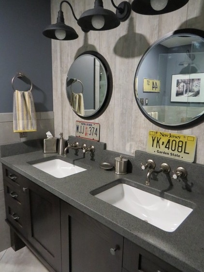
The license plates are a play on his-and-her markings — she’s from New Jersey; he’s from New York.
The wall-mounted faucets save space and make cleaning easier. Amorello took round medicine cabinets intended to be surface mounted and recessed them into the wall.
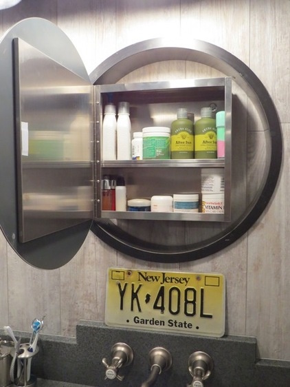
She had a steel collar fabricated to fit inside the wall. Because she gutted the bathroom, she was able to plan for this addition and have the units framed into the existing walls, and the plumbing and electrical wires routed accordingly.
The tile inside the opened portal is glued to the back of the Sheetrock that forms the hallway wall. The installer lined up the tile lines on both walls to make it look flush.
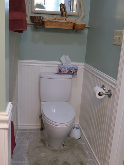
BEFORE: The protruding shower-tub combo crowded the toilet into the corner.
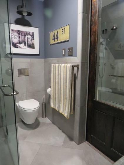
AFTER: Pushing the shower farther under the eave and installing a wall-hung toilet opened up this corner. “With a wall-hung toilet, you can buy yourself 10 or 11 inches without changing the wall,” she says. “Plus, it allows you to sweep and clean under the toilet, which is a dream for anyone in charge of bathroom cleaning.”
For just a bit more room, she recessed the toilet paper holder. “It’s really a game of fractions of inches,” she says.
The artwork is a photograph that Amorello’s daughter took of graffiti inside an abandoned camp in New Jersey.
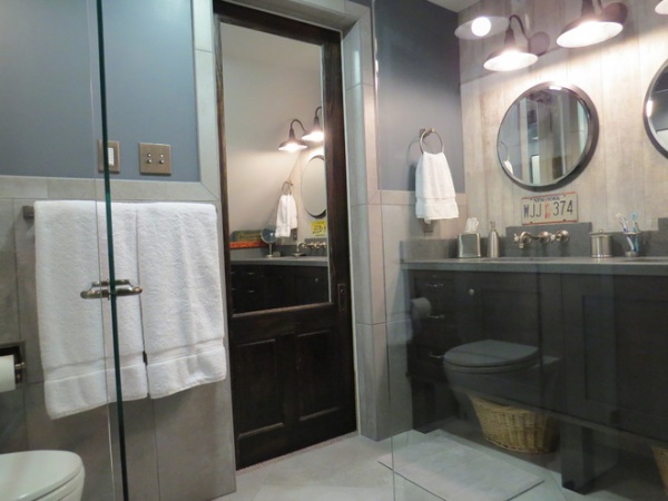
A sliding barn-style door means the space isn’t impeded the way it would be by a regular door that would swing into it. A large mirror on the inside (and outside) helps visually double the room.
Amorello was also mindful of the room’s many sharp corners and right angles. “I tried to subliminally throw in circles when possible,” she says. “It’s my way of softening it up a bit.”
Before, the lighting came from a light and fan and a three-bulb fixture over the sink. Four barn-light fixtures and a fan with two LED lights now brighten the space just enough.
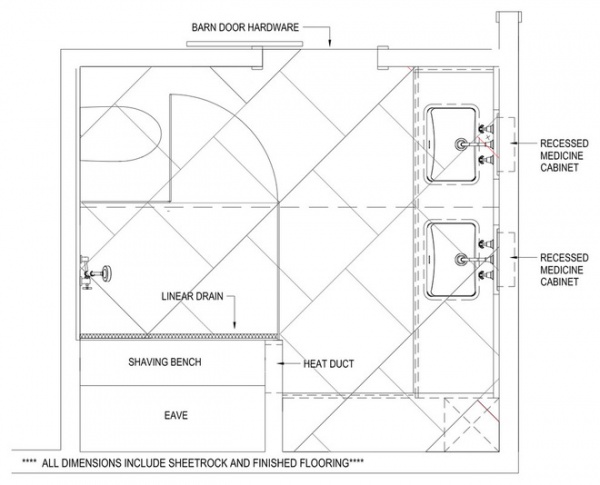
This floor plan shows how Amorello squeezed everything she wanted into her new master bathroom and maximize every square inch of the 75-square-foot space. “It was nice being my own client for a change,” she says.
Amorello says the cost of materials was about $25,000. Most of the labor was a “gift from some pretty fantastic tradespeople,” she says. Those planning a similar project should budget around $50,000, she says.
More:
10 Tips for Chic Little Bathrooms
How Much Does a Bathroom Remodel Cost?


