Room of the Day: Awkward Attic Becomes a Happy Nest
http://decor-ideas.org 11/27/2014 04:13 Decor Ideas
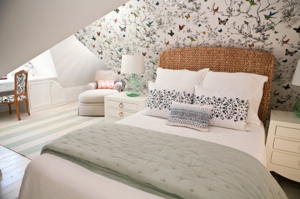
In this attic renovation, it was all about the angles. Awkward roofline angles, so often found with attic walls and ceilings, can be made cozy and light with the right approach. In turning this attic into a master bedroom, interior designer Sarah Wittenbraker knew she needed a free-flowing wallpaper to work with the room’s challenging nooks and crannies, and after choosing a colorful bird and butterfly pattern, she needed to apply it to the right walls. “The last thing we wanted was for it to feel like the butterflies were attacking!” she says. Here’s a closer look at how she turned the formerly dark and uninviting space into a happy nest for the parents of two young children.
Photos by Kady Dunlap
Room at a Glance
What happens here: Sleeping, lounging, reading, working, nesting
Location: Austin, Texas
Size: About 200 square feet (18½ square meters)
Attic tip: When choosing a wallpaper for a room with odd angles, opt for a free-flowing pattern over an unforgiving geometric one.
When this couple moved into their antique Tudor-style cottage, the former owners had begun converting the attic into their master suite but had not finished. To save costs, Wittenbraker built on the existing renovations without doing any major architectural changes. Phase one was creating a cozy bedroom; updating the master bath would come later. The biggest splurge was the beautiful wallpaper, which makes the biggest impact in the room.
Wallpaper: Birds and Butterflies, F. Schumacher
Tempted to Try Wallpaper? 10 Tips for Finding the Right Pattern
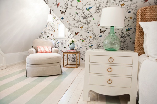
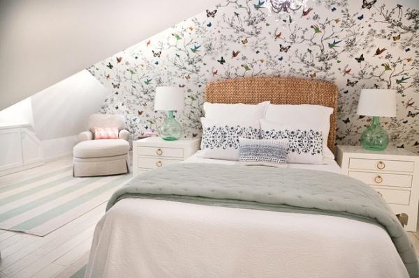
Attic tip: “Consider unified colors for floors and ceilings, so they will all become one thing,” Wittenbraker says. “This helps with all of the odd angles.” She chose Decorators White by Benjamin Moore to brighten up the once-dark space, which has only two small windows. She carefully chose focal walls for the paper, to avoid the aforementioned butterfly attack. “The beautiful wallpaper makes the walls recede and adds interest, but overusing it would have made it dizzying and highlighted the odd angles,” she says. She used it on the headboard wall, the wall behind the desk and the window wall in the reading nook.
She also made the room look deeper by choosing two matching flat-weave striped rugs — the stripes orient to accentuate the room’s length. They create zones (the workspace–reading nook zone and the bed-nightstand zone) without overwhelming the floor. Their light colors work well with the whitewashed floors and add more of the blue, green and aqua tones she used throughout the rest of the room.
To keep everything from looking too stark, sparkling and new, she added a few items that show age, like warm brass finishes and a vintage-style chandelier over the bed.
Nightstands: Jacqui 3-Drawer Side Table, Bungalow 5; rugs: Dash & Albert
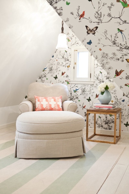
Attic tip: Get the lighting right. “Proper lighting is really important in this type of space, as the angles can cause a lot of strange shadows,” the designer says. “This couple wanted to come upstairs and really feel like they were entering a bright retreat.” She used a mix of two pairs of table lamps, a pendant (seen here), a chandelier and recessed lights in the ceiling.
The owners already had the chaise longue, but it was skirted and covered in a cabbage rose fabric. Wittenbraker had it reupholstered in a basket-weave natural linen for a more tailored, modern look. To make the reading area stand out, she introduced a vibrant coral on the throw pillow, which draws the eye to the cozy nook.
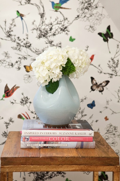
Warmer natural materials, like the reclaimed wood on this tabletop and the woven natural-fiber headboard, also help soften the stark white. Like the chandelier over the bed, they add some age.
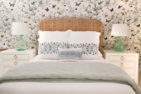
“I knew I wanted color on the lamps, but I didn’t want it to be opaque, so that the light could shine right through,” she says. The glass lamps pick up on the aqua hues in the wallpaper and on the rug.
The bedscape continues the use of blues from the wallpaper, with a blue-gray quilt and dark blue hand-blocked pillows. The homeowners wanted to save on the headboard, because while they had decided to use their existing full-size mattress, they knew that someday Wittenbraker would probably talk them into getting a bigger bed. She picked this headboard up at Pottery Barn to add natural fibers to the room.
Small pillow: John Robshaw Textiles
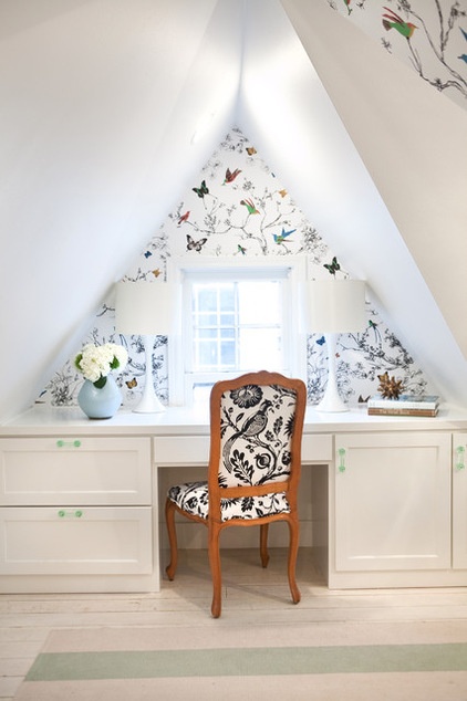
The built-in desk was part of the former homeowners’ renovation and was perfectly functional. Wittenbraker had the natural wood piece painted in a high-gloss white to help it blend in with the walls, floors and ceilings, then added vintage-style green glass drawer pulls. Two modern table lamps add symmetry while blending in seamlessly. “We wanted something modern, to contrast the feminine lines of the chair and wallpaper,” Wittenbraker says.
Privacy was not an issue, so she left both windows bare, not wanting to block out any of the natural light.
Tip: When upholstering with a larger-scale print, carefully consider how the pattern will be framed out. Note the composition and where the bird is on the back of the chair here. “I would usually choose something geometric and not another free-flowing pattern for a chair like this, but we scooped this one up at a great price, and the black breaks up all of the soft colors,” she says. “Now that bird is part of the team in here.”
Drawer pulls: House of Antique Hardware; chair: local antique
See more Rooms of the Day
Related Articles Recommended


