Houzz Tour: Traditional Shingle With a Modern Soul
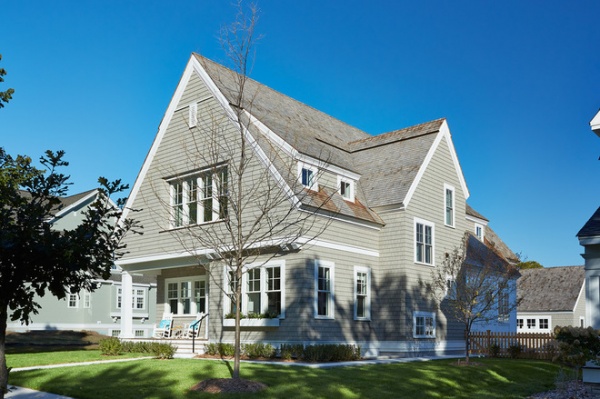
When a couple starting their family decided to build a home, they wanted everything new and fresh for the next exciting chapter in their lives — raising children. Their new home has a traditional shingle-style exterior out of respect to the historic area and cobblestone street, but architect Colby Mattson planned the design around a modern interior. The process was a true team effort between the architect, interior designer Lucy Penfield and contractor Kraemer & Sons. To create balance between old and new, as well as a pleasing flow throughout the home, the team picked motifs in textures, colors, geometry and small architectural details and repeated them for continuity. “These clients were completely open to ideas and really wanted to be pushed beyond their comfort levels,” Penfield says. Though the couple had no idea how contemporary they wanted to go in the beginning, by the end of the process they were committed to their crisp white, clean-lined, family-friendly home.
Photos by Susan Gilmore
Houzz at a Glance
Who lives here: A couple and their 2-year-old daughter; during construction a second child was on the way too.
Location: St. Paul, Minnesota
Size: 4,480 square feet (416 square meters) including the finished basement; 5 bedrooms, 4½ bathrooms
Team: Architecture: Charlie & Co. Design; interior design: Lucy Interior Design; general contractor/builder: John Kraemer & Sons; landscaping: Topo
The house is located in a new development that borders St Paul’s historic Crocus Hill neighborhood, where most of the homes were built between 1890 and 1910. It even has a cobblestone street that dates to the 1800s. It was important to Mattson, who has designed several other homes in the area, to respect the history of the neighborhood and provide something pleasing for the neighbors to look at. He knew shingle style could be detailed in a historically respectful way on the exterior and could also work well with more open and modern spaces inside. If you made a note of the square footage, the look of the house from the outside may surprise you; thanks to the clever massing, it appears much smaller than 4,480 square feet.
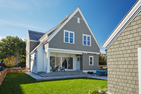
The clients were interested in maximizing the outdoor space on the urban lot for their kids and their dog. There was an existing back alley for cars, so Mattson proposed a detached garage that would close it in and block the alley and views of other houses.
“The garage allowed us to create a private backyard oasis,” he says. Referring to the large glass doors, he says, “We were able to go with a more contemporary feel back here because it is hidden from the street.”
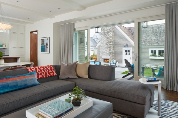
Mattson turned the garage into a charming building to view from the house and yard. This charm comes from the interesting roofline, window boxes and the most critical piece, a large stone outdoor fireplace. The garage includes storage for a portable Ping-Pong table that they like to use outdoors.
The view and access allowed by the large glass doors makes the terrace a natural extension of the living room. Just off the terrace is an outdoor living room that stays toasty, thanks to the fireplace. “You can even enjoy the outdoor fireplace just by viewing it from inside,” Mattson says.
Penfield dressed the windows in soft gray wool sheer drapes for privacy and warmth and to cut the glare on the TV. The streamlined treatments don’t distract from the view, and a traverse track rod continues the clean, unobtrusive look.
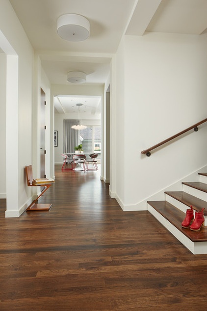
Mattson designed the floor plan so that the view is open from the front door all the way through to the garage. The hallway is 5 feet, 7 inches wide, and the ceilings are 10 feet high, which prevents it from feeling tunnel-like. The staircase has longer-than-average runs and a wider-than-average landing, which gives it a gracious presence.
From the first steps through the front door, one gets a strong idea of what’s to come. The designers used warm walnut wood on all of the floors and built-ins, while the same shade of bright white paint on all of the walls, trim and ceilings provides a strong contrast. “The crisp and clean white palette could receive all of the furniture and materials,” Penfield says. For example, a classic modern Zig Zag chair hints at all the clean lines and plays on the geometry to come. The round drum ceiling lights let us know the look won’t be all about straight lines.
Wall paint: Super White, Benjamin Moore
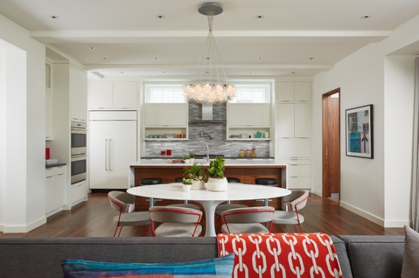
The kitchen, casual eating area and family room are open to one another. There is flow between the spaces, thanks to the flooring, wall colors and other finishes. Mattson delineated the different areas via ceiling beams and lighting.
Throughout the house there is a play on horizontal and vertical. “Alignment and continuity are crucial,” Mattson says. For example, the transom windows line up with the tops of the doorways, and the cabinets follow the same lines. “The small details really add up,” he says.
“There are bands of materials,” Penfield adds. There is a band of walnut on the island, surrounded by a quartz waterfall counter; a band of gray marble tile on the backsplash; and bands implied by the cabinets and open shelves. At the top a band of light is provided by the transoms, which maintain privacy from the house next door. The cabinet towers on both sides bring in balanced vertical elements. The refrigerator, on the left, is camouflaged by a panel front; a coffee station is incorporated on the right. On the far right is a mudroom; on the far left is a pantry space that leads to the dining room.
Countertops: Blizzard, Caesarstone
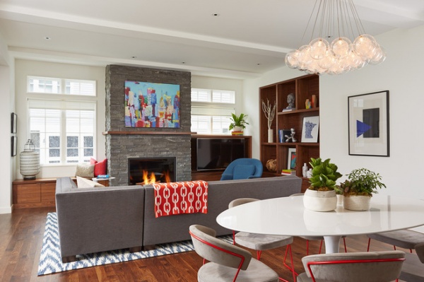
Also providing continuity throughout the house are dashes of fiery orange-red, seen on the chairs and throw blanket here. A simple tulip table and chairs with powder-coated red metal frames add modern style; a chandelier adds a bouquet of glass balls overhead. The comfortable chairs are covered in a suede-like upholstery.
The couple loves blue, which Penfield brought in with the ikat-patterned rug and the art. The cushy sectional sofa is a custom piece the whole family can sit on together, and its nubby gray upholstery can stand up to kids and pets. So can the storage coffee table, which is covered in a leather-like vinyl and is flat enough for playing board games on.
A custom gridded walnut shelf unit plays with proportion. Note that each rectangular section is exactly the size of two of the grid’s boxes. The transoms imply another band, broken by the stone fireplace. The French doors and transoms provide a more traditional exterior look for the facing neighboring house.
Chairs: Calligaris
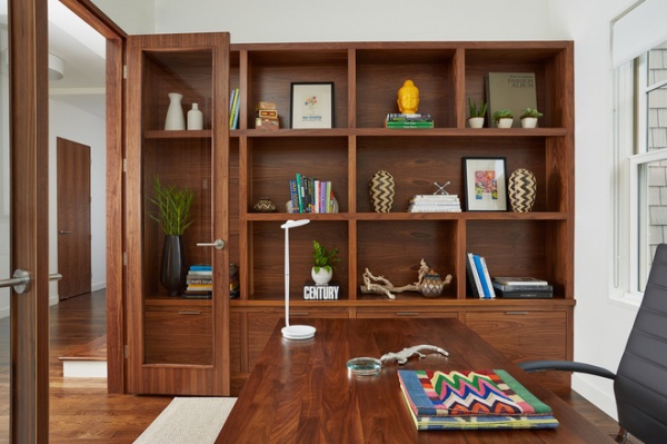
The office is located just to the right of the front door. A handsome walnut unit similar to the one in the family room has file drawers on the bottom. It also plays with the grid with one tall box and one long one that fit within the grid. The desk is also walnut. Full-view French doors let the light flow in from the hallway.
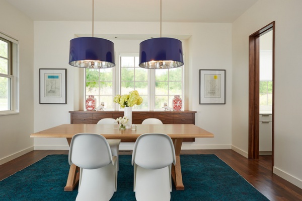
The dining room is just off the left side of the front entryway, across from the office. A pantry area on the right leads to the kitchen; pocket doors like this one were used wherever possible for a clean look. The cantilevered walnut buffet provides another band. It has drawers along the top and cabinets underneath.
The table is custom made. It has an X-base and is crafted of rift-cut cerused white oak; the important piece provides some contrast with its lighter coloring. There are two breadboard end extensions that can slide into the ends at Thanksgiving.
“The rug is so fun!” Penfield says of the overdyed antique, which grounds the room in a dramatic deep turquoise. Ginger jars on the buffet bring in small pops of red-orange, while glossy navy pendants lined in silver add a strong playful geometric element.
Tip: When it comes to art, framing can make all the difference. Because the budget was being spent on other things at this point in the homeowners’ lives, the designers helped them find great prints. “All of the art adds a graphic modern splash and looks high end,” Penfield says. “They are printed on canvas and framed in bright white mats with crisp black frames.” This gives them a gallery-quality look.
Pendant lights: Robert Abbey
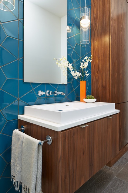
In the powder room, “we wanted to make a total showstopping statement,” Penfield says. “We call this our web wall.” The Italian tile is stunning — the shapes form large hexagons, and the lines create a big, crackled web-like look.
Tip: Just because a powder room is small, there is no reason not to incorporate large-scale elements like this white trough sink, tall walnut cabinet and stunning tiled wall. The cabinet’s narrow width makes it more of a sliver, and cantilevering it and the vanity kept them from bulking up the space. “The unframed floating slab mirror doesn’t take attention away from the web wall,” Penfield says. Neither do the transparent glass cylindrical light fixtures.
“We also used chrome all over the house,” Penfield says. “It lends a high-design look at a nice price.” The floor is made of tile planks with faux bois graining. They used the same flooring in the mudroom.
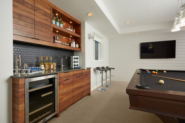
“We gave the basement its own flavor by using the same materials in a different way,” Mattson says. The white shiplap walls provide strong horizontal lines. The cabinets are made of the walnut seen upstairs but in long, horizontal planks. Note the way the open shelves look like an extension of the planks due to their thickness. The shelf design also allowed for built-in lights.
The graphite hexagonal tile and pool table cloth and blackened earthy hardware lend a more masculine feeling to this man cave. The hexagons create a subtle connection to the powder room upstairs.
Light fixture: Jonathan Adler
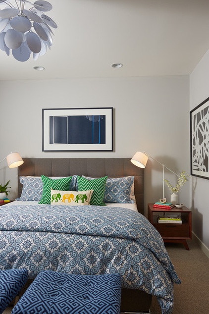
Upstairs the master bedroom highlights the owners’ favorite color, blue, in the bedding and art. The midcentury modern–inspired nightstands add the element of walnut, while the tufting on the headboard repeats the grid seen on the cabinets downstairs.
“We gave each of the bedrooms a splash of design with their own unique light fixtures,” Penfield says. In here it’s a contemporary white paddle-wheel chandelier. Another fun lighting move is the reading light — the designer placed swing-arm floor lamps behind the nightstands. This saved surface space and added some interesting lines that recall the Zig Zag chair in the front hall.
Tip: Headboards get a lot of use, so they should be upholstered in something durable. Penfield chose a heathered faux wool.
Bedding: John Robshaw Textiles
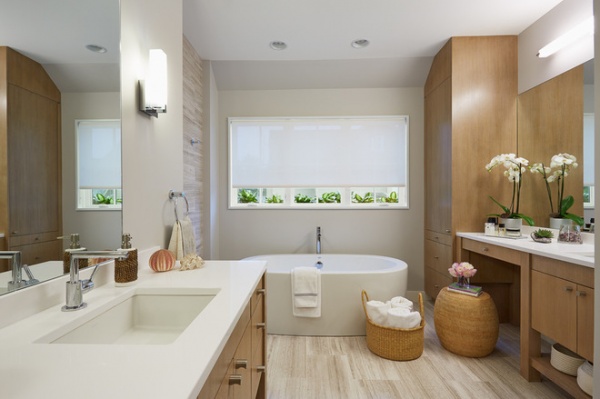
“The homeowners really wanted their master bathroom to feel like a spa,” Mattson says. The team switched up the cabinetry from the walnut they used in the rest of the house. They chose a lighter wood, rift-cut white oak. They also used different hardware.
Large slab mirrors and a big window give the room an open feeling. But the most stunning element is the light honed travertine tile, which extends through the room and up the walls on either side of the bathtub. “We used very few materials, but the design is interesting,” Penfield says.
Everyone on the team enjoyed working with the intrepid clients and one another. Mattson credits Penfield with gaining the clients’ confidence and the contractor with maintaining it. “Once we brought Lucy onboard, the clients really opened up and trusted us … [and] our clients always feel they can trust the process with [John] Kraemer involved,” he says. “Between Lucy’s eye and the contractor’s can-do attitude, this project reminded me how invigorating the collaborative process can be.”
Wall paint: Shoreline, Benjamin Moore; countertops: Concrete, Caesarstone
Browse more homes by style:Small Homes | Colorful Homes | Eclectic Homes | Modern Homes | Contemporary Homes | Midcentury Homes | Ranch Homes | Traditional Homes | Barn Homes | Townhouses | Apartments | Lofts | Vacation Homes


