Room of the Day: Finding Middle Ground in a Master Bedroom
http://decor-ideas.org 11/25/2014 00:13 Decor Ideas
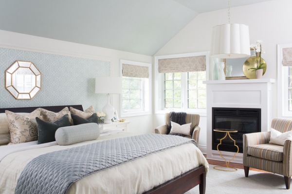
Saddled with long and stressful commutes, this husband and wife craved a master bedroom that would serve as a true retreat after long workdays. However, they were having trouble agreeing on a bedroom style for their traditional home — she loves light neutrals, while he has a penchant for brighter color and bold patterns. Interior designer Katie Campbell was able to find a beautiful middle ground that met both of their needs, creating a soft space in ivory, watery blues and greens with just the right dollops of bold pattern and dashes of color.
Photos by Michelle Peek Photography
Room of the Day
What happens here: A couple of empty nesters retreat and relax after a tough commute.
Location: Oakville, near Toronto
Designer: Katie Campbell
Size: About 280 square feet (26 square meters)
Tip: A framed headboard accent wall can help keep a bed from feeling lost against a large wall.
“The room already had great bones,” Campbell says. The owners were recent empty nesters and were ready to start fresh with new furniture and accessories in their room as they slowly transitioned toward the retirement chapter of their lives. Campbell approached the vaulted ceilings as something to highlight, painting them a very light watery blue and leaving the walls soft ivory. “This gives the room a sense of calm, clean freshness,” she says. Bright white paint lets the traditional moldings stand out, while a mirror over the fireplace visually extends the windows on either side.
A major element is the accent wall behind the bed. Campbell sized it to frame the headboard, mirror and side tables. The molding around the wallpaper is similar to the traditional moldings around the windows and lines up with the top of the window molding. She used a trellis pattern in a watery blue. The intricate pattern satisfied the husband’s love of bold graphics, while the hue suited the wife’s desire for softer colors.
The armchairs offer a cozy spot for catching up on each other’s days and reading in front of the fire. The colorful stripes pull together the greens, ivory and blues in the room and add a little orange, which picks up on a hue seen in the flooring.
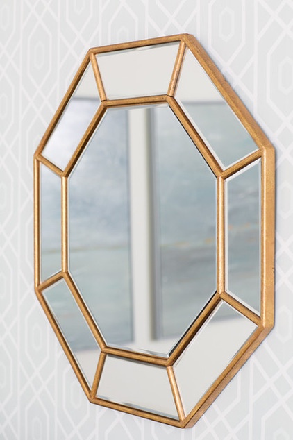
The room balances clean lines and more intricate patterns, keeping things calm and serene all the while. A brassy-gold octagonal mirror serves as a focal point over the bed, brings in some geometry and reflects the light. It’s also a touch of bold for him and reflects the soft colors for her.
Wall paint: Dove Wing; ceiling paint: Tranquility, both by Benjamin Moore
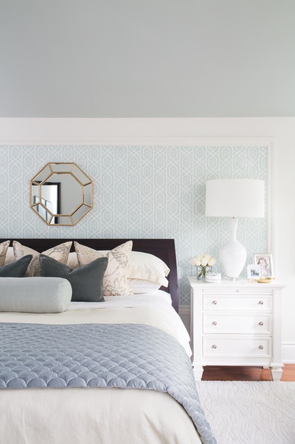
A major element is the accent wall behind the bed. Campbell sized it to frame the headboard, mirror and side tables. This keeps the bed from looking lost against the long wall, anchoring it in the space. The molding is similar to the traditional moldings around the windows and lines up with the top of the window molding. She used a trellis pattern in a soft watercolor-like shade of blue. The intricate pattern satisfied his love of graphics, while the color suited her.
For the bed Campbell created a rich mix of textures. The back three pillows have a floral print with birds that ties it to nature. The natural silk is a creamy off-white with silvery metallic accents. The bolster fabric has a pattern of tiny quatrefoils. The pillows in the middle are a charcoal velvet with blue undertones. “When you use a lot of soft tones, you need to bring in something deeper and richer for contrast,” Campbell says. “The dark pillows also play off the throw blanket on the chair.”
Tip: You can save money by having a broadloom rug (wall-to-wall carpeting) cut and bound into an area rug. This one has a subtle pattern made from different pile sizes. Campbell had the edges serged here but notes that it’s also possible to add a band in the same color or a contrasting one as a border.
Thibault wallpaper and window treatments: available via Katie Campbell Interiors & Design; bedding: Hudson’s Bay; throw pillows: custom; silk pillow fabric: Anna French
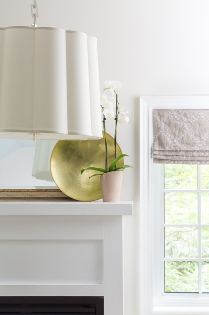
“When you go into a room and can’t put your finger on why it seems simple and pleasing, it’s often because of subtle repetition,” Campbell says. The embroidered pattern on the window treatments is a trellis-like vine pattern, and the little drink table in front of the fireplace has trellis-like lines. The shape of the pendant light picks up on the quatrefoil pattern on the bolster pillow. The shapes and patterns tie into one another without being matchy-matchy.
“The views of nature from up here make it feel like a cottage in the woods,” the designer says. Some of the windows were too close to the ceiling for drapery hardware to be properly hung. Instead, faux Roman shade valances add a crisper touch and hide the light-blocking functional blinds underneath. They also keep the view clear to the trees outside.
Glints of golds, silver and a little brass layer in some shine. A hammered-gold bowl adds shape and texture.
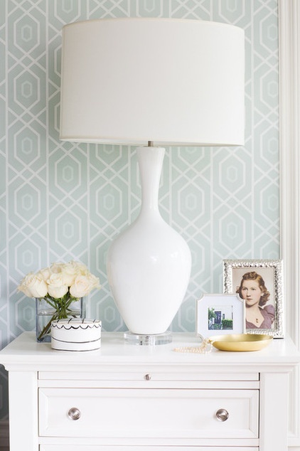
Nickel drawer pulls, a white ceramic lamp and a framed photo of one of the homeowners’ mothers create a lovely little tablescape. The side chests have leaves that pull out for drinks, so that the surface is not damaged by water rings.
“Overall the room has an inviting, cozy feel, while the fabrics add some formality,” Campbell says. For these empty nesters, this traditional home needed to be a serene place where they could settle into the next chapter of their lives as well as retirement down the road. For now it’s a dreamy place in which to retire after a long day at work and a stressful commute.
Lamps: Elte; side chests: Cocoon
Browse more Rooms of the Day
Related Articles Recommended


