Houzz Tour: Sleek Addition With a Standout Stairway
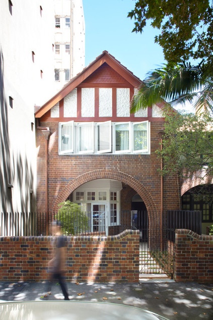
This house in the Potts Point area of Sydney, Australia, wasn’t a house at all when the current owners bought it, but a federation-style terrace house (Edwardian-era row house) that had been split into four apartments. It was run-down when the architects at Smart Design Studio took it on with a view to transforming it into a contemporary home that could adapt to a varied number of occupants with ease. One partner travels overseas a lot for work, and the other maintains and runs the home; the couple often has family members staying over.
“The home had to accommodate mostly one to two people and at times sleep up to eight adults,” says architect William Smart. “The main objective was to create a private inner-city retreat for themselves and their extended family.”
Houzz at a Glance
Who lives here: A couple and their 2 dogs; many extended family members stay periodically too
Location: Potts Point, an upmarket urban area in Sydney, Australia
Architect: Smart Design Studio
Size: 4,208 square feet (391 square meters); 3 bedrooms, 3 bathrooms
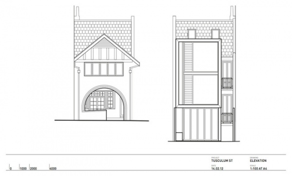
From the street the smart terrace home is as traditional as its neighbors, but the tall apartment buildings to the side and rear meant privacy considerations had to come into play for the planned extension.
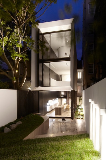
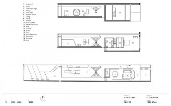
From the back the home is anything but traditional. Spanning three stories, this ultramodern addition features a central circular stairway linking the floors together.
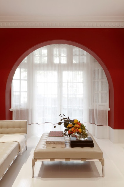
“Broadly, the house falls into two halves: a modern half on the back and a traditional part on the front,” Smart says. The original (traditional) house accommodates the formal lounge and dining area, the master bedroom and bath, and a music room.
“We retained the interior architecture with tall [baseboards], denture cornices and paneled doors,” Smart says.
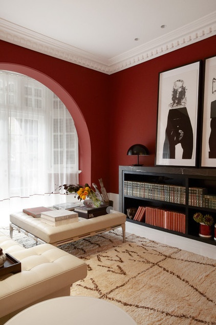
Smart then added a variety of strong colors that complemented each room’s use and appearance and, in some cases, compensated for the challenging features of the room. For example, this room was formerly cold and dark, so it was painted blood red to provide warmth and color. The paint colors throughout the house are by Resene but color matched to Dulux colors.
Wall paint: Carmen Miranda, Dulux
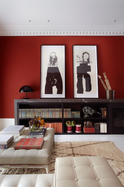
Bookcase: custom; table lamp: Dome, Todd Bracher for Mater; sofa, ottoman: Prive, Phillipe Stark, Cult
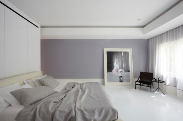
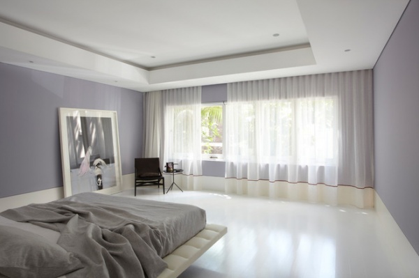
The master bedroom, also in the original part of the house, has been given a contemporary edge in line with the new addition at the rear.
Wall paint: Veiled Delight, Dulux; chair: Pilotta, Cult
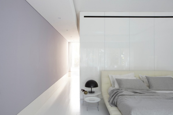
DLM bedside table, Dome table lamp: Todd Bracher for Mater, Cult
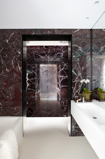
The en suite in the master bedroom is both luxurious and chic, with striking Rossa Levanto marble walls set against clean white floors and fixtures. Smart Design Studio designed the bath and basin; they were then custom made in Corian.
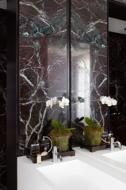
Faucet set: HV1, Dedece
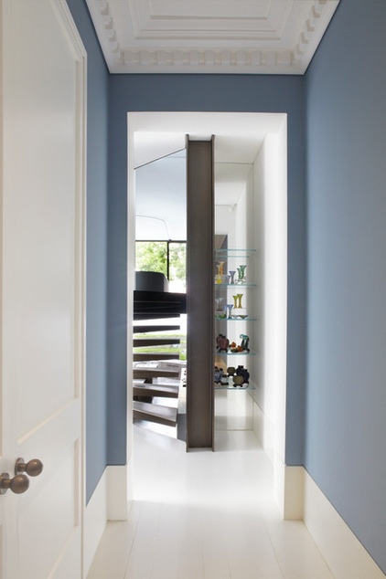
The entry hall serves as a transitional space from the original home to the addition.
Wall paint: Blue Garter, Dulux
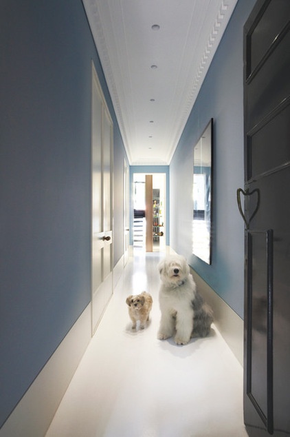
The couple’s two dogs.
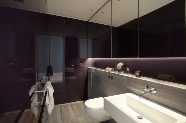
The powder room features marble Nero Marquina tiles with a polished finish, from Classic Ceramics.
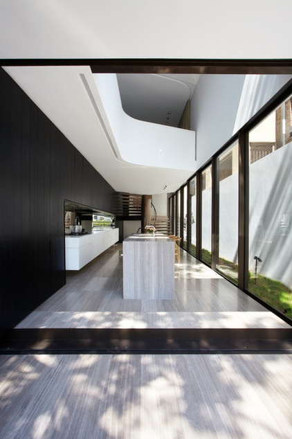
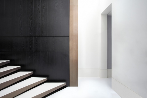
The rear portion of the house is monochromatic, with white floors, walls and ceilings and a single blackened ash wall that runs the full three stories of the extension.
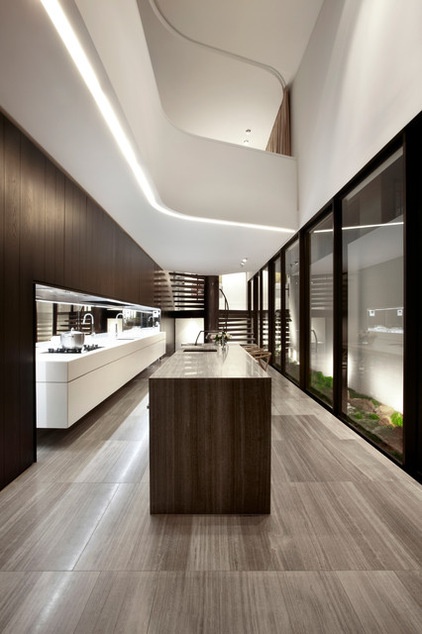
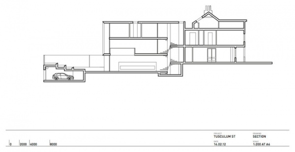
The kitchen is as sleek as the rest of the addition. To accommodate three levels, Smart had the back of the block excavated. The ground-floor level now houses the living-dining area and kitchen, while the original part of the home at this level houses the formal lounge and dining space, plus a powder room.
Faucet on long counter: Gessi Oxygene Hi-Tech with pullout spray, Abey Australia; faucet on island: 590-T36 with swivel spout, Dedece; mirror: 6-millimeter toughened Starphire, Grosvenor Glass
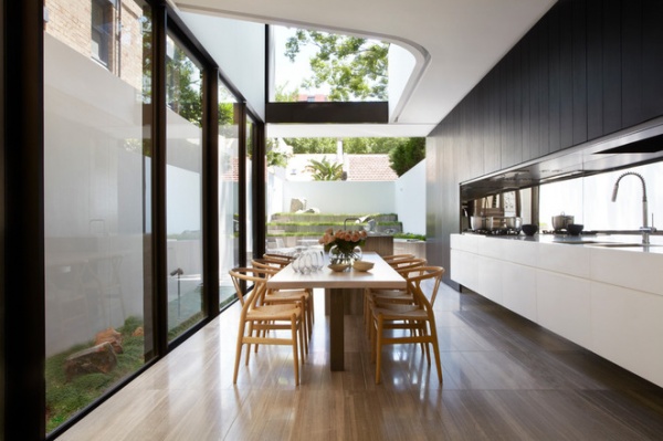
Tall windows and a disappearing glass wall that opens the kitchen-dining space to the outdoors ensure this area is flooded with light at any time of year.
Travertine tiles have been used throughout the kitchen, dining area, laundry and bathroom, while blackbutt floorboards line the formal lounge–dining area, hallway, master bedroom, study, guest bedroom and stair landings.
Tiles: 900- by 300-millimeter Shima Scuro travertine, Skheme; wooden flooring: Anton’s Floors
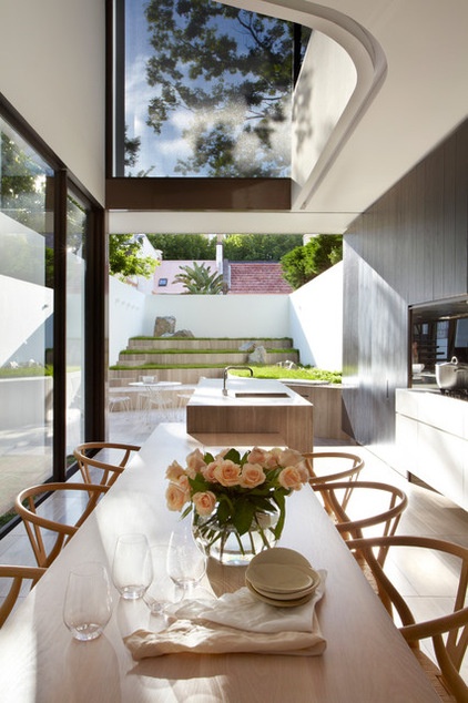
A table is built into the island bench, which can act as a serving area during inside-outside gatherings.
Dining chairs: Wishbone, Carl Hansen
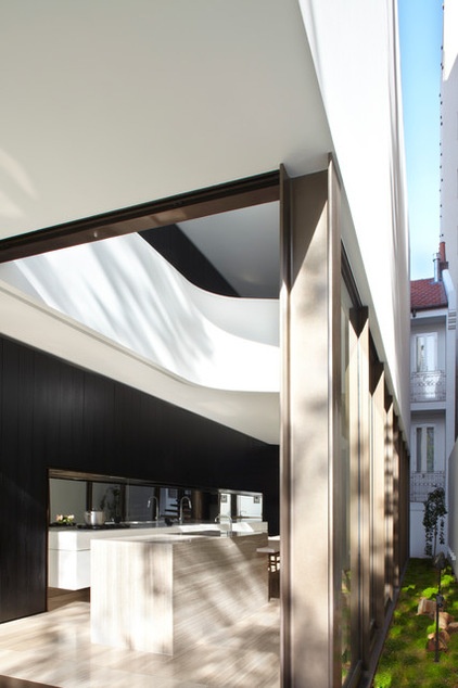
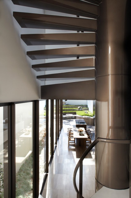
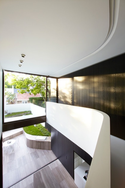
“In contrast to the front part of the house, the detailing is recessive, minimal and modern with expansive uninterrupted walls of glass or solid material,” Smart says of the addition.
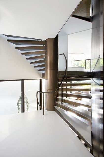
“What grafts the new portion to the existing is a three-story high spiral stair that extends the full width of the house with cantilevering treads that don’t touch the perimeter walls,” Smart says. “Further to this, because the house has split levels, there are no balustrades on the staircase.”
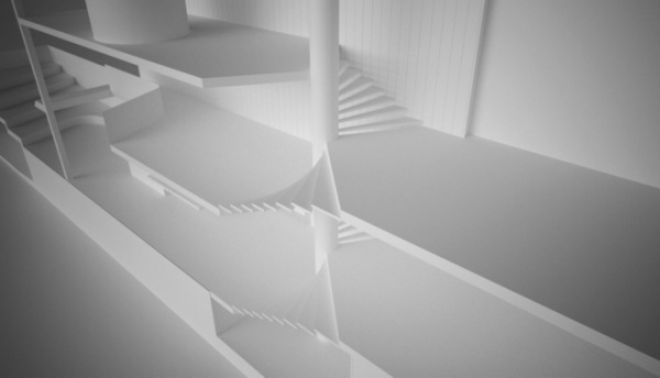
This 3D model shows what an integral part the stairs are to the addition.
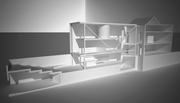
Here’s the addition from the side.
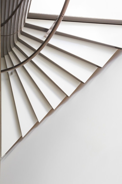
The stairs were constructed by a boat builder and have an exquisite level of detail that binds the whole project together. In fact, the stairs are what Smart is most proud of about this house.
“The staircase is dramatic, clever and beautifully made. It’s the most impressive feature of the house,” he says.
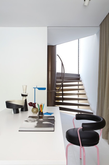
A simple study punctuated with surprise dabs of color is the only “room” on the first floor; it overlooks the dining space.
Chair: LC7, Cult; lamp: Tab T, Euroluce
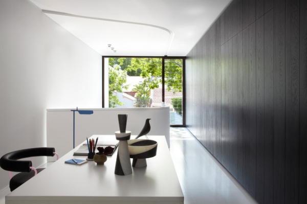
A fold-out bed concealed in the wall means the study can become another guest room.
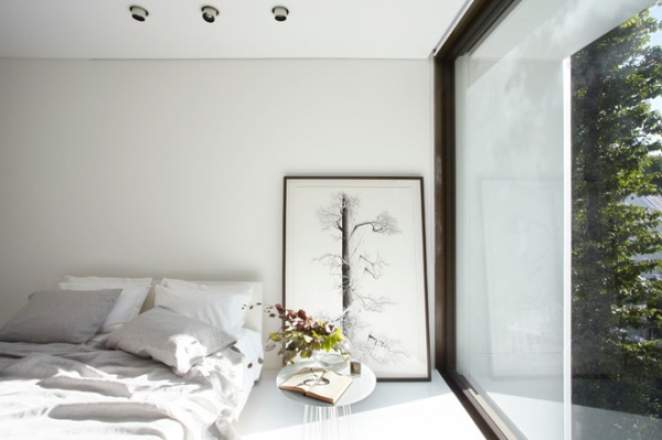
The third-story guest room is awash with sunlight and the same minimalist look and restrained color palette as the rest of the house.
Bedding: Stretch, Analu
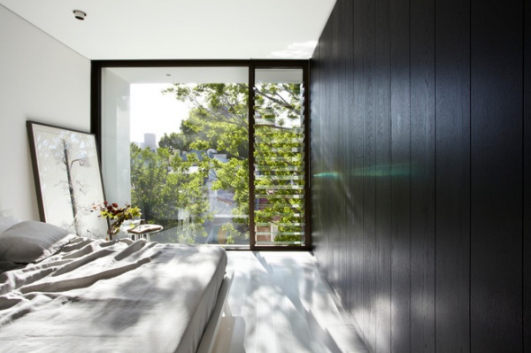
Energy-efficient fixtures and fittings are installed throughout the house; plus, planning and shading of the building were done with the environment in mind.
“Sustainability is a highly integrated and important part of this project,” Smart says. “Further to this we used native species for the gardens and Good Environmental Choice Australia–rated materials wherever possible.”
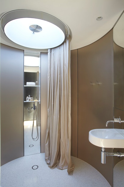
“Round rooms and secret doors emphasize the fluid contemporary aspects of these spaces,” Smart says.
This circular bathroom sits between the guest room and guest living area spanning the second floor, giving visiting family members their own space.
Sink: Architec Handrinse, Duravit, Meco; tiles: 600-millimeter square Signorino in polished white, Signorino
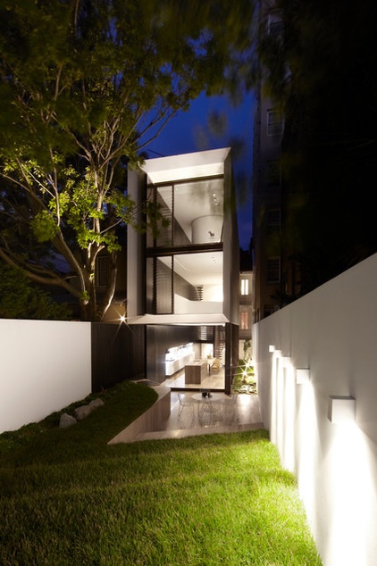
The task of building an extensive addition on a compact inner-city site was a challenge. “It meant that we had to design the construction sequence as well as the house,” Smart says.
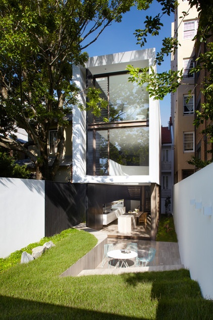
The external paving to the front and rear gardens and external stepping stones is gray Shima Scuro travertine tiles (900 by 300 millimeters), available from Skheme. They tie in with the living areas on the ground level.
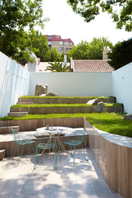
Smart incorporated a sunny terraced garden in the design despite the narrow site and addition. A double garage lies beneath this garden.
Browse more homes by style:
Small Homes | Colorful Homes | Eclectic Homes | Modern Homes | Contemporary Homes | Midcentury Homes | Ranch Homes | Traditional Homes | Barn Homes | Townhouses | Apartments | Lofts | Vacation Homes


