Houzz Tour: A Modern Take on Southwest Style
Several months ago all the signs led interior designer Chandler Prewitt to his hometown of Santa Fe, New Mexico. The designer had had many successful years in San Francisco, working for top designers and founding his own company. But toward the end, it seemed like he was swimming upstream in the Golden State. “The cost of living was going up, and it was getting harder and harder to make it there,” he said. He made the decision to move back to Santa Fe and establish Chandler Prewitt Interior Design, and shortly after hanging up his shingle, he landed the job of redesigning this classic home.
The house was built in the late 1970s or early 1980s in that classic Southwest style known around the world, with its Saltillo tile floors, whitewashed adobe brick walls, heavy beams (called vigas in the local parlance) and kiva fireplaces (those charming, rounded adobe units typically tucked in a corner). As the son of a local home builder, Prewitt cut his design teeth on the style. “I got my first job working on one of my father’s homes when I was something like 14 years old,” he says. Like many of us, Prewitt has always been attracted to the opposite of whatever was familiar in childhood, but the chance to update this home was irresistible. “It is a classic Spanish Territorial–style home, and it had a lot of personality,” he says. “The problem is that the style can go over-the-top and become kitschy. My idea was to keep the best parts of the look and make the rest a bit more modern.”
Photos by Bill Stengel Photography
Houzz at a Glance
Who lives here: A couple and their cats
Location: Santa Fe, New Mexico
Designer: Chandler Prewitt, Chandler Prewitt Interior DesignSize: 2 bedrooms, 4½ bathrooms
That’s interesting: In some rooms Prewitt removed carpeting and replaced it with Saltillo tile floors.
Era built: The late 1970s or early 1980s
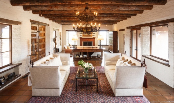
Like many homes in this vernacular, this one had a great room — a large room that holds the living and dining area. Here it’s a long, relatively narrow room with a fireplace at one end and a dining room at the other. But the scene stealers are the vigas (rough-hewn beams). “Essentially, they are whole logs,” Prewitt says. “You can still see moss and the prints of loggers’ work boots on some of them. It’s like a forest on the ceiling.”
Because of this the designer used a lighter touch with the furnishings. There are few pieces, and many of them are the same height. “This way the eye moves easily around the room,” he says. “It doesn’t look too cluttered or busy.”
In the center of the space, these high-armed, high-backed sofas face each other, making an intimate spot for cocktails.
Sofas: Ebanista
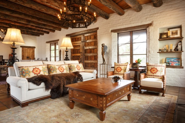
Prewitt focused the sofa and seating at the end of the room around the fireplace to create a cozier and more informal space. “The colors here are a little richer and a little warmer,” he says.
The pillows are made from a modern fabric with a suzani-like motif. Chandler found that ethnic prints and materials work with the traditional Southwest aesthetic. “The Spanish people embraced Moroccan and Moorish motifs,” he says. “There are room for those in this setting.”
And, true to his roots, Prewitt draped a buffalo hide across the sofa.
Pillow fabric: Schumacher
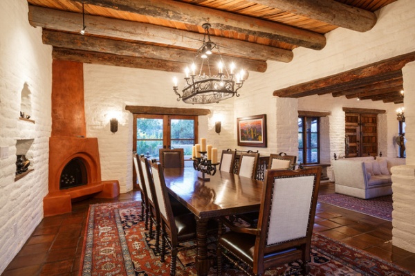
The heavy beams, Satillo tile and kiva fireplace make the dining room distinctly Southwestern. But the Persian rug (whose colors blend with the terra-cotta tile) and the dining chairs with the linen backs give the rustic a touch of luxe.
Dining table, chairs: Ebanista
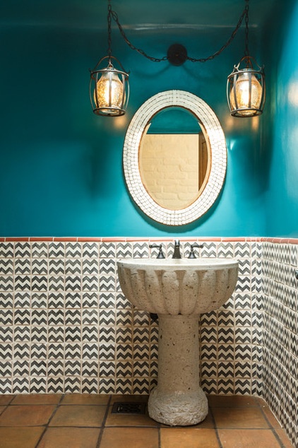
The powder room has a remarkable custom pedestal sink with an avian pedigree. “When I was working in San Francisco, I worked with a designer who used an old fountain as a bathroom sink,” Prewitt says. “That really inspired me. Because this couple loves birds — a lot of their art collection has bird imagery, and they have something like seven bird feeders on the property — I decided a birdbath would make the perfect sink for this room.”
The problem is that many antique birdbaths are hard to retrofit, as well as expensive. Prewitt tapped a local concrete fabricator to make the sink, using the image of an old and rare birdbath as his inspiration.
When picturing a Southwest interior, it’s hard to imagine it without turquoise. Prewitt has it here, but done in a high-gloss sheen and paired with traditional Mexican tiles that have a mod twist. “I wanted the color to be as intense as possible,” he says.
Paint: Blue Azul, Benjamin Moore
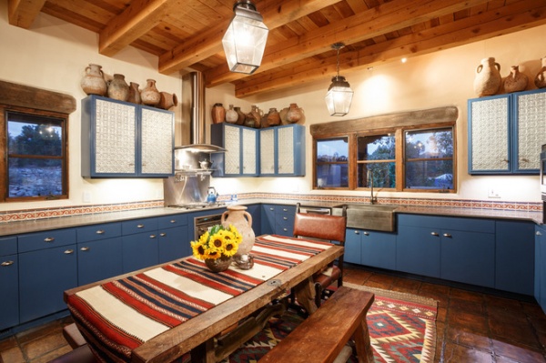
Blue makes another appearance in the kitchen, the space the designer calls “the least formal room in the house.” The idea was to keep the original blue cabinets (the clients loved that the upper cabinet fronts were fitted with Mexican tinwork fronts. “Everything here is a Mexican Craftsman style,” Prewitt says. “It’s all a bit rustic.”
Elements like the kilim rug and the earthy pottery along the top of the cabinets reinforce the idea. To give the Saltillo tile floor an even more provincial style, Prewitt had it darkened for an enhanced patina.
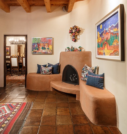
In keeping with the theme, Prewitt preserved the banco (a fireplace with bench seats). But he had it refinished with a hay and clay plaster to echo the rough look of a cob adobe. “Cob adobe is like a substrate to adobe,” Prewitt says. “Normally, you put adobe directly over it, but in the country a lot of buildings never get to that step, leaving a rough finish on the exterior.”
To give the banco the same rural look, Prewitt had it re-covered with a mix of red clay found nearby and hay. “The trick is to use a very fine hay,” he says. “If you use thick clay, it just crumbles.”
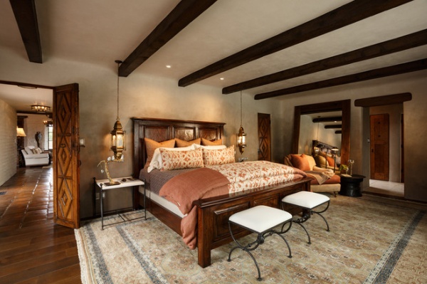
The bedroom is done in an unexpected ombré plaster. “You start with an almost white plaster on the ceiling, but it gets darker as you move down the wall,” says Prewitt. “The contractors blended the colors as they troweled.”
Achieving the effect took a lot of work, but the designer says it was worth the effort. “Whenever I do a master bedroom, I try to make it feel calm and soothing,” he says. “The ombré pattern gives this space a dream-like feeling.”
Plaster: American Clay
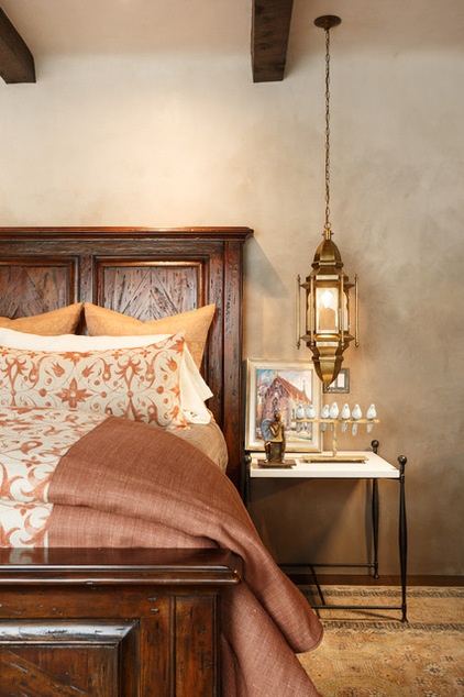
Because the beams and the wood headboard are heavy, Prewitt balanced them with thinner, metal side tables and ottomans. Lanterns that hang from the ceiling are as much sculptural accents as they are sources of illumination.
Lanterns: Tazi Designs; bed: Theodore Alexander
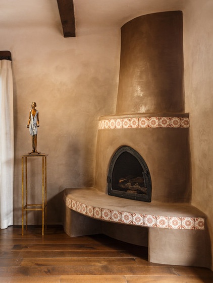
The master bedroom’s kiva fireplace is done in the darkest color used in the ombré pattern. It’s accented with traditional Mexican tile, replacing a painted border of geckos.
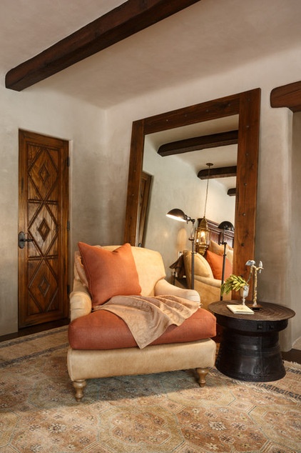
The doors are original to the house, and their harlequin pattern is reflected in the bed’s headboard. Upholstered pieces with rounded backs and arms are hallmarks in Southwestern design. Prewitt gave this piece a fresh look by covering it in cowhide and burlap.
When he talks about landing this project, the first big one since he returned to his home state, Prewitt conveys amazement at the serendipity of it all. “I don’t think they intended to hire me, but I met them and they showed me the house, and I fell in love with it,” he says. “It just came together in a wonderful way, which is how it happens in Santa Fe sometimes.”
Looking back, he takes the project as a sign that moving back was the right thing, so maybe you can go back home after all.
Browse more homes by style:
Small Homes | Colorful Homes | Eclectic Homes | Modern Homes | Contemporary Homes | Midcentury Homes | Ranch Homes | Traditional Homes | Barn Homes | Townhouses | Apartments | Lofts | Vacation Homes


