Houzz Tour: Traditional Chicory Kiln Becomes a Retreat for Two
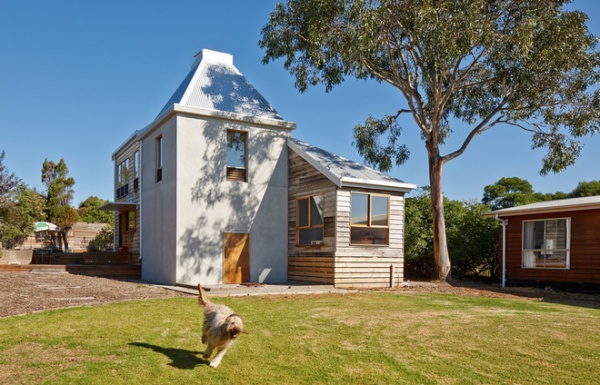
Landscape architect Charles Anderson and his wife, Tiziana Launech, scoured Australia’s Phillip Island for years in search of a traditional chicory kiln they could transform into a unique vacation home. Chicory kilns — once used for drying chicory dock, a root vegetable similar to parsnip that thrives in the island’s rich volcanic soil — are a prevalent architectural feature on the island, which is southeast of Melbourne. When they finally came across the right one on Ventnor Beach, they asked architect and friend Andrew Simpson to turn the historical building into a modern getaway. Anderson and Simpson collaborated on the design to produce A House for Hermes, named after Anderson’s art exhibition at Tarrawarra Museum in Victoria, Australia, in 2007.
Houzz at a Glance
Who lives here: Landscape architect Charles Anderson and his wife, Tiziana Launech
Location: Ventnor Beach at Phillip Island, Victoria, Australia
Size: 1,345 square feet (125 square meters); 1 bedroom, 1 bathroom, 1 powder room
Surprise inside: The cabinetry in the main living area can be moved around according to the homeowners’ needs.
When it came to renovating the original structure, Simpson was careful to maintain the building’s historical charm. To do this he took an understated and restrained approach, highlighting its traditional features through the use of industrial and recycled materials.

The property sits in the stunning coastal setting of Phillip Island and is across from protected wetlands — a lush and secluded backdrop. “It is a relatively flat [property] dotted with indigenous shrubs and trees, along with a second smaller home and detached studio,” Simpson says. The property is a third of a mile from the beach on Phillip Island.
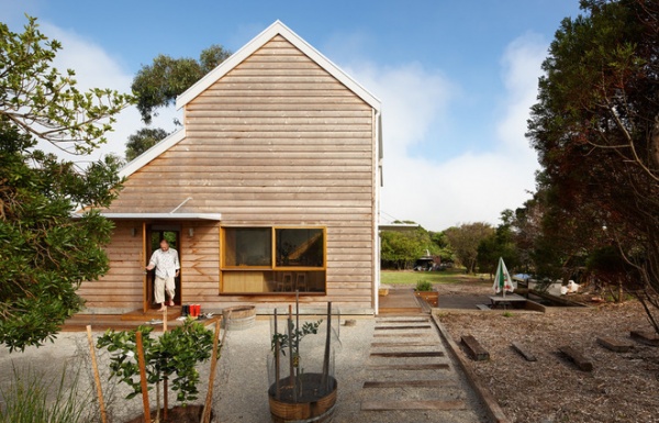
The renovation of the 20th-century structure wasn’t a completely smooth process. The renovation team had to rebuild and restore the chicory kiln’s cracking and flaking concrete after construction had already begun. To resolve this issue, Simpson worked closely with the builder and opted to use shotcrete, a concrete projected at a high velocity, over steel reinforcement.
“It’s these unknown existing conditions that can potentially cause a budget blowout, which is why collaborating closely with everybody else involved was crucial to the project being completed on budget,” Simpson says.
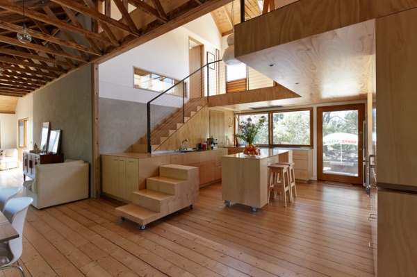
The entrance opens to the bright and airy kitchen and dining room. The open-plan living space creates a social atmosphere where Anderson and Launech can entertain guests with ease.
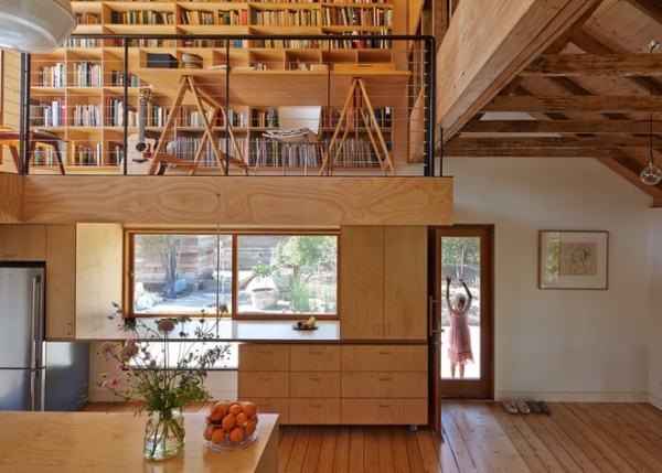
The hoop-pine plywood and stainless steel kitchen is one of the quirkier aspects of the house. The mobile cabinetry can be reconfigured for a variety of uses within the downstairs area, providing both access to the staircase and extra counter space when needed. (Consult stair building regulations in your area before planning a stair unit of this kind.)
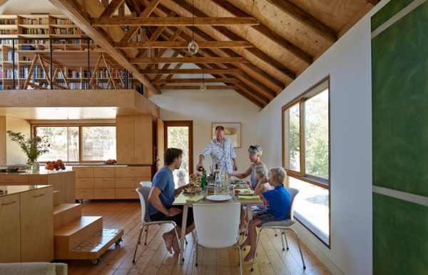
The space can be transformed to facilitate a group cooking class or an intimate meal. When the cabinetry is stowed, a completely open-plan space is created on the ground floor. The structures can also act to separate the kitchen and dining areas — more strongly defining the two rooms.
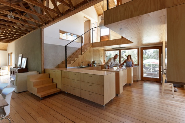
Don’t be fooled by the minimalist design of the cabinetry. Simpson cleverly crafted the units with ultimate functionality in mind.
“Each mobile joinery unit is built on casters to allow them to easily roll along the floor,” he says. The casters include breaks so they can be moved and securely set in place to allow people to walk up and down. “Each unit is based on the same module to allow multiple configurations with flush heights and consistent materials,” Simpson says.
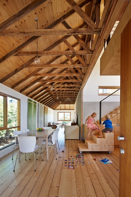
Showcasing the industrial past of the house, the high ceilings and large, open spaces pay homage to the traditional chicory kiln structure.
Anderson put his mark on the design not only by naming the project after his exhibition, but also by reusing materials from it. The plywood with intricate etchings from the art show is embedded in the ceiling of the spacious dining and living rooms.
The floorboards are recycled oak, and the dining table was salvaged from an old cottage onsite.
Chair: James Richardson
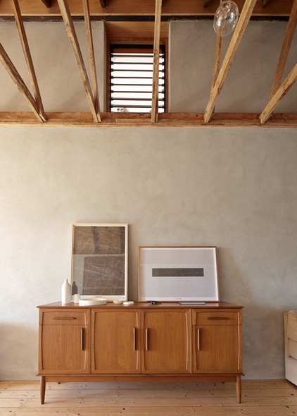
Anderson and Launech used both old and new furniture for the house, including this mid-20th-century sideboard they picked up from a secondhand store.
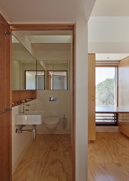
A humble powder room is slotted into the downstairs living area with a suspended toilet and wall-to-wall mirror, giving the illusion of more space.
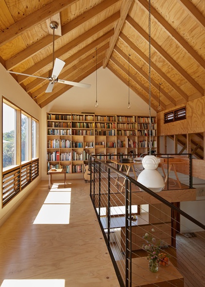
Upstairs, the study is a secluded haven where Anderson can focus on his projects. The large windows provide a scenic view of the beautiful coastal landscape, and the louvers beneath the window encourage natural ventilation.
The bookcase spanning the back wall was custom made by Orana — just what Anderson and Launech needed for their extensive book collection. Anderson made the industrial hanging lights with large globes from Beacon Lighting and ceiling light cords from Fat Shack Vintage.
Desk: Chapman and Bailey
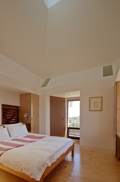
The bedroom is on the kiln’s upper level; light streams in through a strategically placed skylight. “The skylight at the apex of the kiln in the bedroom affords an uninterrupted view to the sky during the day and the stars at night; it also allows for passive cooling,” Simpson says.
And so, a vacation house was born.
“It was a collaborative design process, and the owners were very closely involved from inception through to completion,” Simpson says. “They love being there.”
Browse more homes by style:
Small Homes | Colorful Homes | Eclectic Homes | Modern Homes | Contemporary Homes | Midcentury Homes | Ranch Homes | Traditional Homes | Barn Homes | Townhouses | Apartments | Lofts | Vacation Homes


