Kitchen of the Week: Traditional Kitchen Opens Up for a New Look
In 2000 Brett and Jill White moved into their Winfield, Illinois, two-level brick home about a year after it was built. They never quite felt at home with the traditional style of the home, located on a scenic site along a golf course. “We’re in the burbs of Chicago, but our style is more the lofts of downtown Chicago,” Jill says. Recently they undertook a major update, paying special attention to opening up the cramped kitchen. “We hold a lot of parties, and it never worked,” she says. Working with kitchen designer Susan Klimala, the couple came up with a more efficient layout and a fresh look, with bamboo cabinets, a new glass wall system that makes the kitchen feel more spacious and a multifunctional island with a versatile sink. The kitchen now allows them to entertain, enjoy views and spend time together.
Kitchen at a Glance
Who lives here: Brett and Jill White and their daughter Addison (age 7)
Location: Winfield, Illinois
Size: About 250 square feet (23 square meters)
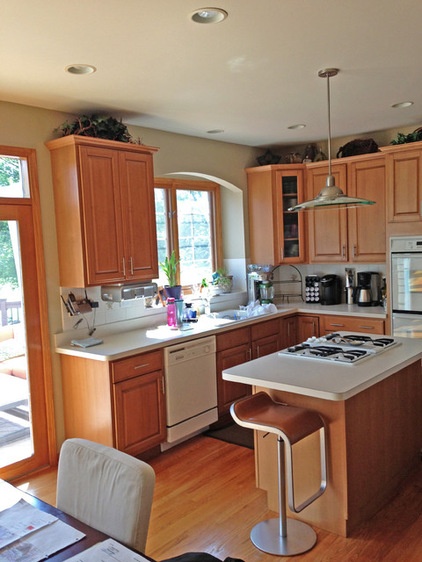
The previous U-shaped kitchen had light maple cabinets, a red oak floor and a small, cramped center island with a cooktop.
The kitchen’s broken-up layout made the room difficult to navigate when more than person worked in the space.
“After” photos by Carlos Vergara
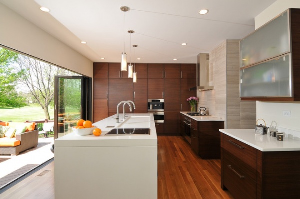
AFTER: Removing a structural column that hindered the flow and views between the kitchen and the adjacent family room helped open things up. A breakfast table was also eliminated, since the family can now enjoy casual meals at their larger center island.
Customized bamboo cabinets with oversized stainless steel pulls have improved storage. A full side wall of storage includes large cabinets with pullout shelves on each side of the integrated Sub-Zero and Wolf refrigerator for pantry storage, and high upper cabinets for tray storage and seasonal items.
The kitchen’s red oak floor was replaced with white oak, which contrasts nicely with the bamboo cabinets.
Cabinets: bamboo with blackberry stain, Jay Rambo; cabinet hardware: Top Knobs; wall paint: China White, Benjamin Moore; baseboard trim paint: Sharkey Grey, Martha Stewart Living
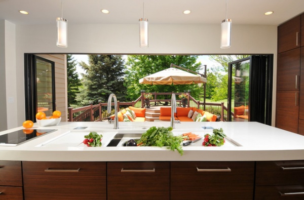
The new glass wall system was a major undertaking that required a structural engineer and a new structural beam to support the floor above. The couple included a separate retractable screen for protection from bugs. “We didn’t add any square footage during the remodel, and the kitchen just feels bigger,” Jill says. “I love waking up, coming downstairs and having a cup of coffee while I enjoy the view.”
The front side of the island seen here includes (from left to right) a double trash can with fronts made to look like drawers, large drawers for sink supplies and accessories, the sink base and garbage disposal, and the kitchen’s dishwasher, disguised as more drawers.
Glass wall system: NanaWall; retractable screen: Centor; pendants: Sara Grande, Lightology
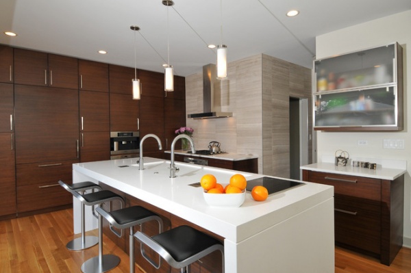
The kitchen’s spacious new island includes adjustable-height stainless steel stools with black leather seats that provide a place for casual meals. The contemporary-style island includes a solid-slab 3-inch-thick Caesarstone countertop in Blizzard with a mitered edge and beveled detail and a two-burner induction cooktop from Wolf. Three bamboo panels by the stools bring the warmth of the cabinetry to the island.
Two upper cabinets on the back wall with frosted glass and aluminum frames add lightness, with integrated Sub-Zero refrigerator drawers below for bottles of water, soda and juice boxes.
Island stools: LEM Piston Stools, Design Within Reach
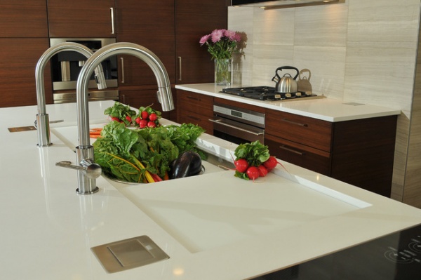
Two layers of sliding boards and a colander insert are two of the special features of the island’s Galley sink that measures more than 5½ feet long. It was a nonnegotiable item for Jill, who first saw the sink on Houzz. “It’s all-encompassing, so all the food prep is right there,” she says. “It’s so versatile and user friendly, and you can fill it up with ice for entertaining.”
An air switch that controls the garbage disposal sits between the sink’s two pull-down faucets. Pop-up electrical outlets integrated into the island’s top help keep the clean lines the couple wanted.
Faucets: Trinsic, Delta Faucets
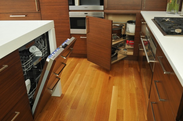
This photo shows the integrated Bosch dishwasher in the island (concealed by panels that look like drawers) and an easy-reach corner cabinet for small countertop appliances, including a rice cooker and slow cooker.
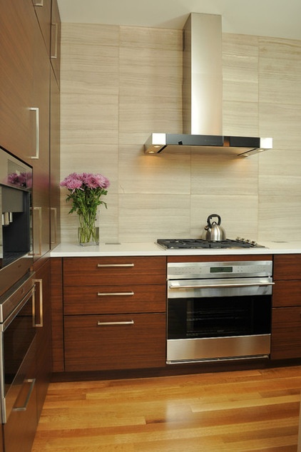
The sleek sculptural hood above the four-burner gas cooktop with a convection oven below provides ventilation and creates a focal point for the cooking zone. The large drawer to the right of the cooktop has peg storage for plates, while the top-left drawers offer utensil storage, with a large drawer on the bottom left for pots and pans. “We also included plenty of counter space on each side of the cooktop,” designer Klimala says. The backsplash features large squares of limestone specified by project architect Richard Carr that contribute to the modern feel of the space.
A built-in coffee unit with a microwave drawer below are seen on the left side of this photo.
Cooktop, hood, microwave drawer, oven: Sub-Zero and Wolf; built-in coffee unit: Miele
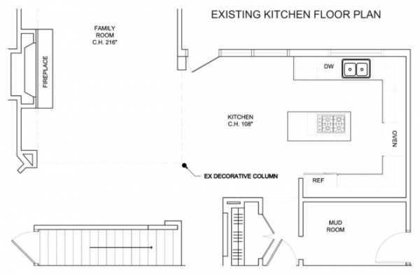
This plan of the previous kitchen illustrates the tolerable but not very efficient U-shaped layout.
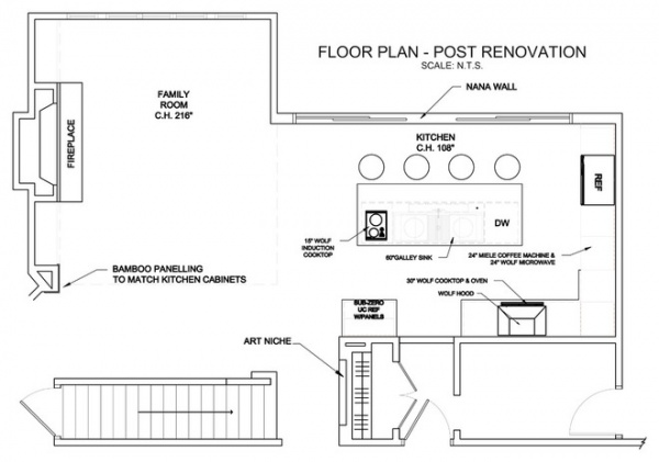
Better flow between the sink, refrigerator and cooktop, along with the kitchen’s newly open feel, has given the family the space they wanted for preparing meals and entertaining.
“We definitely use the kitchen more now,” says Jill. “It’s very peaceful and serene, and just nice to be in.”
Team:
Kitchen designer: Susan Klimala, The Kitchen Studio of Glen EllynArchitect: Richard Carr, Carr Warner, ArchitectsGeneral contractor: Chris Shenuk, C & C Shenuk Construction
See more Kitchens of the Week


