Lightened-Up Midcentury Kitchen Goes With the Flow
The last time these Boston homeowners renovated the kitchen in their 1960s ranch house was about 15 years ago. While most of their kids have flown the nest for college, they still have a 10-year-old boy at home, and they were ready for an update. The problems with the kitchen’s design were apparent from the very first time the family walked into the house. “They didn’t have any sort of landing strip,” says architect Stephen Reilly of SLR Architecture. “Their kitchen bar and dining table had become the place where mail, keys and coats piled up.”
Reilly implemented clever architectural solutions that grounded the kitchen in a large, open plan, but when it came time to help one of the homeowners incorporate her love of eclectic contemporary design through finishes and furniture, he called upon interior designer Justine Sterling. “The kitchen needed to be fully part of the greater open space,” Sterling says. “It needed to work well on its own and with the rest of the furniture in the living room and dining room.” Designing all three spaces concurrently helped each room inform the others. The results is a seamless look and an easy flow from one area to the next.
Photos by Jessica Delaney Photography
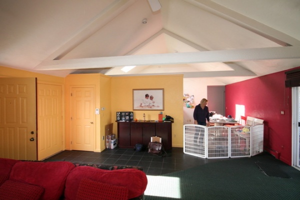
BEFORE: The house had great bones, but a partial wall and awkward closets were cutting off the kitchen from the living and dining room, leaving it cramped. The ceilings were covered in a swirled stucco that showed every defect.
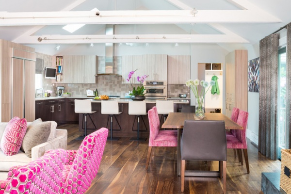
AFTER: Reilly took out the wall, creating one big, open space that incorporates the kitchen, dining area and living room. Architecturally, the existing high ceiling and trusses make it look like it was always supposed to be this way. Sterling’s choices for the furnishings and finishes reinforce the continuity.
“It would have been a mistake to use woods that were all the same tone,” Sterling says. Instead, she took her cues from the 8-inch walnut planks on the floor. The cabinetry, dining table, coffee table, credenza and other pieces all pick up different colors found in the floorboards.
The homeowner is also very into industrial style. The stainless steel on the hood vent and exhaust pipe is repeated in details throughout: The dining room table has natural steel legs, the fireplace has a stainless steel mantel, the ball ceiling fans are aluminum, and even the window treatments have metallic threads.
Money saver: The homeowners wanted to save money by keeping their refrigerator, so Sterling had it wrapped in a veneer that matched the cabinets (left).
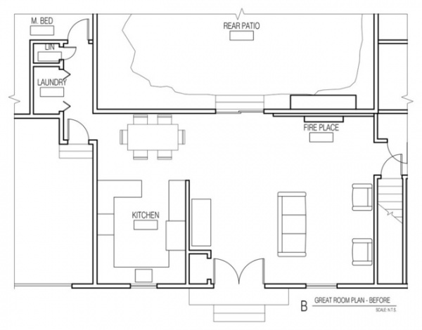
BEFORE: A large laundry room was wasted space. Reilly had to prevent the new kitchen from becoming another landing strip.
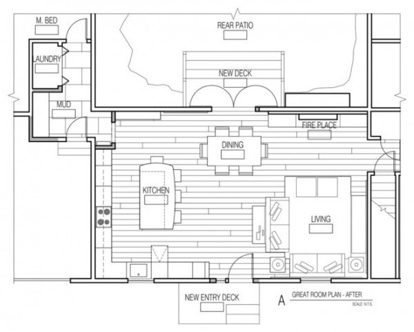
AFTER: He created a mudroom–back entry hall by borrowing a little space from the laundry room and garage. This keeps clutter, coats, keys, shoes and mail from being dumped on the kitchen counters and dining room table. You can see a glimpse of the mudroom on the right side in the second photo above where the green coat is hanging.
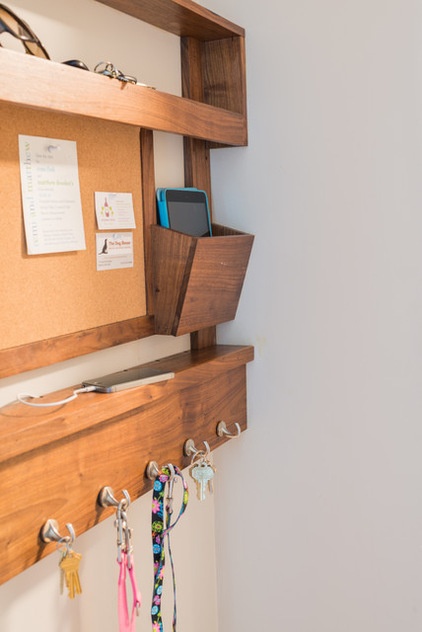
This landing strip in the new mudroom is small but a key part of the solution. It includes a charging station for phones, hooks for leashes and keys, and a bulletin board.
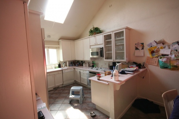
BEFORE: As you can see, the breakfast bar had become a dumping zone. The dining table was just out of frame to the right and had also become a place where the owners tossed coats, keys and mail.
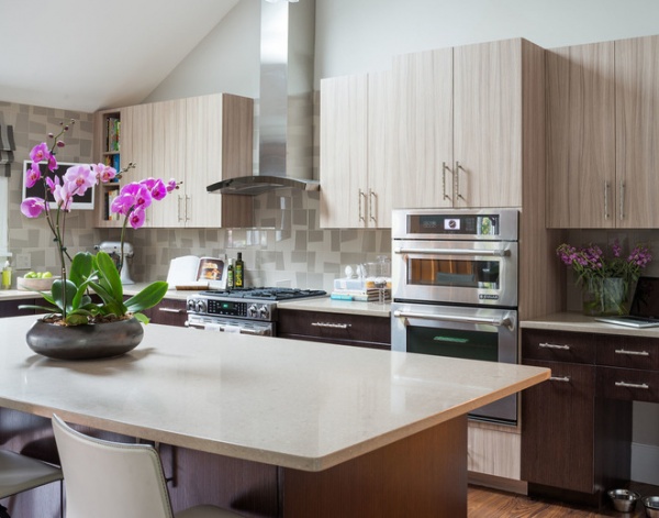
AFTER: When choosing colors and finishes, Sterling worked on the living room, dining room and kitchen at the same time; she chose some of the furniture pieces in the living room first and then selected the cabinetry based on those decisions. “The warm gray paint creates connected spaces and ties the cabinets, the backsplash and the furniture together,” Sterling says.
Wall paint: Nimbus 1465, Benjamin Moore
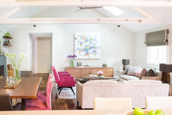
The team repainted all of the trusses and used ⅜-inch drywall and smooth plaster to give the ceiling a clean look. They also replaced the outdated bubble skylights with solar-powered skylights with shades that open and close via remote control.
Tip: Great lighting is worth the investment. “The high ceilings presented a challenge, because you want to get the light down low enough to counter and work-surface levels,” Reilly says. The solution was adding track lighting to both sides of each truss. The homeowner was able to pick different heads for each track from about 100 options. Installation was no easy feat, as each track required its own transformer recessed into the truss, but the results were well worth it.
Track lights: Tech Lighting
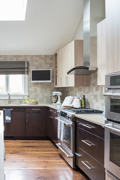
In the kitchen the color goes from dark to light from the lower cabinets to the ceiling. This keeps the kitchen from feeling lost within the very tall space; the dark lower cabinets ground the room.
Six-inch-square porcelain tiles create a random pattern on the backsplash, bounce the light around and satisfy the homeowner’s love of bold, unusual elements. The tiles could have been mounted in an infinite number of patterns. Creamy quartz composite countertops and counter stools keep things light.
Tile: Royal Mosa Mural, via Justine Sterling Design; vent hood: Dune, Best, with custom exhaust pipe
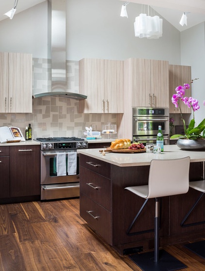
The lights on the kitchen truss track are sculptural and cloud-like, as is the larger Logico Lamp.
Stools: to the trade, via Justine Sterling Design
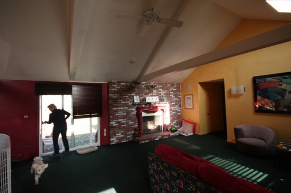
BEFORE: The old fireplace surround was screaming for a modern update. Colby the dog seems perfectly happy here, but I’m not so sure how he felt about that penned area.
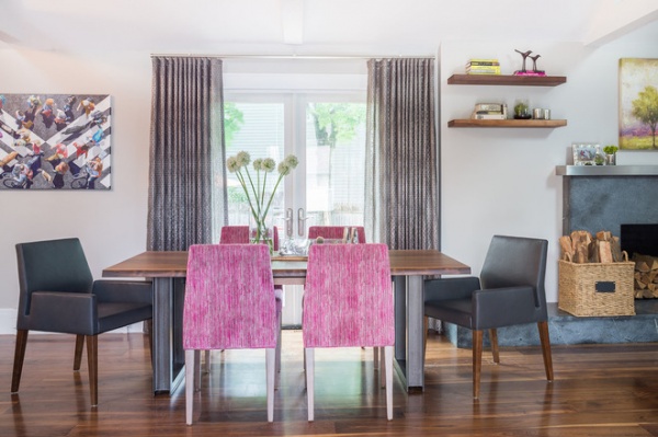
AFTER: A new soapstone hearth and surround have clean lines. The stainless steel mantel satisfied the client’s desire for pulling that material through the rooms. The doors were scooched a little to the left and replaced with swing-out French doors complete with phantom screens. They lead to a new deck that was part of the project. The window treatments are sheer, with metallic threads and a ripple fold detail. The rod has a hidden channel for hanging. “They have a very contemporary look,” Sterling says.
The biggest thing the family wanted for the dining room was room to host their extended family for important holiday meals. This Italian live-edge walnut table seats six and has extensions for larger groups. When they want to extend the table, they turn it 90 degrees so that it’s parallel to the kitchen island.
Velvet, leather and chenille fabrics create continuity throughout the three rooms. In addition to the tones inspired by the floors, bold pink and small hints of the homeowner’s favorite celadon green are carried through each space.
Dining table: to the trade, via Justine Sterlign Design; dining chairs: Bernhardt Design
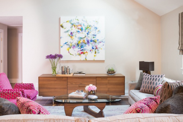
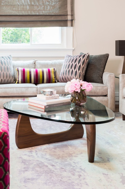
“At first the clients thought they’d want a TV in here, but as the project got closer and closer to completion, they realized they just wanted a beautiful piece of art instead,” Sterling says. “The colors in the piece tie everything together so well.”
The armchairs, credenza and iconic Noguchi coffee table all nod to the house’s midcentury pedigree. The armchairs swivel to face the conversation or the fireplace. Graphic geometric prints lend a modern look, and shocking pink keeps things playful and eclectic.
Credenza: Blu Dot; armchairs: Circle Furniture with custom fabric; table lamps: Pablo; pillow fabrics: Romo; sofa: Mitchell Gold + Bob Williams; Roman shades: custom
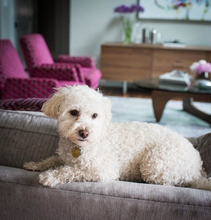
Colby looks pretty content in the renovated digs.
More:
Beef Up Your Ranch Kitchen
Ranch House Love: Inspiration From 13 Ranch Renovations


