Houzz Tour: Happy Days Are Here Again in a Miami Apartment
This apartment held many happy memories for Nina Berrocal. When she was a little girl growing up in Puerto Rico, it served as her family’s Miami pied-à-terre. But 40 years later, it was too much of a time capsule. The interior hadn’t been touched since her parents purchased it in 1973, and worn-out gold shag rugs, popcorn ceilings, heavy damask draperies, vinyl floors, outdated fixtures and water-damaged, stained ceilings and walls abounded. However, Berrocal and her husband, Stephen Tannenbaum, knew it could be a special place in which to create new memories with their three kids, as well as a fun hub for hosting parties and a jumping-off point for the many events they attend nearby. They turned to Lourdes Gabriela Suárez, the interior designer who had successfully decorated their primary home north of Miami, and gave her free rein.
At a meeting in the apartment, Suárez’s clients gave her the budget, the keys and a mandate to make it “clean and happy,” and then ended their participation in the design process. “I knew a gut renovation was needed, and Nina gave me authorization to throw everything away,” Suárez says. However, the designer had picked up on Berrocal’s nostalgia as she talked about her happy memories of the place, especially when she mentioned that her sister had painted one of the artworks on the wall. Listening to Berrocal reminisce, Suárez knew the design would be a mix of new, vintage and the existing 1970s pieces.
Photos by Emilio Collavino
Houzz at a Glance
Who lives here: This is the urban pied-à-tierre of a 2 busy surgeons, Nina Berrocal and Stephen Tannenbaum; their 3 children; and their dog, Milo
Location: Brickell area of downtown Miami
Design: Lourdes Suárez, Lourdes Gabriela Interiors
Size: 1,000 square feet (93 square meters); 1 bedroom, 2 bathrooms
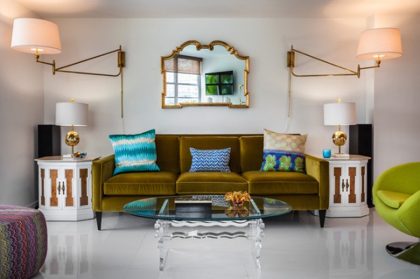
This lounge area beyond the foyer incorporates all the colors Suárez chose and the apartment’s vintage-modern mix. Because the concrete ceilings presented some lighting challenges, Suárez went with two large swing-arm wall lamps flanking a vintage La Barge Italian mirror. Funky side tables pop in gold and white; a Lucite coffee table with a glass top keeps the view through the apartment from the front door open. A pouf brings in the entire color palette.
Pouf: BoConcept; vintage mirror and coffee table: Mostly Modern; sofa: Crate & Barrel; throw pillows: John Robshaw Textiles; wall lamps: Renovation Room
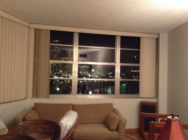
BEFORE: Heavy drapes once dimmed the brilliant views.
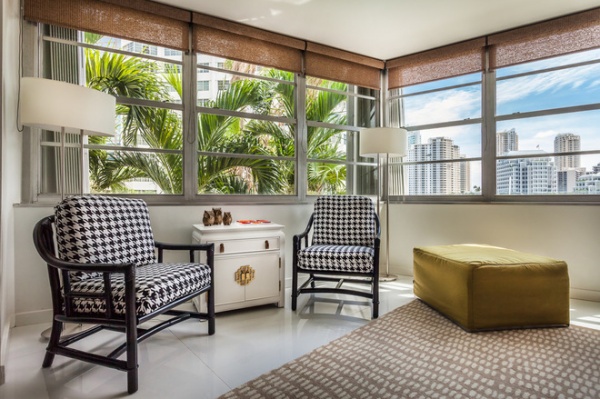
AFTER: When this building went up, it was one of the only high-rises in Miami’s Brickell neighborhood; none of those seen out the window here existed. Suárez’s inspiration hit her once she’d cleared everything out, down to the studs. “Amazingly, when all was cleared away, the apartment revealed an incredible view of Biscayne Bay and Brickell Key,” she says. “I was inspired by the aquamarine blues of the bay, the lush green foliage outside the jalousie windows and the go-go vibe of Brickell.” She was also inspired by the era in which the building was constructed, and infused the apartment with a groovy 1960s and 1970s spirit. “I got a picture in my head of a cool, gutsy, modern apartment with vintage elements, then I began sketching in the details,” she recalls.
She had the signature Miami jalousie, or louvered, windows repaired and cleaned, adding simple fabric shades with an organic feel that made the most of the view. The apartment had six of the chairs you see here; she refinished these two in black lacquer and reupholstered them in a bold houndstooth Sunbrella fabric. The pouf conceals a fold-out mattress for nights when the kids bunk here.
Window treatments: Woodberry Oak Tree, Hunter-Douglas; lamps: Farrey’s; rug: Serena & Lily
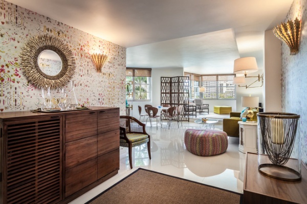
“The layout was kind of like one big bowling alley, so I created the illusion of a foyer, though the front door opens right into the living space,” Suárez says. She accomplished this by defining the area with a fabulous Élitis wall covering that included all the hues in the apartment’s color palette.
The foyer space welcomes with cocktails and tunes. A bar stocked with small-batch crafted spirits and glasses, a Sonos entertainment system and movable seating is in here. The barrel chair is one of the original furnishings; Suárez had it re-covered. Berrocal was so touched when she saw it that she dug up a photo she had of herself sitting in it at age 2 to share with the designer.
Bar: Crate & Barrel; Hampton Wall Lights: Aerin
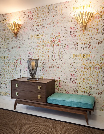
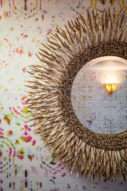
Jonathan Adler’s walnut Gossip bench provides a seat, a landing strip, storage, a surface for drinks and a big burst of turquoise, inspired by the views of Biscayne Bay. Aerin’s Hampton lights add a funky Florida-style touch, as does a funky coconut mirror. Suárez found the sisal rug in the apartment.
Mirror: Horchow
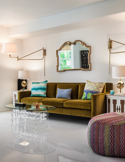
Farther inside, glossy white brightens up the open space and bounces the light around. Suárez used 32-inch by 32-inch white crystallized porcelain tiles on the floors and continued the white up the walls and across the ceiling. “I did something that I do not normally do — I painted the ceilings, walls and trim all in one color, Benjamin Moore’s Decorators White,” Suárez says. This gave her a nice, bright, blank canvas that made the whole apartment light and provided a white envelope to fill with colorful furnishings.
The white makes the vibrant saturated color palette stand out. Magenta, olive, teal, turquoise and acid yellow “created a gorgeous, happy combination,” the designer says.
The couple has a lot of social events in the area on the weekends, so their home also serves as a great loungey launch pad, where they can gather with friends before a party. The furniture lends itself well to cocktail hour as well as kids’ slumber parties.
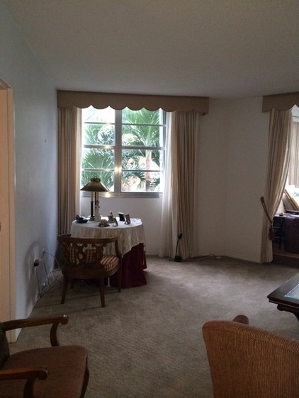
BEFORE: You can see how the wall-to-wall carpet, drab colors and heavy drapes made the ceilings seem lower.
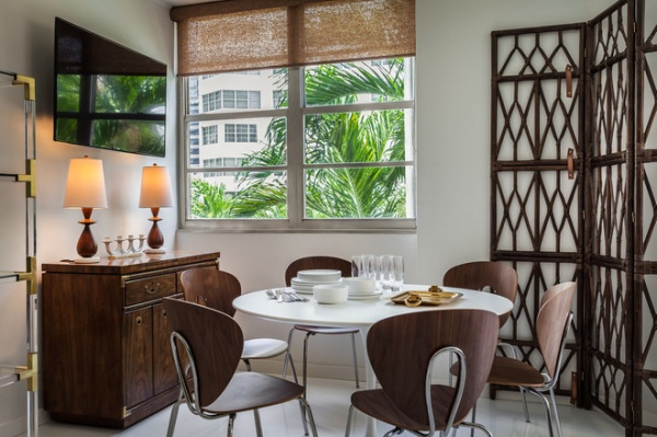
AFTER: Suárez delineated a dining area with help from two original repurposed pieces from the apartment. The first is a room divider screen that defines a seating area and functions as artwork. The second is a cabinet, which serves as a buffet. A midcentury modern icon, the Saarinen Tulip table, is surrounded by contemporary Globus chairs. The TV has a swing arm and can be enjoyed from the olive-colored sofa.
Table, chairs: Design Within Reach
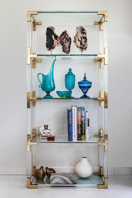
Modern VibeAn étagère holds elements that inspired the design — organic forms; bright glossy white, funky vintage glass; and pieces in deep and bright shades of blue.
Étagère: Jonathan Adler; petrified rocks: Adriana Hoyos
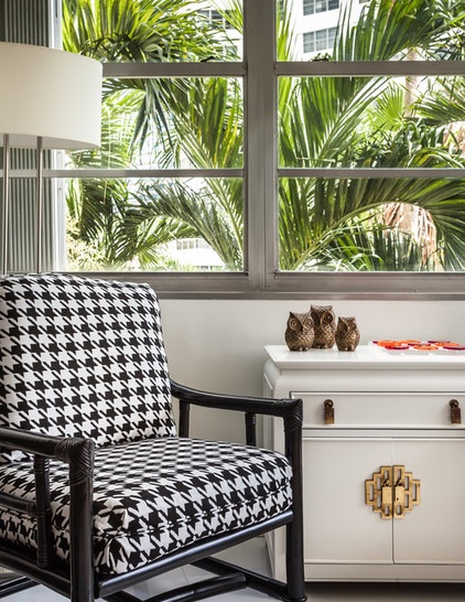
A graphic black and white houndstooth pattern strongly contrasts all of the color. Suárez had a vintage chest painted glossy white to suit the apartment’s style.
Chest: vintage, Mostly Modern
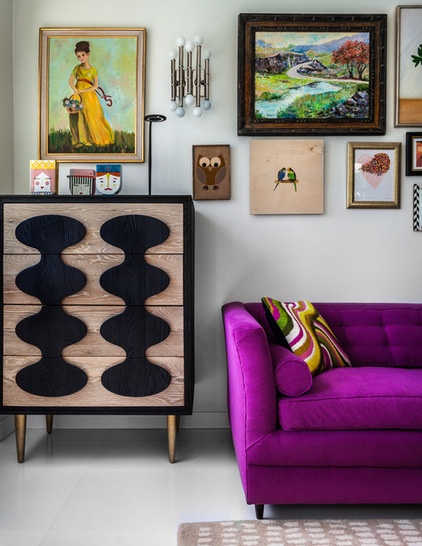
The family room could have been converted into a separate second bedroom, but they wanted to leave the apartment open and light instead of closing rooms off. The piggy banks seen here represent each one of the kids — this is their sleeping space.
The sister of one of the homeowners painted the artwork of the girl in the yellow dress, which inspired a lively gallery wall. Suárez found some of the artwork dispersed throughout the apartment, including the landscape and some of the botanicals. The tall chest’s graphic look continues the far-out ’70s vibe.
Chest: Jonathan Adler
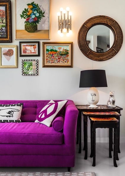
Believe it or not, Suárez also found this sleeper sofa in the apartment. She redesigned it to have one long bench cushion and tufting, added bolster pillows and reupholstered it in a shocking magenta fabric.
See the sofa before
The nesting tables were another apartment find; each one is topped with a different wild animal print.
The kids, who have their own rooms in the other house, look forward to camping out in here. The couple’s two daughters bunk on the sleeper sofa, while their son takes the mattress hidden in the green pouf.
Needlepoint pillows, sconces: Jonathan Adler
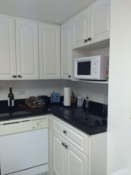
BEFORE: Because it doesn’t have any windows, the kitchen was quite dark.
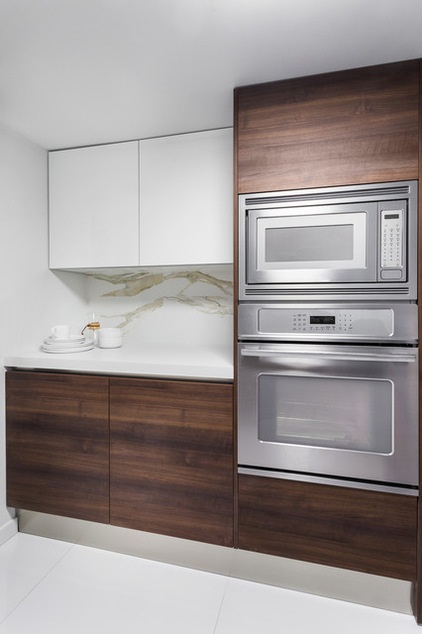
AFTER: The designer added glossy surfaces and loads of LEDs to brighten up the kitchen and bounce the light around, then provided strong contrast with the rich texture and deep color of walnut cabinetry. The waterfall counter emphasizes the contrast.
“The project tells you where to save and where to splurge,” she says. In this case the flooring and kitchen needed bigger chunks of the budget. While the family often orders in or goes out to eat while hanging out in the city, one of the homeowners loves to cook, especially breakfast. Because Suárez already had a good idea of how the family lived from working on their main house, she was able to outfit the kitchen with everything they might need.
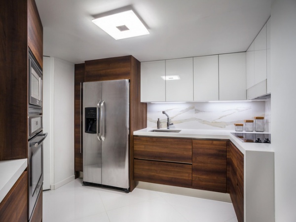
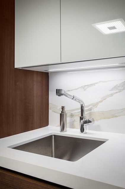
The backsplash is a porcelain product, rendered to look like Carrara marble but much more durable. The counters are Caesarstone, and the baseboards are stainless steel.
Overhead light: Farrey’s; backsplash: porcelain in Calacatta, Porcelanosa
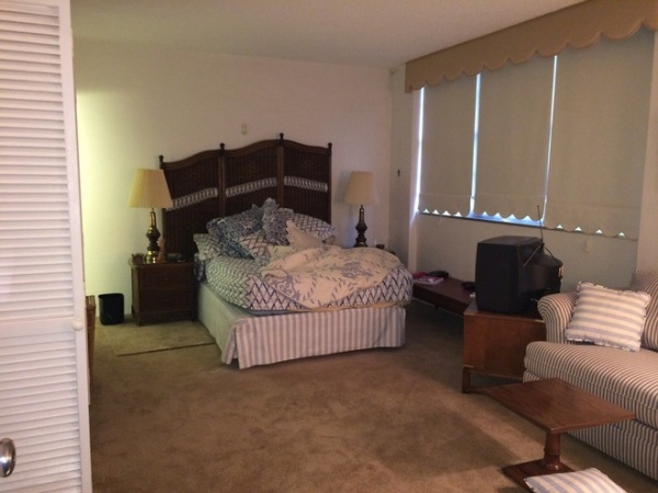
BEFORE: The apartment’s only bedroom was uninspiring, and no one had stayed there for years.
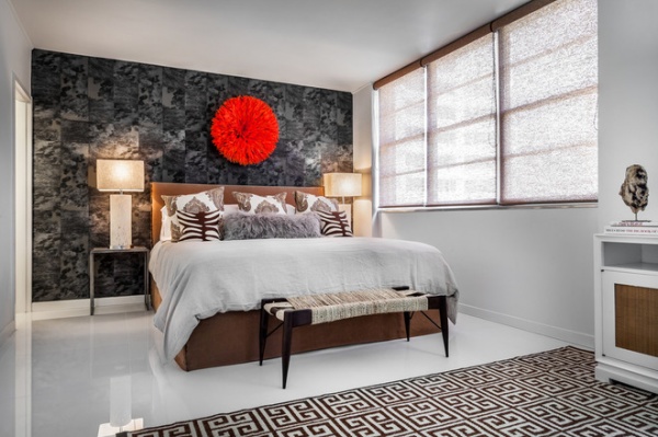
AFTER: The designer went to her favorite wallpaper showrooms with charcoal grass cloth in mind, but couldn’t resist this fabulous vinyl patchwork cowhide-print wall covering. A bright red juju hat creates a focal point above the headboard. A hemp rope bench adds some funky ’70s style.
Wallpaper: Élitis; nesting tables: Crate & Barrel; zebra pillows, juju hat, sheepskin, Greek key rug: Jonathan Adler; bed linens: Restoration Hardware; shag pillow: West Elm; hemp rope bench: CB2
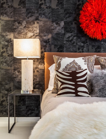
“I like layering and texture, even when doing modern or contemporary — it adds warmth and dimension,” Suárez says. This included sheepskin, a needlepoint zebra print and a large shaggy throw pillow on the bed.
She broke up a set of nesting tables to fit into the small space on either side of the bed and topped them with vintage Murano glass table lamps. She replaced the original large lampshades with smaller rectangular ones to fit the scale.
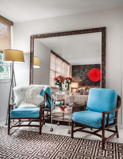
An oversized mirror with an ornate Italian frame makes the room look brighter and feel larger. Suárez had it custom made at a framing shop (making sure it would fit in the elevator first — the glass just barely fit, and the frame was assembled onsite.) These two chairs are from the same set as the black lacquered pair we saw earlier. Cushy bright turquoise upholstery brings in a pop of Miami color.
Mirror: custom, Complete Frames; chair fabric: Chivasso via Jeffrey Michaels Showroom
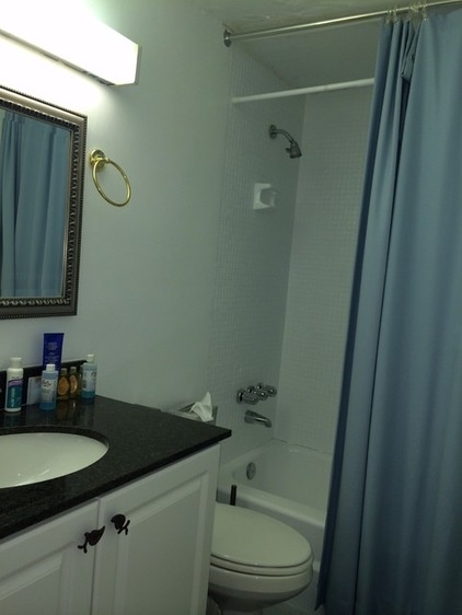
BEFORE: The bathrooms were cramped and uninspired.
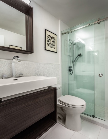
AFTER: In the master bathroom, Suárez fought off the claustrophobic feeling by hanging clear glass shower doors on a track, using a cantilevered vanity and keeping the color palette very simple. She also kept within her budget by buying the vanities, sinks and mirrors at Build.com.
Because the room is so small, she was able to use a more expensive tile 48 inches up the wall. The playful bubble-like pattern adds texture, but the clean white color keeps it from jumbling things up. A large-scale (24-inch by 12-inch) tile on the floor also helps the room feel larger.
Toilet: Toto; bubble tiles: Italgres
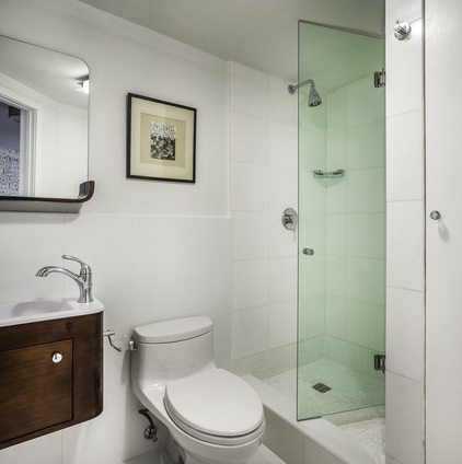
This second bathroom was previously so cramped, it wasn’t even to code. By using a small wall-mounted vanity and a bifold shower door, Suárez got it up to code with style.
The clients did not see a thing until Suárez was finished with the gut renovation and the last throw pillow was placed. They were almost speechless with joy during the big reveal.
Mirror, vanity: Build.com; toilet: Toto
Browse more homes by style:
Small Homes | Colorful Homes | Eclectic Homes | Modern Homes | Contemporary Homes | Midcentury Homes | Ranch Homes | Traditional Homes | Barn Homes | Townhouses | Apartments | Lofts | Vacation Homes


