Houzz Tour: Thoroughly Modern and Family Friendly
Interior designer Ann Lowengart describes the home she created for a stylish couple and their two young children as “hip and edgy but family style.” Glossy finishes and high-impact details mix with family-friendly materials and loungeworthy furniture in a home that emphasizes glamour but doesn’t lose sight of functionality. This is a home for a family who wasn’t afraid to make bold choices and have a little fun.
When she met the homeowners, Lowengart was immediately taken by their casual but refined personal style and how their newly purchased house in Marin County, California, didn’t reflect that at all. She wanted the home to embody the sense of style of the owners, so she removed the dated trappings of the 1990s house and put its large rooms, tall ceilings, natural light and well-executed floor plan to good use. “It was the perfect blank slate,” Lowengart says.
Photos by David Duncan Livingston
Houzz at a Glance
Who lives here: A couple with 2 young children
Location: Tiburon, California
Designer: Ann Lowengart
Size: 3,700 square feet (about 344 square meters); 4 bedrooms, 4½ bathrooms
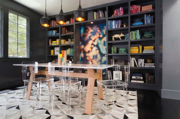
Lowengart prepped her canvas by painting many of the interior walls Decorators White in an eggshell finish and painting the floors high-gloss black. “Every time you use a flat paint, it sucks the light,” she says. These finishes keep light moving. In the dining room Lowengart used a high-gloss paint in a gray called Deep Space.
The dining room doubles as a library. “We didn’t want it to be just a dining room,” says Lowengart, reinforcing the idea that often rooms serve more than one purpose. The gray walls emphasize the couple’s colorful collection of books, and the niche backed with Glow Wallpaper from Flavor Paper stands out as a bold move. Whether they’re dining or reading, the sturdy dining table and acrylic chairs invite the family members to take a seat.
Lucite chairs: custom designed by Ann Lowengart Interiors; High on Wood Dining Table: H.D. Buttercup; Alber Hide Rug: One Kings Lane; 3-Piece Mango Wood Guardian Set: CB2
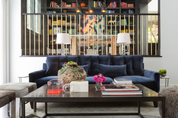
Lowengart replaced an existing half wall that split up the living room and dining room with a brass balustrade, opening the dining room up to more light and introducing more glamour.
Large Octagonal Spire Table Lamps: Circa Lighting; Metal Parquet Coffee Table: Restoration Hardware
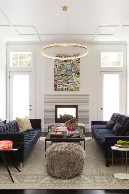
The living room sits just below the dining room. Lowengart had the custom couch on the right filled with a softer material so the homeowners could lie down on it and relax while watching TV on the opposite wall. A second sofa gives friends and family a spot for gathering and lounging in front of the two-way marble-surround fireplace.
Like the dining room, the living space has a sophisticated edginess but still feels casual and comfortable. Lowengart kept the color palette subdued, primarily using neutral pieces to fill the room. Dark sofas pick up the home’s charcoal theme and anchor the room, while accessories from Alexander McQueen and Alexandra Von Furstenburg add playful color and pattern. A crystal chandelier by Christopher Boots hangs above the room like a glittering tree topper.
Designer tip: “Pick one bold piece for the room,” Lowengart says. She set the tone for this room with the dramatic light fixture and built everything around that. She kept the rest of the bigger furnishings subtle, but punched up the edginess with accessories. “That’s where you can really play,” she says.
Prometheus Chandelier: Christopher Boots; painting: Kim Ford Kitz; Ashra Rug: Restoration Hardware; Dean Rectangular Side Table: Gabriel Scott; Skull Gold Pillow: Alexander McQueen; round acrylic bowl: Alexandra Von Furstenburg; fabric for both sofas: Ritz Blue Velvet, Cowtan & Tout
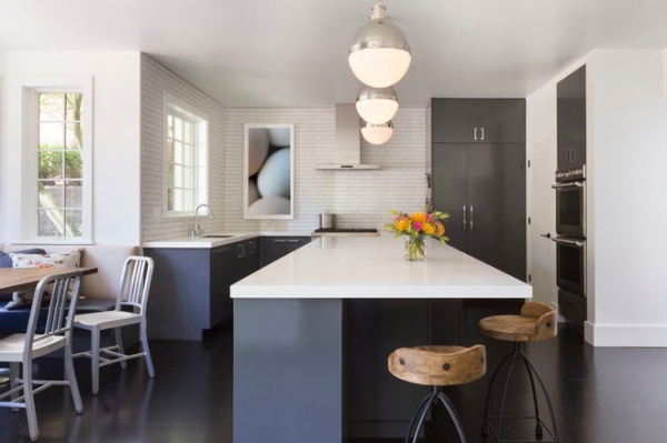
The kitchen called for a little more work, and Lowengart rearranged the layout and replaced the finishes. “We wanted to inject some fun and whimsy,” she says. The key to having the kitchen read family as well as modern was to avoid extremes. Lowengart used a high-gloss charcoal paint for the cabinets but chose ceramic tiles from Ann Sacks in a honeycomb pattern for the backsplash to make the kitchen appear less severe. Instead of sleek metal bar stools, she used wood furniture. She decorated with neutral wall art, and the breakfast nook looks like a place where you’d want to kick back and eat.
Since the couple has two young children, Lowengart selected quartz countertops instead of glossy white marble or another natural stone. “We chose a quartz because that’s as tough as countertops come,” she says.
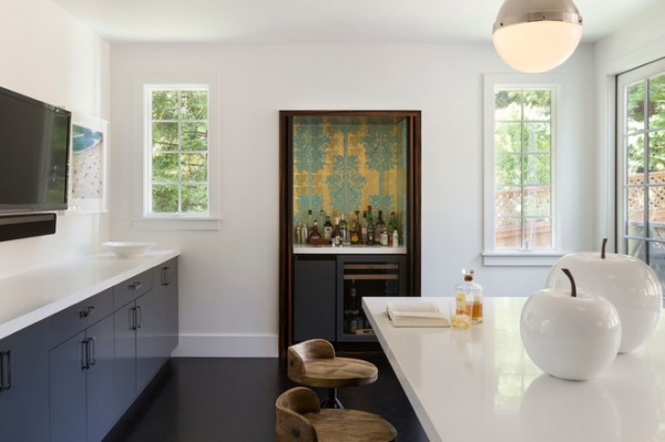
Snow Apples: CB2; Large Hicks Pendant: Circa Lighting; countertops: Super White Honed Quartz, Pental Quartz; Henson Counter Stool: Arteriors Home
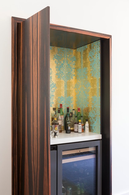
The original kitchen included a fireplace. When the homeowners decided they didn’t need a fireplace in their kitchen, Lowengart suggested they turn the nook into a bar.
She installed a wine cooler and mini refrigerator and lined the bar’s interior with gold and turquoise Monaco wallpaper from Flavor Paper to give the kitchen a playful tone. When the bar isn’t in use, the homeowners can close it off with a custom Macassar ebony door that Lowengart designed.
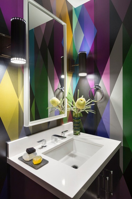
Lowengart played again with wallpaper in the downstairs powder room, covering all four walls in a bright geometric pattern. “Wallpaper has come back big,” she says, and in general she is particularly daring with wallpaper in bathrooms. “When you use a big pattern in a large room, it can be overwhelming,” she says, but bathrooms and other smaller rooms can benefit from wallpaper’s drama. It’s a great way to inject color, whimsy and pattern, she says, especially since bathrooms are mostly about utility and essentials.
Wallpaper: Circus, Cole & Son; Pruitt Sconce: Arteriors Home; mirror: custom; vanity top: Super White Honed Quartz, Pental Quartz; sink: Verticyl, Kohler
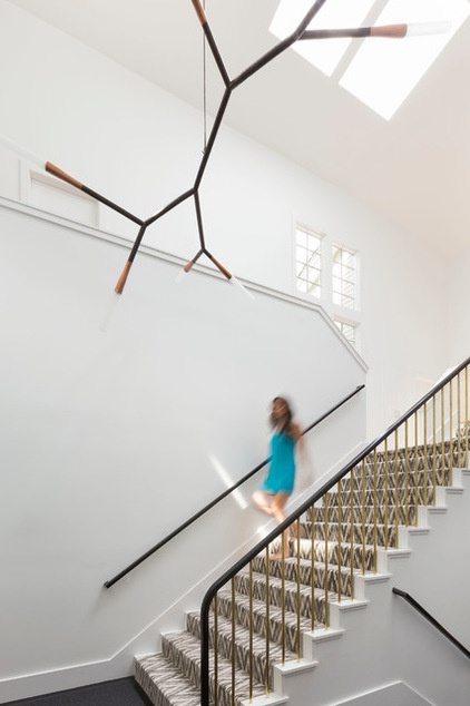
Natural light, towering ceilings and expansive rooms made for beautiful spaces, but Lowengart wanted to make sure this house would feel like a home. “The combination of a tall ceiling and a large room can feel cavernous and unwelcoming,” she says — particularly for the entry and the staircase, areas that should feel especially inviting.
“We wanted that space to read beautiful, warm and welcoming,” the designer says. Part of that involved hanging the light fixture over the staircase lower than normal, giving the illusion of a more intimate room. Instead of focusing on the 20-foot ceiling, visitors could focus on the light sculpture. All the other details are bright and simple.
Carpeting: Bargello, Stark; chandelier: Phasmida, Christopher Boots
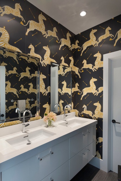
Lowengart covered an upstairs guest bathroom in Scalamandre’s iconic Zebras wall covering in black. The vanity is from Ikea.
Designer tip: “If you love dark, pick one thing that’s dark,” Lowengart says. That way you achieve drama without overwhelming the room. Wherever she uses dark colors, Lowengart makes sure they have a sheen or a gloss, and keeps all the other colors in the room bright and light.
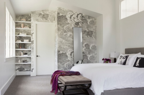
The master bedroom turns away from some of the details Lowengart used throughout the rest of the house. It features no dark or colorful accents and instead has a serene, muted palette. Lowengart covered one wall with wallpaper, but instead of introducing a bold or colorful pattern, she reinforced tranquility.
Throw pillows: Fornasetti, linen duvet, shams: Matteo; Avery Bed, Infinity Leaning Mirror: Room & Board; wallpaper: Nuvole, Fornasetti
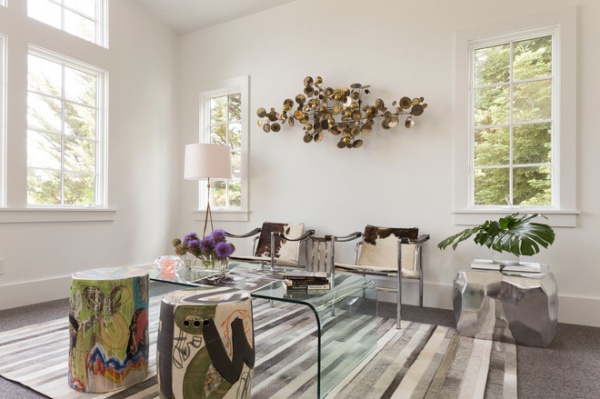
With the rest of the house designed for family and entertaining, the bedroom is a refuge for the couple. This sitting area next to the sleeping area gives them a place for hanging out and relaxing away from the rest of the house.
Vintage LC1 Chair: Le Corbusier; graffiti stools: The Future Perfect; stainless steel side table: Mecox
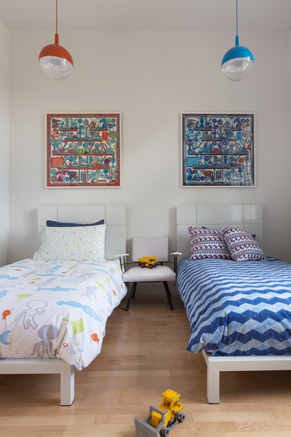
The couple’s two kids share a bedroom that has as much of a casual modern vibe as the rest of the house.
Browse more homes by style:
Small Homes | Colorful Homes | Eclectic Homes | Modern Homes | Contemporary Homes | Midcentury Homes | Ranch Homes | Traditional Homes | Barn Homes | Townhouses | Apartments | Lofts | Vacation Homes


