Kitchen of the Week: Simple Lines and Bold Color
When given the task of redoing this farmhouse kitchen, designers Catherine and Justine Macfee, the mother-and-daughter team at Catherine Macfee Interior Design, went for something that was both appropriate and unexpected. The industrial materials speak to the utilitarian nature of a farm kitchen, but the orange accents owe a debt to Hermès — a company whose products were likely in short supply in Napa, California, in the 1800s, when this home was built.
Today the home is owned by John and Joy Caldwell, proprietors of Caldwell Vineyards. They agreed to let their home be used for the Traditional Home Napa Valley Showhouse. (The home can be toured until November 17.) “When we were chosen to do the kitchen, I knew that I wanted to start with orange,” Catherine says. “I selected an earthy Hermès orange, which is the color of the grape leaves at this time of year.”
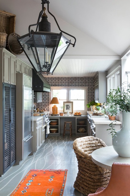
“It’s really a galley kitchen,” says Catherine. “It feels larger because it looks over the vineyards.”
The rows of grapes in said vineyards inspired the painted pattern on the floor. The designers noted that as the vines follow the landscape, they appear to become wavy rather than form straight rows.
Photos by David Duncan Livingston
Floors: Nor-Cal Floor Design; floor paint: Urbane with stripes in Filament, both by C2
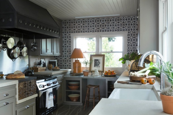
The lines lead to a window and a small seating area at the end of the kitchen. “It probably was once meant as a baking space,” says Catherine. “But it makes a great little desk, a place you can set up your laptop and gaze over the vines.”
What gives the area its wow factor are the hand-painted black and white tiles that rise from the countertop to the ceiling. “We used a lot of neutral colors. Pattern and texture bring a neutral palette to life,” Catherine says. These tiles add more than excitement; they lend allure. “They really pull you in,” the designer says. “A big pattern can make a small kitchen really interesting.”
Tile: Country Floors; cabinet paint: Filament, C2
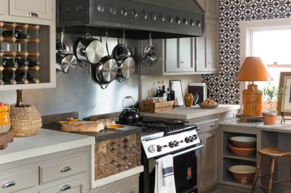
Another eye-catching element is the range hood with its supersize rivets. The surprise is that the element is a cover custom made by a blacksmith and bolted onto the original, plain vent hood.
A handcrafted piece is also located to the side of the cooktop. The Macfees had it created to replace a deep fryer. “The base is carved in a pattern the woodworker came up with after looking at the tile,” says Catherine. “We put a chopping block on top.”
The cabinets, hardware and stainless steel backsplash behind the cooktop were all existing. But the Macfees gave the cabinets a gray coat for a fresh look.
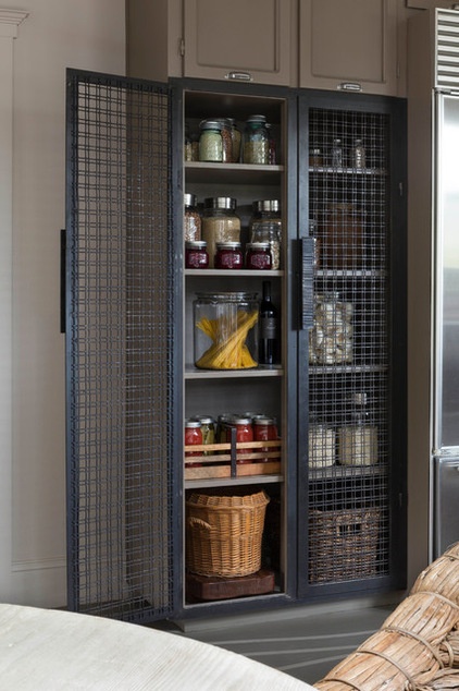
That same blacksmith made new, open pantry doors. The woven texture is echoed in the collection of baskets hanging above it (seen in the first photo).
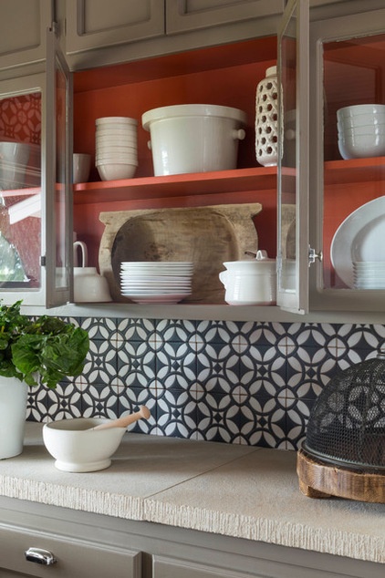
The handmade tile, range hood and pantry doors called for a handcrafted countertop. “We took slabs of Colorado limestone and sandblasted it,” says Catherine. “It has less smooth texture, but it’s wipeable. Then we had an adzed edge put on it.”
Orange paint: Vroom, C2
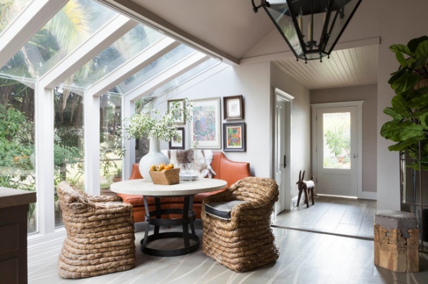
In the eating area, chairs woven from banana leaves provide a unique shot of texture. Catherine designed the curved leather bench that hugs the table on the other side, fitting nicely into the space without being built in.
More: How to Remodel Your Kitchen


