Design Workshop: How to Separate Space in an Open Floor Plan
http://decor-ideas.org 11/12/2014 01:13 Decor Ideas
The open floor plan — championed by early modernists Le Corbusier, Mies van der Rohe and Walter Gropius, among others — is as relevant today in home design as it was in the early 20th century. But modern life still requires, at varying times, functional, aesthetic, visual and auditory isolation. The following examples explore the intersection of openness and isolation, showing how we can provide separation without losing the openness we crave.
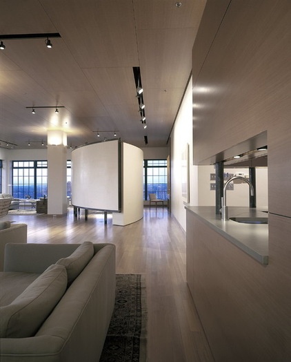
Room within a room. The designer of this loft in Minneapolis skillfully addressed the idea of connected separation. Two freestanding leaf-shaped curved partitions conceal an office space in the larger room. The workspace is anchored in the thicker, heavier mass (on the right), while the floating screen wall conceals a collection of books. The freestanding object in space is sculptural and made lighter by the canvas-like floating screen.
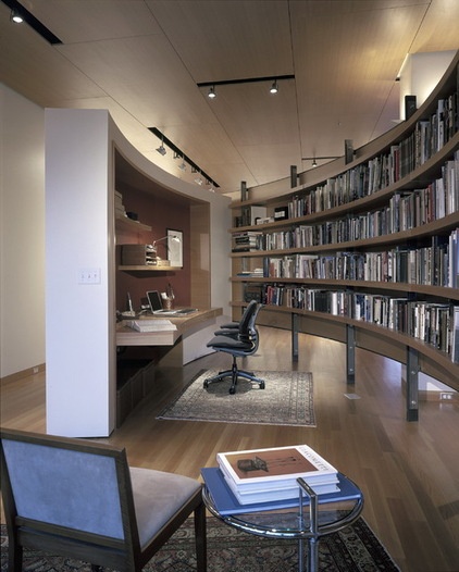
The design reinforces the physical separation with different materials used on the inside of the workspace too. Here the warm backdrop of the wood tones picks up on the floor and creates a more intimately scaled space.
The room-within-the-room concept works well when the bounding walls of the space appear to float, as they do here. This allows the larger space a presence on the inside of the smaller space and a sense of the smaller interior space when viewed from the larger room.
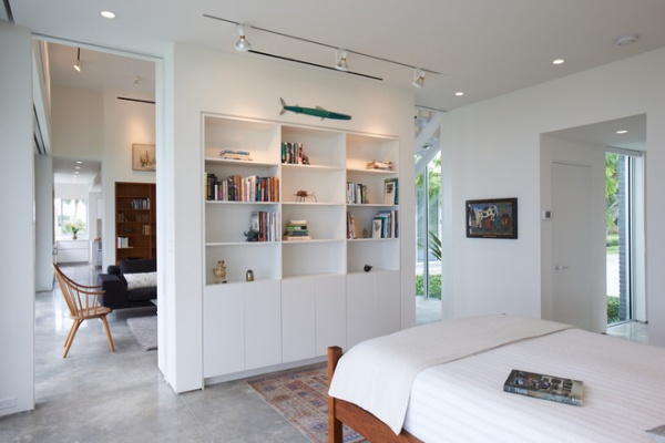
Thick wall. A freestanding partition can act as a container supporting the function of spaces. This integrated, thick wall can both conserve the open-plan layout and provide separation when needed. It works well in this kind of configuration, flanked by pocket doors. While the entire space isn’t open to the adjacent areas, it offers a sense of both openness and enclosure. The pocket doors make this marriage possible by lending the ability to completely close off the bedroom.
The Secret to Pocket Doors’ Success
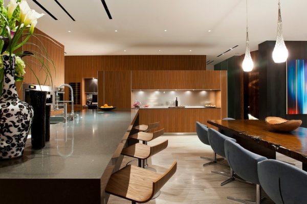
This freestanding thick wall element conceals a cooking area on one side and a serving counter facing the dining area. It does the heavy lifting here — it’s a visual backdrop, a functional screen for the clutter of the preparation space and a serving counter to keep traffic out of the cooking area. Because it floats in the space, it allows the full dimension of the room to be appreciated — open yet functionally separated.
This example offers only visual separation — it can’t be completely closed off — but it serves a public space, so it makes sense.
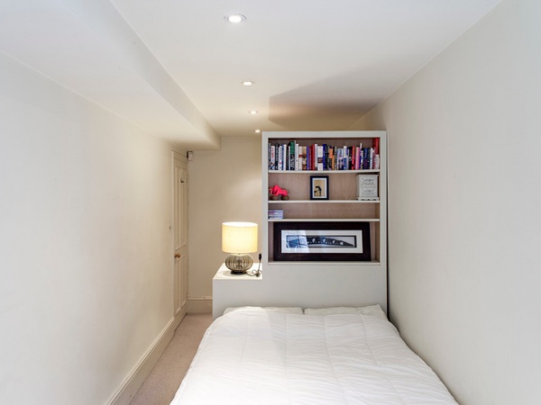
Small spaces benefit the most from the subdivision of space using the thick wall concept. Rather than making a small space even smaller, the architect here has chosen to use a freestanding cabinetry unit to provide storage, a small concealed changing area and a functional headboard for the bed. By floating the unit and not connecting it to the ceiling, the feeling of openness and light is preserved.
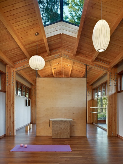
Thin plane. Using thin planes to suggest subdivisions of activity in a larger space works well too. Centering the thin plane in the room allows for circulation at the edges and activity in the middle. Another option for the partition is to position it to one side, which would make the subdivided space feel more room-like.
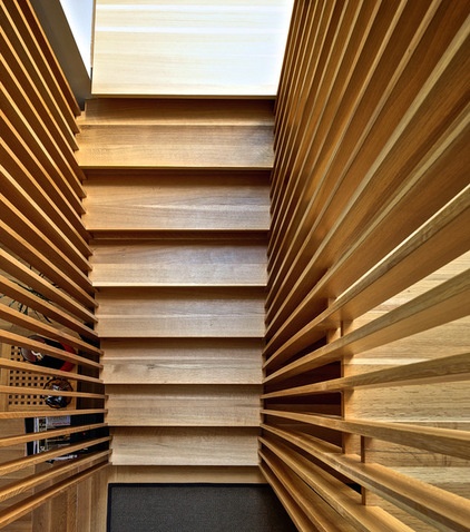
The planar wall used to separate doesn’t have to be solid. Here a slatted screen bounds the stairs, but one could imagine this screen as a freestanding element in a larger room, positioned to act as a backdrop for various functions. The width of the slats and their spacing could be varied to achieve more or less openness.
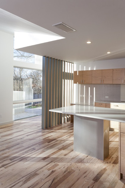
Here the thin plane is composed of vertical slats separating the circulation from that of the kitchen. Again, the spacing and depth of the slats can be changed to adjust the degree of separation.
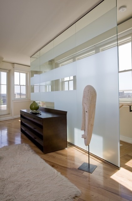
A fixed glass plane defines the circulation zone of this room and doubles as a guardrail for the stair. Glass partitions can be quite expensive, but the trade-off is a clean, modern material that diffuses natural light and helps contain sound. Custom etching the glass partition, as has been done here, can alter the degree to which one feels connected to or separated from the adjacent spaces.
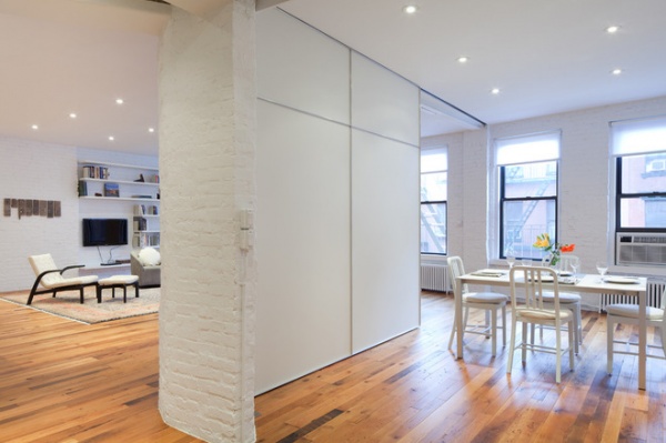
Sliding walls. The flexibility this arrangement offers is really appealing. It allows for the transformation between open and closed as the need arises. This method is possibly the most diverse in terms of the types of problems it can address, including noise, privacy and how large a room feels. It also can change the amount of light a room receives and alter traffic patterns.
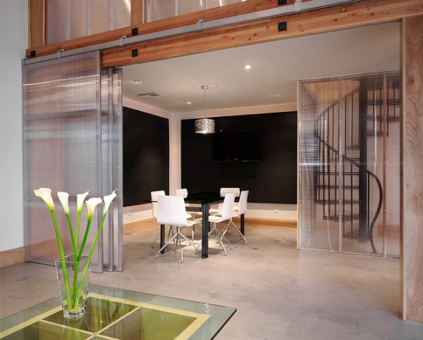
Using translucent materials to add privacy, both visual and auditory, while allowing light in is a great solution for interior spaces requiring privacy and daylight.
In this live-work space, the architects have cleverly designed a custom set of sliding doors that can close off their meeting space from the larger room. The striated plastic panels refract and diffuse the light entering the space, offer privacy and natural light, and limit sound transmission. They are a simple solution to competing requirements.
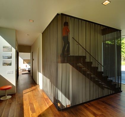
Fabrics. Fabrics and drapes, such as this metal mesh, are a unique alternative to the standard partition wall. They add a softer edge and come in a variety of patterns, transparency levels, materials and colors. This open mesh defines the stair volume, acts as a guardrail and permits light and air to flow freely between the floors. While this example is fixed, mesh can be used as you would regular fabric to divide spaces.
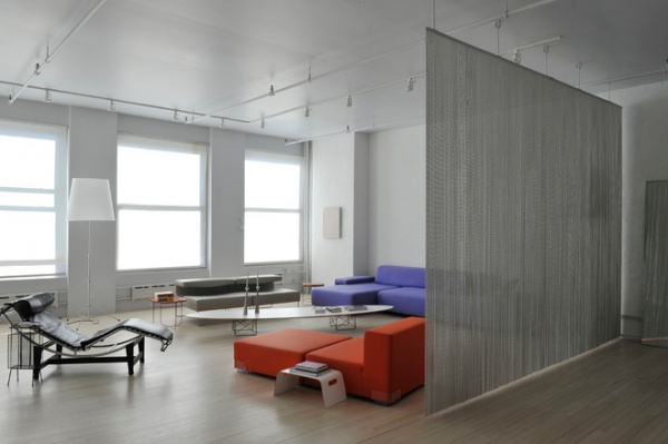
It takes surprisingly little to suggest the boundary of a space.
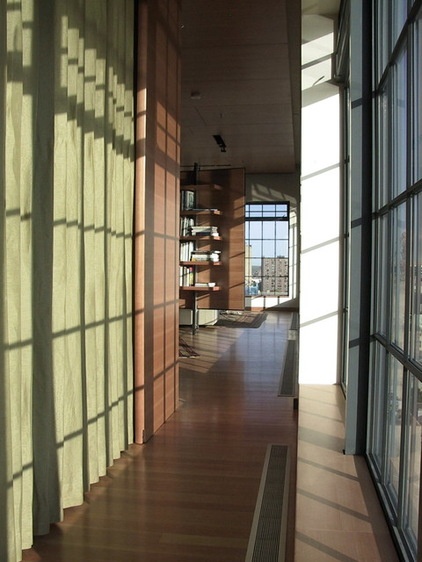
The visual weight of fabrics allows them to define spaces in much the same way as a wall, but they can be drawn out of the way very simply. They can help diffuse and absorb sound in open spaces too.
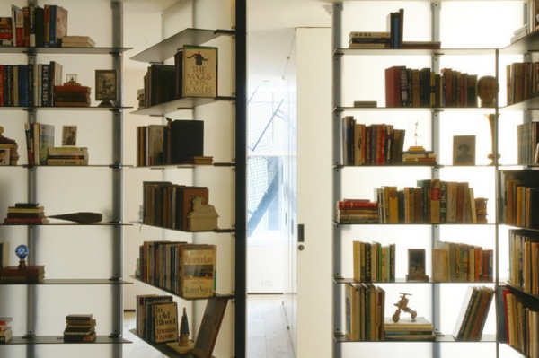
Open shelving. Bookshelves make excellent spatial dividers. Their density can be altered based on the number of books stored. If the clutter of the book spine activates your inner obsessive, you can use translucent materials to soften the effect, as shown here.
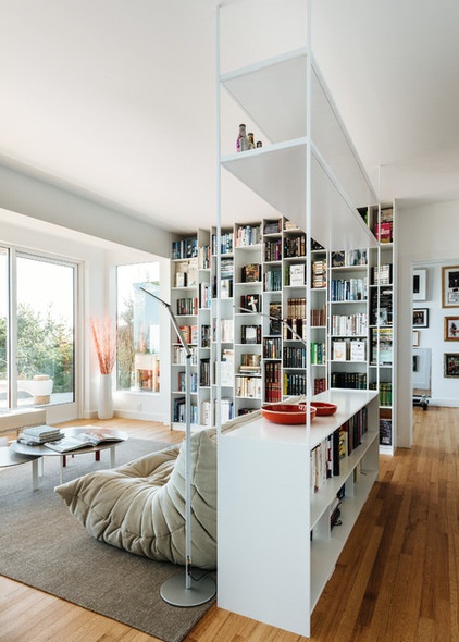
Shelving and cabinetry units can be used to partition space without the visual heft of a framed wall.
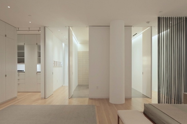
Hybrids. Combining pivoting full-height walls, doors, translucent screens, drapes and freestanding walls, this project has a variety of elements dividing the space while playfully hinting at their connectedness. Some walls are diaphanous, some are completely solid, and others are translucent. Etched glass walls are left bare or covered by layers of cloth or metal fabric, making for a rich sensory experience.
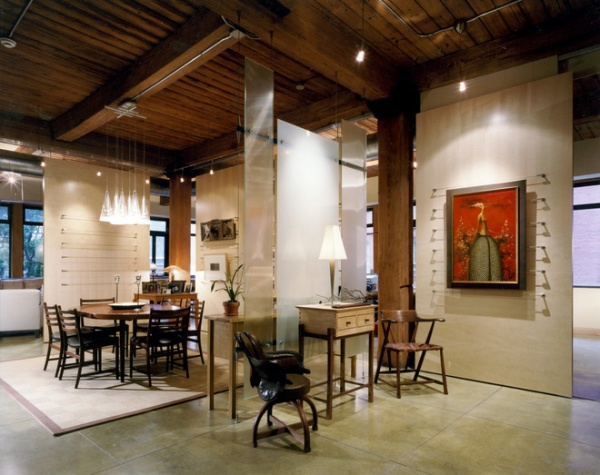
In this space the division is more straightforward. Sliding panels double as room dividers and movable gallery walls. The architect has deferred to the scale of the structure while offering sensible divisions with varying levels of enclosure.
More: House Planning: When You Want to Open Up a Space
Related Articles Recommended


